How to edit or replace close and back buttons
In this guide, we’ll show you how to customize the close and back buttons of your widgets using Getsitecontrol’s built-in CSS editor.
Make sure you read the general instructions first (next paragraph), then feel free to skip to the section you need using the shortcut menu below.
1. General instructions on using the CSS editor
❗Make sure to read the following instructions carefully if you are not familiar with CSS code. Please note that the recommendations below apply to all the button styling methods in this guide.
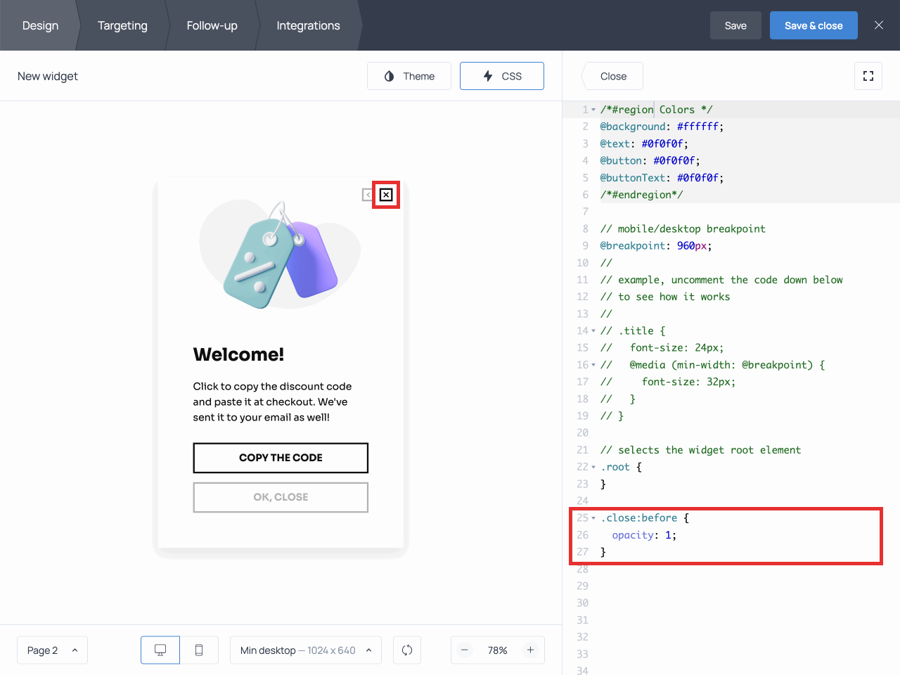
- Add the code snippets you will find in this guide to the
CSS editorof your widget. To get started, open the widget in editing mode and find the CSS editor on theDesigntab:

- You can add the code snippets provided in the upcoming sections anywhere in the CSS editor, but make sure not to interrupt any existing lines of code there. To be safe, we recommend adding the new CSS code at the very end.

- If you see a red X on the side, the CSS button is also red, and the platform doesn’t let you save the changes, something is wrong with the code you’ve added. Make sure you have not left out any part of it or added any characters by mistake.

- Similarly, when you copy and paste the code from this guide or from anywhere else, make sure that no extra dots are automatically added to the code in the process. This can happen sometimes, and it will prevent the code from working. You can spot the unnecessary dots because they will appear in red and be marked with a red X on the side:

Now that you know the basics, let’s dive right in!
2. Change the color of the button
To change the color of the close button, you need to change the background-image value for the smth:before pseudo-element. “smth” can stand for the close button as well as the back button.
Copy the code below and adjust the stroke parameter. Write the name of the desired color in double quotes.
Here is an example of code that changes the color of the close button to red:
.close:before,
.close:hover:before {
  background-image: url('data:image/svg+xml;utf8,<svg stroke="red" stroke-width="4" xmlns="http://www.w3.org/2000/svg" viewBox="0 0 24 24" fill="none" stroke-linecap="round" stroke-linejoin="round"><path d="M1.458 1.458l21.084 21.084m0-21.084L1.458 22.542" /></svg>');
}
As an alternative to writing the name of the color, you can use the following formats to express the color property:
- RGB and RGBa color values: rgb(0, 255, 255), rgba(0, 255, 255, .5), or rgba(0, 255, 255, 50%)
- HSL and HSLa color values: hsl(180, 100%, 50%) or hsla(180, 100%, 50%, .5).
You can apply similar changes to back buttons. Back buttons are automatically added to multiple-page forms to allow respondents to return to the previous page; they are available on all pages except for the first one.
Here is an example of code that changes the color of the back button to purple using the rgb format:
.back:before {
background-image: url('data:image/svg+xml;utf8,<svg stroke="rgb(155, 15, 155)"  stroke-width="2" xmlns="http://www.w3.org/2000/svg" viewBox="0 0 16 11" fill="none" stroke-linecap="round" stroke-linejoin="round" ><path d="M1 5.5h15M5.5.55L.55 5.5l4.95 4.95"/></svg>');
}
If the button looks thinner or is less visible after you’ve changed its color, you can increase the value of the stroke-width property to make it stand out more:
.close:before {
  background-image: url('data:image/svg+xml;utf8,<svg stroke="red" stroke-width="6" xmlns="http://www.w3.org/2000/svg" viewBox="0 0 24 24" fill="none" stroke-linecap="round" stroke-linejoin="round"><path d="M1.458 1.458l21.084 21.084m0-21.084L1.458 22.542" /></svg>');
}

.back:before {
background-image: url('data:image/svg+xml;utf8,<svg stroke="rgb(155, 15, 155)" stroke-width="2" xmlns="http://www.w3.org/2000/svg" viewBox="0 0 16 11" fill="none" stroke-linecap="round" stroke-linejoin="round" ><path d="M1 5.5h15M5.5.55L.55 5.5l4.95 4.95"/></svg>');
}
3. Change the size of the button
To change the size of the button, increase or decrease height and width for the :before pseudo-element.
.close:before {
  width: 40px;
  height: 40px;
}
Feel free to adjust the values of height and width to suit your needs, but remember that they should always be equal.
❗If a widget is designed in the Outlined theme, the X button includes a circle as part of the design. When adjusting the button’s size, the changes won’t affect the circle; so the circle will look either too big or too small.
To avoid this issue, you can remove the circle. To do that, hide the :after element by adding the following snippet to the code:
.close::after {
  display: none;
}
4. Change the position of the button
To change the position of the close button, use the following code:
.close {
  margin-right: 8px;
  margin-top: 40px;
}
As mentioned before, feel free to adjust the numerical values depending on your needs.
If there are several pages in your widget, don’t forget to change the position of the back button as well. You can use the following code to change the position of both buttons at the same time so that they’ll be aligned:
.close,
.back {
  margin-right: 8px;
  margin-top: 40px;
}
To move the close button to any corner of your widget, use the property pairs top/bottom and left/right.
Set the necessary value to the first property, and add the value auto to the other. This way, if you resize your widget, the button’s position will adjust automatically.
💡 Tip: to achieve a balanced design, place the back and close buttons in the opposite corners. To do that, change the position of the back button using the code below:
.back {
  left: 0px;
  right: auto;
}
The close button does not require any changes.
To move the close button to the top left corner along with the back button, change the values of its left property.
For example, add the property left: 10px; to the close button and left: 36px; to the back button, as shown below:
.close {
  left: 20px;
  right: auto;
}

.back {
  left: 36px;
  right: auto;
}
5. Change the opacity of the button
Add the opacity property to set the opacity level for the element .close:before.
The opacity value lies between 0 and 1, where 0 represents the lowest level of opacity, and 1 represents the highest.
In the following example, the close button is set to be fully opaque, as you can see in comparison with the back button in the illustration below.
.close:before {
  opacity: 1;
}
Set the :hover pseudo-class to change opacity when a visitor moves the cursor over the close button. By adding the code below, you’ll make the X button become more opaque when visitors hover over the button.
.close:before {
  opacity: 0.1;
}

.close:hover:before {
  opacity: 1;
}
6. Hide the button
To hide a button, add a display:none property to it.
Use the following code to hide the close button:
.close {
  display: none;
}
❗Please, note that you should add the property to the .close class element, not to its pseudo-element.
To hide the back button, add the following code instead:
.back {
  display: none;
}
7. Replace the button with a piece of text
If you want to replace the ‘X’ icon with a piece of text — e.g. the word ‘Close’ — write the CSS code as follows:
- Add the necessary word to the
contentproperty. - Remove the ‘X’ image by adding the
nonevalue to thebackground-imageproperty. - Add the
autovalue to the width and height of the element to display the text within the widget borders (recommended). - Remove the pointing effect from the ‘X’ button (the cross rotating upon hovering over it) by discarding the
transformproperty. - If you are using the Outlined theme on your widget, hide the circle surrounding the X button by setting a
nonevalue for the:afterproperty.
Here is the complete code (including the extra snippet for the outlined theme):
.close:before {
  content: 'Close';
  width: auto;
  height: auto;
  background-image: none;
}

.close:hover::before {
  transform: none;
  background-image: none;
}

.close::after {
  display: none;
}
In all themes but the Outlined one, when a user hovers over the text, it gets darker and more visible:

This does not happen with the Outlined theme, as the close button is always opaque, and therefore it doesn’t change when a visitor hovers over it.
To reproduce the hovering effect displayed above for the Outlined theme, check out section 5 of this article, which is dedicated to button opacity.
As an alternative to transforming the X button into a word, you can create an additional button displaying the necessary text, and set it up to close the widget. Make sure to add the CSS code to hide the X button as well.

8. Replace the button with an image
- To replace the default ‘X’ icon with a custom image in svg format (such as icons from Icons8, for example), compress the code of the image before adding it to the CSS editor. To do that, you can use a free service such as this one. Here is an example of compressed code:
<svg data-name="Livello 1" id="Livello_1" viewBox="0 0 128 128" xmlns="http://www.w3.org/2000/svg"><title/><path d="M64,0a64,64,0,1,0,64,64A64.07,64.07,0,0,0,64,0Zm0, 122a58,58,0,1,1,58-58A58.07,58.07,0,0,1,64,122Z"/><path d="M92.12,35.79a3,3,0,0,0-4.24,0L64,59.75l-23.87-24A3,3,0,0,0,35.88,40L59.76,64,35.88,88a3,3,0,0,0,4.25, 4.24L64,68.25l23.88,24A3,3,0,0,0,92.13,88L68.24,64,92.13,40A3, 3,0,0,0,92.12,35.79Z"/></svg>Next, insert the code after
background-image: url('data:image/svg+xml; utf8,Don’t forget to add
');after the compressed code of the image, and set the height and width for your icon (see section 3 of this document).
Here is an example of code that you can tailor to your needs:
.close:before,
.close:hover:before {
  width: 28px;
  height: 28px;
  background-image: url('data:image/svg+xml;utf8,<svg data-name="Livello 1" id="Livello_1" viewBox="0 0 128 128" xmlns="http://www.w3.org/2000/svg"><title/><path d="M64,0a64,64,0,1,0,64,64A64.07,64.07,0,0,0,64,0Zm0, 122a58,58,0,1,1,58-58A58.07,58.07,0,0,1,64,122Z"/><path d="M92.12,35.79a3,3,0,0,0-4.24,0L64,59.75l-23.87-24A3,3,0,0,0,35.88,40L59.76,64,35.88,88a3,3,0,0,0,4.25, 4.24L64,68.25l23.88,24A3,3,0,0,0,92.13,88L68.24,64,92.13,40A3, 3,0,0,0,92.12,35.79Z"/></svg>');
}
And here is the final result:

In widgets with multiple pages, you can apply the same styling to the back button by adding the code above to the .back:before element.
❗If you’re using the Outlined theme in your widget, don’t forget to hide the :after element by adding this code snippet as well:
.close:after {
  display: none;
}
Svg is not the only suitable image format; in fact, you can replace buttons with images in any format you want.
To achieve that, you’ll need the URL of the image. Here is the method you should use:
- Choose an image on Icons8.com and hit ‘Download’.

- Click ‘Link (CDN)’ and copy only the URL, as shown below:

- Paste the URL of the image into the brackets of the
background-imageproperty:
background-image: url('https://img.icons8.com/material/24/000000/close-window--v1.png');- Add the property
background-size: contain;to resize your image and make sure it’s fully visible.
Here is the complete code:
.close:before,
.close:hover:before {
  width: 24px;
  height: 24px;
  background-image: url('https://img.icons8.com/material-rounded/24/null/close-window.png');
  background-size: contain;
}

.close:after {
  display: none;
}
Feel free to adjust the width and height value for your image.

Now that you know the ins and outs of close and back button customization, it’s time for some experimenting.
Feel free to reach out to our Support Team should you need assistance with any CSS-related task.