Create a popup for free
Need website popups that generate leads from day one?
 Oct 17, 2025
—
11 min read
Oct 17, 2025
—
11 min read Popups are a powerful tool to grow your email list, promote offers, and guide visitors toward key actions.
Our data shows that a well-designed email popup can convert 3.77% of your visitors into subscribers on desktop, and 6.57% on mobile, on average.
But not all popups deliver results — there’s a stark difference between those that fall flat and those that convert.
This guide dives into both the theory behind effective popup designs and real-world examples that get it right.
Whether you’re after more signups, higher engagement, or increased sales, you’ll find actionable tips and inspiration to craft popups that work.
Let’s dive right in!
The first section of the article will go over the theory behind designing website popups. Beyond the design and content, we’ll also delve into some other relevant areas, like when and where to display your popups.
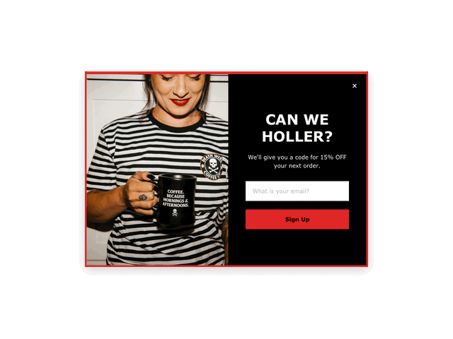
When you design a popup, you want it to feel like it’s a part of your site, rather than an intrusion.
The way to achieve that is to match the style, colors, and typography of the rest of your site, just like in the example from Sector 9 below.
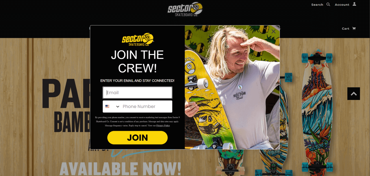
It might seem like a small detail, but this way, when your popup does appear, it will feel like part of the experience and convey trust.
Use the template below! Just swap the image with your own, and tweak the copy, color theme, and CSS code if needed.
Based on behavioral science studies, motion is one of the most efficient ways to capture a visitor’s attention. If you want to apply that knowledge in your popup design, you can either replace a still image with a GIF or use animated popups, as Etérea did in the example below.
This popup is created with Getsitecontrol
This approach works especially well if you’re using popups to promote a new product, collection, or a limited-time deal and don’t want visitors to miss it.
Grab the template below. The animation part is already pre-designed and requires no special knowledge. Just replace the text and the image to make it yours.
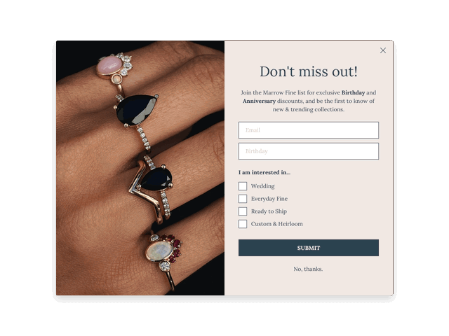
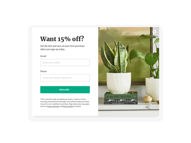
Targeted emails convert better, so the best approach is to segment your audience from the start. Fashion and jewelry brands can ask about preferences during signup — just like Marrow Fine does in the example below.
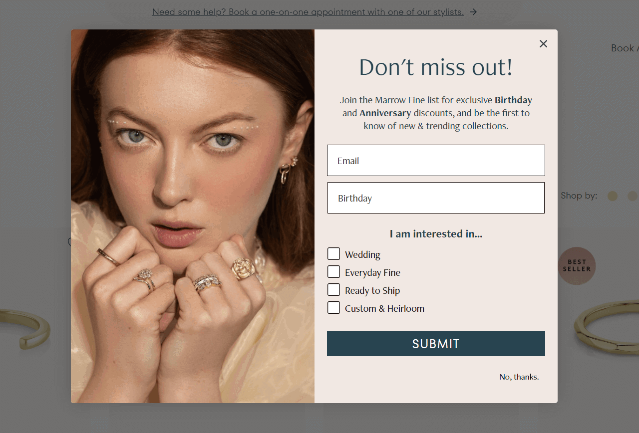
According to Michael Melen, co-founder of a digital marketing agency SmartSites, “Personalized emails to segmented lists drive up to 18x more revenue than broadcasts”, so upfront subscriber segmentations is well worth the effort.
You can easily add a similar email signup form that tags new subscribers based on their preferences, using the template below. On top of that, you can set up automated welcome email sequences for each segment.
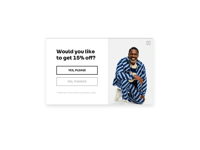
One of the latest trends in popup design is a two-step email signup. It means that instead of displaying an email form immediately, you first ask website visitors if they’re interested in your offer.
To get inspired by a real-life example, visit Paradisefold, a fashion brand helping women optimize their hair routine.
This popup is created with Getsitecontrol
In the case of Paradiseford, the popup design performs very well: 18% of first-time visitors express interest in the offer at the first step; from there, more than half fill out the email form and join the list.
Use our pre-designed popup template. The two-step part is already built-in and requires no special knowledge. Edit the offer, swap the image, and adjust audience targeting – then follow the prompts to add it to your website.
You’re probably displaying a popup on your site because you want your visitors to “do something”. That “something” could be joining your email list, checking out a sale, grabbing a coupon, etc.
To encourage people to perform that action, you want to have a single button with a strong call to action (CTA). For example, if you’re offering a coupon in exchange for an email subscription, something like “Get a discount” sounds way more enticing than “Subscribe.”
This is exactly what Lola Blankets does with their CTA. Instead of “Sign up” or “Subscribe,” their action button says: “Send me 35% off” 👇
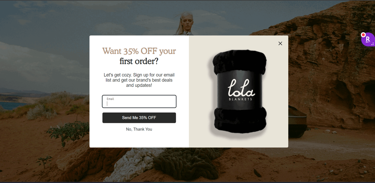
This popup is created with Getsitecontrol
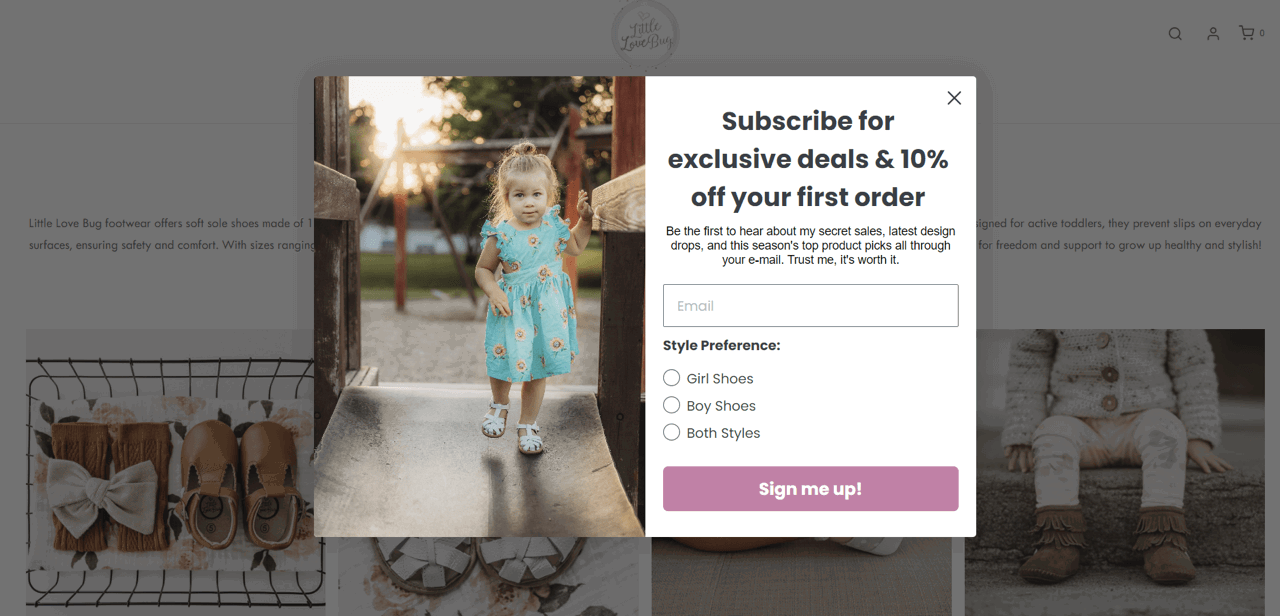
A compelling CTA isn’t just about the text; it’s also about grabbing your visitors' attention in other ways. Namely, color.
You want to use a color that contrasts with the rest of your popup to specifically draw visitors' attention to the button you want them to click.
For example, Little Love Bug below uses a contrasting lilac color that draws attention while still matching the rest of the site.
If you struggle to find a contrasting color that will also match your branding, the easiest option is to paint the CTA button black and leave the button text white. It’s a universal solution that works for most websites.
When you hear the word “popup”, the first thing that comes to mind is probably one of those modal popups that appear and take over your screen until you click a button.
Don’t be afraid to experiment with less intrusive popup types, though. For example, you can try compact slide-ins.
When designed correctly, they can still drive action without requiring a modal interaction or drastically compromising conversion rates.
Microcopy is a small, unobtrusive piece of text near your CTA button that allays the fears some people might have of interacting with your popup. For example, if you have an email lead generation popup, a natural fear that most people will have is “I don’t want to get spam emails”.
Using microcopy, you can eliminate those fears by explaining what type of emails you’re planning to send and how often. Here are some phrases that can be helpful:
Below is an example of a popup with a minimalistic design and embedded microcopy at the bottom.
Nowadays, web traffic is split about 50/50 between desktop and mobile visitors. When you’re designing popups, though, it’s easy to forget about that and just focus on the desktop experience of your visitors.
One of the best design practices for mobile popups is to use a sticky “Get X% off” button that opens an email form upon click. That’s exactly what Pilgrim, a European jewelry company does on its website:
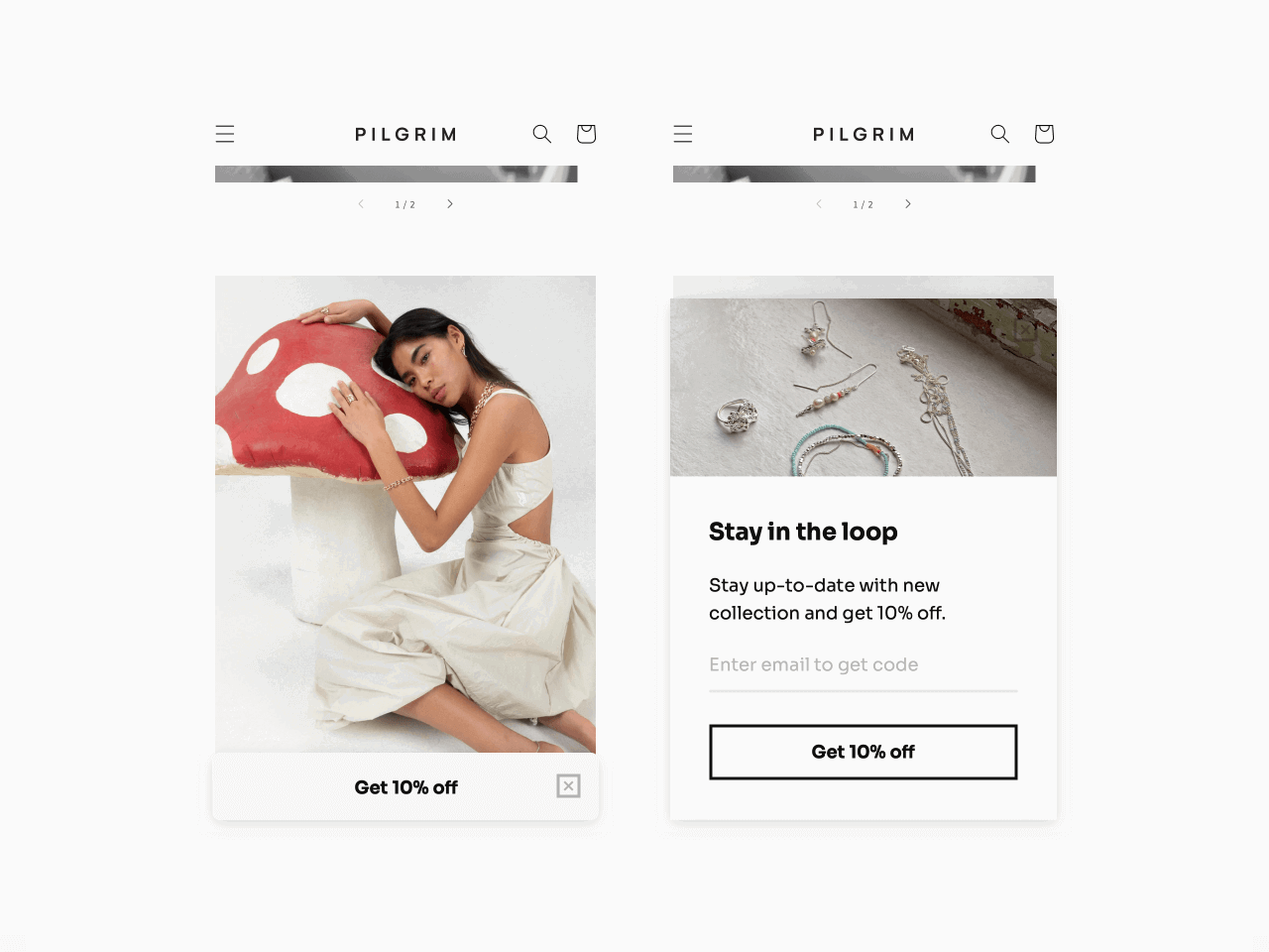
This popup is created with Getsitecontrol
Finally, while timing isn’t a part of popup design from an aesthetic perspective, it’s still an important part of creating an effective website popup. Rather than displaying your popup right away, you can experiment with various delays.
Popups can be brilliant, but only if they feel like part of the site rather than a slap in the face.
Web-Knack web design agency
Popup timing options you can experiment with are:
Most brands choose to display their email opt-in forms after a visitor spends a few seconds on their websites. If you wait until visitors are engaged with your content to ask for their email addresses, there’s a better chance they will be willing to join your list.
Take Mosaic Journal store as an example. Their website popup appears after a visitor spends at least 25 seconds browsing the store or scrolls over 55% of a page. Nearly 7% of those who see the offer accept it and join Mosaic’s email list, which is above the average email signup rate among ecommerce brands.
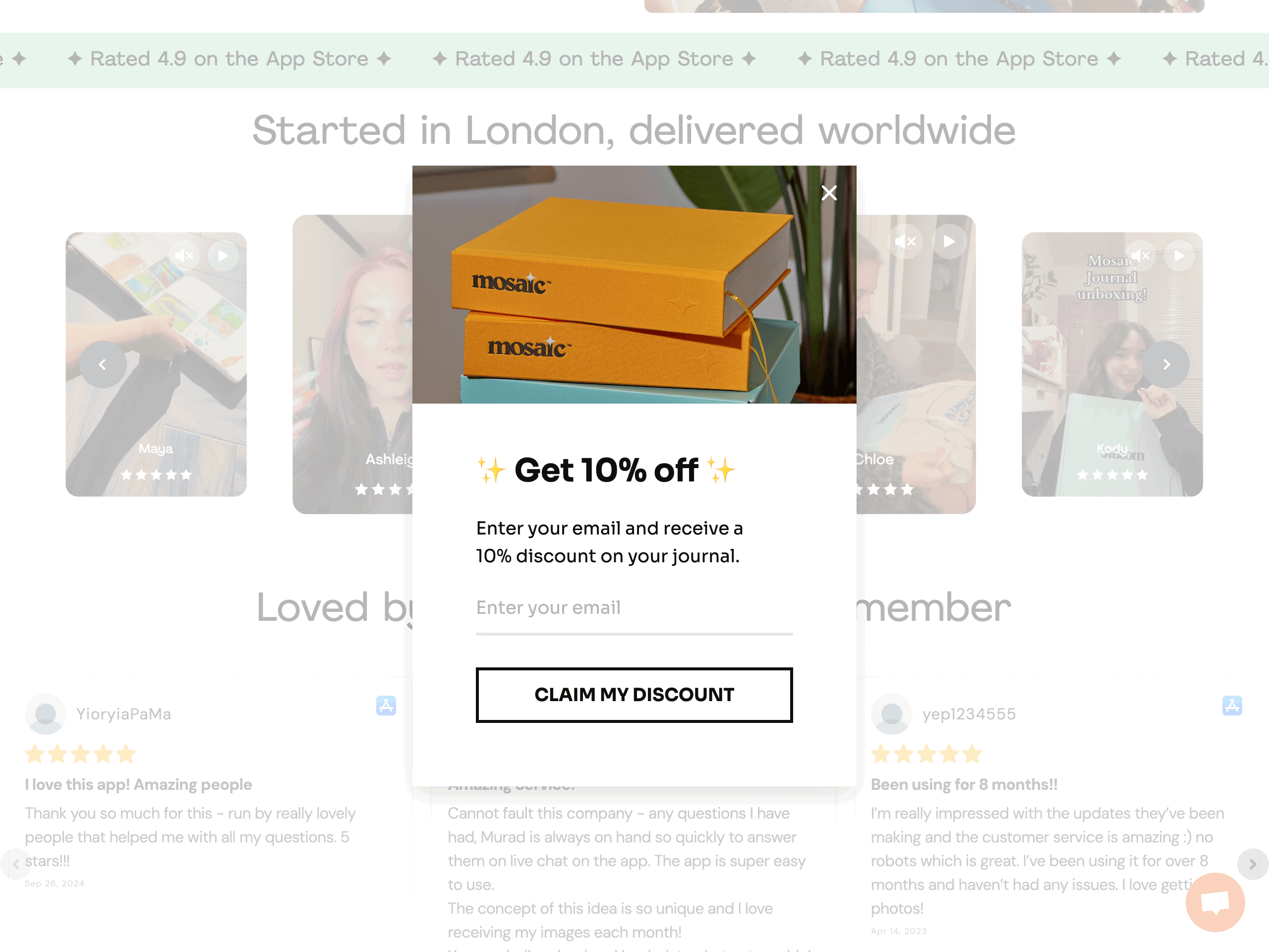
This popup is created with Getsitecontrol
Now that you know some theory, let’s explore real-world popup design examples. Beyond providing popup design inspiration, we’ll also dig into why these examples work so well.
All the popup examples below can be easily recreated on your website with the Getsitecontrol popup builder.
This popup from Urban Kissed is a great example of a form using a contrasting color for the CTA button. This popup does several other things well, though, so it’s worth investigating in a little more detail.
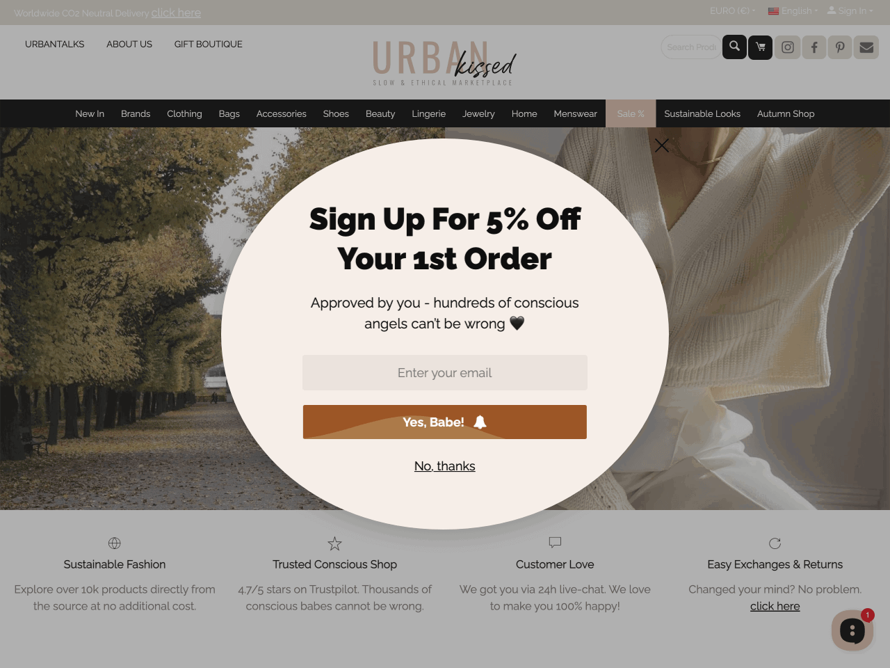
This popup is created with Getsitecontrol
First, you can see how the entire design matches the looks and colors of the rest of the site, especially the combination of beige and black used for both the popup and the logo. It also uses an opt-out button (“no, thanks”), and dangles a 5% discount as an incentive in exchange for people’s email addresses.
The results? Within the first year of implementing this popup design, Urban Kissed more than doubled their signup conversion rate — jumping from 0.9% to 2%, a 2.2X improvement. This simple, brand-aligned popup helped them grow their email list by 250% while staying true to their aesthetic.
Michelle Vella is an online art store, and this popup design example is worth attention because it employs the two-step approach we discussed earlier. It also demonstrates a smart use of CSS, enabling a darkened background that drives focus straight to the offer.
This popup is created with Getsitecontrol
This popup targets new store visitors and offers free shipping on the first purchase in exchange for an email. Note that the microcopy at the bottom of the popup specifies the locations included in the promo.
Unlike the previous example, SIEDRÉS uses a minimalist, dark-themed popup to collect emails.
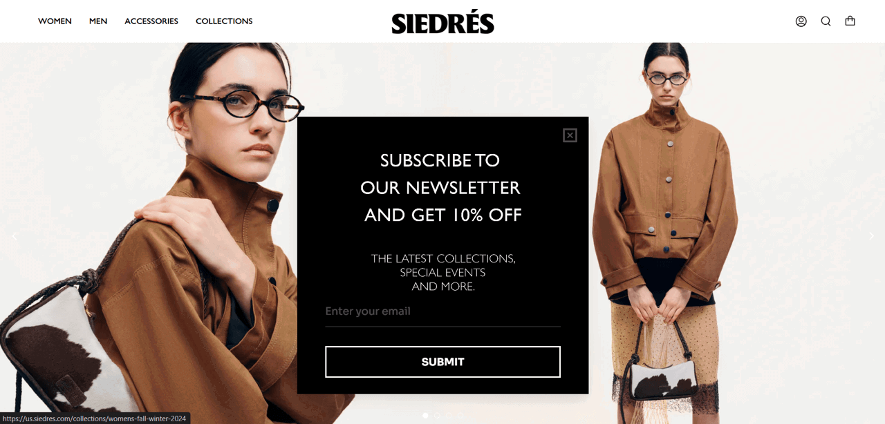
This popup is created with Getsitecontrol
Although our research shows that popups with images convert better than popups without images, when your landing page is busy, a single-tone popup may be your best solution — as long it’s in contrast with the background. Another detail you should take note of is the inverted pyramid text structure in the description. It maintains the overall aesthetics and makes the text easier to read.
This popup design example from Scarpetta pasta is interesting mainly because it uses a GIF instead of a still image.
This popup is created with Getsitecontrol
The popup doesn’t just look attractive — it creates a semi-immersive experience by showing the incentive in action. You can create similar animated visuals from short product videos with an online video-to-GIF converter before adding them to your popup.
Kanzen Skincare uses a fullscreen email popup, but with a twist. Rather than showing it as a “welcome mat” when a visitor arrives, which a lot of people find annoying, this brand triggers it with exit-intent.
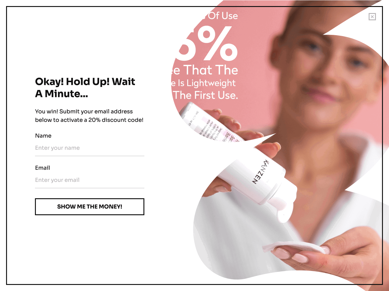
This popup is created with Getsitecontrol
This creates a less intrusive experience and gives Kanzen Skincare one more chance to capture exiting visitors. Beyond that, Kanzen uses a big bold call-to-action button saying: “SHOW ME THE MONEY!”. And they’ve also added a unique touch to the headline by making it fun and conversational.
Everyday Prayer Co is a company selling Catholic street apparel, mass journals, and prayer tools. When they released a wallet Rosary Card, they used a welcome popup message to notify website visitors of a new product.
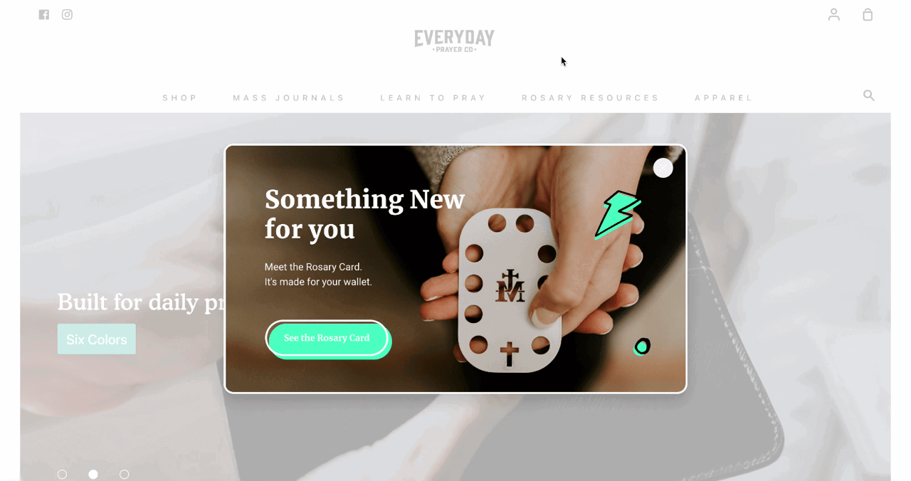
This popup is created with Getsitecontrol
This is a great popup design example because it appears at the right moment (soon after a visitor lands on the website), uses the same accent colors as the website, and effectively conveys the message through the background image and a concise text. Finally, the CTA button takes those interested in the Rosary Card straight to the product page.
This BIBS popup is a good example because, unlike the vast majority of popups, it slides-in from the left, thus using a pattern-interrupt approach.
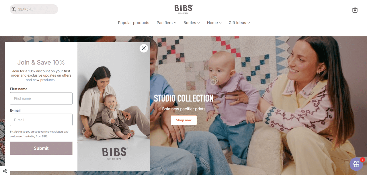
This popup is created with Getsitecontrol
There’s nothing too flashy going on, but such is the overall tone of the website aesthetics. What’s noteworthy is that the form is asking subscribers to type their first names — presumably, so that BIBS marketers can personalize email subject lines and newsletters. That’s another neat trick you may want to try when you collect emails on your website.
Johnny Fly utilizes interesting techniques that we haven’t previously discussed — urgency and an element of surprise. In addition to offering a discount in exchange for visitors' email addresses, Johnny Fly ups the ante by adding a countdown timer.
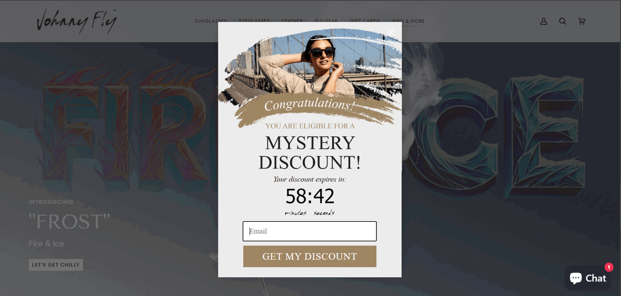
While this is an aggressive tactic for a popup, urgency is a proven way to increase your conversion rates. Beyond that unique twist, you can also see how the popup matches the rest of the website in terms of style.
Swedish Linens uses a sidebar to collect emails. It’s a less common but highly-efficient popup type that slides in from the side and takes up the entire screen height.

This popup is created with Getsitecontrol
There are a couple of nice things going on here:
If you’d like to learn more about how different popup formats look and perform, here is a guide to help you.
Like some of the examples above, Proper Pasty uses a two-step approach in their popup design. A compact popup teaser in the bottom left corner notifies visitors of the 10% discount and launches a fullscreen popup upon click.
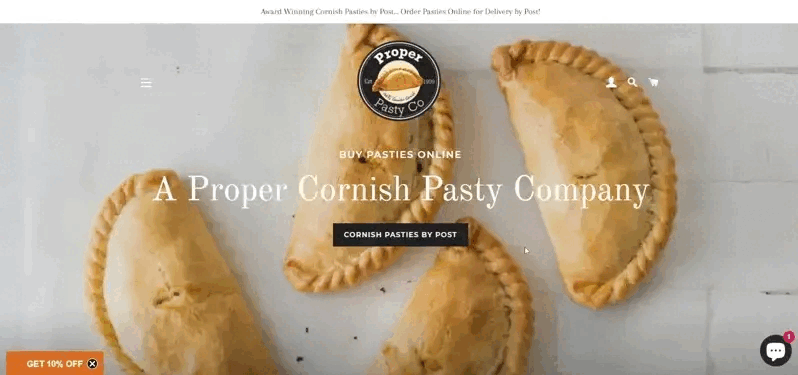
Once visitors agree to get a discount, they’re asked to type their email addresses and sign up. Although usually fullscreen popups are considered to be an aggressive way to grow an email list, it’s perceived differently when a visitor launches it intentionally via a teaser button.
At first glance, Le Braquet’s email opt-in might seem like any other popup in this roundup, but there is a couple of things here that are worth noting.
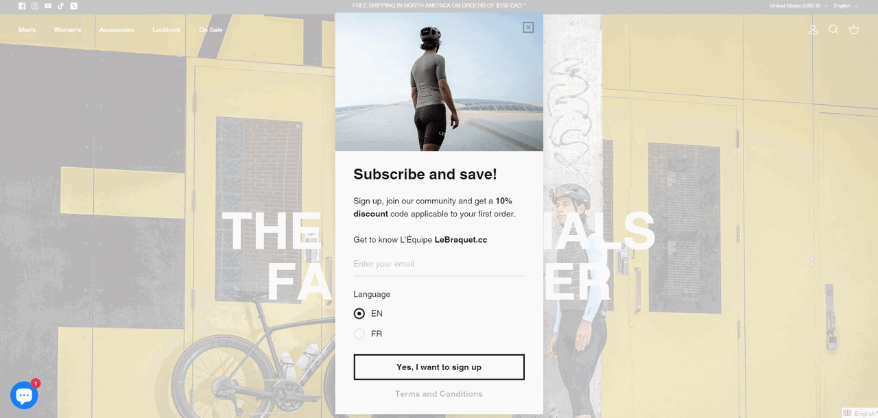
This popup is created with Getsitecontrol
First, this popup contains newsletter language preference buttons that will help the company automatically tag new subscribers and send them newsletters in the corresponding languages. Second, the text on the signup button is crafted thoughtfully: “Yes, I want to sign up”. It’s actionable and affirmative. Finally, the link at the bottom of the popup links to the Terms and Conditions page, for those who might have questions before subscribing.
This compact pop-up coupon on Hot Skwash’s site offers a welcome 20% discount on the first purchase and only appears for first-time visitors.
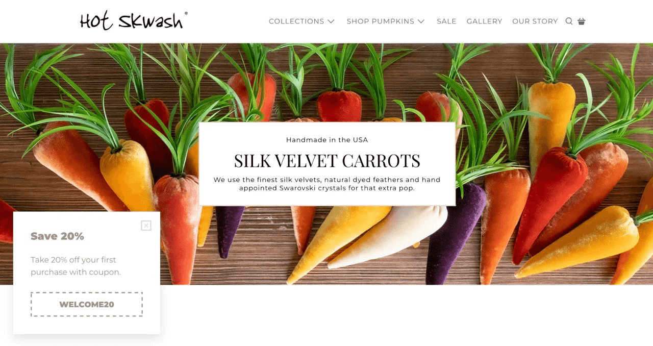
This popup is created with Getsitecontrol
This popup is straightforward. The noteworthy part about its design is that the coupon button allows visitors to copy the discount code to the clipboard and paste it at checkout instead of typing it manually.
MANC OFFICIAL uses this modal popup to prevent shopping cart abandonment. The promo will only appear if a customer adds a product to the cart and starts heading to the exit before completing the purchase.
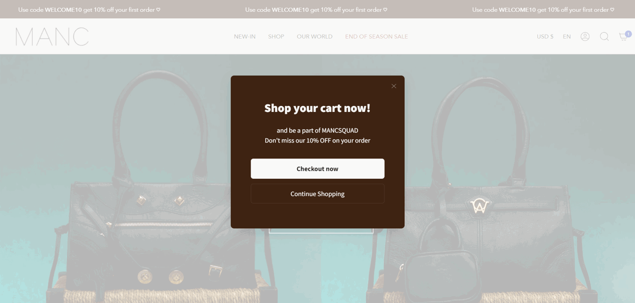
This popup is created with Getsitecontrol
The popup reminds of the 10% discount and offers two options for visitors: going straight to checkout or closing the popup to continue browsing the store.
Even well-intentioned popups can kill conversions if they violate basic user experience principles. Here are the mistakes to watch out for.
“The worst mistake I see? Popups that trigger instantly,” notes Paul C., a Web-Knack web design agency founder. “Someone lands on your site and before they’ve even read a word, there’s a massive box blocking everything. It kills trust straight away.”
Wait 5-15 seconds after page load or use scroll depth (30%+) or exit-intent triggers instead.
Hidden X buttons or microscopic close links frustrate visitors. On mobile, this is worse — tiny buttons in awkward corners make people leave your site rather than hunt for the exit.
Use a clearly visible close button (X) in the top-right corner. On mobile, ensure tap targets are at least 44x44 pixels.
“Desktop popups don’t always translate well to mobile,” warns our web design expert. “I’ve seen so many that cover the entire screen with no obvious close button — it’s a quick way to make visitors leave.”
Design mobile popups separately. Use single-column layouts, large tap-friendly buttons, and test on actual devices. If you struggle to adapt your popup for mobile screens, consider creating two popups: one for those visiting from desktop, and one for mobile visitors.
Stacking an exit-intent popup, a time-delayed popup, and a scroll-triggered popup on the same page doesn’t increase conversions — it increases bounce rates and damages your brand.
Limit to one popup per session maximum. Use frequency capping, and if someone closes your popup, don’t show it again for at least 24 hours.
Decline buttons like “No, I don’t want to save money” might seem clever, but they’re condescending and damage brand trust. This manipulative tactic creates negative associations even among people who do sign up.
Keep it simple and respectful: “No, thanks” or “Maybe later” works perfectly. Someone not ready today might become a customer later — if you don’t insult them first.
| If your goal is… | Use this format | Why | Intrusiveness |
|---|---|---|---|
| Maximize conversions | Two-step popup or slide-in | Reduces commitment anxiety | Medium |
| Promote limited-time offer | Fullscreen or modal popup | Impossible to miss | High |
| Collect emails without disrupting | Slide-in or sticky bar | Allows browsing while offer stays visible | Low |
| Prevent abandonment | Exit-intent modal popup | Targets only leaving visitors | Medium |
| Collect feedback | Targeted slide-in or sidebar | Targets only deeply engaged visitors | Medium |
You don’t need to be a designer or a developer to publish stylish, high-converting popups on your website. With Getsitecontrol, you can choose from a gallery of professionally designed popup templates, customize them to fit your brand, set up preferred timing, and publish within minutes.
Getsitecontrol is my preferred tool for creating pop-ups that sell. I have been using it for the past 5 years. What I like is the pre-made design templates that save me time. With a well made pop-up I achieve a CTR of over 45%, which for a marketing channel is more than an excellent result.
Sales & Marketing Manager capterraOnce your popup is live, monitor key metrics to understand what’s working. Focus on click-through rate (CTR) – that’s the percentage of those who viewed the popup and took action. Most email popups convert at 3-10%, with our research showing 3.77% on desktop and 6.57% on mobile on average. If your popup underperforms, find out the reasons by A/B testing one variable at a time: headline, timing, offer value, or CTA text.
With Getsitecontrol, creating stylish and functional popups is a straightforward process that requires zero technical knowledge. If you’d like to experiment with popup designs before committing, try the free online popup builder — it requires no signup. Or go ahead and register an account with Getsitecontrol to access the full platform with the template gallery, advanced feature set and analytics.
The sweet spot is no more than 30% of the screen on mobile, and less than that on desktop. When designing your popup, keep the height minimal, so the offer, CTA, and close button are well visible on any screen size.
The best practice is to wait 5–15 seconds before showing a popup. This allows visitors to orient themselves first. You can also test scroll-based triggers (e.g., displaying your offer after a visitor scrolls down 50% of a page) or an exit-intent popup, which feels less intrusive because it only appears when someone is leaving.
The north star metric for popups is click-through rate (CTR). It shows the percentage of those who have viewed the popup and clicked the action button. Whether it’s an email signup popup, a pop-up coupon, or a sale promo, CTR shows how efficient its design, copy, and timing are.
The numbers depend on the niche, the offer, the timing, and the popup design. Our internal research, which includes predominantly ecommerce brands, shows that email signup popups convert at 3.77% on desktop and at 6.57% on mobile, on average. However, some of the Getsitecontrol users report conversion rates beyond 30%.
Not if used correctly. Google penalizes intrusive interstitials that block most of the content on mobile immediately after a click from search. To stay safe, delay your mobile popup at least 3 seconds, keep it under ~30% of the screen, and make the close button easy to find.
To stay compliant, explain what data you collect and why, include a link to your privacy policy, and only request necessary information such as an email address. If you plan to send marketing emails, include an unchecked opt-in box so visitors can give explicit consent to receiving your emails.
Yes. Exit intent popups work well for cart abandonment prevention and last-chance offers. Because they only appear when someone is leaving, they can capture leads you would otherwise lose. Our data shows that exit-intent popups can convert up to 7% of visitors into email subscribers if you offer a discount for the next purchase.
Most popup builder tools, including Getsitecontrol, allow you to set frequency rules. You can configure a popup to show only once per a certain period, or hide it permanently after someone closes or interacts with it. This prevents frustration and creates a smoother user experience.
It depends on your goal. For email list building, time-delayed or newsletter popups with a discount tend to convert best. For cart abandonment, exit-intent popups with free shipping or an extra discount work well. For ongoing promotions, sticky bars keep offers visible without disrupting shopping. For feedback collection, survey popups after purchase or on exit are a reliable choice.
Colin Newcomer is a freelance writer with a background in SEO and affiliate marketing. He helps clients grow their web visibility by writing primarily about WordPress and digital marketing.
You’re reading Getsitecontrol blog where marketing experts share proven tactics to grow your online business. This article is a part of Lead generation section.
Try email marketing, free
Grow your list with free popups, send 2,000 emails for free.
Get started → May 14, 2026
—
7 min read Adding a newsletter signup form to your website is the most effective way to grow your email list. However, the format you choose matters as much as the offer itself. A sticky bar works differently from a popup. An inline form embedded in a blog post reaches a completely different visitor than an exit-intent modal.
In this guide, we’ll walk through 7 types of newsletter signup forms, explain when to use each format, and include ready-made templates. The recommendations are based on conversion data collected from thousands of websites using Getsitecontrol — a popup and email marketing platform that lets you launch newsletter signup forms on any website in minutes, without coding.
 Oct 11, 2023
—
9 min read
Oct 11, 2023
—
9 min read Looking to grow your email list?
Well, the most effective way to gain new email subscribers is to take advantage of the traffic you’re already generating.
How? By adding an eye-catching subscription form to your website.
In this blog, we’ve talked about creating email popups and collecting email addresses using the Getsitecontrol form builder. But if you’re looking to boost conversion rates significantly, having a great tool isn’t enough.
 Dec 15, 2025
—
7 min read
Dec 15, 2025
—
7 min read Exit-intent popups are one of the most effective ways to stop first-time visitors from disappearing for good.
Here’s why that matters: nearly 3 out of 4 customers never return even after making their first purchase — which means you often only get one shot at converting them.
That’s where exit popups shine: by showing the right message at the right moment, you can turn abandoning visitors into subscribers, buyers, or valuable leads.
Subscribe to get updates
Get beginner-friendly tips for growing your online business.