Create my new arrivals email
Build a product announcement with editable templates,
 9 min read
 A new arrival email announces products or collections that customers can now shop. The useful part is not simply saying “new”: it is helping someone see what has changed, decide whether it suits them, and reach the right product page.
Below, you’ll find eight examples for announcing available products, followed by four related examples for teasers, restocks, and returning customers. These are original email concepts created for this guide, using illustrative brands and product imagery. Editable Getsitecontrol templates appear separately, along with copy you can adapt and instructions for building your campaign.
Start with the decision you want the reader to make. A collection email helps someone choose what to explore; a single-product email should explain why that item deserves a closer look. Trying to do both with equal emphasis often produces a long catalog with no clear starting point.
| What you are introducing | Useful format | Main button destination |
|---|---|---|
| A collection across several categories | An edited grid or a rotating collection image | The new collection |
| New colors of one familiar item | Consistent product views in a GIF | The product and its color options |
| Pieces that work together | A complete look followed by its individual items | A shoppable look or curated collection |
| One standout product | A hero image and one useful detail | That product |
| A new material or practical feature | A close-up paired with a specific explanation | Product specifications and buying options |
Choose a small, deliberate selection rather than showing everything added to the store. Three products can deserve more space than six when readers need to inspect the details. For a broad assortment, a larger grid can help, provided the cards remain readable on a phone.
NEWFORM introduces a spring range by rotating several photographs through one large image area. The reader gets a sense of the collection without scrolling through a separate section for every photograph. This approach suits a coordinated drop: the frames should feel like different views of the same story, not unrelated promotions.
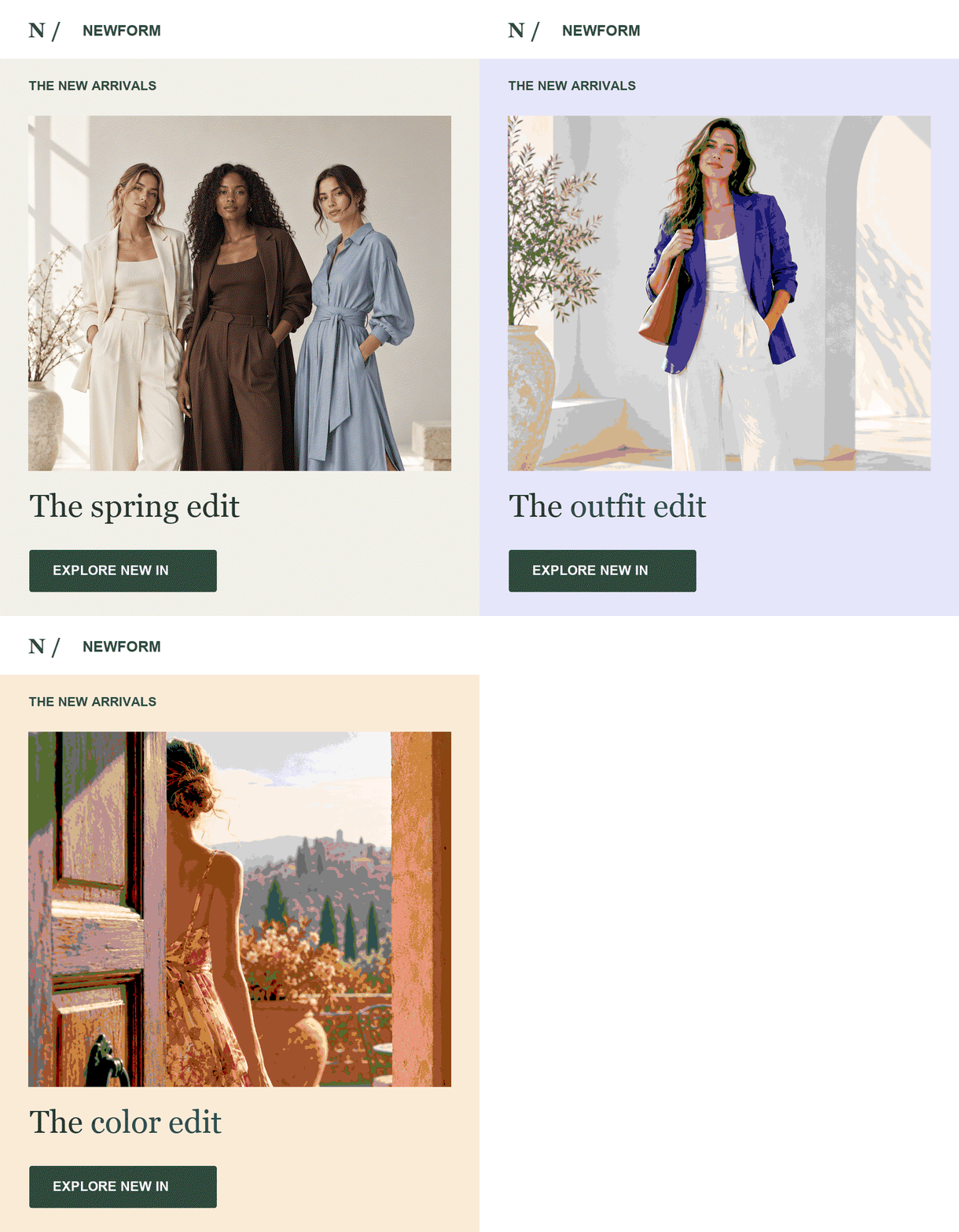
Keep the headline and main button outside the animation. They should remain readable throughout the sequence, and the first frame should make sense on its own. Link the animation to the collection, because a single GIF cannot give each product its own independent link. Add product cards below it if choosing an individual item is important.
Use a free GIF slideshow generator for a sequence of product photographs, or a video to GIF converter for a short demonstration. Keep the sequence focused on one decision and check the exported file at its actual email size. TweenFrame’s guide to adding a GIF to an email covers placement and first-frame checks.
PACE uses animation to answer a narrower question: which color would you choose? The sneaker stays in the same position while its color changes. Unlike a collection slideshow, this is a comparison tool. The consistent angle lets readers notice the difference without repeatedly adjusting to a new composition.
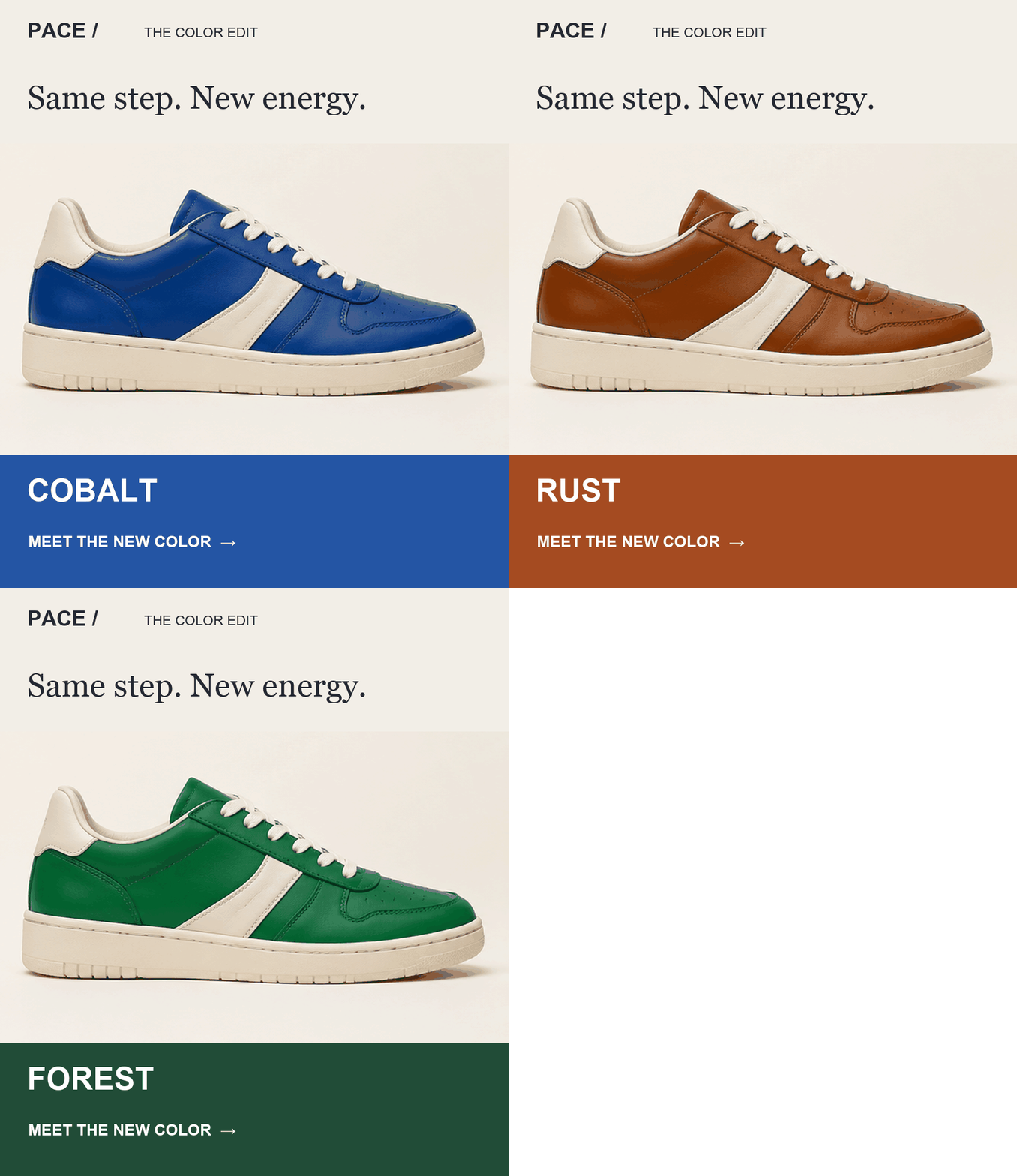
Use photographs with matching scale, lighting, and placement. A shoe jumping left and right makes the movement more noticeable than the colors. Keep variant names and availability on the linked product page, and use a button such as “Choose your color.” This idea also suits a bag, a chair, or a reusable bottle offered in several finishes.
LAUREL combines an opening campaign photograph with six product images. The campaign image establishes the season; the grid lets readers pick an item. The important choice is the selection: each card should earn its place by showing a distinct category, shape, or use within the collection.
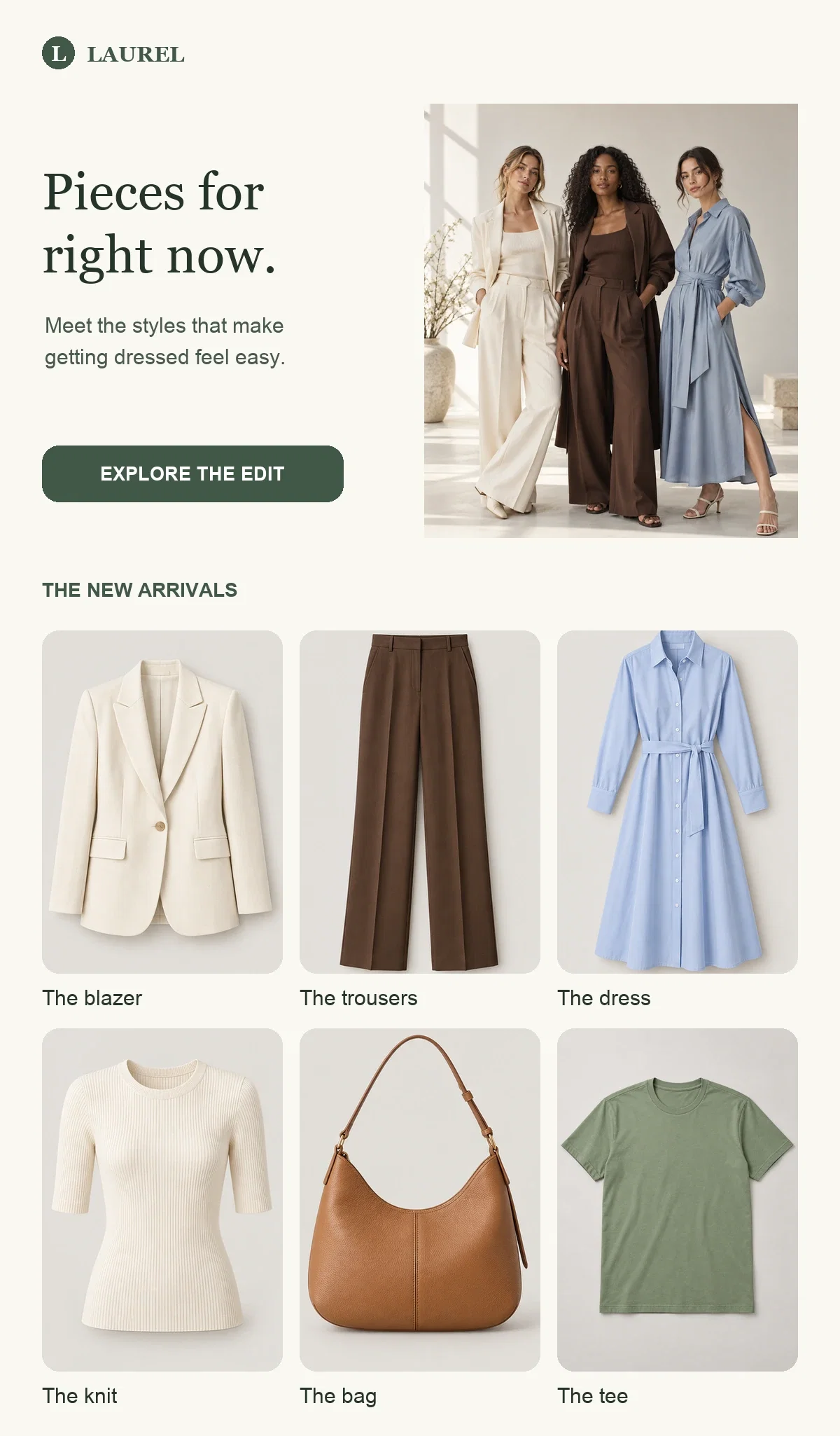
Arrange the grid in the order you would introduce the range in person. Put a representative piece first, then supporting items. Link individual cards to their product pages and keep “Shop the collection” as the broader route. If every card leads to the same general page, readers have to find their chosen item again.
The editable template below is a starting point for a product-led announcement. Replace its imagery, copy, and destinations with your own selection; it is separate from the LAUREL concept above.
Match image proportions to the merchandise: wider frames for footwear, portrait frames for dresses or bags. Consistent spacing does not mean forcing every product into the same crop. Check that the product remains recognizable at the card’s mobile size.
ATELIER AVENUE starts with a styling idea, then breaks it into items a customer can buy separately. This is useful when the appeal of a new piece depends on how it is worn. A blazer on its own asks readers to imagine an outfit; the complete look does some of that work for them.
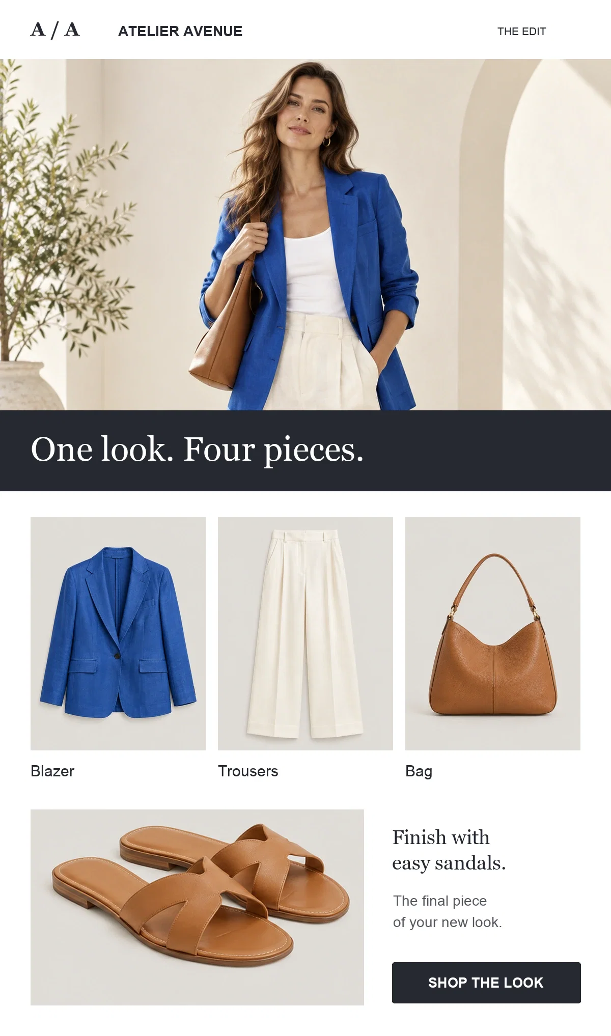
Keep the featured items consistent with the photograph. If an accessory is unavailable, do not present its card as part of the shoppable look. Name an alternative clearly instead. The same structure works outside fashion: show a set dining table followed by the tableware, or a skincare routine followed by its products in order of use.
You can also adapt a template from another campaign category. In the design below, replace the original message with your collection introduction and use the supporting image areas for the individual pieces. Check every button after changing the purpose of the email.
A new arrival does not have to be an entirely new product. PACE gives a new running-jacket color a focused introduction, combining a photograph of the garment with a closer view. Existing customers can recognize the item while seeing precisely what has changed.
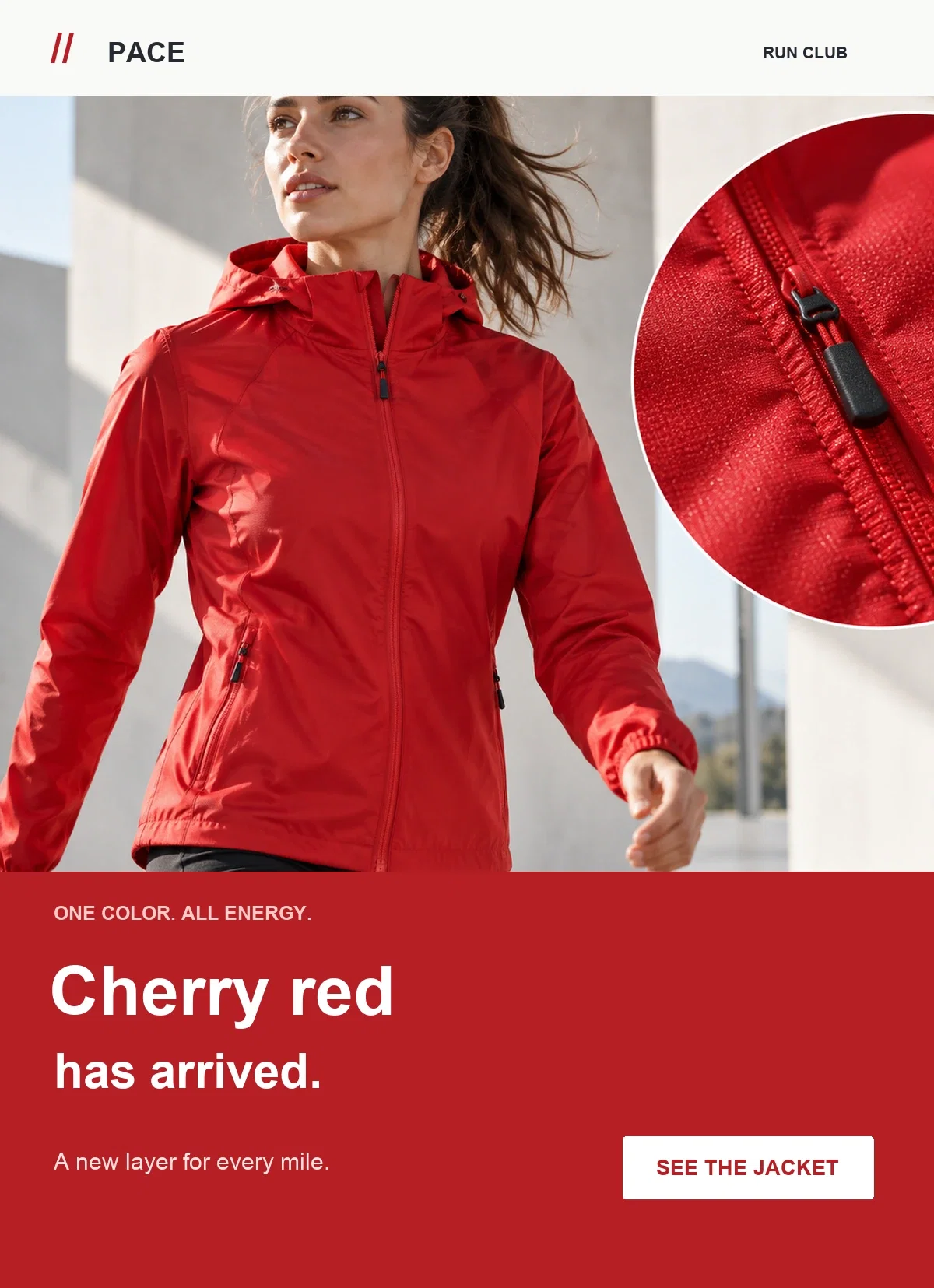
Make the subject and opening sentence accurate: “Our running jacket, now in cherry” is different from claiming a redesigned jacket. Use the supporting photograph for a detail that helps a buying decision, such as the fastening or fabric. If other colors remain available, let the product page show them without turning the email into a second catalog.
SUN/DAY gives one patterned sock design the attention usually reserved for a major collection. A distinctive everyday item can support a whole email when the photograph makes its appeal immediately visible. There is no need to surround it with unrelated products to make the announcement feel substantial.
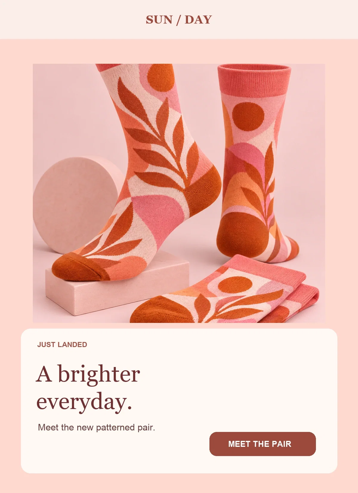
Use the copy for information the photograph cannot provide: available sizes, material, or whether the item is sold individually or as a set. Pick the detail that matters most for this purchase. A short factual introduction and a direct product link are more useful than several paragraphs insisting the design is a “must-have.”
FORM & FIBER puts texture at the center of its knitwear announcement. This approach is useful when a material or construction choice explains the product’s value. The photograph supplies visual evidence; the copy should explain a specific benefit rather than repeat that the fabric looks soft.
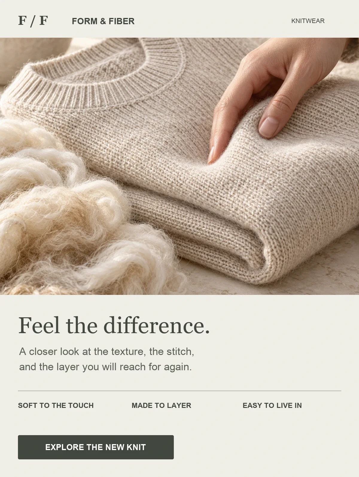
For your version, pair a verified specification with its practical meaning. Explain the fiber composition, weight, or care requirements when they affect the choice. Avoid inferring warmth, durability, or environmental benefits from an attractive close-up. Keep fuller specifications on the product page so the email remains an introduction rather than a technical sheet.
The softly email introduces slippers through a quiet home setting. Instead of using a dramatic launch headline, it connects the product to a recognizable part of the day. This works when use and atmosphere communicate the appeal better than a lineup of product variations.
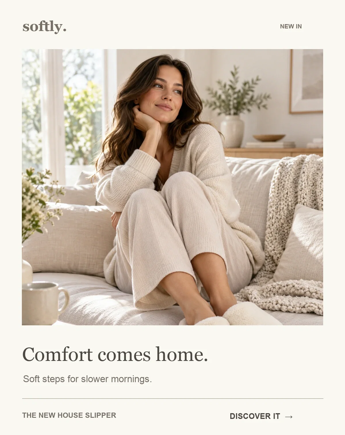
A lifestyle photograph still needs to show the product clearly. Follow it with a useful detail about fit, material, or care, and link to a page with unobstructed product views. For another category, the same approach could show a new coffee blend at breakfast or a reading lamp beside a favorite chair. The setting should explain the use, not hide what is being sold.
The next four emails serve different moments around a product announcement. Keep their promises distinct: a teaser invites interest before availability, a restock brings an existing item back, and a re-engagement email connects new products with an established customer relationship.
MUSE shows a jewelry piece and offers early access. The reveal gives subscribers a concrete reason to be interested without presenting the whole collection. This is a useful first step when the launch has a real release date and there is somewhere to register interest.
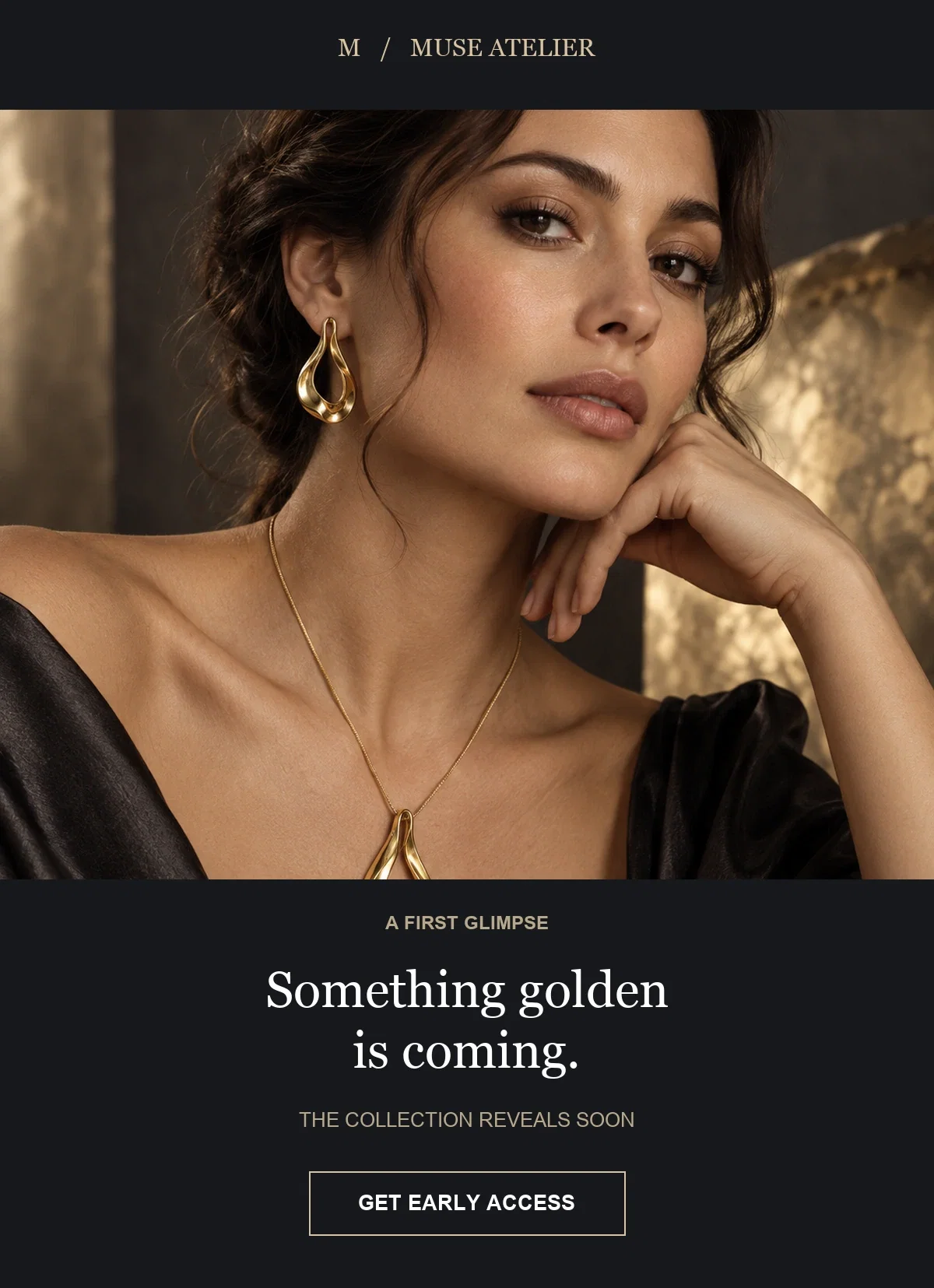
Explain what early access means: an earlier shopping window, a private preview, or simply a notification. Those are different promises. If joining the list does not reserve stock, avoid implying that it does. The follow-up should deliver the promised access and a working destination, not another vague teaser.
SOL reveals a section of a floral dress rather than the complete look. The crop makes the print the story and leaves the full silhouette for the launch. This approach works best when the visible detail is distinctive enough to create interest on its own.
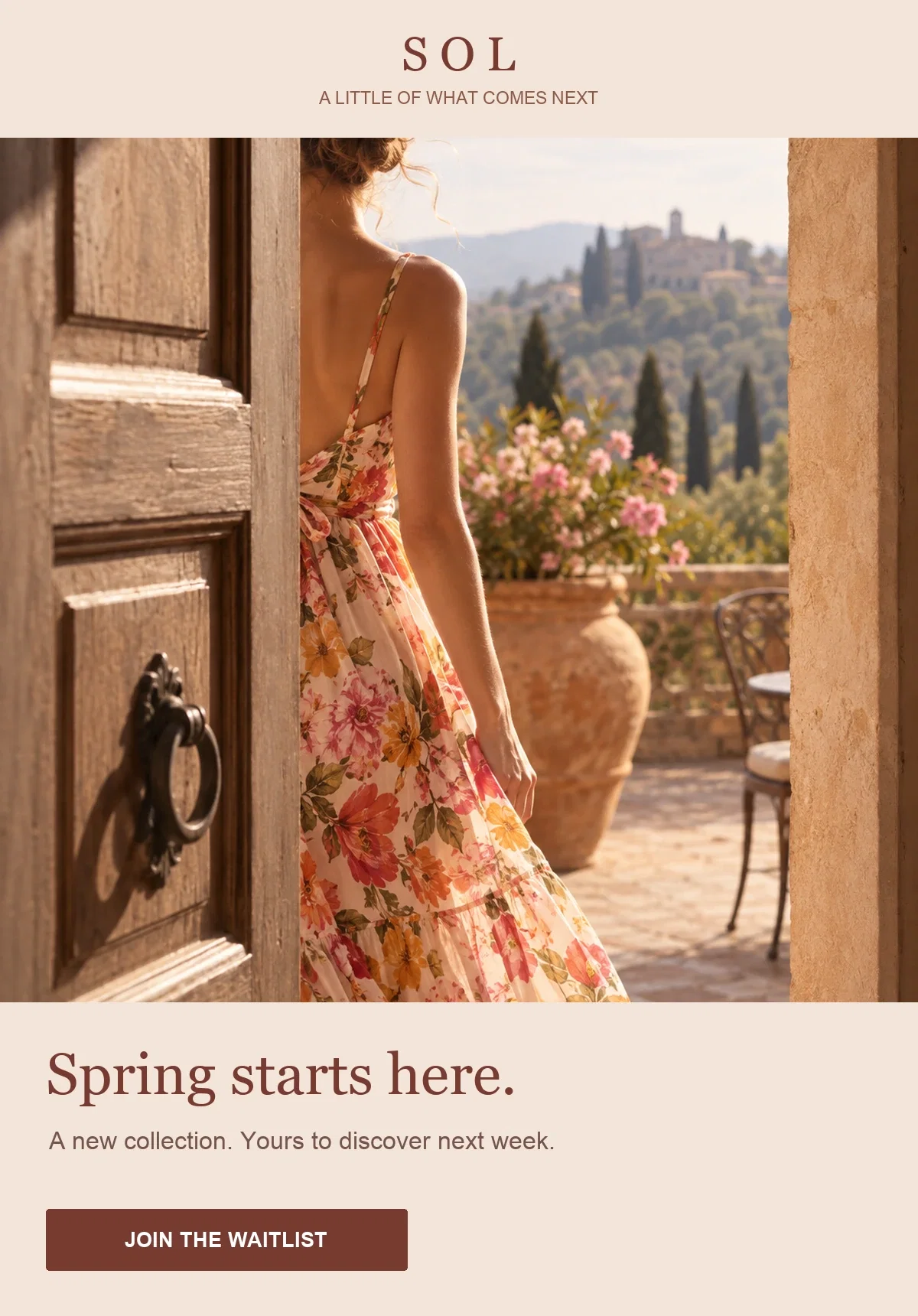
Include the release date in ordinary email text and give the reader one action, such as joining the waitlist. Do not ask them to shop if the product is unavailable. For the full signup-to-announcement workflow, use our product launch email campaign guide, which connects a waitlist widget, confirmation, and launch-day broadcast.
MORROW leads with returning footwear. The useful news is availability: a style or size that customers could not buy is back. Although this can sit in the same marketing calendar as new arrivals, the wording should tell readers that these are returning products.
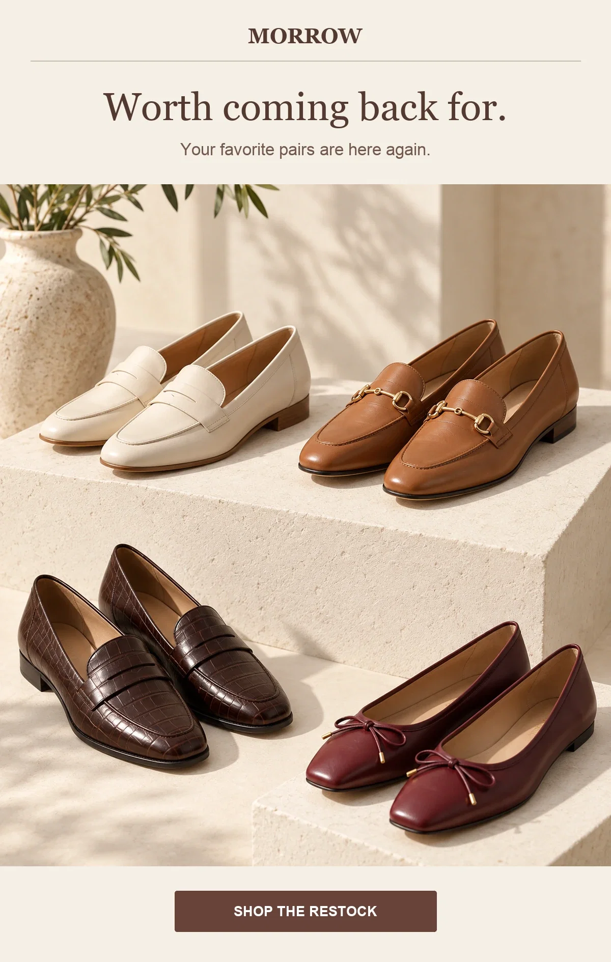
Name what has returned and send readers to the relevant selection. For a size-specific notification, a general collection link creates extra searching; use the closest useful destination. See our back-in-stock email examples for a fuller treatment of restock messaging.
A returning product is not a new release. It can still deserve an announcement, but calling it a restock sets the right expectation. Mention limited quantities only when you have a factual basis for the claim.
FIELD NOTES introduces a skincare range with a message about what has changed. For someone who already knows the brand, the reason to return is the new assortment. The email can acknowledge familiarity without pretending to know why the customer stopped shopping.
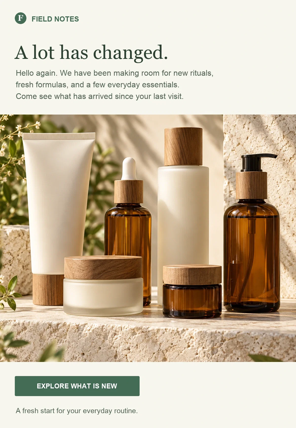
Choose products connected to a known interest, where you have that information. A subscriber who selected skincare in a signup form has given a different signal from a customer who bought a particular product. Use the data you actually have, and avoid copy that implies a purchase history when the audience only signed up. Our customer winback guide covers the separate task of building a return campaign.
A useful subject identifies the news before adding personality. Name the collection, product, color, or use when possible. “New things you’ll love” could belong to any store; “Our everyday tote, now in olive” tells a returning customer what changed.
These examples cover available products. Replace the product details with your own, and keep early-access or restock language for campaigns that actually offer those things.
Choose one clear angle rather than stacking “new,” “exclusive,” “limited,” and a discount into the same line. Use urgency only when stock or a deadline supports it. If you test two subjects, keep the email and audience selection comparable so you can learn something useful from the difference.
Use these as starting points for the text around your images. The product details are illustrative; replace them with facts about your range. Each example has one main destination, so the copy and button make the same promise.
The spring linen collection is here
PreviewRelaxed shirts, easy trousers, and dresses for warmer days.
Our spring linen collection is ready to shop: relaxed shirts, easy trousers, and dresses for warmer days.
Start with a matching set or choose a piece to wear with what you already own. You’ll find the colors, sizing, and fabric details on each product page.
Explore the linen collectionWe hope you find a piece you’ll enjoy wearing throughout the season.
This version gives the range a shared purpose before asking readers to browse. Place an edited product selection beneath the introduction. If the collection spans unrelated categories, group the products instead of extending the opening paragraph to describe everything.
Our everyday tote, now in olive
PreviewA new shade of the shape you know. Take a closer look.
The everyday tote has a new color: olive. It joins the existing range with the same shape and pocket layout.
Take a closer look at the shade, compare the available colors, and check the dimensions before choosing yours.
See the olive toteThanks for making our everyday pieces part of your routine.
The message separates the new color from the established product. Use a photograph that makes the change obvious, and check whether the link can open the relevant variant. Avoid sending readers to a general new-arrivals page when the email is about one specific option.
Meet your new bedside reading light
PreviewAn easy-to-reach switch for the last chapter of the evening.
Our latest reading light puts the switch on the base, within reach when you’re ready to put the book down.
See it in a room, check the dimensions and bulb requirements, and choose the finish that fits your space.
Explore the reading lightHere’s to a comfortable corner and a few more pages before bed.
Here, the feature supports a recognizable use. Substitute a verified detail that matters to your customer, such as capacity, dimensions, or care. Keep the promise narrow enough for the product page to substantiate it.
Create a campaign in Broadcasts and choose a premade template, or adapt a design from the email template gallery. Select the structure before the decoration: one hero image for a single item, a grid for an assortment, or a styled photograph followed by the pieces it features.
The designs below are editable starting points. They do not reproduce the custom concepts above automatically; replace their branding and content, then remove any sections your announcement does not need.
In the email editor, use Image for a photograph or an uploaded GIF, Text banner for the introduction, and Button for the next step. Product cards keep product information and links together. The Slideshow element provides another way to present several images in one section.
Keep essential information in text instead of baking the whole email into an image. Product names and the reason to click should remain understandable when a photograph is unavailable. For a grid, check Column count and Stack on mobile in the product settings: the reading order must still make sense when cards move into a vertical sequence.
For a curated announcement, manually select the products that support the story. This is particularly useful for a complete outfit or a small launch where adding one unrelated item would change the message.
For Shopify stores, product cards can also use catalog feeds, including newly added products or a selected collection. A newest-products feed suits a general update about recent additions. A specific collection gives you more control over a named launch, because other recent catalog additions do not belong in that announcement simply because they are new.
Do not build a general launch broadcast around automation-specific items such as abandoned or purchased products. Those belong to the corresponding customer-event emails, not a shared collection announcement.
If your signup widget asks about interests, map the answer to a contact field or apply conditional tags in the widget’s Contacts settings. For example, a store selling clothing and homeware can ask which updates the subscriber wants, then use that preference when selecting the broadcast audience. Test a signup and inspect the saved contact before relying on the condition.
A dedicated launch waitlist can use its own tag. Send the release announcement as a broadcast when the audience shares a launch date; a delay after each signup would put subscribers on different timelines. See the broadcast guide for audience selection and sending options, and the popup and form guide for contact mapping.
Send a test email and inspect it on a phone as well as a desktop. Confirm that the first GIF frame is useful, text remains readable, and product images are neither stretched nor cropped through important details. Follow each product link and the main button: the destination should show the item, variant, or collection promised by the email.
After sending, compare which product links attracted interest with what happened on their destination pages. A well-clicked item with few purchases raises different questions from an email whose main link gets little attention. Use that distinction to improve the next announcement instead of assuming another animation or a louder subject will solve every problem.
Jack Hayes covers onsite marketing, email campaigns, and ecommerce growth at Getsitecontrol. His guides connect popups, personalization, and automated emails into practical strategies for turning visitors into subscribers and customers into repeat buyers.
You’re reading Getsitecontrol blog where marketing experts share proven tactics to grow your online business. This article is a part of Email marketing section.
Try email marketing, free
Grow your list with free popups, send 2,000 emails for free.
Get started →Subscribe to get updates
Get beginner-friendly tips for growing your online business.