Create your product offer
Build a targeted popup for your Shopify store. Offer a relevant extra and keep the buying process simple.

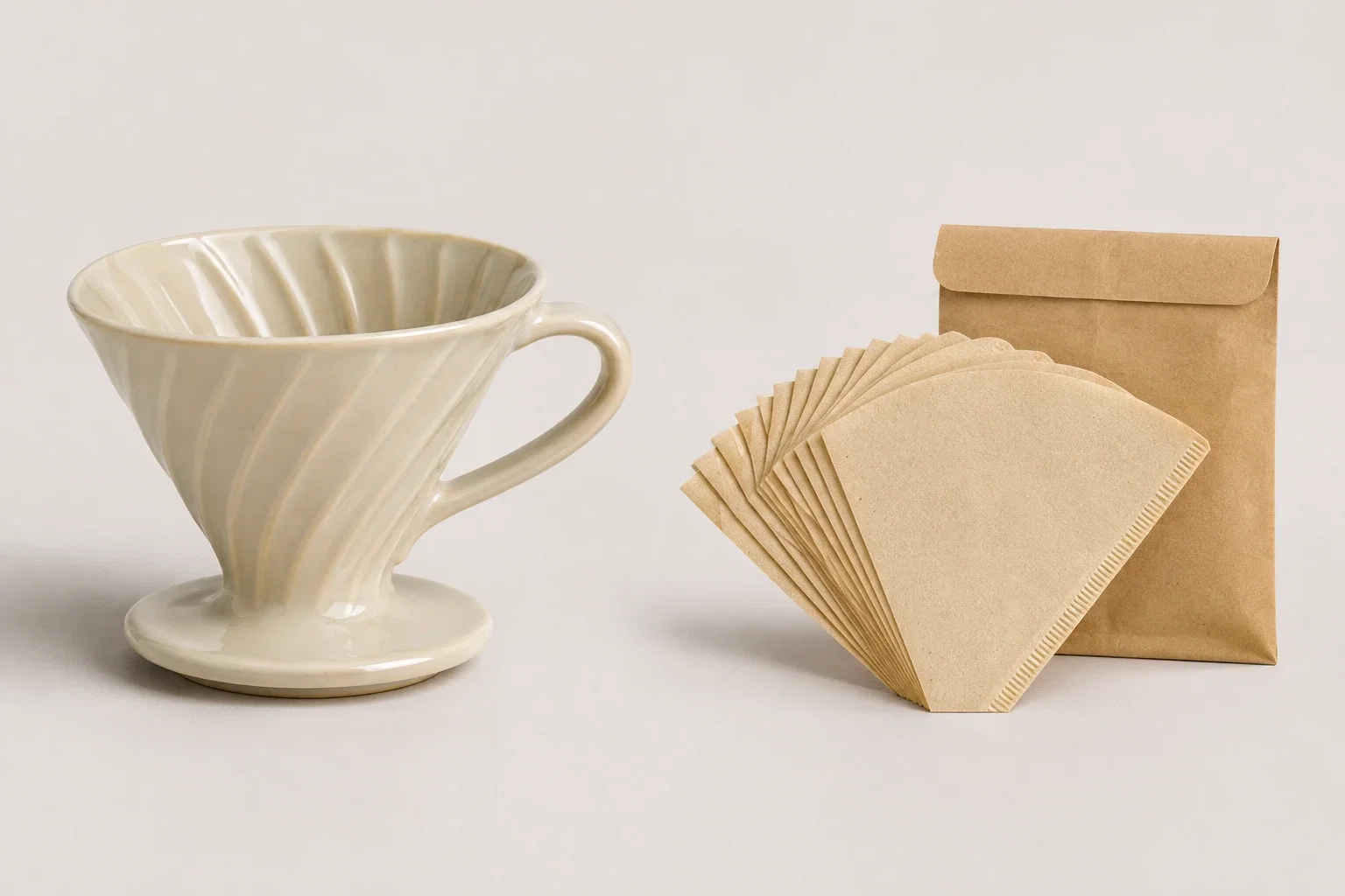
A customer adds a coffee dripper to their cart. Before checkout, they see a pack of filters in the right size, with a clear price and an Add button. That is a useful order bump: a small addition connected to a purchase they have already decided to make.
The difficult part is choosing the extra. Another bestseller may be easy to promote, but it is not necessarily what this shopper needs right now.
The six examples in this guide are original, interactive designs. They demonstrate cart and checkout scenarios, not current offers from named retailers. Try adding and removing the extras to see how the order changes. The prices are illustrative; no purchase is made.
An order bump is an optional additional purchase offered near the point of payment. In its narrowest form, it is a small checkout offer a customer can accept without leaving checkout. Retailers also use closely related offers in the cart, cart drawer, or immediately after a product is added.
This guide includes both checkout bumps and those cart-based offers. The shared idea is a relevant addition that requires little explanation and does not replace the original purchase.
A cross-sell offers a complementary product. An order bump is a focused way to present that offer near purchase. An upsell usually asks the customer to choose a higher-value version, such as upgrading from a basic coffee maker to a premium model.
A post-purchase offer comes after payment. It needs a different setup and should not be confused with adding an item to an unpaid cart.
| Offer | Example | Customer decision |
|---|---|---|
| Order bump | Add paper filters to a coffee dripper order | Complete the purchase with a useful extra |
| Upsell | Choose a larger coffee subscription | Replace or upgrade the original choice |
| Broader cross-sell | Browse mugs on a coffee product page | Explore another product before checkout |
| Post-purchase offer | Add a storage tin after paying | Make an additional purchase after the first order |
Each example solves a different problem. A first-time buyer may need a compatible accessory, a gift shopper may want wrapping, and someone buying a course may appreciate a practical companion. The placement and amount of explanation should follow that decision.
A brewing accessory works best when the customer does not have to check another product page to confirm compatibility. Show the filter size, quantity, and price beside the dripper already in their cart. “100 paper filters · size 02” answers more questions than “Customers also love this.”
In this example, the dripper costs $32 and the filter pack adds $8. The buyer keeps their original choice and decides whether to complete the setup. The offer belongs inside the cart, where both products and the updated subtotal can remain visible.
Show it only when the matching dripper is present and the filters are absent. If the starter kit already includes filters, suppress the offer or explain that it is a spare pack. A useful addition should not look like a hidden requirement for using the main product.
Gift wrapping is a service rather than another product to compare. A customer sending a plant may happily pay $5 to have it arrive wrapped, with their message in the box. Someone buying the same plant for their own desk has less reason to accept.
Place the offer beside a gift option in the cart, or show it after the customer indicates that the order is a present. Describe the actual service: a gift bag, tissue, ribbon, and a printed card. A paid extra called “Make it special” leaves too much to guess.
If you collect a message, reveal the message field after wrapping is selected and state its length limit. Make sure that message reaches the fulfillment team. The design here demonstrates the paid wrapping choice; message collection is a separate part of the store’s gift workflow.

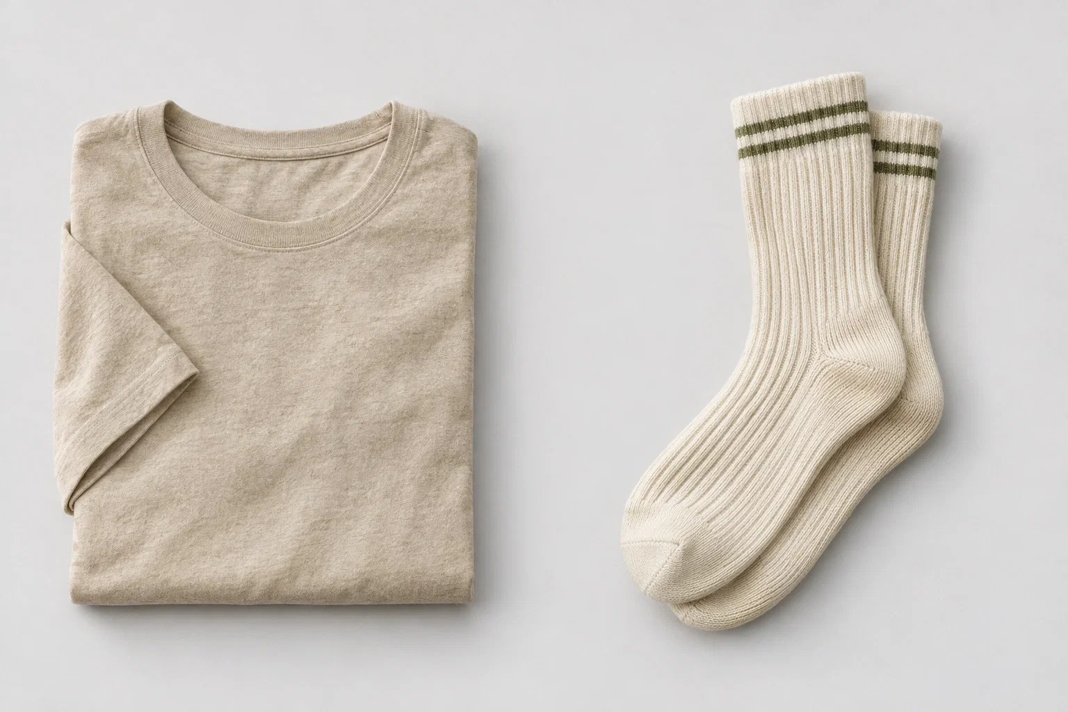
A cart worth $42 is $8 below a $50 free-shipping threshold. A $12 pair of socks could be a sensible addition to a clothing order, but the shipping message must not imply that spending more saves money overall.
Without the socks, the customer pays $42 plus $5 shipping: $47 before tax. With the socks, they pay $54 and qualify for free shipping. They spend $7 more and receive another product. That can be a good choice, but it is still their choice.
Show the remaining amount accurately and recalculate it whenever the cart changes. If a discount lowers the qualifying subtotal, or an address is outside the free-shipping area, the offer must reflect your store’s actual shipping rules. The example assumes the customer is eligible for that shipping rate.
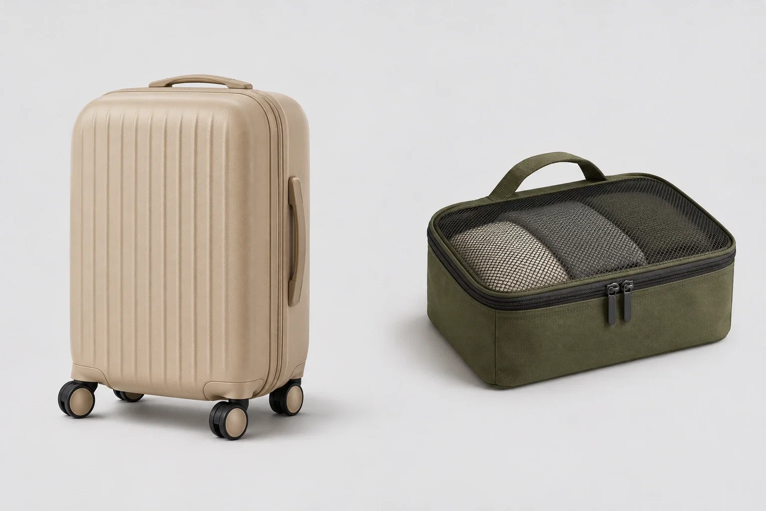
Some add-ons need a choice before they can be added. A packing cube complements a cabin suitcase, but its dimensions matter. Hiding the size behind a generic Add button makes an apparently easy offer harder to trust.
Keep the decision small. Here, both cube sizes fit the suitcase; the shopper chooses a small cube for accessories or a medium one for clothing. The dimensions and price appear together. Changing the size updates the offer, and adding it creates a specific line in the order.
This approach also suits a laptop sleeve or a storage case. Only offer compatible variants, and hide sold-out choices. If the accessory needs a detailed comparison, link to its product page instead of pretending it is a one-click decision.
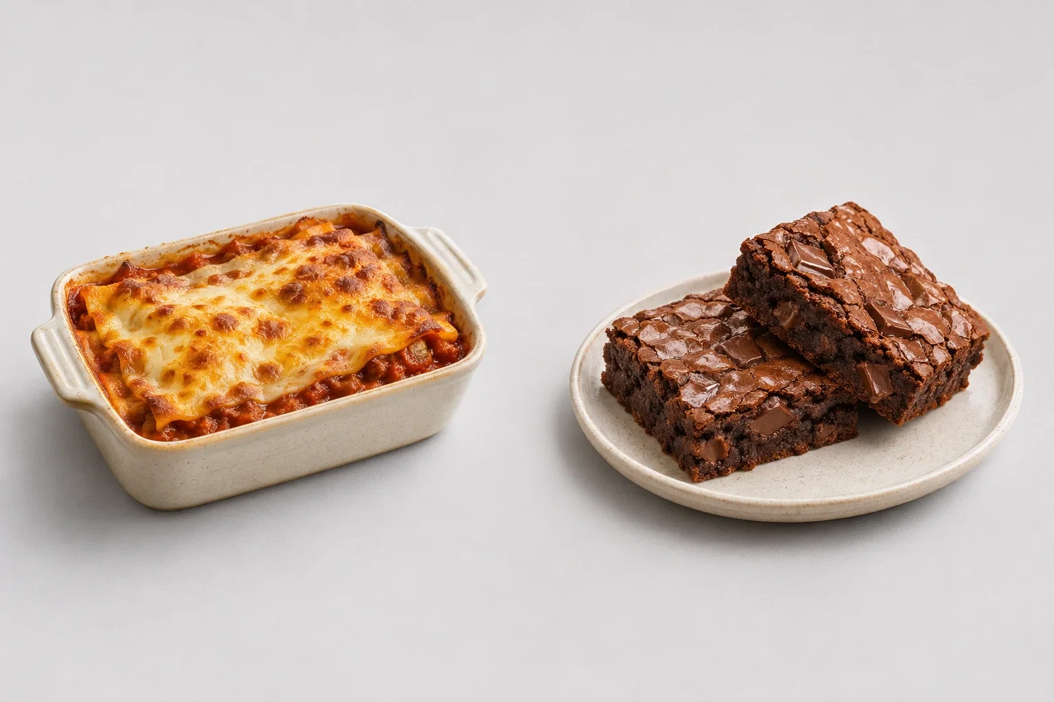
A meal order creates a clear occasion for an extra. Once a customer has chosen dinner for two, two brownies are easier to evaluate than a selection of unrelated dishes. The offer finishes the meal without asking them to reconsider the main course.
A compact offer in the cart can work here. Give the customer the portion count, additional price, delivery arrangement, and relevant allergen information. In this example, dessert adds $6 and arrives with the existing Friday delivery.
Keep the offer beside the order summary and let the customer continue without adding it. If you use a popup instead, show it once after the meal is added and provide a visible close button. If the extra requires a separate delivery or is unavailable on the selected date, it is not the simple addition the offer promises.
Order bumps can work for digital products too. A product photography course teaches the skill; a printable planner helps the student prepare a shot list and record lighting setups. The extra has a distinct purpose rather than charging again for something the course needs to deliver.
Place a compact offer in the order summary. State the format, what is inside, and whether the charge is one-time. A $9 PDF should not turn into a recurring subscription, and customers should understand that they are buying a download rather than a physical book.
The course must still be complete without the planner. If the workbook is essential to follow the lessons, include it in the course price. Optional convenience makes a better order bump than withholding necessary material until checkout.

Start with a product customers already buy and ask what makes that purchase easier to use, maintain, or give as a gift. Then check whether the extra adds a genuine decision or just another screen to dismiss.
| Main purchase | Order bump idea | What makes it relevant |
|---|---|---|
| Silver earrings | A polishing cloth | Suitable for the metal and finish |
| A candle | A wick trimmer | Helps with the care routine described on the candle |
| A paperback | A clip-on reading light | A compact accessory for reading in low light |
| A pet collar | A compatible ID tag | Fits the collar and allows the buyer to enter the details |
| A sketchbook | A small drawing-pencil set | Matches the paper and the intended drawing technique |
| A coffee machine | The correct replacement filter | Matches the exact model in the cart |
There is no universal percentage that makes an order bump work. A $12 accessory can be an easy addition to one purchase and a distraction from another.
Consider an illustrative $8 add-on that costs $3 to source and another $1 to fulfill. It leaves $4 before other costs. If a discount or shipping change consumes that amount, a higher order value may not improve your profit. Calculate the contribution after those costs, then test whether the offer affects completion of the main purchase.
“Add matching filters for $8” is clearer than “Unlock your exclusive upgrade.” A short explanation can answer the remaining question: “A pack of 100 filters sized for this dripper.”
For gift wrapping, show “Add gift wrapping for $5” and describe what is included. For a care product, name the material or product it is suitable for. Avoid preselecting paid extras or hiding the decline option.
Getsitecontrol can display a targeted popup or slide-in on your Shopify storefront and use an Add to cart action for selected products. Start with the cart context and one suitable extra rather than a promotion shown to every visitor.
For a product add-on like the filters or packing cube, start with a product recommendation slide-in from our template gallery. This editable template contains several product cards with prices and Add to cart buttons. Keep one card for a focused offer, replace the example products with your own, and give visitors a clear way to close it.
The template is separate from the interactive article examples above. It provides the storefront offer layout, not an automatic recommendation engine or a replacement for your store’s cart and checkout.
For a dripper-and-filters offer, target visitors whose cart contains the dripper and does not already contain the filters. Use the relevant Shopify cart conditions and choose when to display the widget, such as after a product is added.
Configure the button to add the correct product or variant. Keep the price shown in the widget consistent with the store, and account for unavailable items. A storefront widget should not be described as an offer embedded in Shopify’s payment steps.
Shopify’s checkout app documentation explains the plan restrictions for apps on the information, shipping, and payment pages. Check those separately if checkout placement is your requirement.
Add the main product, accept the extra, and confirm the cart contents and total. Repeat with the extra already in the cart, remove the main item, and try the flow on a phone. Check that the cart drawer reflects the change and that closing the offer leaves checkout usable.
Also test the less tidy cases: an unavailable variant, a quantity change, and a discount already applied. The offer is ready when those cases work, not simply when its preview looks good.
Track how many eligible shoppers see the offer, how many add the extra, and how many finish buying. Review completed orders containing the add-on rather than counting every click as an additional sale.
Average order value can rise while checkout completion falls. Compare revenue or contribution per eligible visitor alongside completion rate, returns, and support questions. Keep the main product, audience, and promotion conditions comparable during the test.
If the offer is ignored, try a more useful product before making the popup louder. If people accept it but abandon checkout, investigate the total cost, delivery impact, or confusion the extra introduces.
A good order bump is relevant to the purchase, easy to understand, and optional. The customer can see the additional price and make any necessary choice without restarting the shopping process.
No. A compatible accessory, gift wrapping, or a useful refill can justify its price without a discount. Test the product’s usefulness and your margin rather than assuming a price reduction is required.
Yes, but distinguish a storefront cart offer from an offer inside checkout. Cart popups and slide-ins use storefront capabilities; checkout app placement depends on Shopify’s plan and extension requirements.
Start with one relevant offer so you can understand its effect. Add choices only when they help the customer, such as selecting a compatible size or wrapping style. Avoid turning the cart into another catalog.
Start with the extra you can explain in one sentence. Matching filters fit the dripper. Wrapping finishes the gift. A packing cube organizes the suitcase. If that connection needs a long sales pitch, choose a different offer.
Choose that connection first, then build the offer around it. With Getsitecontrol, you can create a cart-aware storefront popup, configure its action, and test it with the customers for whom the extra is relevant.
Nina De la Cruz is a content strategist at Getsitecontrol. She is passionate about helping small and medium ecommerce brands achieve sustainable growth through email marketing.
You’re reading Getsitecontrol blog where marketing experts share proven tactics to grow your online business. This article is a part of Ecommerce marketing section.
Create popups for free
Email forms, promos, coupons, surveys, bounce-stoppers.
Get started, it’s free →Subscribe to get updates
Get beginner-friendly tips for growing your online business.