Add Instagram feed to Shopify for free
Create and customize Instagram feed layouts that match your storefront. Built for Shopify and completely free.

An Instagram feed is one of the easiest ways to turn previously created content into an asset for your store. The photos and videos your team spent time shooting, editing, and captioning do not have to stay confined to the app. Pulled into a store page, they become social proof, styling inspiration, and a glimpse of the brand behind the products.
But how you display the Instagram feed on your Shopify store matters. A classic grid or carousel gets the job done, but there’s much more you can do with an Instagram feed. More distinctive layouts can turn the feed into a natural part of the storefront, adding personality instead of feeling like a generic social widget.
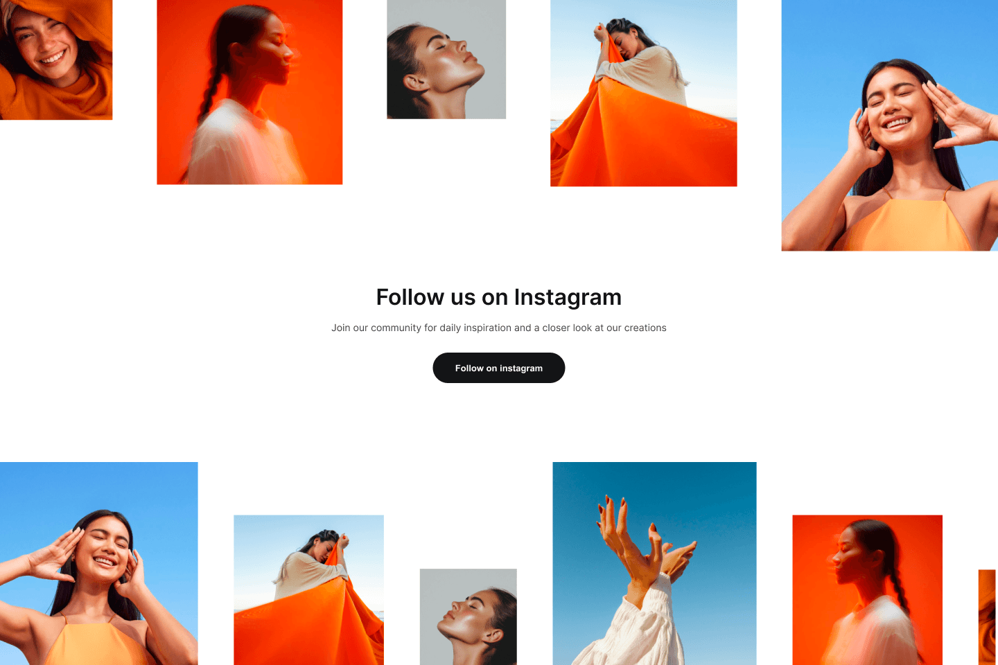
This article showcases real Shopify stores using the free GSC Instagram Feed app to demonstrate feed layouts that go beyond the classic grid and carousel. We’ll also share practical tips to help you choose the right layout and settings for your store.
The final result depends as much on your imagery as on the layout itself, so the same layout can create completely different effects from one store to another. Since GSC Instagram Feed is free, you can easily experiment with different layouts using your own feed to find the one that best fits your brand.
Adding an Instagram feed to your Shopify store does more than fill space. It also builds trust. A regularly updated feed shows shoppers that your business is active, that customers are engaging with your products, and that there’s a community around your brand. Unlike static gallery images, it keeps evolving as you publish new content.
Whether you want to inspire shoppers, reinforce your brand identity, or encourage visitors to follow you on Instagram, a thoughtfully designed feed can support those goals with very little ongoing effort.
Let’s start with the two layouts most Shopify stores use, then explore more distinctive alternatives that will make your feed stand out and capture shoppers’ attention.
Most Shopify stores that feature an Instagram feed rely on one of two familiar layouts: the Carousel or the Grid. Both have remained popular for a reason. They’re clean, versatile, and easy to integrate into almost any storefront without competing with the rest of the page.
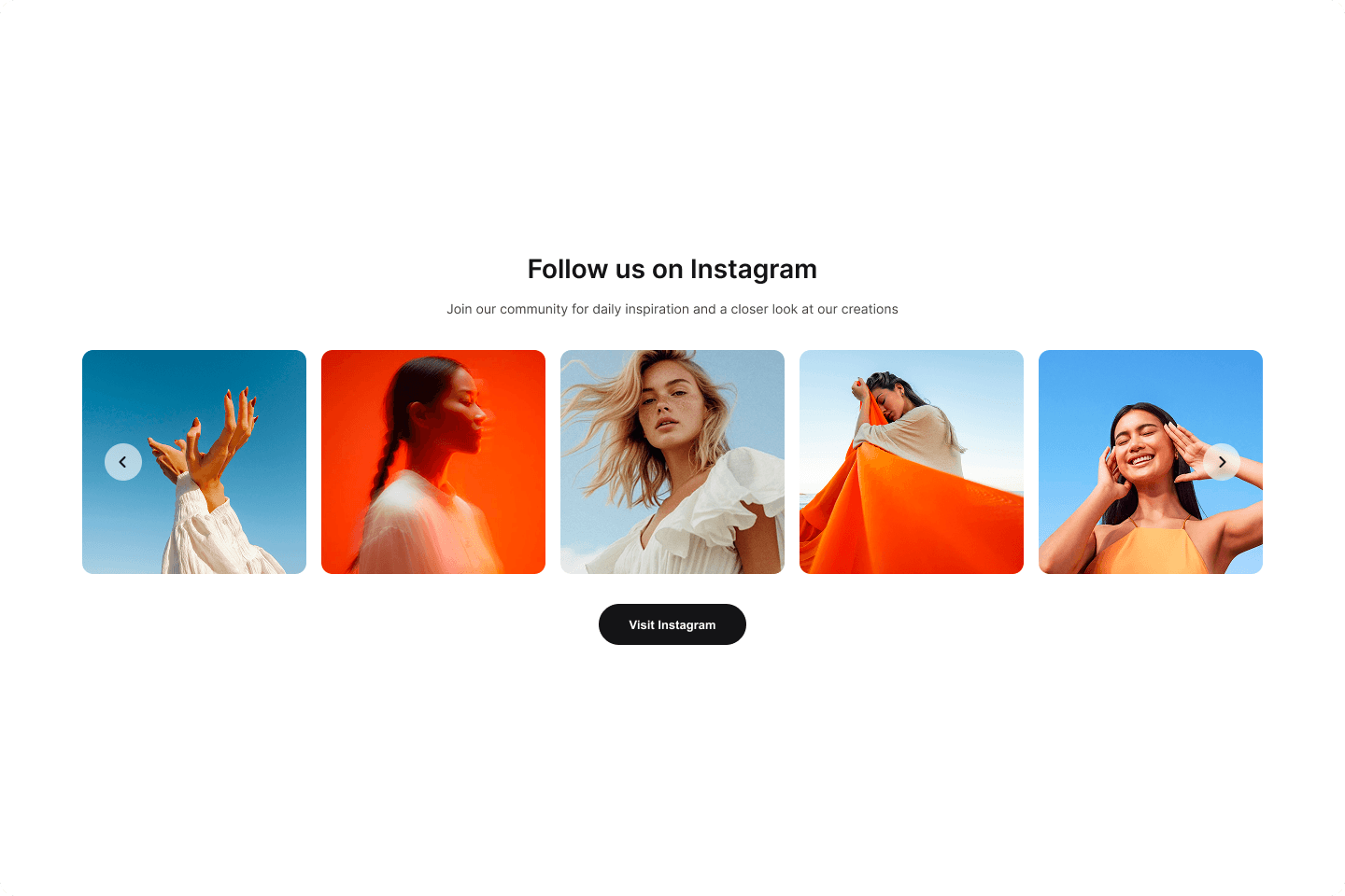
The Carousel displays posts in a single horizontal row that visitors can browse manually or via autoplay. It’s a great choice if you want to save vertical space while keeping the feed dynamic, or if your homepage already contains several eye-catching sections and the Instagram feed is meant to complement them rather than distract from them.
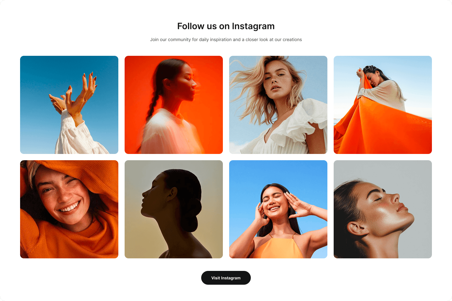
The Grid arranges posts in evenly spaced rows and columns, creating a more traditional gallery. Since several posts are visible at once, it’s ideal for showcasing a broad range of products, collections, or lifestyle content in a single glance.
Both layouts are excellent default choices, but they’re only two of many options available. If you want your Instagram feed to become a focal point, highlight specific posts or Reels, or simply give your storefront more personality, the examples below are a great source of inspiration. Every layout featured in this article is available in GSC Instagram Feed, so you can easily recreate the ones you like for free.
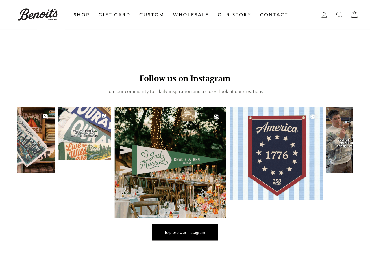
Benoit’s Design Co. uses the Editorial carousel, a twist on the classic carousel, to create a more varied browsing experience. Instead of displaying every post at the same size, the layout mixes larger and smaller cards throughout the feed, creating a stronger visual rhythm as visitors scroll.
The changing proportions naturally draw the eye to different parts of the feed, making it feel less repetitive than a uniform row of cards of equal size. The result feels more like flipping through the pages of a magazine than scrolling through a traditional Instagram feed. It’s a simple way to add visual interest without changing the content itself.
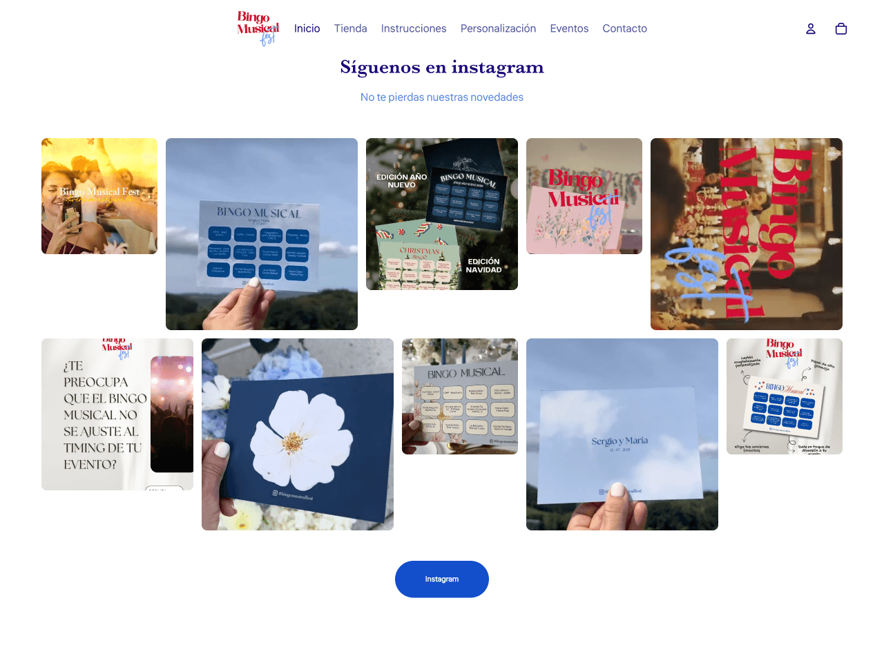
Bingo Musical Fest uses the Editorial Grid to create a gallery that feels less rigid than a traditional grid. Instead of repeating the same card size throughout, it mixes wider and narrower tiles into a mosaic-like composition while preserving the overall structure of the layout.
The mix of wider and narrower tiles creates a composition that feels more organic and less predictable than a uniform grid. It adds personality without sacrificing the clean, structured look of a gallery. At the same time, it keeps plenty of posts visible, making it easy for shoppers to browse a larger selection of content.
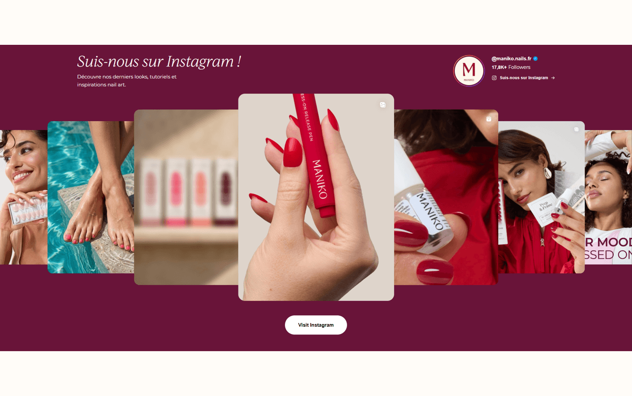
Maniko Nails uses the Spotlight layout to turn one post at a time into the center of attention. One card is displayed prominently, while the surrounding posts remain partially visible, encouraging visitors to focus on a single image or Reel without losing sight of the rest of the feed. As the carousel scrolls, the spotlight shifts from one post to the next, giving each piece of content its moment to stand out.
This makes the layout especially effective for Reels and other high-impact visual content. Rather than presenting shoppers with a wall of competing posts, it slows the browsing experience down and gives each one the attention it deserves. In an era of endless scrolling and shrinking attention spans, this makes your content easier to digest and ultimately more memorable.
The implementation deserves special praise, too. Every detail, from the full-width section and carefully matched color palette to the button styling, makes the widget feel like a built-in part of the storefront rather than a third-party embed. It’s a truly masterful implementation.
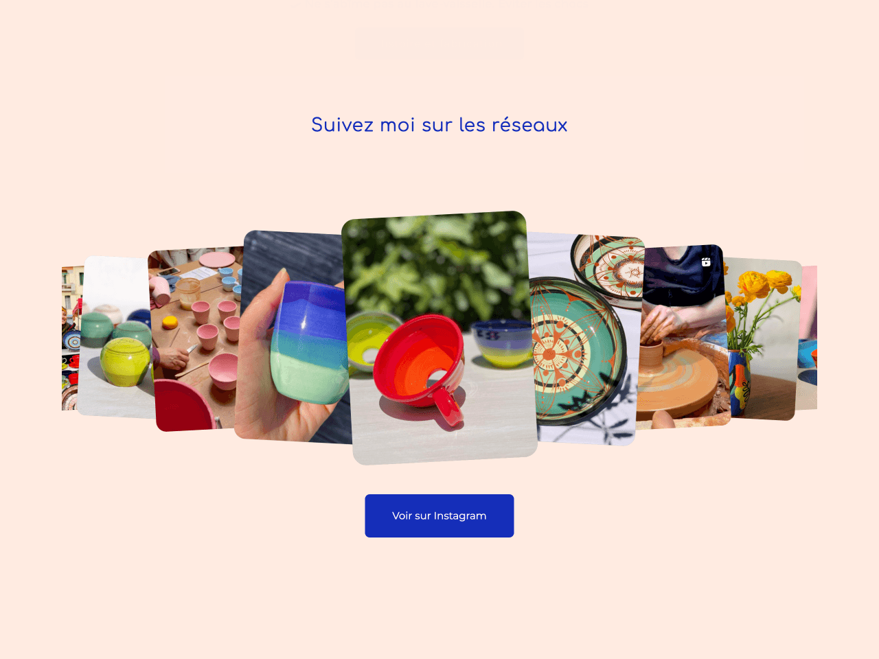
Poteries de Sylvie uses the same Spotlight layout as the previous example, but a single setting gives it a completely different character. Instead of keeping the surrounding cards perfectly aligned, each one is slightly rotated, creating a composition that feels more relaxed and spontaneous while the enlarged center card remains the main focal point.
That small change softens the structure of the layout and makes the feed feel less polished in the traditional sense and more handcrafted. It’s an especially natural fit for a brand selling handmade pottery, but it also shows how a subtle styling adjustment can dramatically change the overall impression of the same layout, making it easier to match different brand personalities.
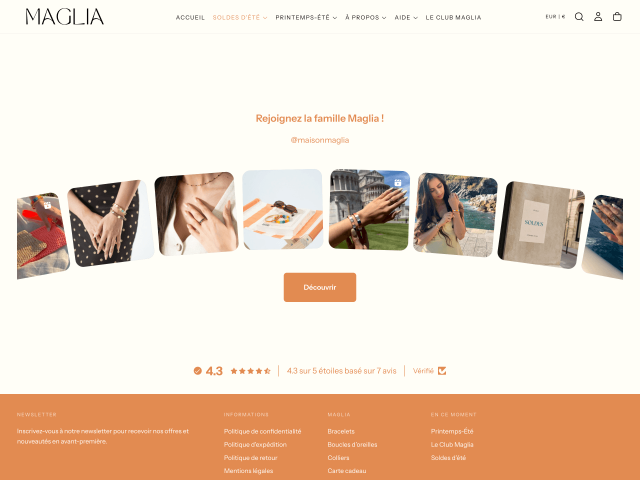
Maison Maglia uses the Arc Carousel to add movement without relying on dramatic animations or oversized cards. Instead of arranging posts in a straight line, the layout follows a gentle arc that naturally guides the eye across the feed while autoplay keeps the content moving.
The curved composition softens the overall look of the widget and creates a stronger sense of flow than a straight row of posts. The carefully matched color palette reinforces that effect, making the feed feel fully integrated into the store’s visual identity. Together, they create a light, whimsical look that suits this jewelry brand particularly well.
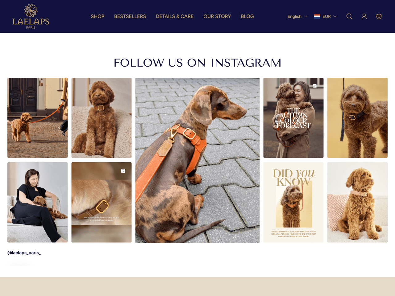
Laelaps Paris uses a nine-card Collage to showcase a broad product range in a way that feels curated rather than overwhelming. Instead of arranging posts in a single row, the layout groups nine images into a collage, with one larger tile at the center framed by smaller posts on either side. That framing gives the eye a clear focal point before naturally leading it through the rest of the collage. The result feels elegant rather than busy, despite showing nine posts at once, and the rectangular cards create a more sophisticated look than the classic square ones. It's a great option for brands with a wide product range that want to communicate variety without sacrificing a premium look.
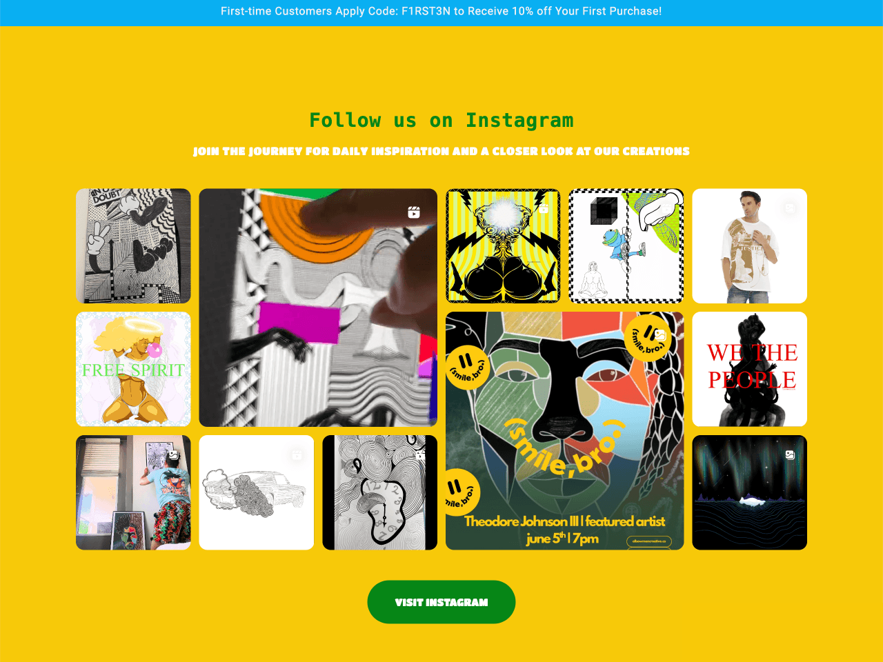
TeamWorks Designs uses a twelve-card Collage to turn its Instagram feed into a striking centerpiece. Twelve posts are arranged in a dense mosaic, with one larger tile anchoring each half of the composition, while the surrounding images fill the remaining space in a mirrored pattern.
Rather than drawing attention to individual posts, the layout invites visitors to appreciate the collage as a single composition, like a work of art on its own. The result is bold, playful, and full of energy without feeling chaotic. It’s a particularly effective choice for brands with bold, highly varied imagery, where the goal is to immerse visitors in the brand’s visual world rather than direct them to a single hero product.
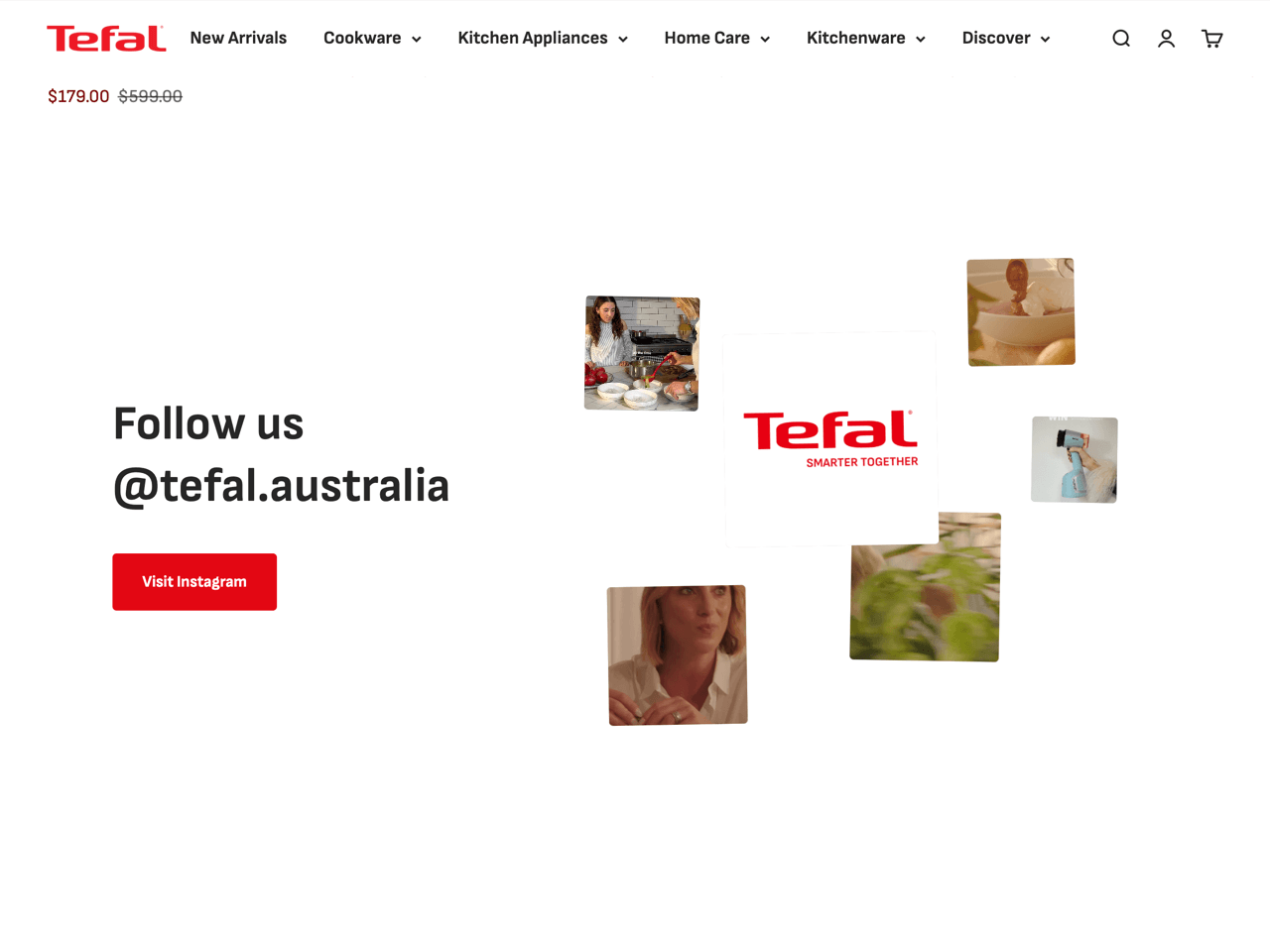
Tefal Australia uses a Side collage: instead of centering the feed on the page, this layout splits the section in two. The heading, handle, and call to action sit on the left in a simple text block, while the photos cluster on the right in a mix of sizes with some slight overlap, more like a moodboard pinned to a wall than a structured grid.
The result feels lighter and more spacious than other layouts. The generous white space and loose arrangement keep the section from feeling crowded, making it a good choice for stores that want to feature social content without letting it dominate the page.
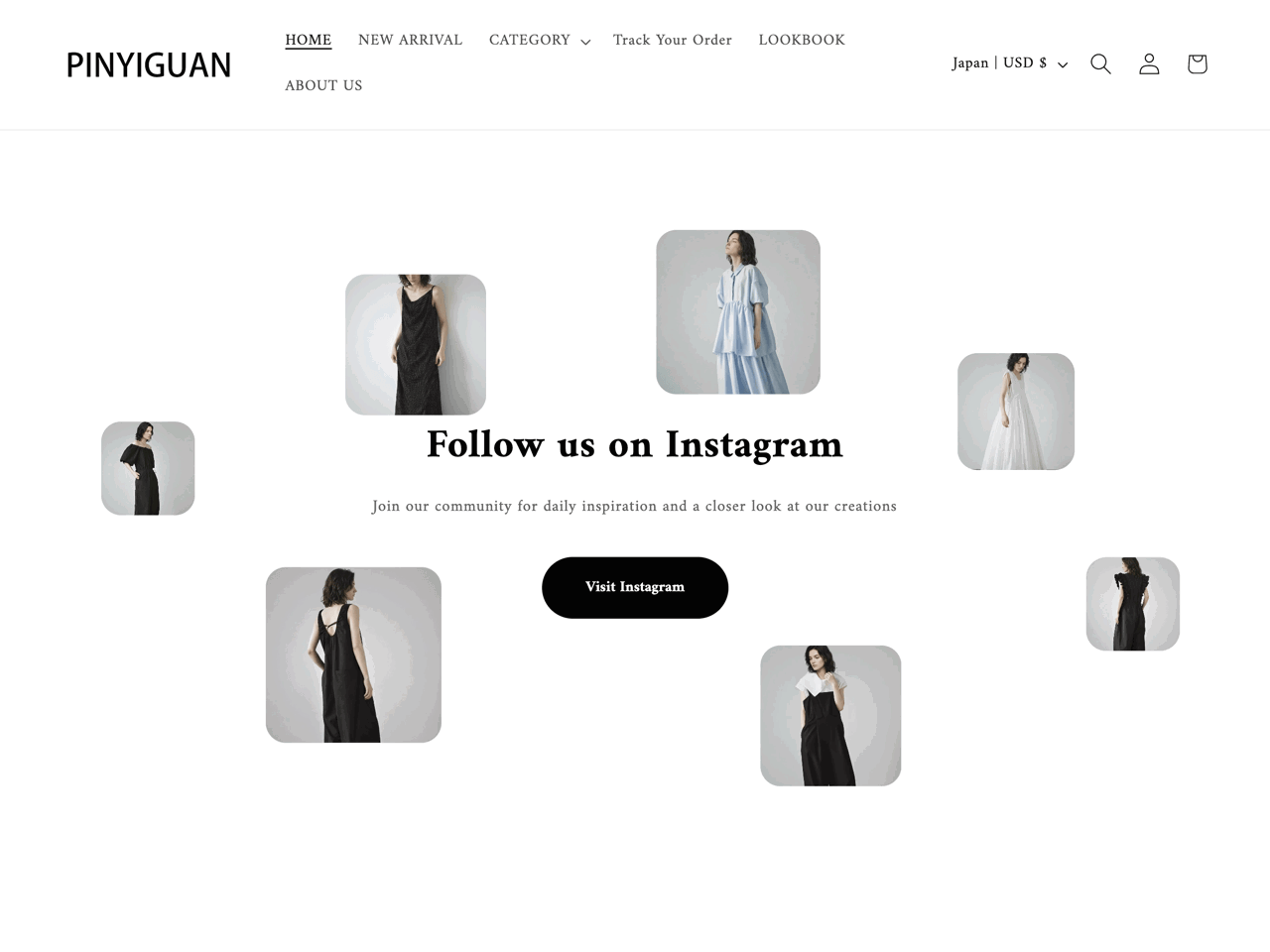
Pinyiguan uses the Scattered collage to achieve the same light, airy feel as the Side collage, but through a different approach. Instead of grouping the images into a loose cluster, this layout lets them float freely around a central heading and call to action, varying in size and position to create an open composition.
Generous white space gives each image room to stand on its own, making the layout feel calm rather than busy. The scroll-linked motion adds another layer of refinement, gently pulling the images apart as visitors scroll down the page and bringing them back together as they scroll up. It’s a subtle interaction, but one that makes the feed feel more immersive.
Choosing a layout is only half the setup. Deciding which posts to display, and how they’re kept up to date, is just as important. In the GSC Instagram Feed app, you can display your content using two different modes: Instagram-like and Manual mode.
The Instagram-like mode pulls your live feed automatically and keeps it synced, so new posts show up without you touching the widget again. Inside this mode, you can still filter by type, choosing to show all content, only static posts, or only Reels, and you can pin specific posts to the front of the row or hide ones you would rather not feature. Choose this mode if you post regularly and want your feed to stay up to date automatically with very little maintenance.
The Manual mode allows you to select the exact posts you want to show and arrange them in the order you prefer. There is no automatic sync of the feed: nothing changes until you change it yourself. Choose this mode if your layout relies on a curated selection or arrangement of posts, or if you simply want complete control over the composition of your feed.
| Mode | How it works | Best suited for |
|---|---|---|
| Instagram-like | Pulls your live Instagram feed automatically, with the option to filter by post type, pin certain posts, or hide others. | Layouts that benefit from a constant stream of fresh content, such as the editorial carousel or arc carousel. |
| Manual | Lets you hand pick and arrange the exact posts shown, independent of your live feed order. | Layouts built around a specific visual balance, such as the collage or scattered arrangements, where the placement of each image matters. |
Once your layout and content are in place, the last step is deciding what happens when someone clicks a post. GSC Instagram Feed offers three click behavior options: Popup, Instagram, and None.
Popup displays a larger version of the post inside your store. You can customize the popup by showing or hiding the profile photo and name, likes, comments, captions, and a link to the Instagram post. You can also choose the navigation style and customize the link label. Choose this option if you want visitors to explore your Instagram content without leaving your website.
Instagram opens the original post on Instagram. Choose this option if your main goal is to drive traffic to your Instagram profile or encourage visitors to engage with your content on the platform.
None disables clicking altogether, turning the feed into a purely visual element. Choose this option if the feed is intended to complement the page design rather than encourage interaction.
| Click behavior | What it does | Best suited for |
|---|---|---|
| Popup | Opens the selected post in a customizable popup within your store. | Stores that want visitors to browse Instagram content without leaving the website. |
| Opens the original Instagram post. | Brands focused on growing their Instagram audience or driving engagement on the platform. | |
| None | Disables clicking on posts. | Decorative feeds where the goal is visual inspiration rather than interaction. |
The tables below summarize the recommendations from the previous sections, making it easier to choose the right combination for your store.
| Goal | Suggested layout |
|---|---|
| Draw attention to a hero product or campaign | Spotlight |
| Create a premium, editorial feel | Editorial carousel or Editorial grid |
| Showcase a wide variety of products at once | Collage (9 or 12 cards) |
| Highlight craftsmanship or handmade products | Spotlight with rotated cards |
| Add movement without overwhelming the page | Arc carousel |
| Complement nearby content with a subtle visual element | Side collage |
| Create a modern, minimalist look | Scattered collage |
| Keep the feed fresh with minimal maintenance | Editorial carousel or Arc carousel using Instagram-like mode |
| Preserve a carefully curated visual composition | Collage or Scattered collage using Manual mode |
| Goal | Recommended setup |
|---|---|
| Keep the feed fresh with minimal maintenance | Instagram-like mode |
| Curate a specific visual composition | Manual mode |
| Keep visitors browsing your store | Popup |
| Grow your Instagram following | Link to Instagram |
| Use the feed as a decorative element | No action |
With GSC Instagram Feed, adding an Instagram feed to Shopify only takes a few minutes. Follow this checklist to recreate any of the layouts featured above or experiment with your own.
The best Instagram feed layout isn’t necessarily the most elaborate one. It’s the one that fits naturally into your storefront and helps you achieve your goal. A collage can showcase a wider range of products, a Spotlight layout can draw attention to a hero product, while a subtle Side collage can simply add personality without competing with the rest of the page.
The examples above show that an Instagram feed doesn’t have to be limited to a row of identical squares at the bottom of the homepage. With the right combination of layout, content mode, and click behavior, it can become another part of your storefront that builds trust, showcases your brand, and keeps shoppers engaged.
Giorgia is a Technical and Marketing Writer at Getsitecontrol. She speaks five languages and enjoys turning complex technical topics into practical, easy-to-follow guides.
You’re reading Getsitecontrol blog where marketing experts share proven tactics to grow your online business. This article is a part of Ecommerce marketing section.
Try GSC Instafeed app
Create stunning Instafeed. Display posts and Reels on your store.
Try shopify appSubscribe to get updates
Get beginner-friendly tips for growing your online business.