Start growing your list today
Create email signup forms and send promo emails
So you’ve just set up an awesome ecommerce store. You’ve picked out trending items, created a great website design, and are ready for the sales to roll in.
But so far, your results are nothing short of underwhelming.
Getting an ecommerce store up and running is only the first step of launching a successful business online — now you need to establish sustainable strategies to increase ecommerce sales.
Boosting ecommerce sales isn’t as difficult as you might think! It certainly doesn’t require you to burn yourself out in the process. More often than not, it’s a combination of small techniques working together in unison to help you reach your revenue goals.
Here are 16 tactics to boost ecommerce sales without spreading yourself too thin.
This first one is a biggie! Sure, it may seem like a daunting task at first, but there are countless ways to build an email list for your ecommerce store without reinventing the wheel.
When you build a tribe of loyal customers, you’re checking off several critical business-building tasks:
Email works so well because your customers choose to opt-in to hear more from you instead of getting targeted by paid promotions. Plus, you have full control of your email list, whereas you don’t own social media platforms. Remember when Instagram and Facebook went down for nearly an entire day?
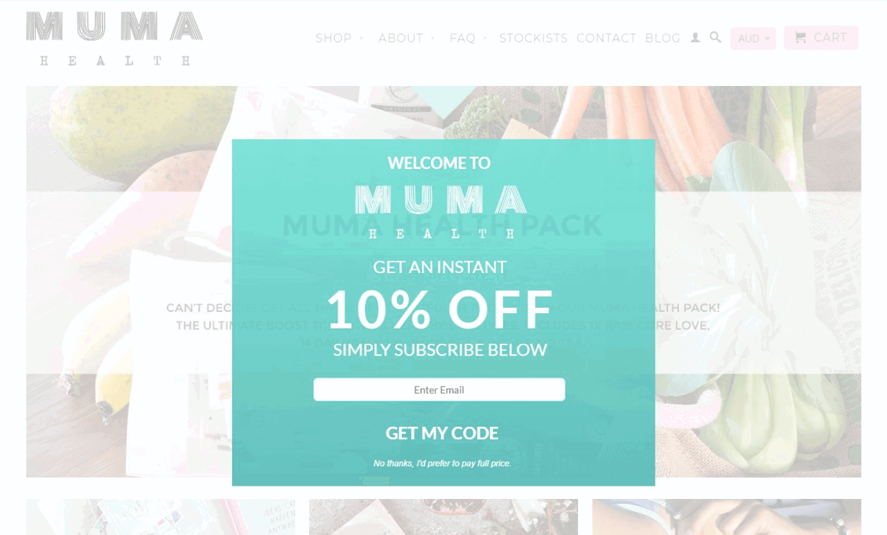
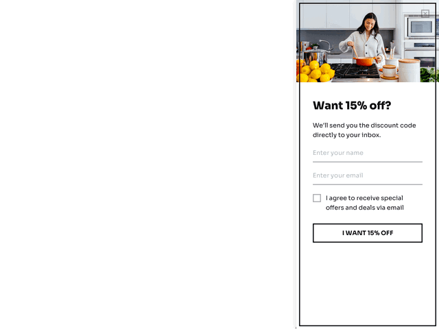
Now, if you’re wondering about the best email list building strategies, popups work incredibly well for online stores. To make sure they aren’t too intrusive, you can trigger them when a customer spends a certain amount of time on your page or when they scroll down the page to a certain point.
Because the last thing you want is to repel the customers who are browsing all the cool things in your shop!
For example, check out this slide-in form displayed after a visitor scrolls down over 50% of the page:
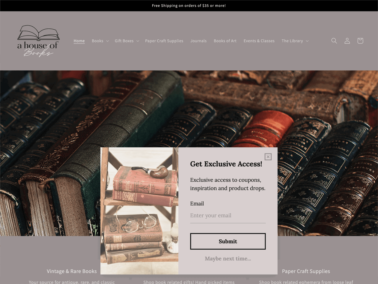
Or this floating bar that only takes up the top section of the page:
You can quickly recreate the slide-in and the floating bar from the examples above using Getsitecontrol, an email subscription popup builder.
Another effective tactic to build an email list is to add an opt-in checkbox during the checkout process. This is much less intrusive than a popup.
Not only that, but the customer who’s checking out is already on the verge of buying from you. They’re already entering their email address to order, so might as well add that checkbox to get their permission to add them to your list! Adding an opt-in incentive, like a 10% discount, will give them that extra nudge to complete the purchase while gaining you a new subscriber.
When building your opt-in forms, be sure to optimize your call-to-action button instead of writing a placeholder text like ‘Sign Up’.
CTA buttons may seem like a small detail, but they’re very powerful when used to their maximum potential. Just replacing ‘Sign Up’ with ‘Get Started’ is already much more action-oriented and effective.
The obvious next step to building an email list is to make it an integral part of your marketing strategy.
You could choose to send the same weekly newsletter to every subscriber, but that isn’t the best way to get the most out of your list, since that information won’t be as relevant to all of your audience.
Instead, segment your audience according to their actions — what type of products have they purchased from you? What are their preferences when it comes to receiving email promotions from you?
You can implement these personalizations and more using your email list provider. For instance, when asking visitors to confirm their subscription, you could add checkbox options to get an idea of:
When you segment your subscriber list, you can send newsletters and promotions that are more relevant to each group. With personalization, your audience is more likely to engage with your brand and remain subscribed.
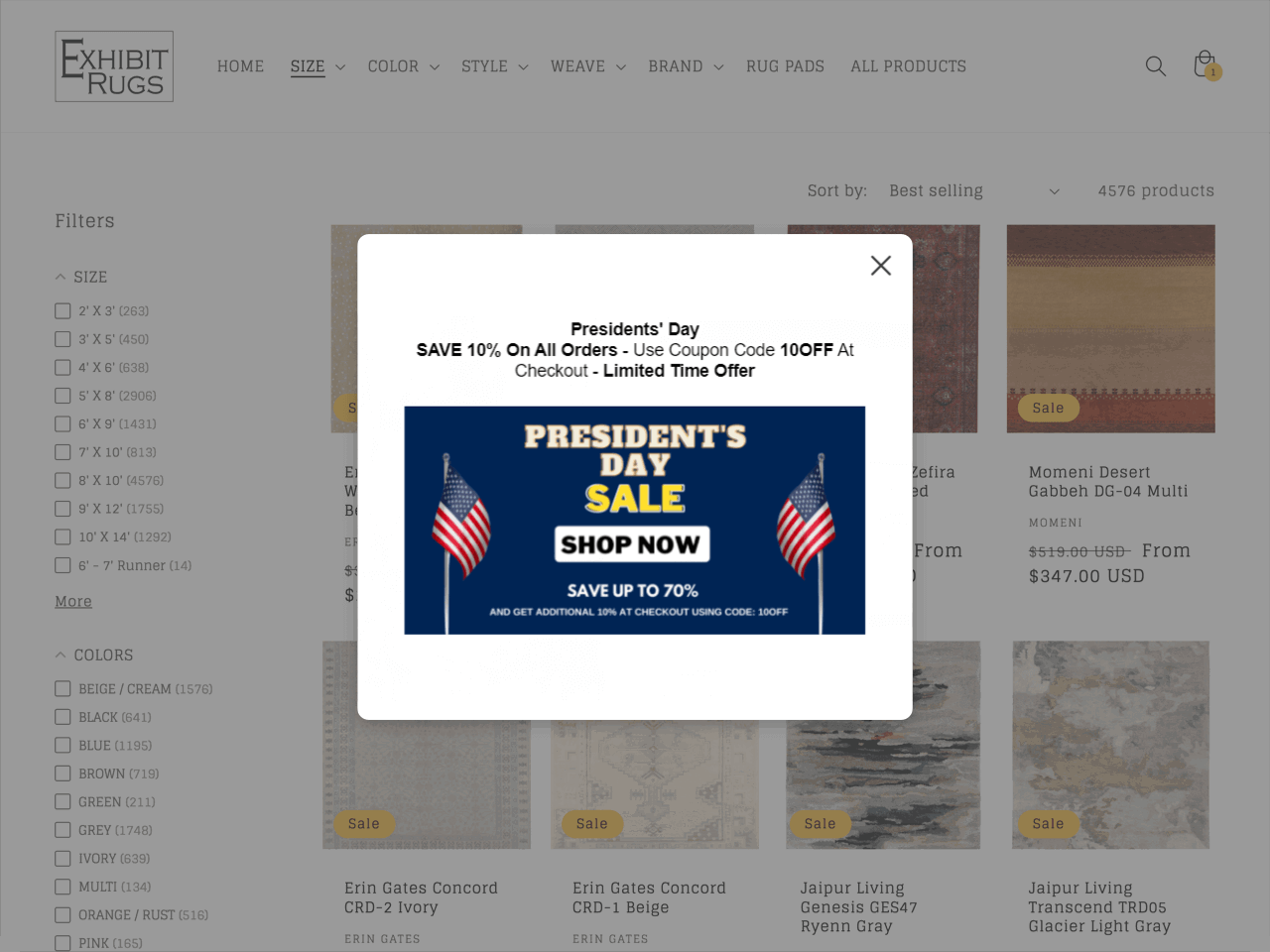
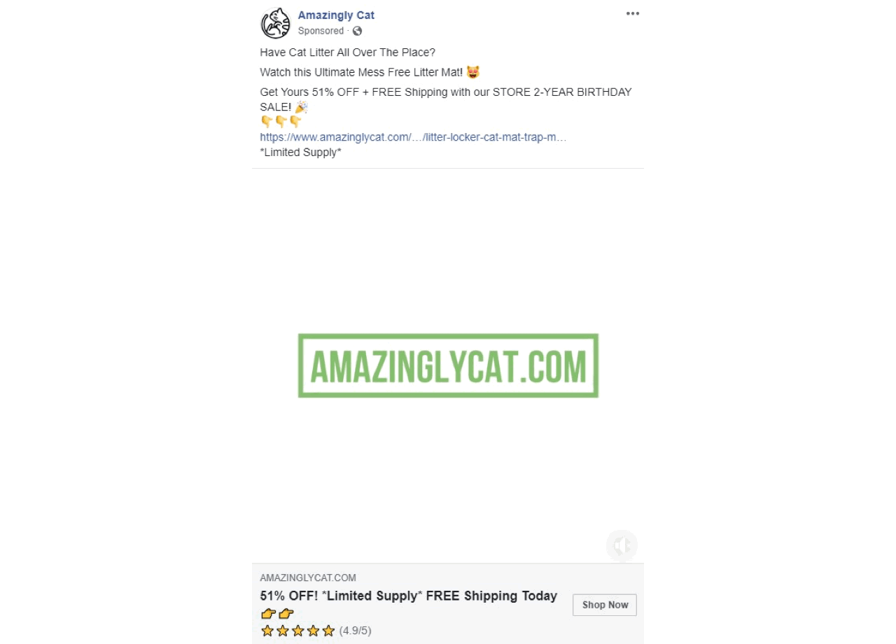
Nothing gets the blood pumping more than scarcity.
If your product seems to be available in limited supply — or if a sale is only available for a short time — your visitors will be more likely to buy from you now. That’s because they can’t be sure that your items will be available at this price (or available at all!) later down the road.
Here are a few ways to use scarcity to boost your ecommerce sales:
Incorporating scarcity in your marketing strategy can increase your click-through rate, boost your sales, and it’s so easy to implement! Simply add a popup on selected pages with a brief message and/or a coupon code to take advantage of the offer.
When your visitors add an item to their cart, you could celebrate that fact and do a happy dance…
… Or you could upsell your visitors to increase your potential for sales.
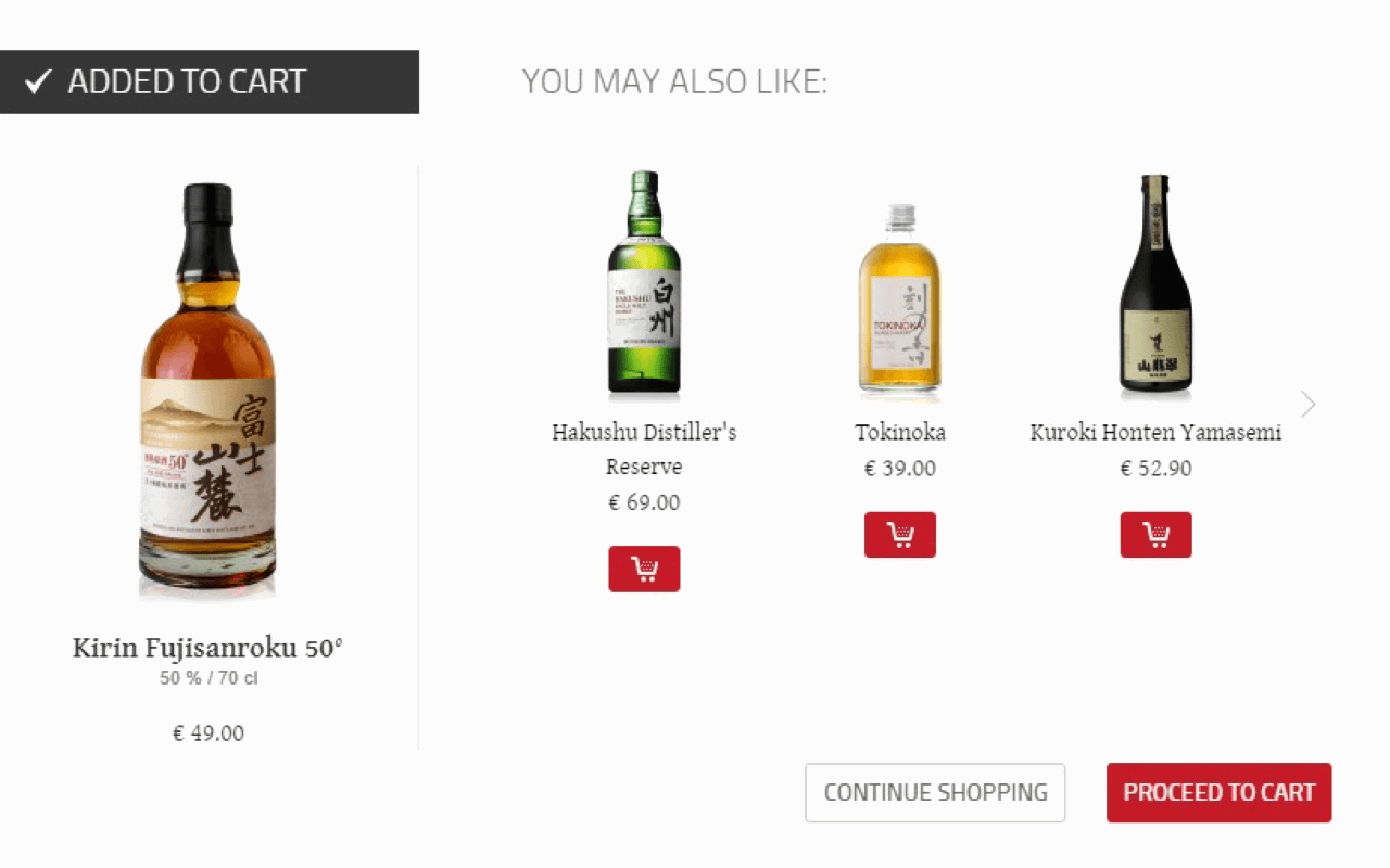
Online stores that offer upsells get an average of 70-95% of their revenue from upsells and renewals — that’s a huge amount of revenue you’re missing out on if you don’t implement this tactic!
Not only that, but it’s also 5x easier to sell to existing customers than to attract new ones. Upsells are an effortless method to make the most of your existing customers.
One of the easiest ways to add upsells is to insert popups to offer a better, more expensive item (or a related item) to your visitors when they add a related item to their cart.
People love shopping on their phones. In the US, 38% of ecommerce sales happen on mobile devices, and that trend is on the rise.
So, having a well-designed website that is optimized for conversions and also mobile-friendly is now a top priority for ecommerce retailers.
And mobile ecommerce owners are indeed suiting up. The conversion rate for mobile shoppers has recently reached 4.8%, getting closer to the 6.08% for desktop shoppers.
This means the competition is getting fierce, and the stores that don’t provide a frictionless mobile experience end up missing a lot of opportunities (aka money).
If you want more sales, make your website user-friendly for all platforms. Don’t forget to optimize your popups for mobile, too!
Optimizing your ecommerce store for search engines will increase your organic traffic, especially if you manage to rank on the first page of Google for a given keyword.
And who doesn’t love free traffic?
If you’re tempted to run away at the mention of SEO, I get it — SEO is a beast to tackle in and of itself.
But SEO for ecommerce stores isn’t really that time-consuming, and you can choose among several great plugins to simplify the process. Some are paid and some are free, but ultimately, these plugins are mostly affordable and will provide a great ROI when used to their maximum potential.
Think of it this way — every time someone lands on your website via an organic search, you’re saving on paid promotions.
If you are a complete newbie and need guidance, here is a detailed article to help you optimize your ecommerce website for search engines.
The following will ring a bell to every ecommerce store owner: you get a notification saying someone filled up a cart with goodies from your store.
You get all excited about the hefty sale coming your way and start thinking that things are finally taking a turn for the better.
But then, your visitor suddenly abandons their cart without finalizing the sale. Aww, shucks.
This probably happens more often than you’d like, and may leave you feeling helpless. But, fear not, there are effortless ways to minimize cart abandonment.
For instance, exit-intent popups can make your visitor think twice before clicking that ‘x’ button on your store’s tab.
These types of popups automatically detect when your user is moving their mouse away from your store and give them a last chance to redeem a tempting offer if they complete their sale.
Find out how to create an exit-intent popup in Getsitecontrol within minutes.
Another way to prevent cart abandonment is by using chatbot software. Apart from standard customer assistance, chatbots can offer personalized recommendations and discounts that might nudge shoppers to complete their purchase.
What does your ecommerce landing page look like right now?
Your store’s landing page should be home to the best-selling products in your store. This is the first thing your visitors will see — it’s your one chance at a first impression.
By showcasing your best-selling items on your front page, a) you’ll make a great first impression and b) you’ll give a starting point for your visitors’ shopping spree, instead of overwhelming them with all your existing product choices via your menus.
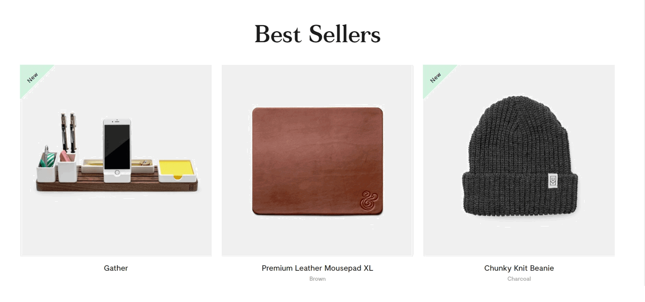
Plus, these products are best-selling for a reason. Leverage their power to entice all newcomers to your store.
Did you know Instagram had Shoppable Posts? If your business belongs to one of Instagram’s supported markets and complies with their commerce policies, you can use your Instagram Business profile to link directly to your ecommerce store.
With a monthly active user base of 2.4 billion people (and over 500 million daily users, what??), Instagram provides a wide-open window of sales opportunities.
This is especially true if your store’s visual branding is on point. You can use enticing images of your products to catch the eye of your Instagram followers, and then link back to a product page on your store.
Another way to integrate Instagram is to add your feed to your ecommerce site directly. This will encourage social engagement from your visitors.
And engaged visitors are much more likely to buy again from you in the future.
93% of users say online reviews had an impact on their buying decisions. If you’re not using reviews, you’re losing out on a huge chunk of potential income.
If you’re not using reviews, you’re losing out on a huge chunk of potential income.
One easy way to leverage reviews is to add ratings to your products. Be sure to prompt buyers to leave a review, or they might not think of doing it themselves.
Another way to power up your reviews is to reach out to some of your most loyal customers — those who have repeatedly bought from your store — to ask for a testimonial. Testimonials differ from reviews because they’re not necessarily related to a specific product — they can build trust in your brand as a whole and recommend the overall experience of shopping on your site.
Use your email list to reach out for testimonials, since this is where you’ll find your most loyal customers.
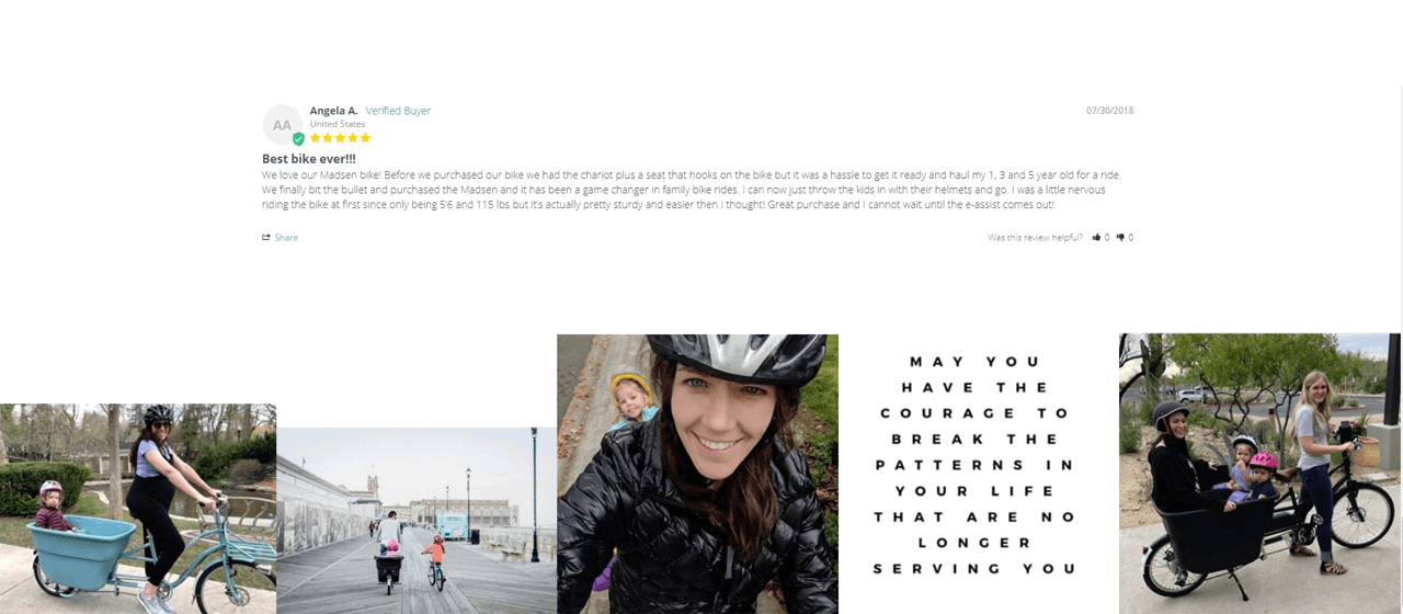
Once you have these testimonials, showcase them on your landing page to immediately put on a trustworthy face for new visitors. Testimonials work even better when you use a real name and photo, since your visitors can identify the customer as a real person.
Here’s a great example from Madsen Cycles, where they feature reviews next to photos of real people using their products:
A live chat is another one of these ecommerce marketing tools that sounds difficult to implement, but that is much simpler than you think.
Adding a live chat option to your store allows you — or your customer service reps — to directly speak to visitors in case they have a question.
Sometimes, visitors want to buy something from you, but they have a burning question that needs to be answered first.
And if you’re making your prospective customers jump through hoops to get in contact with you, they’re more likely to click away entirely.
For instance, imagine this:
Your visitor needs to know if your clothing is true to size before picking which size they’d like to buy. To get in contact with you, they need to click on your contact page, copy your email, open up their email app, and type out their question in an email.
That’s a lot of steps — and you’re taking your visitor away from your store, which might end up costing you the sale.
And this isn’t just speculation — 77% of customers won’t make a purchase on a website if there’s no live chat option.
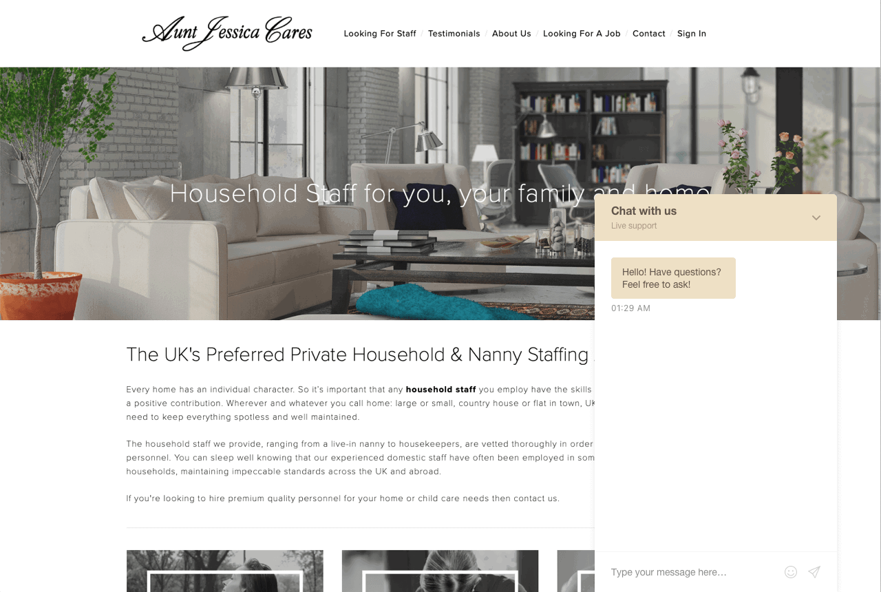
Whereas, if you have a live chat tool implemented directly on your website, your visitor can stay right on the page and interact with your customer service rep, without additional friction. Take a look at the Aunt Jessica Cares website for an example:
It’s an effortless way to establish a connection between potential buyers and your brand.
Live chat boxes are non-intrusive additions to your ecommerce store, but can also be used to prompt visitors to interact.
How do you know what works best and what doesn’t work at all when it comes to your store’s conversion optimization?
The short answer is that you don’t. The only real way to figure out what works is by testing your options.
A/B testing is an effective method to do that. It puts two different headlines, product descriptions, page layouts, or more against one another to see which one performs better.
Most A/B testing tools offer key metrics to get detailed insight on the performance of your instances. When you understand what works better, you can iterate improvements to your store’s experience and keep testing various options against one another.
Each new iteration will help you boost your ecommerce sales since you’re relying on pure data to optimize your conversions.
A/B testing ultimately helps you create an increasingly better experience for your customers. The better the experience, the more likely your customers will come back to buy from you again.
Of course, A/B testing isn’t 100% effortless. It requires you to constantly improve your store. However, with the right tools, you don’t need to fight against the tech to implement these tests — all you need to do is come up with great content to try out.
More often than not, first-time visitors on your store browse for a while, then leave without making a purchase.
Although that’s part of the reality of having an ecommerce store, it doesn’t mean you can’t do anything to win back bouncing visitors.
That’s where visitor retargeting comes in. Using a Facebook pixel, you can detect who has visited your site and whether they made a purchase. From there, you can target your paid social media ads towards these people.
There are many ways you can use retargeting. For instance, if a visitor left your store, but clicked on a certain product, you can promote this product to them on social media and offer them a limited-time or limited-quantity discount (scarcity!).
On the other hand, if someone filled up their cart and left, you can call this out specifically and offer them a bonus if they complete their purchase.
Here’s the deal — customers might not buy from you the first time they interact with your brand. They might not buy the second time, either.
But the more exposure they get to your store, the more likely they are to eventually buy something from you.
And making that first purchase is the first step to becoming a repeat customer. That’s important because, remember: it’s so much easier to retain existing customers than acquire new ones.
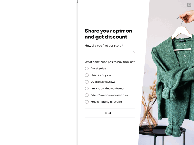
You can learn a lot about your customers’ experience with a post-purchase survey.
You can ask them what convinced them to buy from you, what would have been a deal-breaker, or what could have improved their experience.
In other words, you learn about your strengths and weaknesses through the eyes of your customers. And since it’s them you are trying to impress, their opinion is what you should care about the most.
With Getsitecontrol, you can easily create a post-purchase survey like the one below and display it on the purchase confirmation page of your website.
To increase the number of responses, you can reward survey-takers with a coupon code for their next purchase. Mention the reward before the survey to give an incentive to your customers and feature it on the last page of the form or send it via email.
If you manage to implement changes based on your respondents’ feedback, you can rest assured your sales will benefit from that.
The last thing you want is for your customers to give up their purchase because their preferred payment option is unavailable.
Providing a variety of payment methods will largely prevent this issue, especially on mobile.
According to the latest online shopping stats, mobile wallets like Apple Pay, Amazon Pay, Samsung Pay, and Google Pay are becoming the new normal.
Make sure to include the most widespread payment methods for ecommerce, and always pay attention to your customers’ requests and complaints about this.
Personalized messages come across as more heart-felt. They can make people feel special, noticed, appreciated. That’s exactly how you want your customers to feel.
There are many ways to add personalization on different levels of your marketing campaigns, including emails, ads, entire landing pages, and even website popups.
For example, using the dynamic text replacement feature, you can display a visitor’s location, current date, or even name:
Don’t underestimate the power of a personalized message, it can do wonders to make your potential customers more eager to buy from you.
There you have it — 16 tactics that will boost your ecommerce sales without burning you out.
On its own, each of these tactics is quite effective. However, when implemented together, they’re rocket fuel for your ecommerce sales.
And using Getsitecontrol makes many of them really effortless, from cart abandonment popups and email opt-in forms to sale announcements.
Try implementing just one of these tactics today — you’ll be able to measure the difference in sales and have a taste of what all of these techniques could do for you over time.
Charlene Boutin is a freelance content writer & email marketing strategist for hire specializing in helping Ecommerce and SaaS businesses increase conversions by growing authentic relationships with their audience. She loves helping business owners tell their unique stories to capture the hearts of more customers.
You’re reading Getsitecontrol blog where marketing experts share proven tactics to grow your online business. This article is a part of Ecommerce marketing section.
Try email marketing, free
Grow your list with free popups, send 2,000 emails for free.
Get started →Of all the marketing emails, flash sale emails are the most exciting ones.
For your customers, they entail a generous deal. For you, they can help dramatically increase revenue and clear out inventory.
But how do you design an email that is both good-looking and efficient?
In this article, we’ll break down 7 real flash sale email examples from ecommerce brands, explain why they work, and share customizable templates you can use for your next campaign.
We’re all familiar with the thrill of snagging a great deal. It feels good to grab that offer while it lasts — that’s just how we’re wired.
Most companies know that. From flash sales to seasonal clearances, brands use limited-time offers year-round to boost conversions and move inventory.
You’ve probably seen them everywhere: in emails, on website landing pages, and on popups — like this one 👇🏼
You’re finally getting traffic to your online store.
Congratulations!
But you’ve noticed most of your traffic bounces without making a purchase. Or worse: you’re getting zero sales from all that traffic.
Don’t panic – this happens more than you know, and it can be fixed.
Keep reading to understand why you may be getting traffic but no sales in your store – and how to start fixing this issue ASAP.
Subscribe to get updates
Get beginner-friendly tips for growing your online business.