Create your offer popup
Start with an editable design and match the message to your promotion.

A shopper likes the product, has checked the price, and still closes the tab. Sometimes the missing ingredient is a reason to decide now. A limited-time offer can supply it — provided the promotion solves a buying hesitation instead of merely adding a clock.
That reason might be a birthday sale, a useful gift, a subscriber preview, or a bundle that disappears after the weekend. Each changes the buying decision in a different way. A bigger percentage is only one option.
A countdown can make that deadline visible, but the offer needs to make sense without it. If shoppers discover exclusions only at checkout, the campaign creates friction exactly where it should remove it.
Below are ten offer structures, fresh website examples from Farmacy, LANEIGE, and REI, plus editable designs and a worked campaign plan. The focus is the promotion across your website; for the email creative, use the dedicated flash sale email examples.
A limited-time offer has a genuine closing point: a date and time, a defined eligibility window, or the end of a scheduled event. “While supplies last” describes an inventory limit. It can accompany a deadline, but it is not the same thing.
Write the campaign rule before the headline. For example: “20% off selected outerwear until Sunday at 11:59 p.m. ET, using code WEEKEND20.” That sentence gives your popup, landing page, checkout settings, and reminder email a shared source of truth.
The examples below use illustrative amounts and deadlines. Choose figures that fit your margins, stock, and audience rather than copying them into an active campaign unchanged.
A flash sale works best with a focused range and a short, clearly communicated window. Send shoppers directly to eligible products so they can act without searching the entire catalog.
This template puts a code at the center of the offer. Replace its sample discount, add your closing time, and test the code against both eligible and excluded items. The discount popup use case explains how to present codes and match campaign rules to the offer.
Use a category offer to give one part of your range more attention: winter layers, desk accessories, or skincare refills. Keep the benefit in the headline, such as “20% off selected knitwear through Sunday.”
Bed Bath & Beyond illustrates the category-sale approach with its Top Deals presentation: shoppers can explore deals by the kinds of products they need. Bring the same clarity to the collection linked from your campaign.
REI’s Anniversary Sale announcement is a stronger model for organizing a large promotion. Its May 16–26 event combined category and brand discounts with a separate member coupon for one full-price item and one Outlet item.
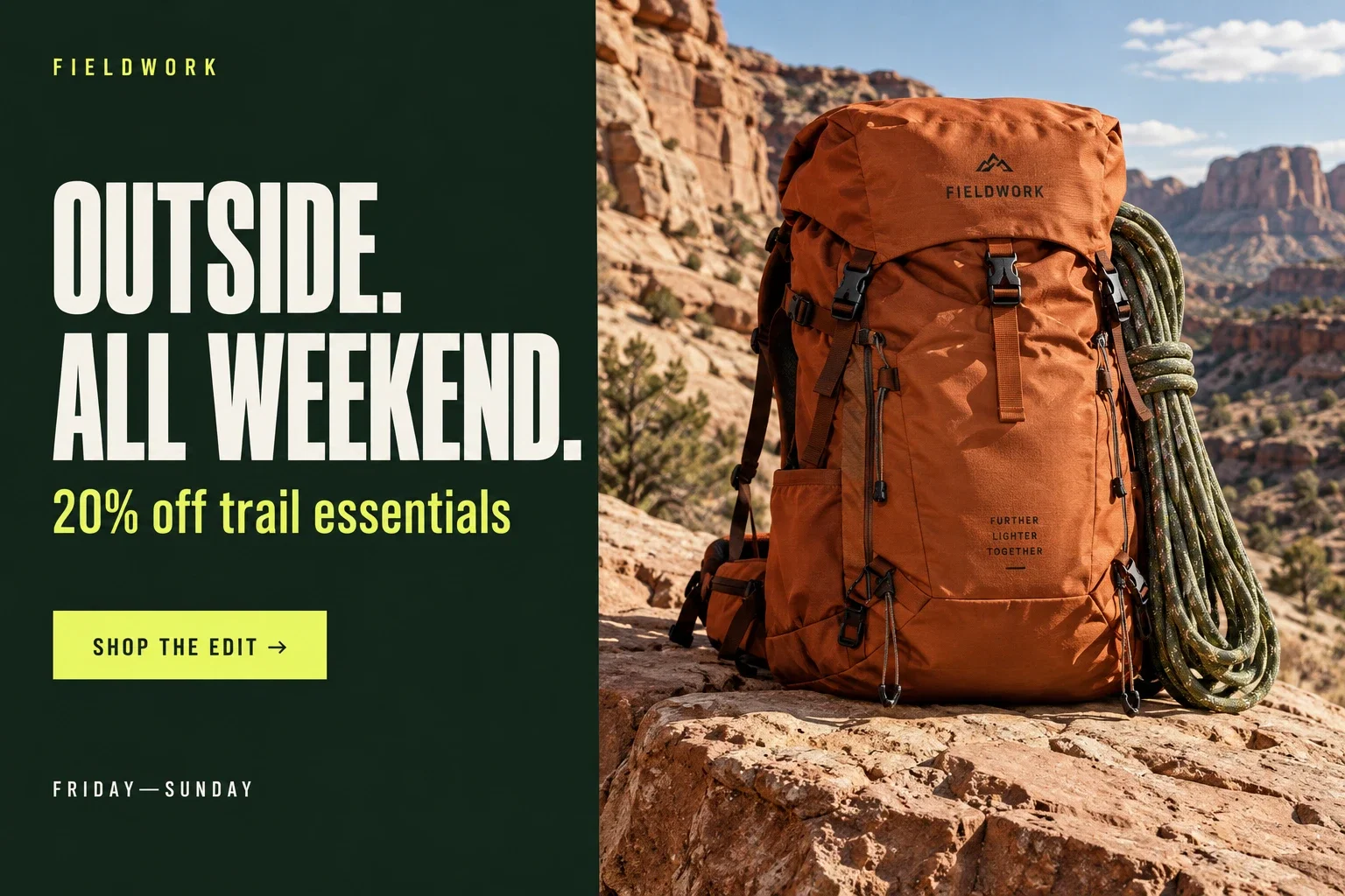
REI’s event structure helps shoppers choose a route into the sale. This is useful when a single percentage would oversimplify the promotion. A bike shopper and someone replacing hiking socks need different destinations even though both arrived for the same event.
For a smaller store, translate that into three collection links under one campaign headline: “Trail layers,” “Camp essentials,” and “Footwear.” Make the eligible range easy to browse before adding more urgency to the banner.
Target the relevant collection pages and link back to the eligible range. A visitor browsing footwear should not have to decode a popup about an unrelated category. For Shopify product-page placement, follow the product-page discount guide.
A broad event needs a message shoppers can find again as they browse. A compact bar can carry the code and closing time across relevant pages, while the full terms live at the destination.
Farmacy built its birthday campaign around a recognizable occasion: another year of the brand. The announcement bar carried the October 9–12 window, a scrolling strip repeated the saving, and the hero paired the skincare message with oversized offer typography.
In that campaign, notice the division of work. The slim bar supplies the dates, the hero gives the event personality, and the shopping button leads into the range. The brand still looks like a skincare business; the campaign has not turned the homepage into a generic coupon page. This is an example of campaign presentation, not a claim about its conversion results.
You can apply the same hierarchy to an anniversary, a store opening, or a community milestone. Pick an occasion customers can understand in a sentence, then give the offer enough visual space to feel like an event.
Another approach is the promo banner from Tommy John. In Tommy John’s earlier campaign, separate men’s and women’s shopping routes made the broad offer easier to navigate. Keep that destination choice when your sale covers very different collections.
Use “sitewide” only if that description matches the actual eligibility. If exclusions are substantial, “selected styles” or a named collection is more informative. Before launch, check gift cards, bundles, subscriptions, and already discounted items against the promotion rules.
Clearance gives a practical reason for a promotion: the range is changing and remaining inventory needs to move. Organize the sale collection by current availability, not just the size of the discount.
Faherty Brand uses a floating bar for a seasonal sale, carrying the store’s colors into the promotion. This keeps the message available while visitors browse.
An adapted message could read: “The season-end edit: selected pieces up to 40% off until Monday.” If sizes are limited, say so. Avoid sending shoppers to a page full of unavailable items, and remove sold-out products from reminders.
For clearance, spend as much effort on the landing page as the announcement. Put size filters within reach, make final-sale conditions visible, and consider a “last few in your size” collection when the underlying stock supports it. The offer becomes more useful when the shopper can actually find a product that fits.
A shipping offer can address a checkout objection without cutting product prices. Explain the threshold, eligible destinations, and shipping method before the visitor commits.
“Free standard shipping on orders over $75 through Sunday” is more useful than “Free shipping today!” when a threshold applies. Test a basket just below the threshold and one that qualifies. The delivery promise and the promotion deadline are separate facts; neither should imply guaranteed arrival unless you can support it.
The threshold also shapes the basket. Suppose a customer has a $62 order and shipping costs $7. A $75 free-shipping threshold may prompt them to look for a $13 addition; it may also prompt them to leave. Show relevant small additions close to the basket rather than expecting shoppers to search from scratch. Those figures are illustrative — start with the order values and shipping costs in your own store.
A free-shipping weekend can work particularly well for a new range whose prices you want to preserve. The message becomes “Try the new collection without the delivery charge,” rather than “These new products are already discounted.”
A gift works when it complements what the customer is buying. Show what the gift is, how the order qualifies, and whether the customer must add it to the cart.
If stock is limited, explain both constraints: “Spend $100 by Sunday to receive the travel kit, while gift stock lasts.” Prepare a fallback for when the gift runs out. Do not keep a live popup advertising a reward that checkout can no longer provide.
Make the gift do some product discovery. A full-size moisturizer paired with a travel-size cleanser introduces another part of the routine. A notebook paired with a pen helps the customer use the purchase immediately. An unrelated clearance item may have a high stated value and still feel like something the store wanted to unload.
In the Farmacy campaign observed above, a separate announcement offered a Honey Halo travel size with qualifying orders. Keeping the gift threshold distinct from the sitewide percentage makes both benefits easier to understand. If your own gift can stack with a sale, show whether the qualifying spend is calculated before or after the discount.
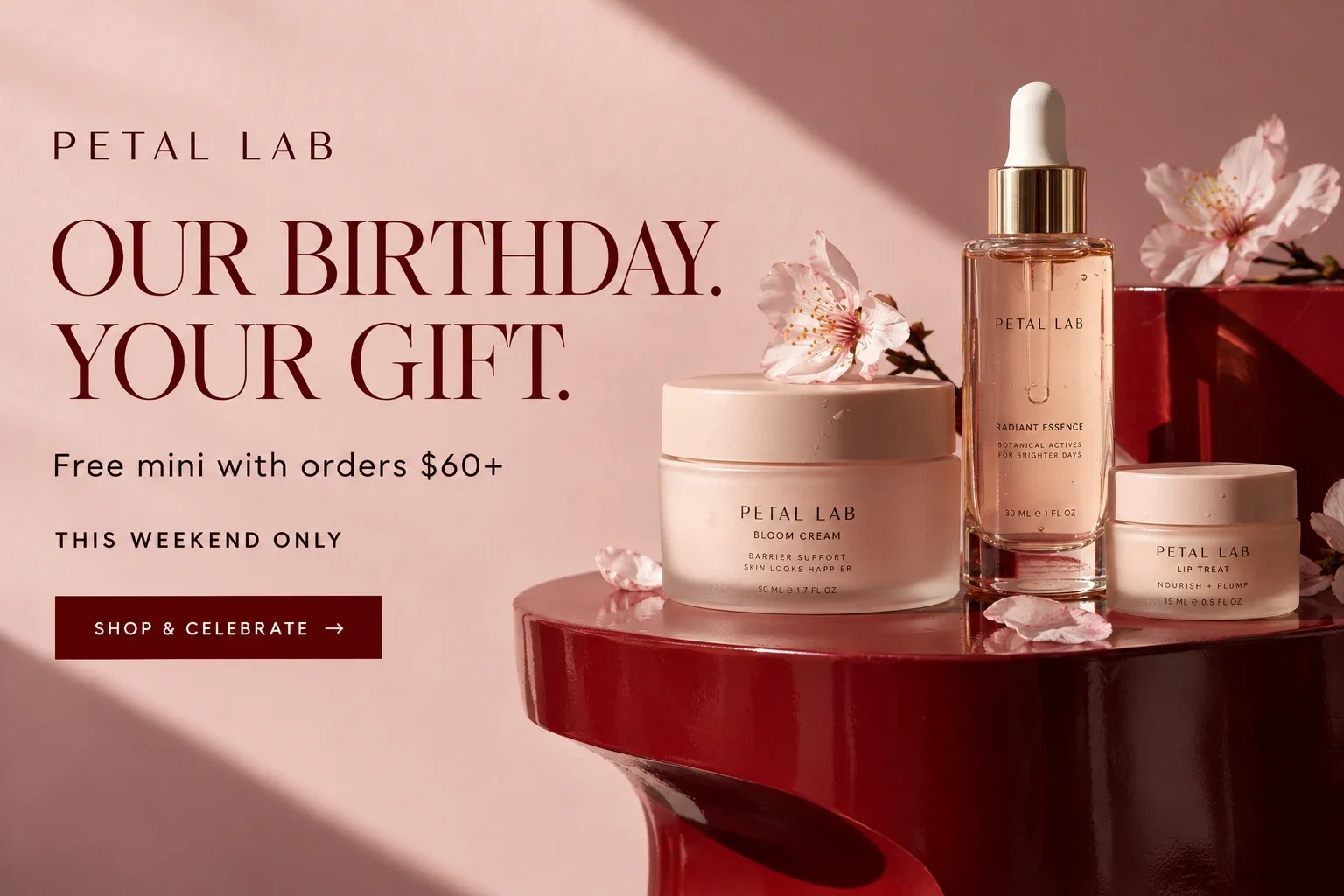
A bundle helps shoppers understand how products work together. State the contents and the saving compared with purchasing the same items separately, where that comparison is accurate.
Link directly to the bundle page. Specify whether variants can be mixed and whether the offer can be combined with another code. A strong product image can explain the combination more quickly than a long popup description.
Consider a coffee store selling a weekend tasting set: three small bags, a brew guide, and one clear price. The appeal is the chance to compare flavors without buying three full bags. Lead with that experience, then explain the saving. For skincare, the equivalent could be a travel routine; for homeware, a ready-to-give table setting.
The time limit should attach to something real: the set is assembled for a seasonal event, the bonus is available through Sunday, or the introductory bundle price ends at launch. A bundle that stays unchanged all year does not need a permanent “last chance” badge.
A first-order incentive is limited by who can use it; it becomes time-limited only when an actual expiry applies. Keep those two rules separate.
Lola Blankets provides a brand example of a first-order offer used to invite newsletter signups. Capital One Shopping’s discount research also explores how discounts influence shoppers’ willingness to try a brand. Treat acquisition and repeat purchasing as separate outcomes when evaluating the offer.
The useful idea in Lola’s welcome campaign is the connection between the product, first-order eligibility, and the incentive. Adapt that relationship in the editable form above. A first-order offer can run continuously; give it a deadline only when the customer’s code really expires.
This template collects a signup and promises the code by email. Connect the welcome email before publishing. If each code expires after a defined period, the email and checkout need to enforce the same period. Otherwise, use a fixed campaign deadline or omit the expiry claim.
Early access offers time rather than a larger discount. It can suit a collection launch or a limited release when subscribers genuinely receive access before the public.
Explain when early access opens and when it ends. Joining a list does not automatically reserve a product. For a launch with a waitlist, use the product launch email campaign guide to connect signup, announcement, and follow-up.
Build the early-access page before announcing the window. Subscribers should arrive at a page that recognizes the invitation and clearly identifies what they can shop. A public homepage that still says “coming soon” wastes the advantage you just promised.
For a small release, a two-stage message can work: invite subscribers to preview the products first, then send the shopping link when access opens. The first message answers “Do I want this?”; the second answers “Where do I buy it?” This is especially useful when color, size, or compatibility requires thought.
LANEIGE’s promotional page illustrates the handoff from a broad homepage message to precise offer terms. The homepage presents the maximum saving and code in a blue product-led composition; the terms specify an October 12 cutoff at 11:59 p.m. ET and identify excluded product groups.
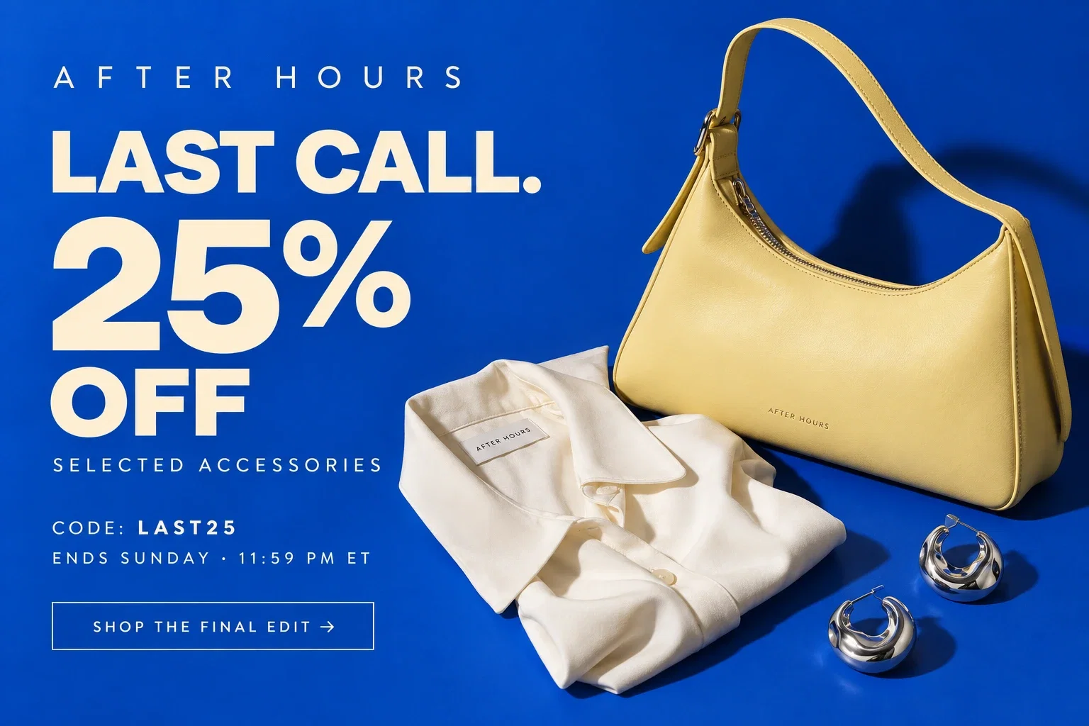
The design keeps the code close to the reward, so the visitor does not have to remember a message from another screen. For a final-day version, put the actual cutoff beside that code. The terms page can carry the full exclusions, but a major restriction should not be a surprise at checkout.
The last reminder should help someone finish a decision they were already considering. Show the remaining benefit, the exact cutoff, and the eligible destination.
This template includes a countdown and a code. Configure the timer to match the actual campaign end; the preview’s sample countdown does not set your store’s discount expiry. Schedule the popup to stop and expire the offer in the commerce system as well.
For a dedicated website timer, explore GSC Countdown Timer on Shopify or the HurryTimer plugin on WordPress. Match the configured countdown to the real offer deadline.
For email creative, you can make email countdown timers in TweenFrame. A GIF is an animation, so retain the actual closing date as text; do not assume a looping animation tracks a live deadline.
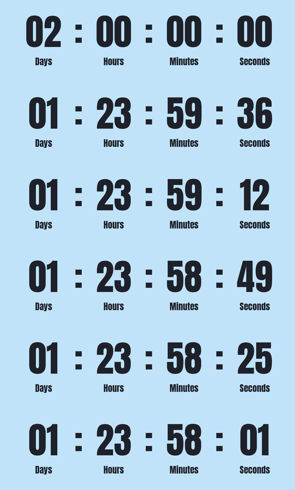
For the matching email, see the last-chance email templates. Keep the deadline as readable text so shoppers do not need an animation or timer to understand it.
Start by finishing the sentence: “They are interested, but…” If the answer is “delivery feels expensive,” a sitewide percentage may be an expensive solution to a shipping problem. If the answer is “they do not know which products go together,” a bundle can do more work than a countdown.
| The hesitation | Offer to explore | What the destination should do |
|---|---|---|
| I will come back to this later | A genuine event deadline | Show the eligible products and closing time |
| Shipping makes this small order feel expensive | A short shipping offer | Explain regions, threshold, and shipping method |
| I cannot decide which items belong together | A curated bundle | Show the combination in use and list its contents |
| I want to try the brand without a big commitment | A starter set or complementary gift | Explain what the customer can experience |
| The new release might sell out before I get there | Subscriber early access | Give subscribers a usable access route |
This gives your campaign a stronger creative brief. “Reduce the hesitation about shipping” is a decision you can design around. “Make it more urgent” is usually a request for louder typography.
Give the reader a fact they can act on. A short headline can carry the benefit, while a supporting line explains the cutoff and conditions. Avoid vague urgency when you can state a real deadline.
| Vague wording | More useful version | Why it helps |
|---|---|---|
| Hurry! Almost gone! | Selected colors available until Sunday, while stock lasts | Distinguishes a date from an inventory limit |
| Huge discount today | 20% off selected outerwear until 11:59 p.m. ET | States the range, benefit, and timezone |
| Your exclusive deal | First-order offer for new subscribers | Names the eligibility |
| Get it now | Shop the weekend edit | Describes the destination |
| Last chance, again | Offer ends tonight; regular pricing returns tomorrow | Only use this when the offer really ends |
These are writing patterns. Replace sample facts with your own, and make sure the short version does not contradict the detailed terms. A reset-on-refresh timer is a poor fit for an offer advertised as ending at one fixed time.
Create the eligible collection or landing page, configure the discount, and test checkout first. The promotional visual should reflect a working offer. On Shopify, the coupon popup guide covers the connection between the storefront message and discount setup.
Use an announcement bar for an offer that needs to remain easy to find, a popup for a focused announcement, or a relevant product-page message for a narrow offer. Avoid multiple overlapping promotions competing for the same visitor.
Use the available targeting and scheduling controls for the campaign. Check the account timezone, page eligibility, and stop conditions. Schedule availability depends on the plan; the widget targeting guide documents the controls.
Capterra’s Coupon Preferences Survey discusses coupon discovery across channels, including company emails and coupon websites. Plan where customers will encounter the offer, and keep each route consistent.
Keep the same code, deadline, and exclusions in the popup and email. At the end, stop the campaign, disable the expired discount, and update destinations that still receive traffic from old emails. An expired-offer page should explain that the promotion ended and help people continue shopping.
Imagine a clothing store with a defined outerwear range and a 20% weekend offer. Here is how the same campaign changes across the visit. This is illustrative campaign copy, not a reported customer result.
On the homepage, lead with “A weekend for warmer layers” and a short line naming the discount and Sunday cutoff. The button says “Shop the outerwear edit.” The collection page opens with the same offer and makes sizes easy to filter.
On eligible product pages, a compact bar carries the code and deadline. Someone comparing two jackets can still reach sizing and delivery information. A returning visitor who already dismissed the announcement does not need the full modal again.
On the final day, change the supporting message to the actual closing time. After the cutoff, the same campaign URL becomes “The weekend event has ended” with a route to the current outerwear range. Old emails remain useful instead of sending people into a failed-code experience.
The creative changes across the journey, but the offer does not. This lets you use a hero, a bar, and an email without repeating the same interruption at every step.
Watch popup clicks, eligible orders, average order value, and the cost of the incentive. A busy campaign can still be weak if it gives away margin on orders that would have happened anyway.
Separate new-customer acquisition from purchases by existing customers. Track returns and cancellations after the event. When comparing offers, keep the audience and period comparable; a holiday weekend is not a clean control for a normal weekday.
Use popup statistics to understand the measurement vocabulary. Your main decision is whether the campaign produced worthwhile orders and a good customer experience, not whether the timer received attention.
Consider a simplified $100 product with $40 of product cost. Before other costs, the order contributes $60. A 20% discount leaves $80 of revenue and $40 of contribution. You would need 50% more of those orders to match the original contribution, assuming the product cost stays the same.
That is why the largest revenue day is not automatically the strongest promotion. Include shipping subsidies, gift costs, returns, payment fees, and the mix of products sold when reviewing the campaign. Compare the event with a sensible baseline, and distinguish new demand from customers simply bringing a planned purchase forward.
A gift can preserve the ticket price, but it still has a cost. A bundle can raise the order value, but it may reduce the contribution on items the customer would have bought anyway. Choose the mechanism with those tradeoffs in view, then let the creative make the benefit clear.
It is a promotion with a real closing point, such as a scheduled date and time. Limited stock is a separate restriction and should be described separately.
Choose a window that fits the purchase decision and audience. A short flash sale and a considered purchase need different lead times. State the deadline clearly and keep it consistent across channels.
Consider shipping, a complementary gift, a bundle, or early access. Explain the eligibility and make sure the benefit is available at checkout.
No. Use one when the remaining time helps the shopper understand a real deadline. A clear text deadline may be enough.
Do not assume so. Match the timer with the popup schedule and the discount settings in your store, then test what happens after expiry.
Not necessarily. It is restricted by eligibility. It also becomes time-limited if there is a genuine expiry, which must be explained and enforced.
Choose relevant pages, avoid overlapping messages, and configure repeat-display rules. A compact bar can keep the offer accessible while shoppers browse.
Stop the promotional message, expire the offer, and update the destination. Explain that the promotion has ended rather than leaving customers with a code that fails without context.
Jack Hayes covers onsite marketing, email campaigns, and ecommerce growth at Getsitecontrol. His guides connect popups, personalization, and automated emails into practical strategies for turning visitors into subscribers and customers into repeat buyers.
You’re reading Getsitecontrol blog where marketing experts share proven tactics to grow your online business. This article is a part of Popups section.
Create popups for free
Email forms, promos, coupons, surveys, bounce-stoppers.
Get started, it’s free →Subscribe to get updates
Get beginner-friendly tips for growing your online business.