Create your email
Turn your next fashion newsletter idea into an email with an editable design.

A fashion newsletter needs an angle, not just a row of products. Show how an outfit works, explain a detail worth noticing, or give a familiar piece a new setting. The reader should understand why this particular selection belongs together.
These nine ideas focus on individual newsletter issues, with editable designs and copy you can adapt. For audience segments, automated journeys, and a sending calendar, start with the fashion email marketing strategy.
Write the issue's point in one sentence: “Three light layers for a changeable day” is a brief you can photograph and write. “Our latest products” leaves the reader to discover the connection.
| What you have | Newsletter angle | Lead visual |
|---|---|---|
| A coordinated outfit | Show how the pieces work together | One full look |
| A construction detail | Explain the benefit of that detail | A close-up or short demonstration |
| Several useful pieces | Build an edit around a situation | A small, consistent selection |
| A story from the team | Let a person explain their choice | The person or the chosen item |
| No new stock | Teach styling or care for an existing piece | A clear instructional image |
Keep the main destination consistent with the idea. A care issue should lead to the care guide. An outfit should link to the pieces shown. If the main item has sold out, revise the selection before sending.
The product-led designs below are starting points for a connected Shopify store. Replace the sample inventory, prices, claims, and terms; check the source of each product block. Brand names identify the sample designs, not a claim about their campaign results.
An occasion gives a reader a useful reason to consider an outfit: a changeable commute, a weekend outside, or an evening that needs one extra layer. The On design organizes clothing around outdoor use rather than presenting unrelated pieces.
Adapt the structure with a full look, a sentence about the setting, and links to the pieces that make it work. Distinguish styling accessories from items included in a bundle. Use your own verified fabric and performance information instead of copying the sample claims.
Try a subject such as “One outfit, three weekend plans.” If you want to show variations, a slideshow GIF can keep the looks in one visual space while the product links remain below.
Bellroy connects several products through one feature: magnetic closures. The repeated idea gives the selection a stronger point of view than a generic “shop accessories” email.
For clothing, choose a pocket, seam, fastening, or fabric texture. Show it closely, then explain what it changes for the wearer. Two or three products with a shared detail are enough; remove extra rows that weaken the story.
A short caption on a GIF can label the detail being demonstrated. Keep the explanation beside the visual too, so the message still makes sense without waiting for motion.
Nike's layering design uses a simple seasonal situation to organize the message. The visual hierarchy moves from the main look to another relevant part of the range.
Build your own issue around the conditions your audience is dressing for. “Light layers for cool mornings” gives the edit a purpose without requiring every item to be new. Keep the palette and photography consistent so the newsletter feels like one selection.
For a genuinely new collection, the new-arrival email guide covers launch-specific structures. A seasonal edit can work with existing stock.
The STATE design opens with a note from its co-founder and creative director, then moves into her product picks. That gives the assortment a recognizable point of view.
Ask the person for a concrete reason behind each choice: the pocket they use, the bag they travel with, or the piece that goes with most of their wardrobe. Keep their language natural. A staff edit should sound like someone making a recommendation, not several identical sales captions.
Try “What [name] is packing this weekend.” Use the person's actual words and obtain permission for any portrait or quotation.
Patagonia pairs a practical summer selection with customer quotations. The reviews make the benefits more tangible because they talk about wearing and using the clothes.
Choose feedback that answers a buying question: fit, pocket space, fabric weight, or ease of care. Use your own reviews, keep the meaning intact, and link to the relevant products. Avoid treating a star rating as a substitute for useful detail.
This is a newsletter presenting existing feedback. If you need to ask recent buyers for a review, use the separate review-request email guide.
Patagonia's production-story design gives the reader an explanation before the shopping links. Its structure leaves room for a real story about how the product is made.
Use one verifiable detail: where a fabric is woven, how a pattern changed, or what a particular manufacturing step does. Link to the fuller explanation and replace every sample certification or percentage with information that applies to your own products.
If you have footage of the making process, a video-to-GIF converter can isolate one useful step for the email.
A process story does not have to be grand. Showing why you moved a seam or changed a lining can be more interesting than a paragraph of broad values.
The Prada design lets imagery and a short introduction carry the message. It offers a useful counterpoint to a newsletter that tries to fill every available section.
Choose this direction when the photograph already explains the point: a silhouette, a print, or a new combination. Add the information a reader still needs, then stop. Keep product identity and the action in ordinary text rather than hiding everything inside the image.
A short animated heading can introduce an outfit edit. This example uses the Slides mode in TweenFrame's animated text generator, with large lettering and a restrained palette.

A styling issue is useful even when there is no launch or discount. Pick one question: how to layer a shirt under knitwear, how to choose a belt width, or how to store a garment between seasons.
Use one clear photograph or a short sequence and three concise steps. Keep advice specific to the product. A care instruction should match the label; a styling suggestion should identify which accessories are optional.
Try a subject such as “A different way to wear your [piece].” Make the guide the main destination, with shopping links secondary. That keeps the issue helpful for people who already own the item.
A returning size, a new delivery option, or a real shipping offer can be newsletter material when it removes a practical obstacle. Lead with what changed and who it helps.
For a returning item, show the exact color or size and link to the restock email examples when drafting. For a short promotion, use the flash sale email templates. Those guides cover the detailed offer and reminder structures.
A compact scrolling text GIF can introduce the update. Put eligible countries, order thresholds, and dates in normal text rather than leaving the reader to catch them in a moving line.
Start with one of the ideas above, then choose only the product blocks it needs. A material story may work with one hero item and two supporting pieces; a seasonal range may need separate category links.
Replace the sample products in the connected store, check current prices and sizes, and open every destination. Remove a product rather than sending readers to a sold-out page that no longer supports the edit. If a photograph includes several pieces, identify which link belongs to each one.
For a broader plan covering segments and timing, use the fashion email calendar. The design should serve the issue, while the calendar keeps the issues from competing with each other.
Keep a small set of repeated decisions: image treatment, colors, heading style, and button wording. A newsletter can vary its composition while still looking like the same brand.
A brush font generator can create a short editorial accent; a calligraphy generator offers another lettering direction. Use decorative lettering for a phrase such as a collection name, then keep product details and links as readable text.
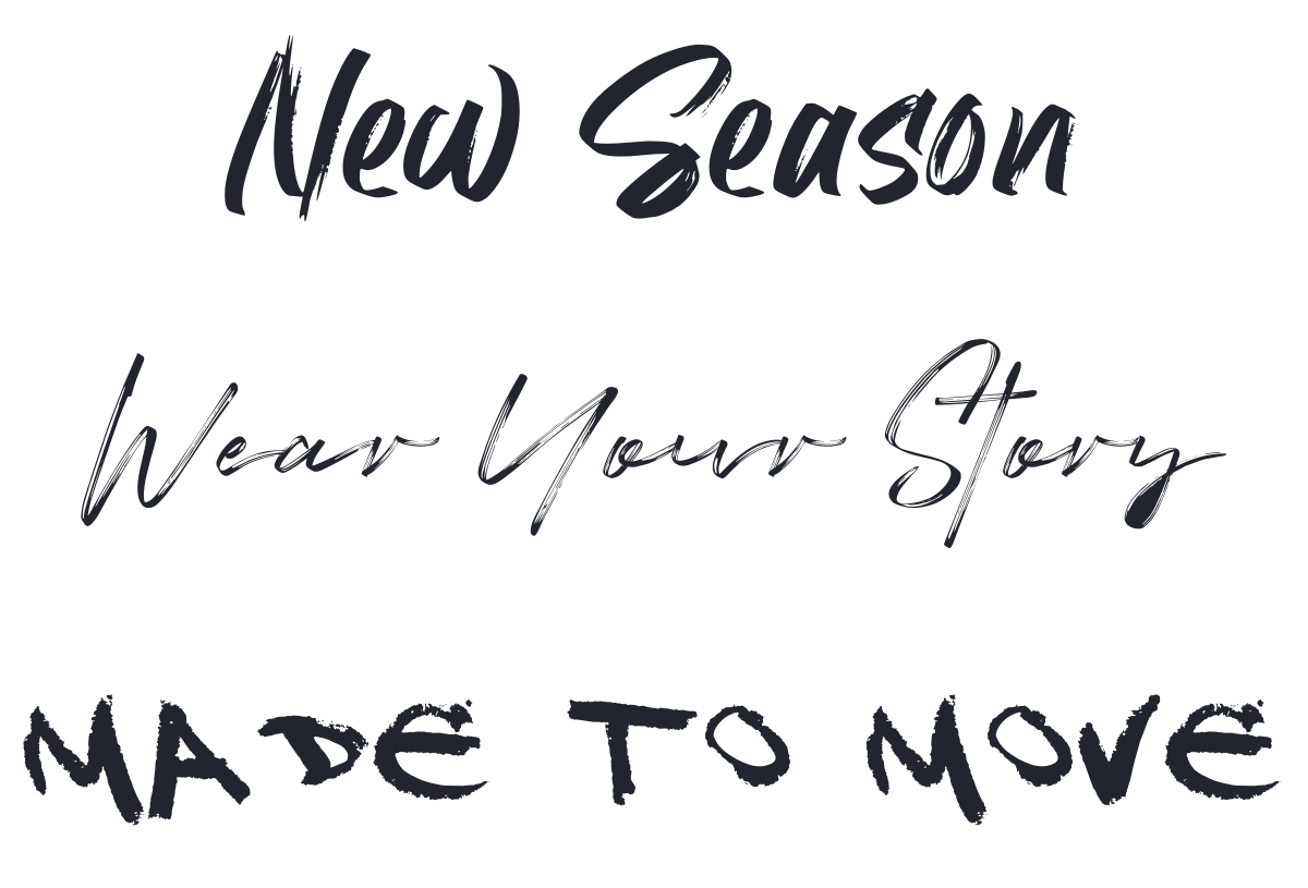
MakeCalligraphy's guide to font images and fancy text explains the different formats. Avoid replacing ordinary email text with decorative Unicode characters that are harder to read or reuse.
For a “one jacket, three outfits” issue, keep the jacket recognizable in every image and change the supporting pieces. Label the occasions in ordinary text, then link each look to its actual products or collection. This gives the reader a useful comparison instead of three unrelated catalog photographs.
Three pieces for [occasion]
PreviewA small edit that works together.
Start with [hero piece], add [layer], and finish with [accessory]. We chose this combination for [specific situation].
[Hero piece] brings [useful detail], while [layer] adds [benefit]. The collection page shows the available colors and sizes.
Already own one of the pieces? Try it with [styling suggestion].
Explore the outfitThe [Brand] team
The detail that changes [product]
PreviewA closer look at [construction or material].
Look closely at [detail]. We chose it because [specific reason].
In use, that means [practical benefit]. You can see the construction and measurements on the product page.
For a closer comparison, pair it with [related piece or guide].
See the detailsThe [Brand] team
Measure the response against the issue's job: visits to a guide, exploration of a collection, or purchases of the featured range. A useful editorial newsletter does not need to pretend every send is a last chance.
Build an outfit, explain a construction detail, share a staff selection, or teach one styling or care technique. Existing stock can support a useful issue when the selection has a clear point of view.
Include only the products needed to explain the idea. A detail-led story may need one item; a complete look may need three or four linked pieces. Remove extra rows that dilute the main reason to open the issue.
Match the layout to the story before choosing colors. An outfit needs a strong worn image and links to the pieces; a material story needs close-ups and explanatory copy. Check the phone layout and the source of any catalog-fed product blocks.
Revisit an existing piece through a different occasion, customer question, or styling combination. A staff pick, care guide, or closer look at a useful feature can make familiar stock relevant without presenting it as new.
Use motion to show a meaningful change, such as two styling options or a close-up detail. Keep the main message understandable in the first frame and put product names, prices, and links outside the animation. Avoid movement that only delays the shopping information.
Name the situation or benefit behind the selection: “Light layers for cool mornings” is more specific than “This week’s favorites.” Make the preview text explain one detail the subject leaves open.
Check whether the layout relies on a connected catalog. Without a suitable product source, start with a layout made from ordinary image, text, and button blocks, and maintain the prices and destinations yourself. Do not assume a working preview means the live product data is connected.
Stick is an editorial pen name used by the Getsitecontrol team for guides on email campaigns, fashion marketing, and Shopify store design. These articles focus on practical ways to present products, plan customer communications, and improve the shopping experience.
You’re reading Getsitecontrol blog where marketing experts share proven tactics to grow your online business. This article is a part of Email marketing section.
Try email marketing, free
Grow your list with free popups, send 2,000 emails for free.
Get started →Subscribe to get updates
Get beginner-friendly tips for growing your online business.