Create a perfect signup form
Choose a template, customize it, and start

If you’re trying to grow your email list, a well-designed newsletter signup form is essential.
And one of the best first steps to create one is to see what other successful websites in your niche are doing.
In this guide, you’ll see 15 high-converting newsletter signup forms — complete with real-world data and takeaways you can apply to your own site.
To help you act fast, we’ve also included customizable signup form templates for each format: popup, sticky bar, and inline. You can preview them right away and add them to your website in minutes, without coding.
Before we look at real examples, let’s break down the key elements that make a form convert.
Give people a reason to sign up (discount, guide, VIP status).
Fewer fields = more signups. High-performing forms use 1–2 fields.
Ask about interests using checkboxes to personalize emails later.
Forms must load fast, look great, and be responsive on any screen.
Go beyond “Subscribe.” Use compelling signup CTAs like “Get 10% Off” or “Join 100,000+ readers.”
Show the form when people are most likely to act (after a delay, page scroll, or on exit).
When you follow these best practices, your newsletter signup form may end up looking something like this:
If you like this example – or any signup form example in this article – you can add them to your website within a few minutes. Just click on a template you like and follow the prompts. You’ll be taken to a form builder by Getsitecontrol, where you can adjust the copy and the appearance of the form before publishing it on your website.
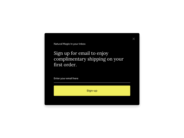
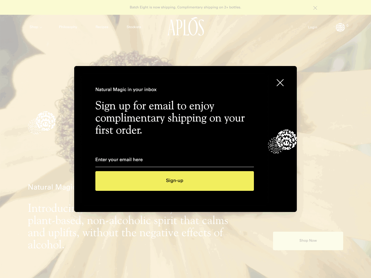
Aplos, a non-alcoholic spirit brand, uses a sleek pop-up form offering free shipping to first-time subscribers. The form delivers an impressive 11% email signup rate.
This form is created with Getsitecontrol
Free shipping is the main headline, making the benefit of signing up instantly clear.
The form uses Aplos’ color palette and typography, helping it blend in while standing out.
Only one field is required, reducing friction and encouraging immediate action.
This is a great example of how simplicity and a relevant offer can outperform more complex approaches.
This ready-made popup is ideal for greeting first-time visitors with an incentive. It’s mobile-friendly, customizable, and easy to set up in minutes. You can also enable automatic follow-up emails with a promo code or welcome message.
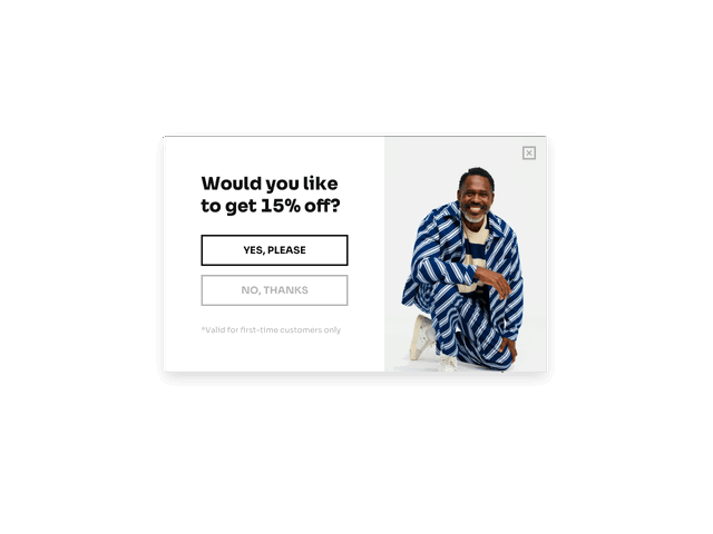
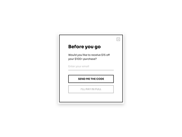
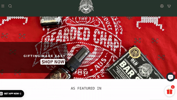
The Bearded Chap, a men’s grooming brand, uses a two-step popup form that first asks a simple yes/no question: “Want 10% off your first order?”
If the visitor clicks “Yes,” the form expands to collect the email address. This small commitment upfront helps reduce friction and boosts conversions — in this case, to a 2.57% submission rate.
This form is created with Getsitecontrol
Breaking the process into two steps increases engagement by starting with a low-effort decision.
The promise of 10% off is clear and immediate.
The form appears after a brief delay, ensuring it reaches users who’ve already shown some interest.
Two-step forms like this are a great way to qualify leads and reduce the intimidation of an email signup form that appears at once.
Trigger this “Yes or No” popup after a scroll or time delay. It’s ideal for ecommerce and helps reduce signup friction. You’ll be able to set up an automated welcome email and use it to deliver the discount code.
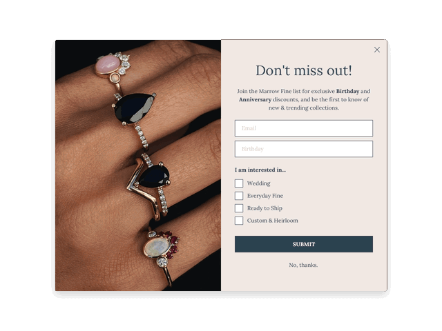
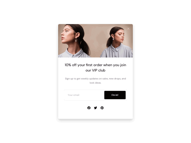
Marrow Fine, a jewelry brand, uses a stylish popup form that lets visitors select their product preferences before subscribing. This simple addition helps the brand segment its list from the start and send more personalized emails.
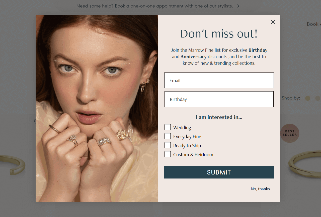
Visitors can choose what they’re most interested in — like wedding or everyday jewelry — using checkboxes. These responses can be used to tag subscribers and tailor future emails.
The form features elegant imagery aligned with the brand’s aesthetic and target audience, reinforcing trust and appeal.
A subtle “No, thanks” link helps reduce pressure and may even increase conversions by making the offer feel optional.
This is a great example of how adding segmentation to your newsletter sign-up form can lead to better targeting and higher engagement in your future email campaigns.
Use this template to segment new subscribers by product interest using built-in checkboxes. You can assign tags automatically and send targeted emails later. Ideal for Shopify jewelry stores and fashion brands.
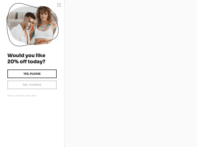
JazzUpCo uses a vertical sidebar form — an uncommon format that stands out without interrupting the browsing experience. The form starts with a question (“Would you like a special discount?”) and shows an email field after the visitor clicks “Yes.”
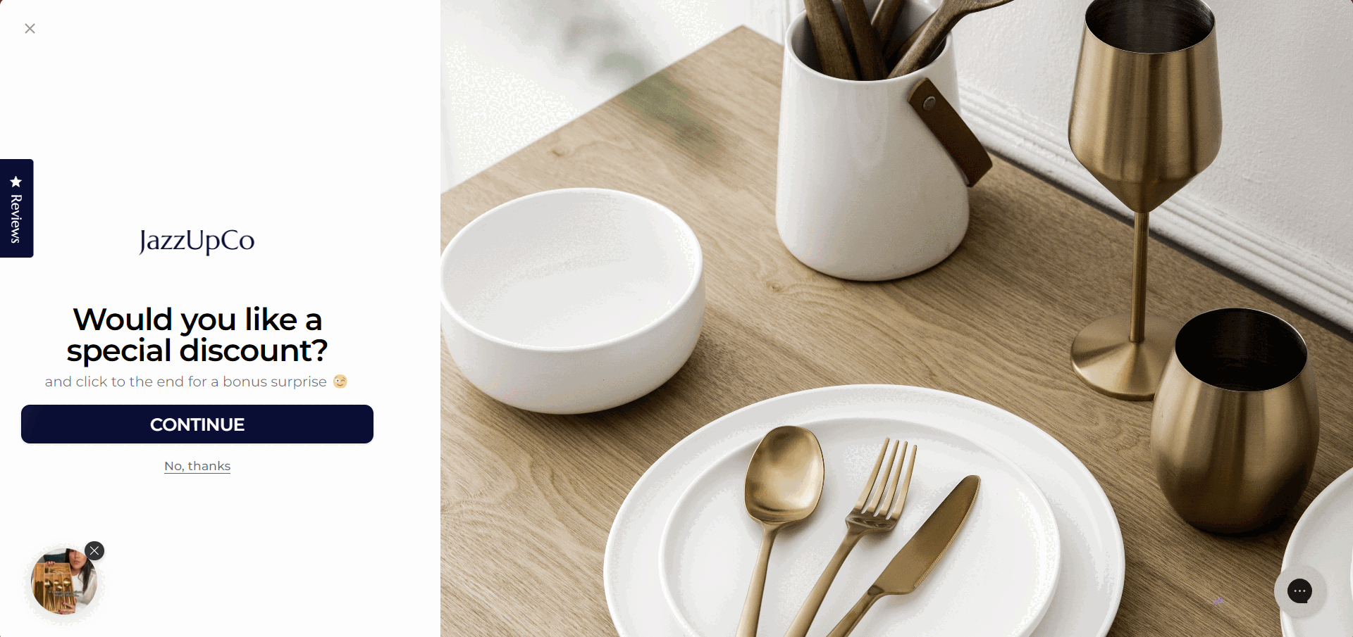
The vertical sidebar format is visually distinct and stays anchored without blocking the page content.
Starting with a micro-commitment increases the chance that a visitor will complete the action.
A 20% discount offer is the central motivator, delivering instant value for subscribing.
This is a smart option if you want to attract attention while keeping the user experience on your website non-intrusive.
Use this layout to present a discount in a soft-entry way. Works well for ecommerce brands and service providers.
Use a sidebar form when you want to stay visible without being pushy. It’s a smart fit for long-scroll pages like blogs or catalogs, where readers can discover the form naturally while browsing.
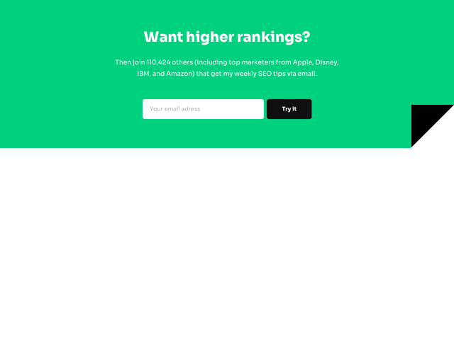
Backlinko, an SEO blog by Brian Dean, uses several inline newsletter signup forms across the site. For example, the form on the homepage is supported by a shiny testimonial.
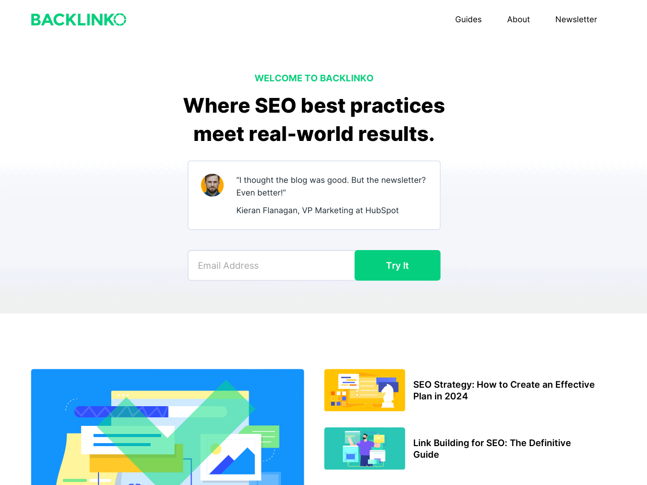
If you scroll around the rest of Brian’s site, you’ll see that other signup forms are strategically placed on different pages and reinforced by even more social proof.
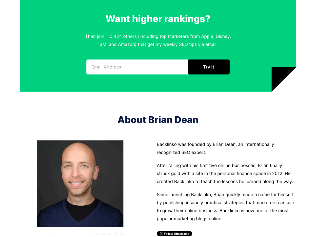
Displaying subscriber numbers or subscribers’ names and titles helps validate the newsletter’s credibility.
The inline opt-in forms blend naturally into the site layout, offering an invitation without disruption.
Copy speaks to the audience’s core goal — growing traffic and rankings — which makes the offer feel highly relevant.
This is a reminder that embedded forms can convert just as well as popups when they’re well-written and reinforced by trust signals.
Use this design to collect subscribers from blog posts, footers, or landing pages. Easily embed the form anywhere and reinforce it with trust elements like testimonials or subscriber counts. Works seamlessly on mobile.
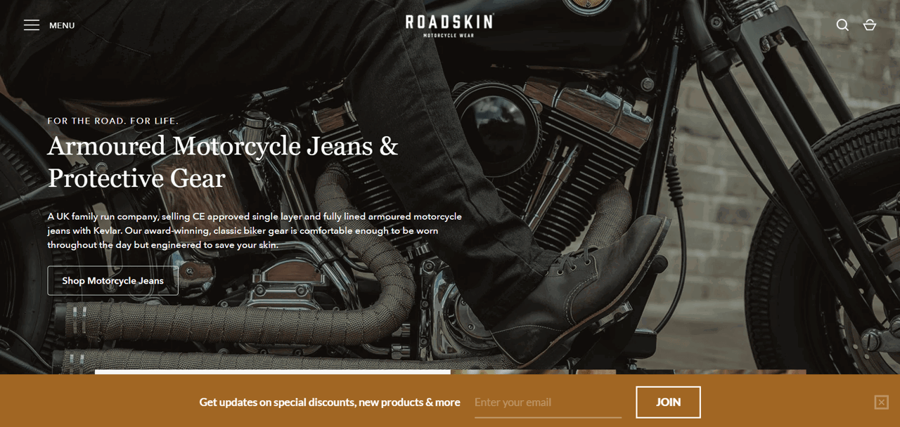
Roadskin, a UK-based biker clothing brand, uses a bottom sticky bar to promote its newsletter. The form quietly appears a few seconds after landing, offering special discounts and product updates. Despite being a subtle addition to the page, the form achieves an impressive 2.9% conversion rate.
This form is created with Getsitecontrol
The visual style of the form reflects the brand’s rugged, adventurous vibe, making it feel like a natural part of the site.
The headline gets straight to the point: join to receive discounts and product announcements — no fluff.
The single-field form and “Join” button make the process feel instant and effortless.
This example shows how even subtle newsletter signup forms, like sticky bars, can convert well when the offer is clear and well-integrated into the brand.
This template keeps your offer visible without interrupting the user journey. Customize it to match your site’s style and display it after a short delay. You can also trigger a welcome email right after signup.
Sticky bars work best when you want a persistent, low-profile prompt across your site. They’re ideal for time-sensitive offers or list-building campaigns that don’t interrupt the user experience, especially on mobile.
New York Bucket List uses a smart strategy to turn social media followers into email newsletter signups. It links to a mobile-optimized landing page directly from their Instagram bio. The top button opens a newsletter signup form, while the rest direct traffic to relevant content and promos.
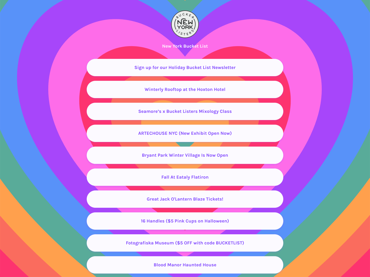
The layout is simple, vertical, and easy to tap — ideal for mobile users coming from Instagram, TikTok, or Facebook.
“Link tree” landing pages are easy to create and manage. It takes minutes to update links, swap content, or adjust the copy.
Since social platforms limit direct email capture, this is one of the few ways to turn followers into subscribers effectively.
This is a great solution if your audience lives on social media and you want a seamless way to bring them onto your email list.
Use Getform to create a dedicated landing page that will help you collect emails from Instagram, TikTok, or YouTube visitors. The app offers a solid free plan that works well for creators, publishers, and ecommerce brands.
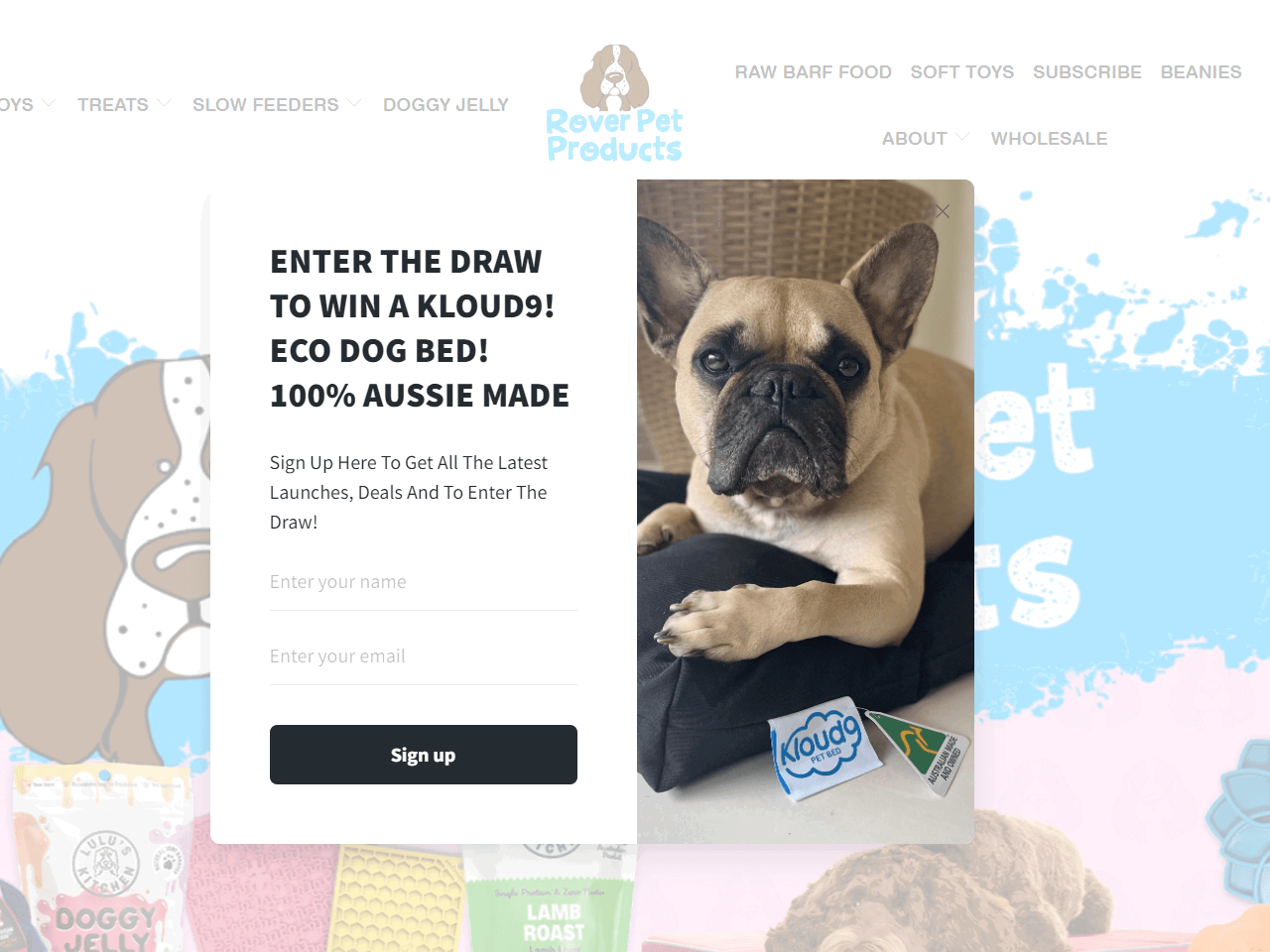
Rover Pet Products, an Australian pet supply store, uses an exit-intent popup to re-engage visitors who are about to leave the website. The form invites people to subscribe by entering a giveaway — a gentle nudge that feels timely and fun.
This form is created with Getsitecontrol
The form appears just as a visitor is leaving, giving the brand one last chance to capture an email address.
A giveaway with an appealing prize — like a dog bed — creates anticipation and taps into gift psychology.
The photo reinforces the product being promoted and speaks directly to the pet-loving audience.
This strategy is perfect if you want to reduce bounce rates and stay in touch with interested visitors who didn’t convert.
Use this exit-intent popup to capture emails before visitors bounce. Offer a discount for their next visit, a free shipping coupon, or a giveaway participation. Great for building a list of warm leads who didn’t convert on the spot.
Bleame, a personal care brand, uses a modal popup form with a twist — it includes a countdown timer to create a sense of urgency around a 10% discount.
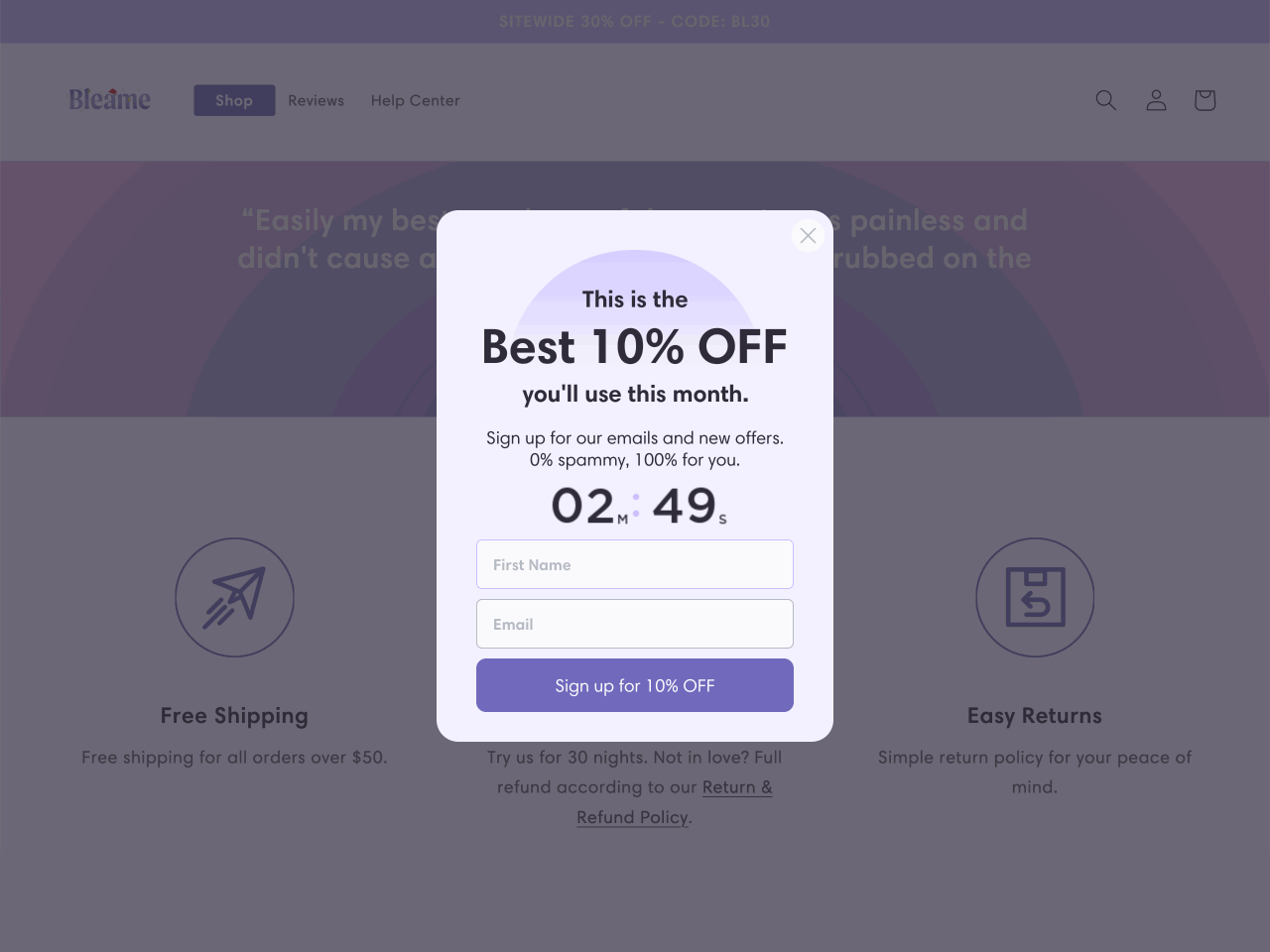
The countdown timer makes the discount feel time-sensitive, encouraging visitors to act quickly.
The form reassures subscribers with clear messaging like “0% spammy,” helping reduce hesitation and increase trust.
Even if the popup is dismissed, a floating button stays visible on the screen, letting users reopen the offer anytime.
This is a smart way to boost newsletter signups using urgency, without being too aggressive or disruptive.
Marketing Millennials is a popular newsletter about modern marketing trends. Their signup form lives on a dedicated landing page, and what makes it stand out is the copy. Everything from the author intro to the testimonials is designed to build trust and excitement.
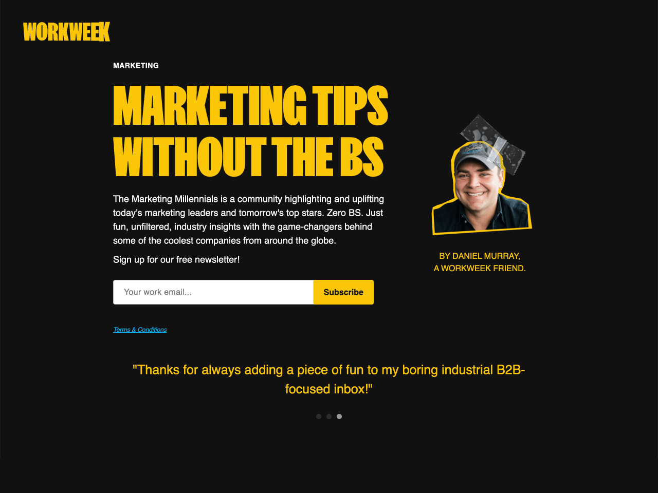
The description is crisp, jargon-free, and gives you a clear idea of what you’ll get, making the value of signing up immediately clear.
Including the creator’s photo and name adds a personal touch and builds credibility with first-time visitors.
Real subscriber quotes act as social proof and reinforce the value of joining the list. Displaying them in a compact carousel keeps the layout clean.
This is an example of how strong, human copy and subtle design can do more than flashy graphics or aggressive popups.
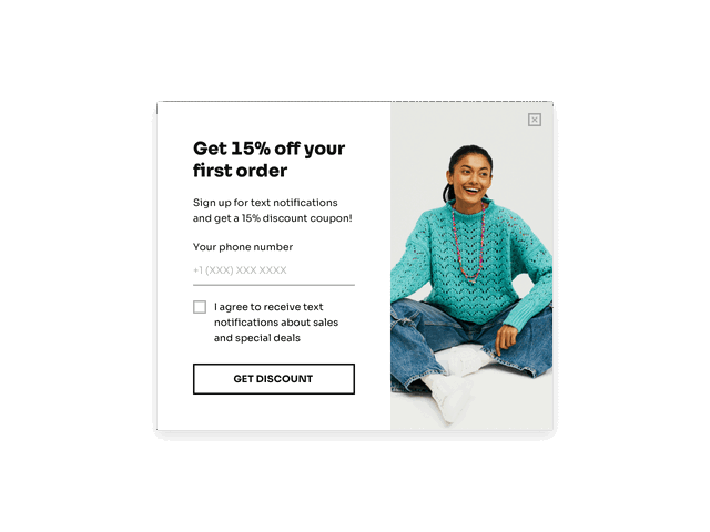
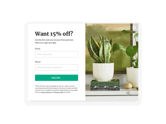
BRUNA, a jewelry brand, uses a pop-up form that collects both email addresses and phone numbers, offering a chance to win one of three €250 vouchers in return. It’s a great example of how to build both your email and SMS lists at once.
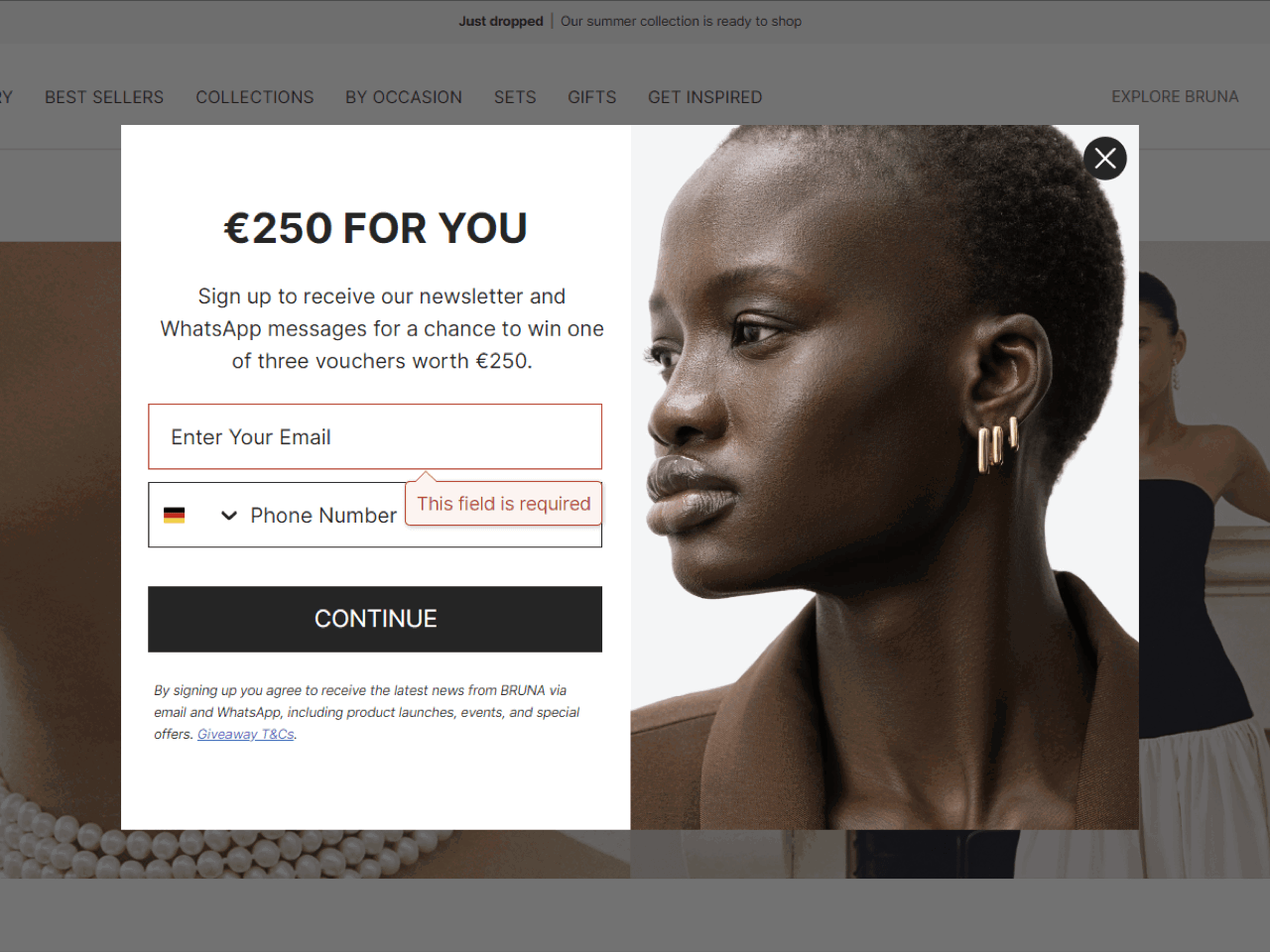
By adding a phone number field, BRUNA sets itself up for SMS marketing: ideal for flash sales and new arrivals.
The chance to win a luxury voucher creates urgency and makes it worth sharing more personal information.
Subtle legal text and clarification links help ease concerns about sharing a phone number, especially for first-time customers.
This is a smart way to grow your list across channels while keeping the signup experience elegant and incentive-driven.
Use this popup to build your SMS marketing list instead of or in addition to the email list. Works great for early access, limited-time offers, and VIP campaigns.
Collecting phone numbers is becoming particularly effective for ecommerce brands targeting Gen-Z customers and running flash sales, VIP campaigns, or product drop alerts.
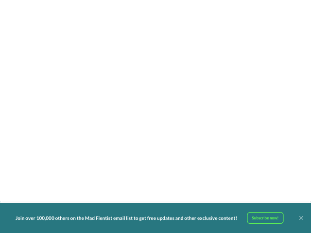
Mad Fientist, a personal finance blog, uses a two-step signup form that begins with a subtle sticky bar at the bottom of the page.
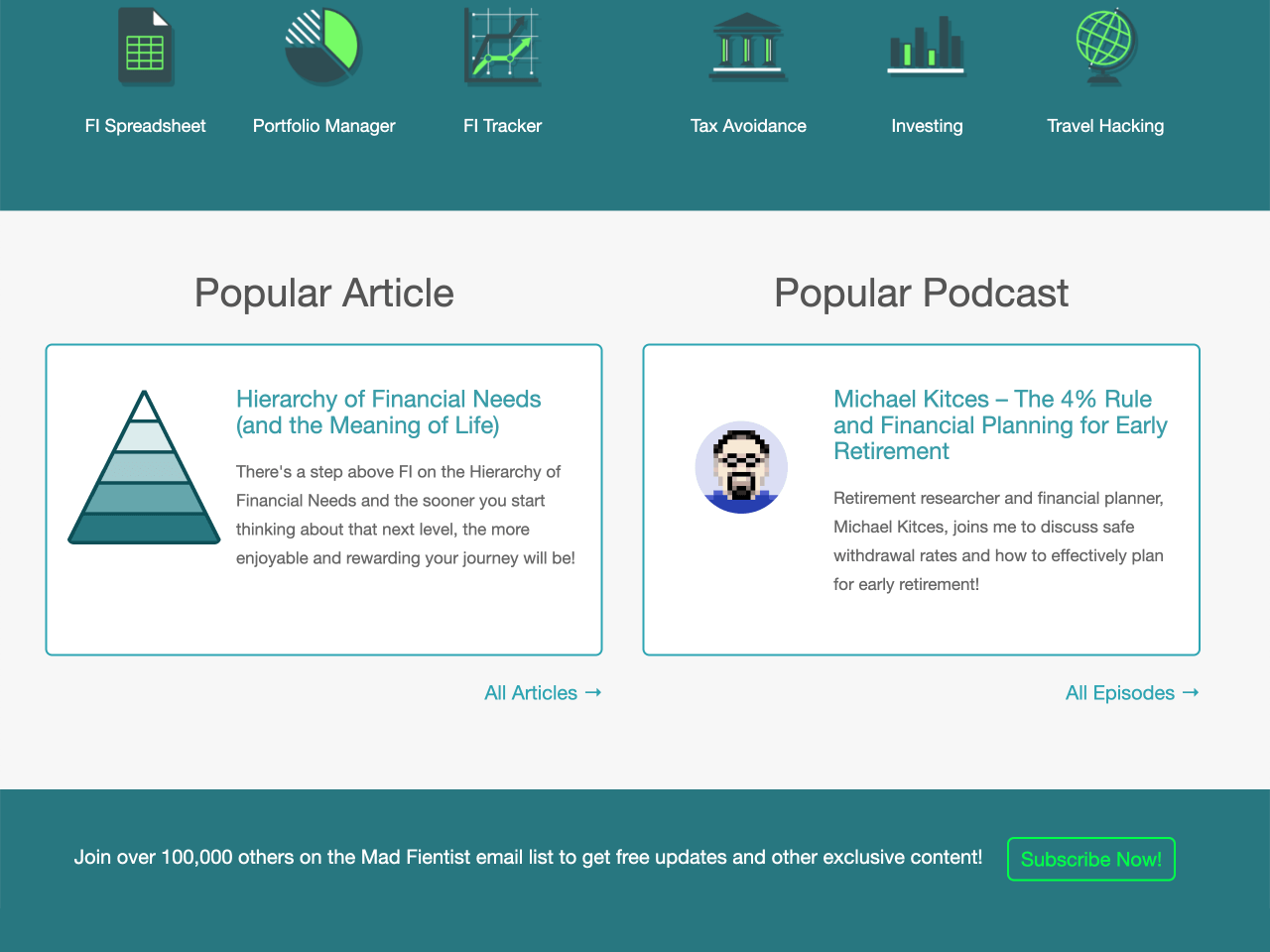
Once they click on the button, up pops a fullscreen newsletter signup form designed in the same color scheme as the website.
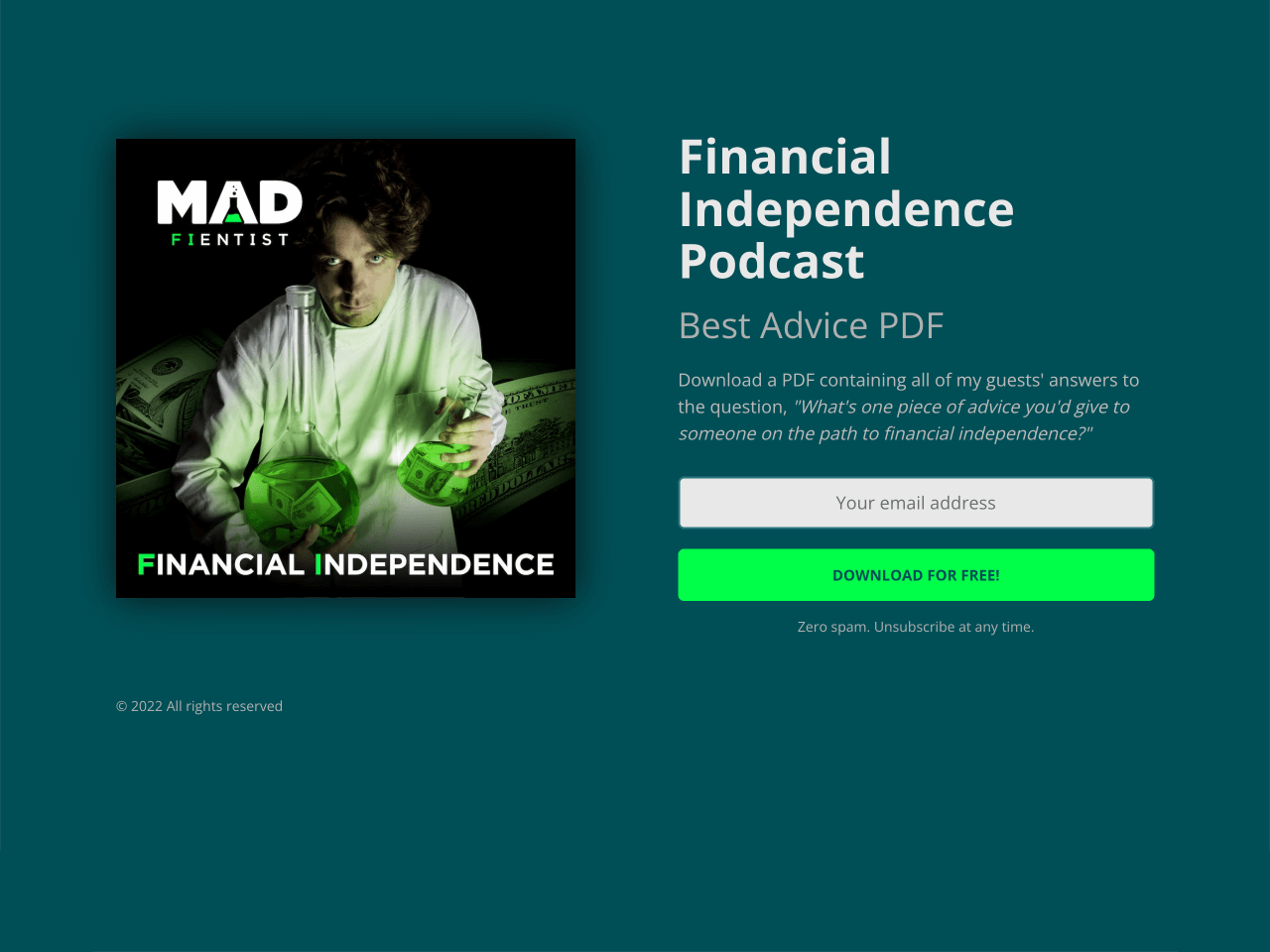
By requiring visitors to click a CTA before showing the form, this approach ensures subscribers are genuinely interested, often resulting in higher engagement.
The form highlights that over 100,000 others have subscribed, creating strong social proof.
New subscribers receive a PDF with advice from podcast guests — a compelling lead magnet that appeals to the target audience. If you plan to deliver downloadable guides like this, it’s a good idea to compress the PDF first, so the file is smaller and faster for subscribers to download.
This is a great format for blogs and media sites that value quality subscribers over quantity.
Use a floating or sticky button as a low-pressure entry point. Trigger the form programmatically, only after a deliberate click.
The way it works is straightforward: your website visitors will only see the pop-up form if they click the action button. As a rule, this means two things. First, your email list is likely to grow more slowly than in the case of a more proactive approach, like a welcome or a time-delayed popup. At the same time, you can expect higher email engagement rates because every subscriber joining your list will do it very intentionally.
This two-step approach works well if your audience needs more time to engage. Use it to capture high-intent subscribers on blogs or editorial pages where trust and context matter.
Ripped Body, a fitness site run by coach Andy Morgan, greets visitors with a clean embedded form offering a free “Nutrition Setup Guide” and a 7-day email course, right on the homepage.
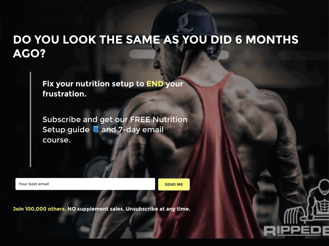
The guide and email course promise immediate value for new subscribers — ideal for building trust in a competitive niche.
By mentioning that 100,000+ people have already subscribed, the form leverages authority and credibility.
With just one field and a clear CTA, the form keeps the signup process quick and distraction-free.
This is a solid approach for educational websites focused on growing email lists through embedded signup forms.
This is an embedded form, and it’s fairly simple compared to other examples in the article. If you want to have something similar on your website, you can either choose an inline form option when creating a new form or create a fullscreen overlay.
CXL, a leading conversion optimization blog, uses a newsletter signup form that focuses entirely on clarity and value. The copy sets up a problem marketers face, and then positions the newsletter as the solution.
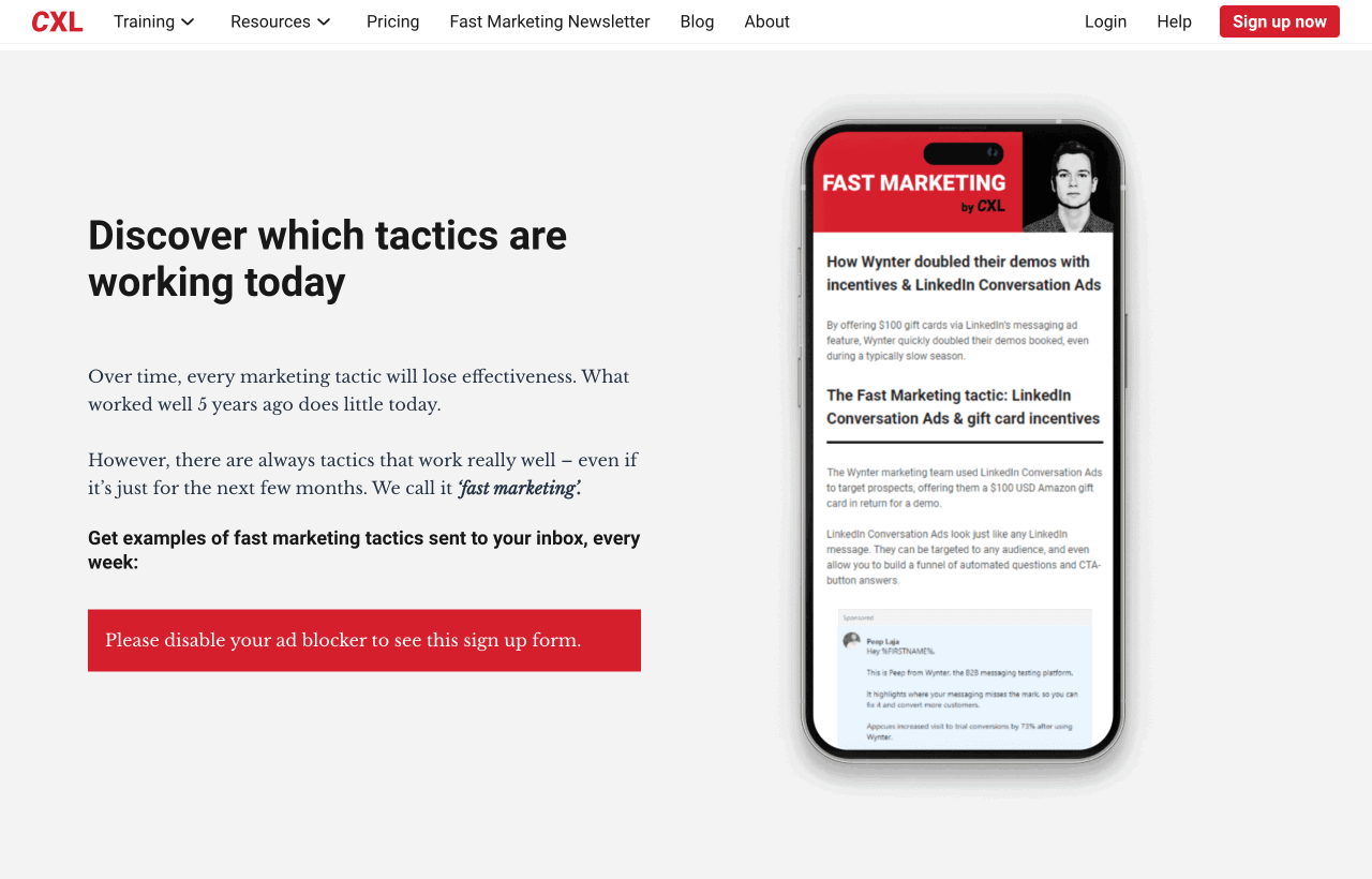
Instead of a short headline, the form uses persuasive language to describe what the reader will learn and why it matters, appealing directly to pain points.
The form includes a mockup of the newsletter on a mobile screen, showing exactly what subscribers will get in their inbox.
CXL clearly states how often the newsletter goes out and what kind of content to expect, which builds trust and sets expectations.
This is a great example of long-form copy done right — ideal for audiences that need a bit more convincing before subscribing.
Perk, a men’s apparel brand, uses a subtle two-step approach to newsletter signups. It starts with a floating button offering 15% off, and only shows the full form after a visitor clicks.
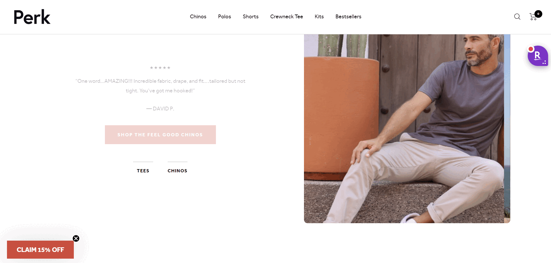
The floating button doesn’t interrupt the browsing experience. It simply sits in the corner, waiting for curious visitors to engage.
Instead of confronting users with a form immediately, Perk uses a two-step trigger, reducing resistance and increasing conversions.
The benefit of subscribing is crystal-clear: 15% off the first order, displayed prominently on the form.
This is a great tactic if you want to avoid aggressive popups while still converting casual browsers into subscribers.
If you’re looking for a subtle yet effective approach, use a floating button (a.k.a. launcher) as the entry point for your signup form. This method will help you engage users without interrupting their browsing experience.
If you’re not a developer, no worries. You can publish a beautiful, on-brand newsletter signup form in minutes using Getsitecontrol, whether you want a popup, a sticky bar, or an inline form.
Getsitecontrol is a beginner-friendly email marketing platform that helps you add professionally designed signup forms to your website and use them to grow your list and tag contacts.
Here’s how the process typically works.
Once you create an account with Getsitecontrol, you can start with a professionally designed template that fits your goals. For example, you can choose a modal popup, a more subtle slide-in, or an inline form. All templates are fully customizable, so you can easily align them with your branding.
Edit the headline, description, and CTA to match your tone of voice — or let the AI writing assistant craft persuasive copy for you. You can also adjust form fields: for example, ask for newsletter or product preferences using checkboxes. You’ll be able to use this information to tag new contacts and send more personalized emails.
Choose when and where the form should appear: on entry, after a delay, or on exit. You can also target new vs. returning visitors, tailor the form to specific pages or traffic sources.
You can automatically send a follow-up email — like a welcome message, promo code, or product recommendations — right after someone subscribes. With Getsitecontrol, it only takes a few clicks using pre-built email templates.
If you want to go the extra mile, you can A/B test your form and find out what design, text, or offer drives more conversions.
Getsitecontrol is an awesome app to get email subs. Was able to get 30% sign up rates on some campaigns which is wild. Great product.
+ Pros
Easy to use. Premade design templates were good. Simple UI. Really effective got some great conversion rates.
Apparel & FashionWhile the core principles of great signup forms apply across all industries, different audiences have unique expectations and behaviors. Here’s how to tailor your approach.
Welcome popups, exit-intent forms, sticky bars
“Get 15% off your first order + early access to sales”
Inline forms within content, scroll-triggered popups
“Join 50,000+ marketers getting weekly insights”
Simple popups, contact form integration
“Get exclusive local deals + free 15-minute consultation”
With Getsitecontrol, setting up a high-converting newsletter signup form takes just a few minutes. Choose from beautifully designed templates, tag new subscribers based on their preferences, and send automated follow-ups.
This way, you’re not just collecting emails — you’re building relationships from the first touchpoint.
Ready to give it a try? Pick a template from the gallery and launch your form today.
Start by adding your form to high-traffic pages where visitors are most likely to subscribe. That often includes your homepage, blog posts, or landing pages with clear value propositions. You can also embed it in your website's footer to keep it accessible across all pages. For time-sensitive offers, use popups triggered by scroll, delay, or exit intent — but always tailor the placement to the visitor’s journey.
If you want to encourage sign-ups for your email newsletter, offer a clear incentive, such as a discount, a free guide, VIP status, or exclusive content. Adding social proof, using compelling copy, and showing the form at the right time — like after a scroll or on exit — can also boost conversions.
Try CTAs that highlight the benefit of signing up. Instead of “Subscribe,” use phrases like “Get 10% Off,” “Join 100,000+ readers,” “Claim your free guide,” or “Get weekly growth tips.” Clear, specific CTAs tend to convert better than generic ones.
For fashion brands, visuals matter as much as the offer. Use high-quality imagery, clean design, and brand-aligned colors to make your signup form feel like a natural extension of your website. Offer an incentive that resonates with your audience and include checkboxes where visitors can select their preferences (women’s vs men’s, casual vs formal). This will help you send personalized emails later.
Many no-code email marketing tools, like Getsitecontrol, offer newsletter signup form templates, including popups, sticky bars, inline forms, and full-page overlays. You can preview each template, customize it to match your brand, and publish it on your website instantly.
Getsitecontrol’s internal research based on 200+ ecommerce websites shows that email pop-up forms convert an average of 6.57% on mobile and 3.77% on desktop. Top performers exceed 10%, while the lowest performers convert less than 1%. These benchmarks offer a realistic range of what to expect and aim for.
Colin Newcomer is a freelance writer with a background in SEO and affiliate marketing. He helps clients grow their web visibility by writing primarily about WordPress and digital marketing.
You’re reading Getsitecontrol blog where marketing experts share proven tactics to grow your online business. This article is a part of Lead generation section.
Try email marketing, free
Grow your list with free popups, send 2,000 emails for free.
Get started →Mention “email popup,” and you might picture those fullscreen forms that appear too early, blocking the content you came to read.
But modern email newsletter popups are nothing like that.
Today’s popups are designed to look on-brand, feel natural within the page, and appear at the right moment — turning visitors into subscribers without being annoying.
Of all the emails you’ll ever send to your subscribers, the first one is crucial. That’s the email where you thank them for subscribing to your newsletter.
So how do you make it memorable?
In search of inspiration, I’ve subscribed to 30 different ecommerce brands’ newsletters and sneak-peeked at their welcome emails.
Below, I’ll share 10 of my favorite email examples, explain why they work well, and provide a couple of templates you can steal.
Mention “email popup,” and you might picture those fullscreen forms that appear too early, blocking the content you came to read.
But modern email newsletter popups are nothing like that.
Today’s popups are designed to look on-brand, feel natural within the page, and appear at the right moment — turning visitors into subscribers without being annoying.
Subscribe to get updates
Get beginner-friendly tips for growing your online business.