

Try Getsitecontrol for free
Create high-converting popups within minutes –

If you like the idea of using popups in your store but aren’t sure if they’re worth it, you may want to stop for 10 minutes to read this article.
Because we have gathered 15 popup stats that prove how effective popups are, which type is best to use, and what results you can expect.
Does this sound interesting?
Great! Let’s get started.
What the data shows
For this research, we analyzed over 200 of our users' popups. About 90% of websites in our dataset are ecommerce stores, while the rest can be categorized as blogs and online media.
Our first question was: do popups work better on mobile devices or desktops?
To see the average click-through rates for desktop and mobile devices, we checked every type of popup — modal popups, slide-ins, fullscreens — and for every use case — email sign-up forms, coupon popups, promotional campaigns, and so on.
The results showed a 10% average click-through rate for mobile devices and 7.09% for desktop. That means mobile popups engage on average 42.04% better than popups on desktop
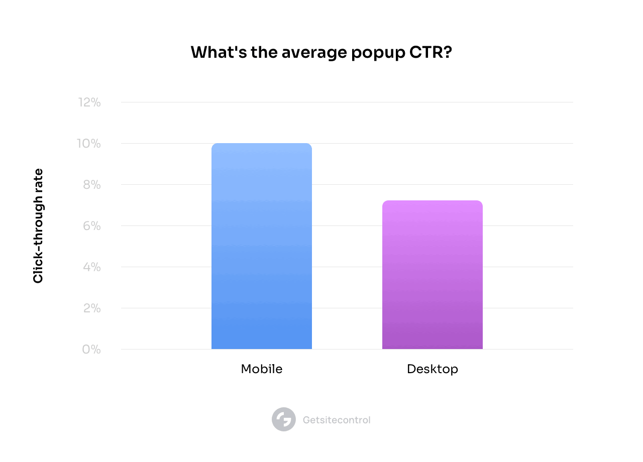
We also saw that the top 10% of popups engaged over 20% of visitors on mobile and 15% on desktop. On the other hand, the 10% worst-performing popups saw click-through rates of 1.09% on mobile at under 0.5% on desktop.
Why do popups perform so much better on mobile devices? Our assumption is that compared to desktop, mobile visitors tend to be more engaged and responsive to CTAs in general, probably due to the fewer distractions when browsing on mobile.
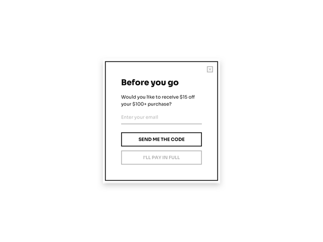
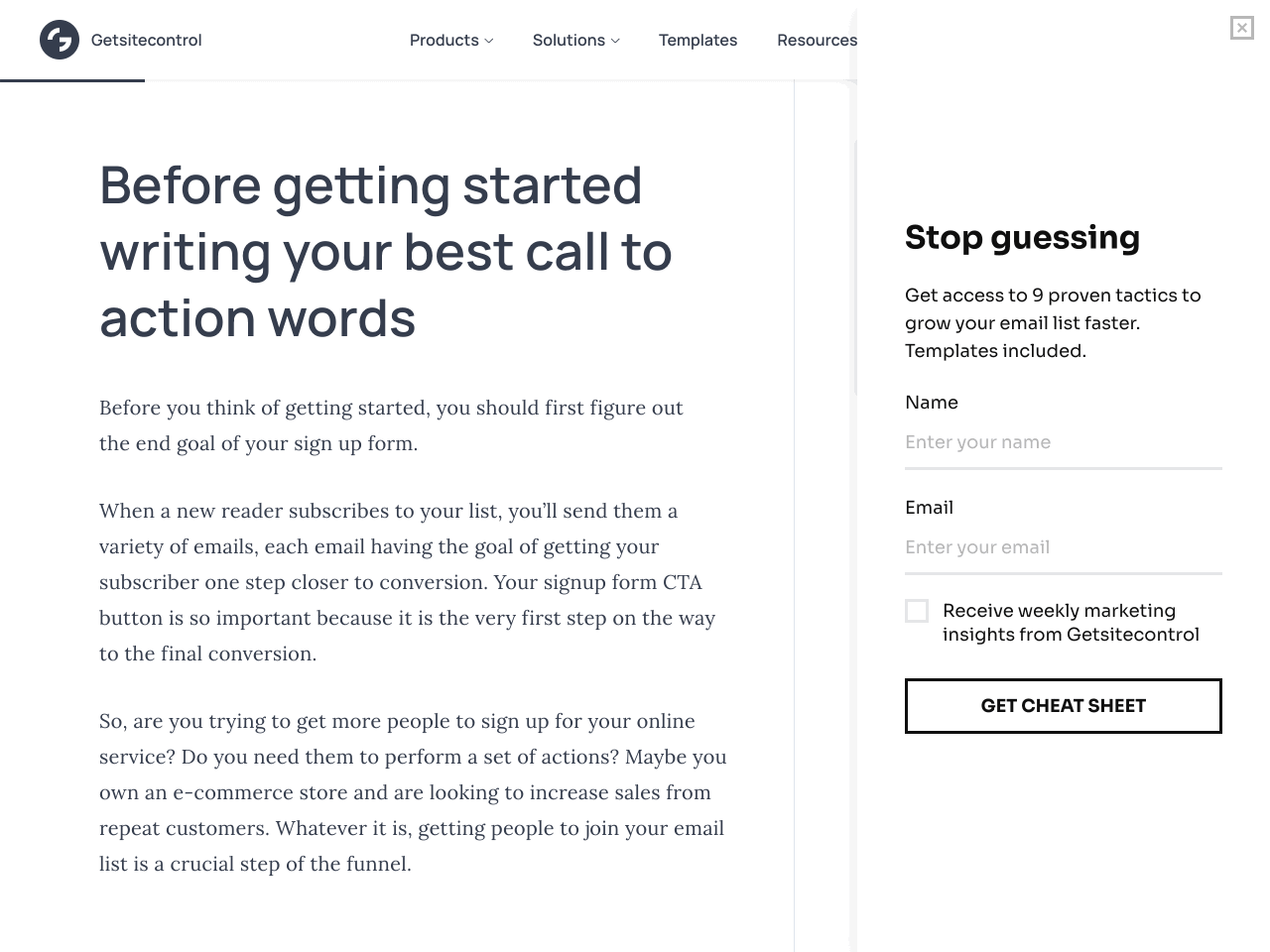
Since we know most of our readers want to know how to build an email list, and whether popups can help them drive more subscribers, we checked email popup statistics for forms like the one you can see below:
Much like our previous stat, we found mobile popups convert an average of 6.57% of visitors, while desktop popups convert only 3.77%.
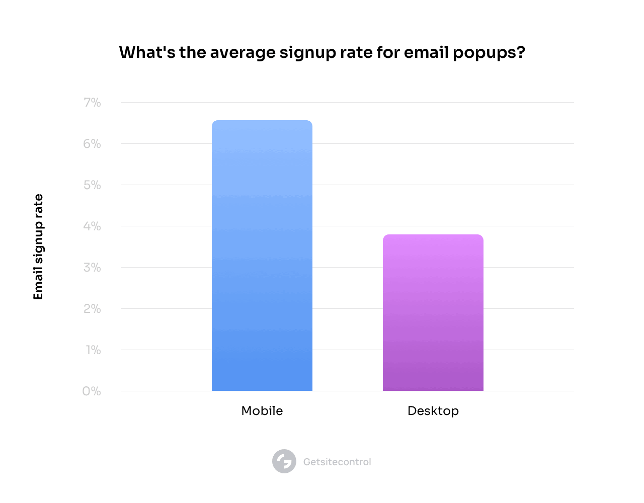
The top-performing users converted 25% of visitors on mobile and 20% on desktop. The worst 10% of performers convert less than 1% on mobile and less than 0.5% of visitors on desktop.
Now that we’ve established the baseline, let’s see how other elements – such as images, lead magnets, and opt-out buttons – can affect popup conversion rates.
Marketers often say using images in a popup makes them more persuasive than when no images are present. But is it true?
In the same experiment as before, we found that popups with images engaged 7.49% of visitors, whereas showing no images saw the number drop to 5.82%.
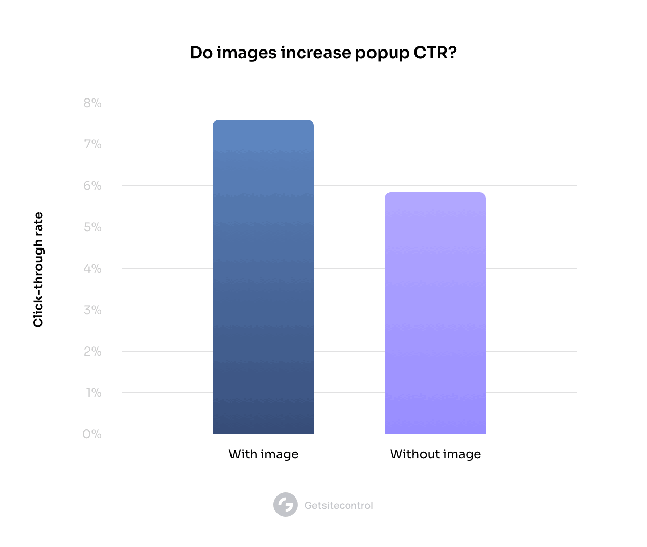
It’s important to note that our analysis was solely focused on desktop devices, as many of our users didn’t use any images on mobile (which can be a good design practice for mobile popups).
When we repeated the same analysis only for email form popups, we found that showing images converts 4.3% of visitors, whereas they only convert 2.63% when no images are present. That means adding an image can increase your email popup conversion rate by 63.49%.
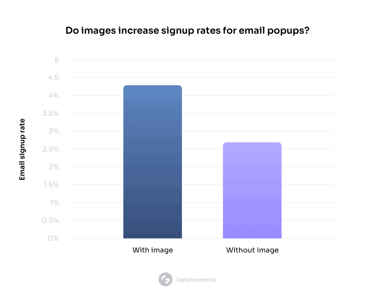
The lesson here is that you should always use images on your popups, at least when you’re targeting visitors on desktop devices.
When choosing an image for your popup, consider using product images, photos of your customers using your product, or even GIFs. Here is a list of email popup examples for your inspiration.
Adding an “opt-out” button to your popups is a good way to give visitors a chance to reject your popups without having to search for the exit button.
You can also use them to make the visitor think about the cost of rejecting your offer. Joanna Wiebe, the founder of Copyhackers, explains that it’s a good idea to write opt-in copy that “focuses on enjoyment and opt-out button copy that focuses on pain or work.”
When we compared the popups with one action button against those that had two (the second one being an opt-out), we discovered the latter had 14.34% higher conversion rates (8.05% versus 7.04%).

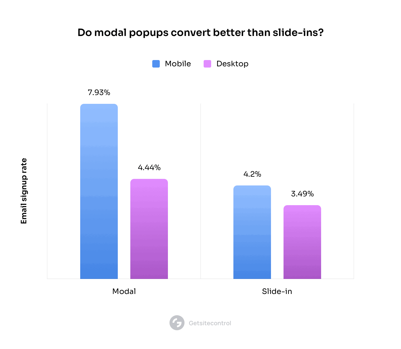
We analyzed the same dataset to see whether modal popups converted visitors into subscribers better than slide-ins.
For the reference, this is what modals and slide-in look like. The former pops up in the middle of the screen, while the latter slides in from the corner 👇🏼
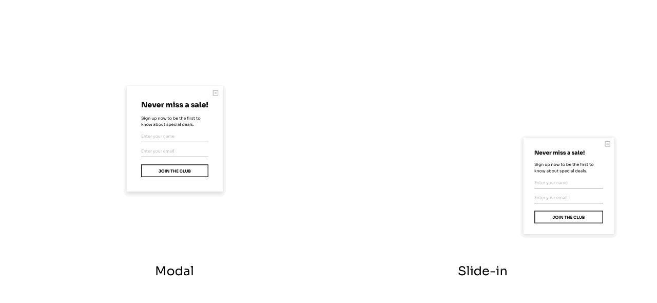
Expectedly, modals won this comparison, however, the results on mobile devices differed significantly more than on desktops.
The results for mobile devices were as follows:
Modals: 7.39%
Slide-ins: 4.20%
Our analysis showed modals convert 75.95% better than slide-ns.
On desktop, the results were a bit more subtle, with modals (4.44%) outperforming slide-ins (3.49%) by only 27.22%
In case you’d like to know popup statistics for other formats, earlier this year, we tested email signup rates on our own website. We ran five different popups against each other: a fullscreen, modal popup, slide-in, sidebar, and sticky bar.
At the end of the test, we found that the fullscreen popup had received the highest signup rate at 3.41%. Following it was the modal popup, with a conversion rate of 2.95%, and the sidebar at 2.61%. Last came the sticky bar (2.3%) and slide-in (2.17%).
Although fullscreens won that competition, we still recommend being cautious with this popup type because when overused, it can easily worsen UX on your website. The best practice would be testing them against less intrusive alternatives to ensure the best visitor experience.
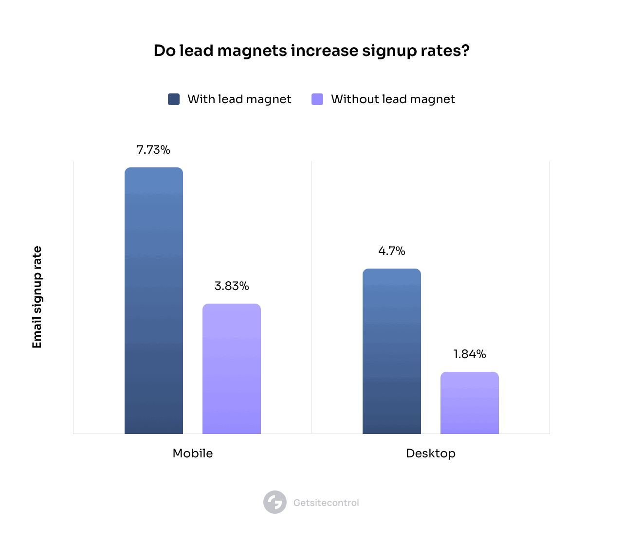
Lead magnets have been proven time and time again as a surefire way to build an email list and increase signup rates. In our analysis, we expected popups with lead magnets to beat those without them; we wanted to see for how much.
Our research found that email form popups without lead magnets converted 3.83% on mobile and 1.84% of visitors on desktop. Adding a lead magnet increased the average conversion rate to 7.73% on mobile and 4.7% on desktop — a 101.82% and 155.43% difference, respectively.
Interestingly, our research didn’t find a large difference in conversion rates for popups offering percentage-based discounts, regardless of their amount (10%, 15%, or 20%).
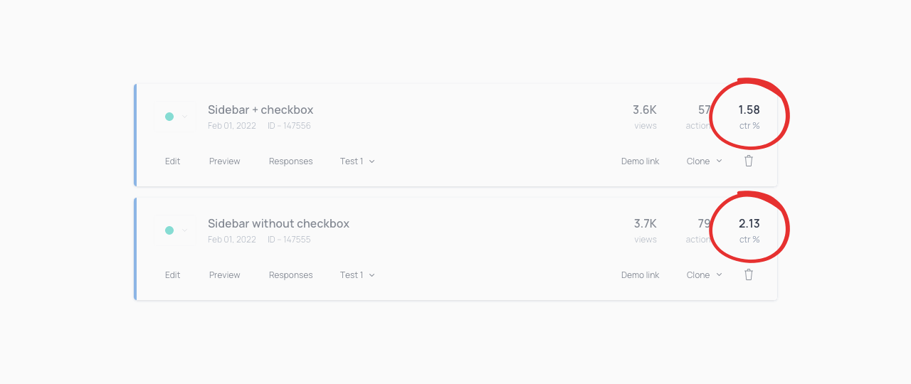
Laws like the EU’s General Data Protection Regulation (GDPR) and Canada’s Personal Information Protection and Electronic Documents Act (PIPEDA) force website owners to ask for consent when inviting a visitor to sign up. Some choose to obtain consent via a double opt-in, others choose to add a consent checkbox directly to the newsletter signup form.
However, when it’s mandatory, asking for consent can lower the conversion rate slightly. This is expected, as anything that adds friction does so.
In our tests, we found that when we tested adding the mandatory consent checkbox, our email signup rate decreased by 25.82%.
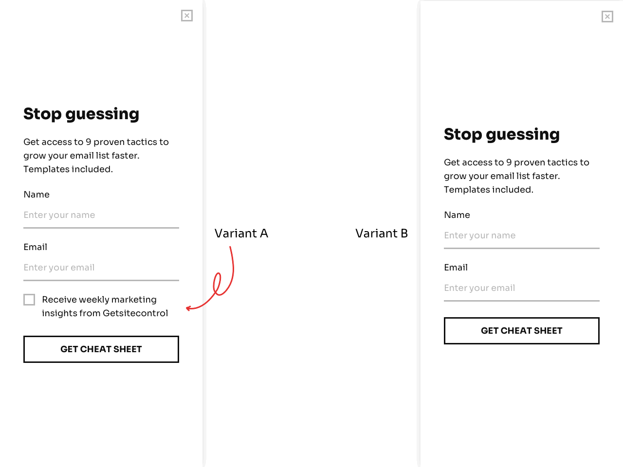
Although this isn’t a huge deal, it’s something that you must consider when planning and designing your popups.
The quality of your popup offer will depend greatly on its context. For example, a free shipping coupon on a contact page won’t look as enticing as when you show it after someone added a product to cart.
We found this to be true in our blog. When we offered a content upgrade, an email list building checklist, it converted times better in the articles closely related to email list building.
Here’s what the content upgrade looked like:
And here are its conversion rates for different articles on our blog:
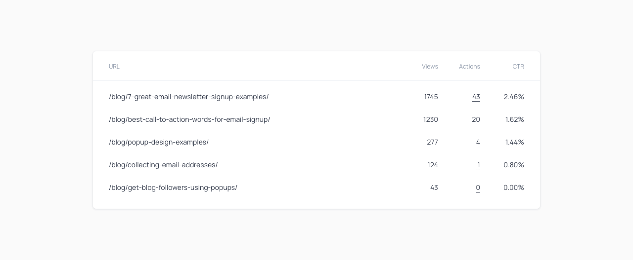
When possible, make your popup offers relevant to the context surrounding them. And in your blog, use content upgrades if you want to take your list building to the next level.
The popularity of exit-intent popups stems partly from their supposed power to stop potential leads or customers from leaving your store. By offering a last-minute offer that entices someone to add a product to your cart or complete a purchase, exit popups can increase your sales.
But how much so?
Our data suggests that you can convert up to 7% of abandoning visitors into email subscribers if you offer a discount for the next purchase, and save up to 13.5% of abandoned sales if you encourage customers to finish checkout with a coupon:
Other researchers have got similar results. For example, according to data from Conversion Sciences, you can save between 10 to 15% of abandoning visitors — assuming that you present a well-crafted pop-up message.
Scarcity plays a major role in persuasion, as Robert Cialdini showed us in his book Influence.
One way to magnify an offer scarcity is by using countdown timers.

To see whether countdown timers actually worked, Drip analyzed millions of their users and found that popups with a countdown timer converted 8.07% of the time, 112.93% better than popups without one (3.79%).
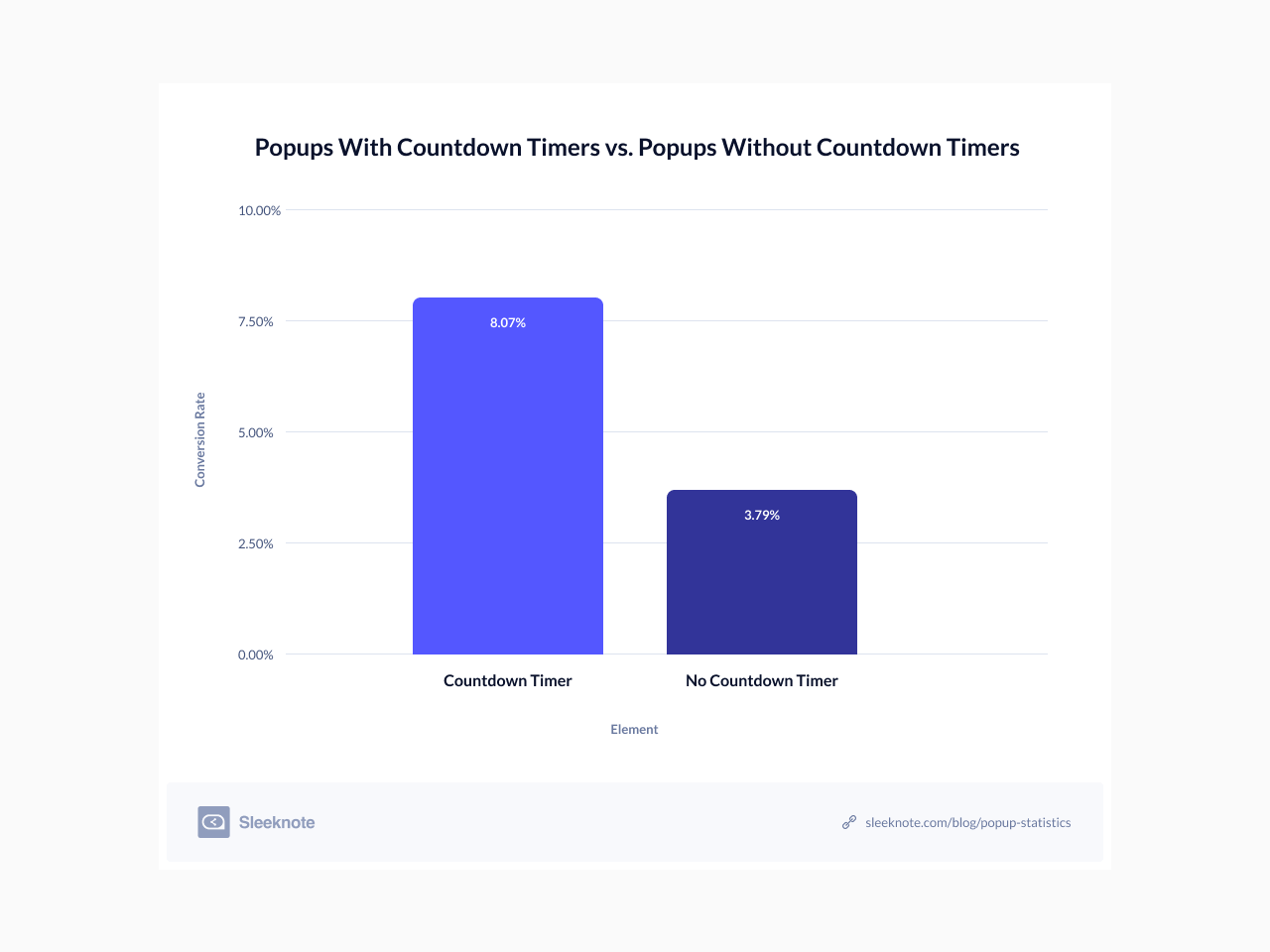
Countdown timers work best for time-sensitive offers, such as a short sales promotion or an abandoned cart discount popup.
Another popular way to increase the conversion rate of popups is to reduce their signup friction, such as lowering the number of input fields shown.
Drip analyzed their users’ popups with one to five input fields and found the following conversion rates for each one:
There’s an almost linear inverse relationship between input fields and conversion rates — the more input fields, the lower the conversion rate, and vice-versa.
The most interesting part is that popups with two input fields outperform those with three by 206.48%. However, the ones with one input field lowered the performance by 3.43%.
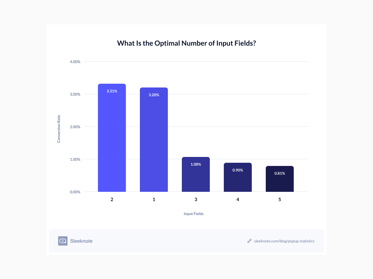
Remember: whenever possible, you shouldn’t use more than two input fields in your popups — unless you really need them. Also, we’d suggest you test one and two-input field popups on mobile as the UX isn’t as optimal as on desktop.
There’s nothing worse than shoving a popup to a visitor as soon as they land on your site. Even welcome popups should be delayed a few seconds.
Now, the question is, how long should you wait?
Our test results showed that delaying popups for more than five seconds (5.26%) generated 52.02% more conversions than delaying them for two to five seconds (3.46%). Interestingly, we saw that popups delayed for less than two seconds converted at 4.01%.
To give you a more specific recommendation, we have to rely on Drip’s study. They found that popups delayed for eight seconds converted better than popups shown before or after. In fact, the eight-second mark outperformed the second one by 34.57%.
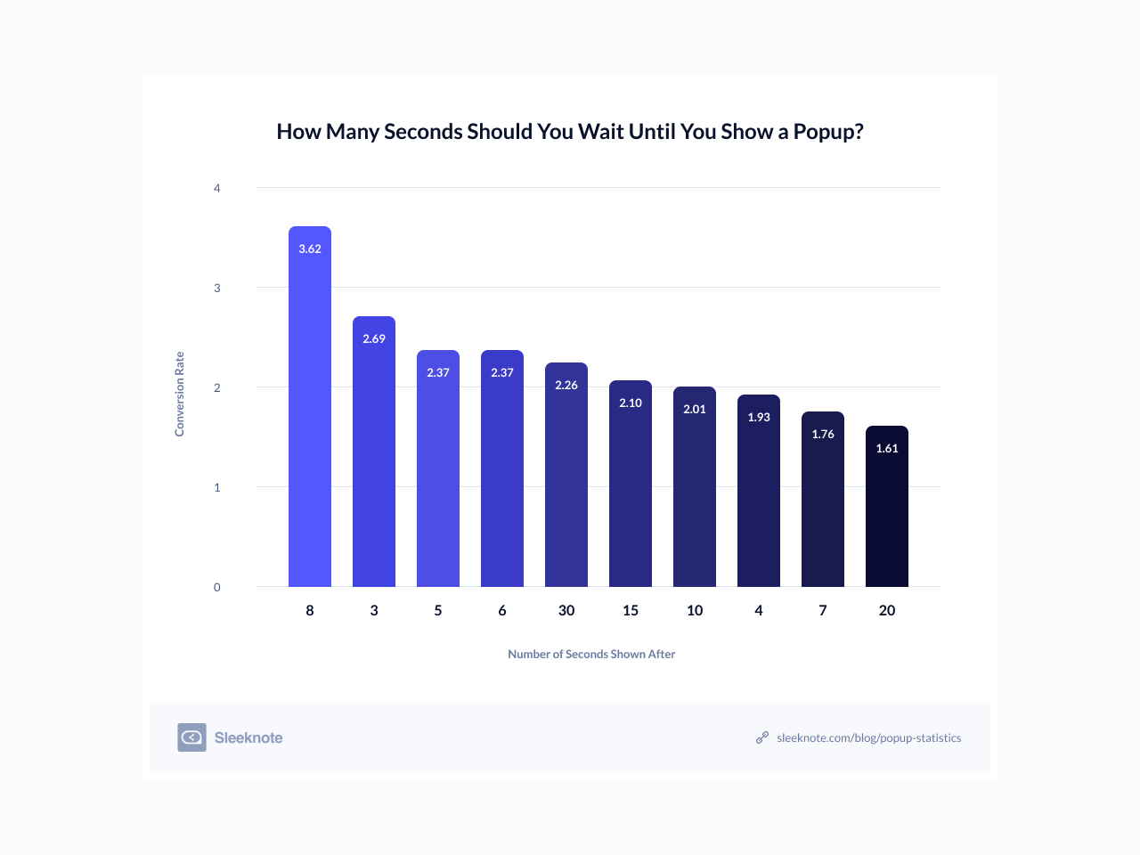
All the results show that the ideal time to delay your popups is between three to 30 seconds.
However, use these marks as a benchmark. You should use a delay time that best fits your average time on site. For example, if it’s 20 seconds, delay your popups five to ten seconds before that mark.
Besides time, you can also delay your popups by scrolling depth.
Drip analyzed the same dataset from the previous statistic and found that the top 10 highest-performing popups by scroll percentage show up after a visitor scrolled at least 35% of a page.
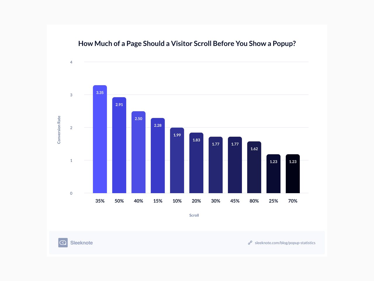
The minimum scrolling depth is 10% (1.99%), and 80% is the highest (1.62%). However, 10 to 50% seems to be the ideal range.
Now that you are done, you’ve got a lot to think about. Where do you start?
To put everything you learned today, let’s take a quick recap of what these website popup statistics can teach you about running high-converting popups:
If you’re looking for an easy tool to apply some of the best practices we’ve covered in this article, you can get started with the free popup builder. It lets you design responsive popups for promo campaigns or announcements and publish them on your website via a code snippet, without having to create an account. If you prefer a full-featured platform with more advanced editing options and templates, consider creating a free account with Getsitecontrol.
Ivan Kreimer is a freelance content writer for hire who creates educational content for SaaS businesses like Leadfeeder and Campaign Monitor. In his pastime, he likes to help people become freelance writers. Besides writing for smart people who read sites like Getsitecontrol, Ivan has also written in sites like Entrepreneur, MarketingProfs, TheNextWeb, and many other influential websites.
You’re reading Getsitecontrol blog where marketing experts share proven tactics to grow your online business. This article is a part of Lead generation section.
Create popups for free
Email forms, promos, coupons, surveys, bounce-stoppers.
Get started, it’s free →Adding a newsletter signup form to your website is the most effective way to grow your email list. However, the format you choose matters as much as the offer itself. A sticky bar works differently from a popup. An inline form embedded in a blog post reaches a completely different visitor than an exit-intent modal.
In this guide, we’ll walk through 7 types of newsletter signup forms, explain when to use each format, and include ready-made templates. The recommendations are based on conversion data collected from thousands of websites using Getsitecontrol — a popup and email marketing platform that lets you launch newsletter signup forms on any website in minutes, without coding.
Looking to grow your email list?
Well, the most effective way to gain new email subscribers is to take advantage of the traffic you’re already generating.
How? By adding an eye-catching subscription form to your website.
In this blog, we’ve talked about creating email popups and collecting email addresses using the Getsitecontrol form builder. But if you’re looking to boost conversion rates significantly, having a great tool isn’t enough.
Popups are a powerful tool to grow your email list, promote offers, and guide visitors toward key actions.
Our data shows that a well-designed email popup can convert 3.77% of your visitors into subscribers on desktop, and 6.57% on mobile, on average.
But not all popups deliver results — there’s a stark difference between those that fall flat and those that convert.
Subscribe to get updates
Get beginner-friendly tips for growing your online business.