Create exit-intent popup now
Pick a template, adjust the text and image,

Exit-intent popups are one of the most effective ways to stop first-time visitors from disappearing for good.
Here’s why that matters: nearly 3 out of 4 customers never return even after making their first purchase — which means you often only get one shot at converting them.
That’s where exit popups shine: by showing the right message at the right moment, you can turn abandoning visitors into subscribers, buyers, or valuable leads.
In this post, you’ll see exit popup examples that invite visitors to join the email list, prevent cart abandonment, address common objections, or survey customers to help understand why they are leaving.
You can replicate any of these examples on your website using Getsitecontrol — a beginner-friendly platform for email marketing and popups.
Let’s get started.
An exit-intent popup is a modal window or a slider that appears when a visitor is about to leave your website — right as they move to close the tab, click the back button, or navigate away.
The technology behind it is called exit-intent detection.
On desktop, it tracks cursor movement and triggers the popup when the mouse moves toward the browser’s close button or address bar.
You’ve probably encountered these popups on ecommerce websites, where they typically offer a discount or free shipping in exchange for an email address. But exit popups can do much more: promote sales, gather feedback through surveys, or prevent shopping cart abandonment.
The key advantage? They don’t interrupt visitors while they’re browsing — they only appear when someone has already decided to leave, making them far less intrusive than standard popups.
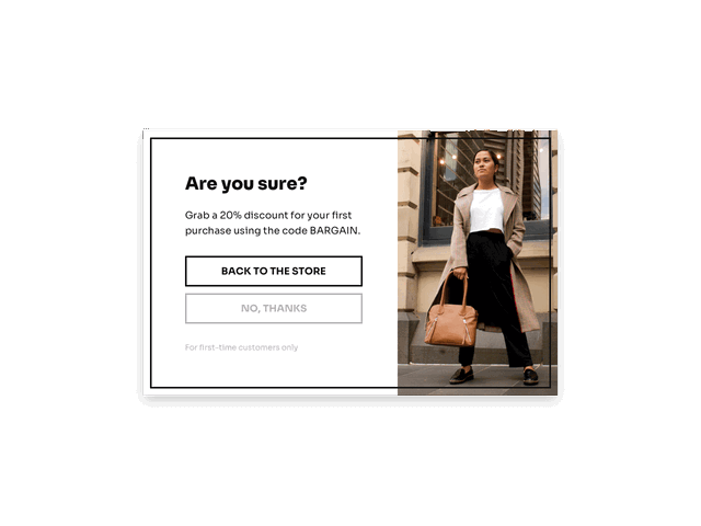
These popups invite visitors to subscribe in exchange for a reward — usually a discount — right before they leave. Their goal is to convert abandoning visitors into email subscribers, so the brand gets a chance to reach them later via inbox.
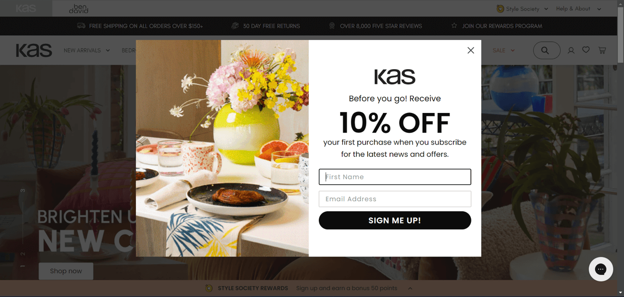
KAS, a home decor brand, uses a split-layout exit popup with a bright lifestyle photo and a short signup form offering 10% off the first purchase.
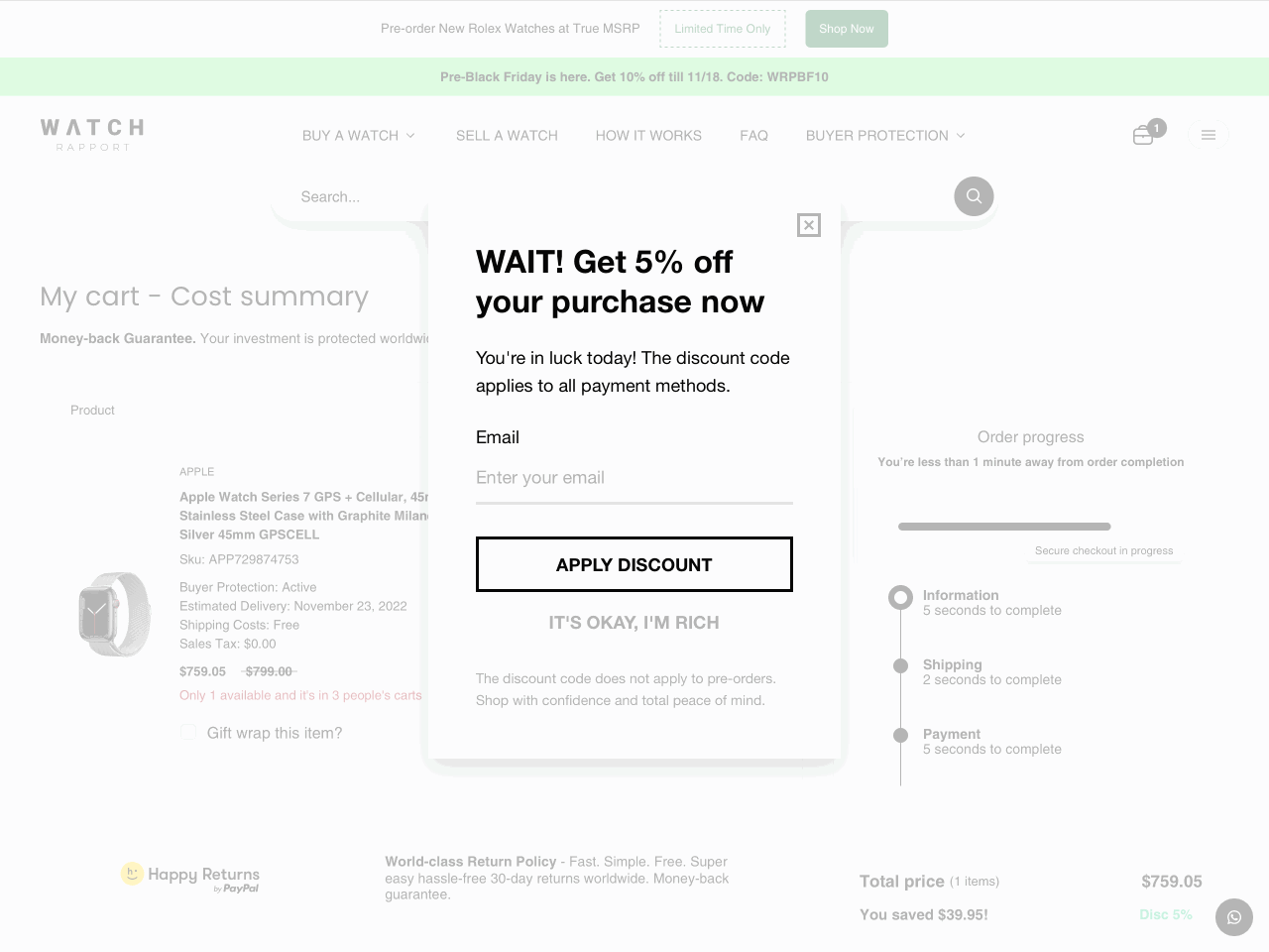
Watch Rapport, a luxury watch retailer, implements an exit-intent popup that only appears when a customer tries to leave after adding an item to their cart. The form offers a 5% discount in exchange for an email address, helping the brand recover potential lost sales while growing its email list.
This popup is made in Getsitecontrol
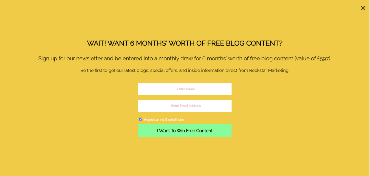
The author of the Rockstar Marketing blog deploys a bold yellow fullscreen popup offering entry into a draw for six months of free blog content worth £597. The offer feels exclusive and instantly grabs attention.
These popups appear when a shopper has items in their cart but starts heading to exit before completing checkout. Their purpose is to remind, reassure, or gently re-engage — not just to push a discount.
Catget, an online pet shop, displays a warm exit popup featuring a 10% savings coupon for shoppers who are leaving items in their cart. The message comes across as friendly and pairs well with the cozy image.
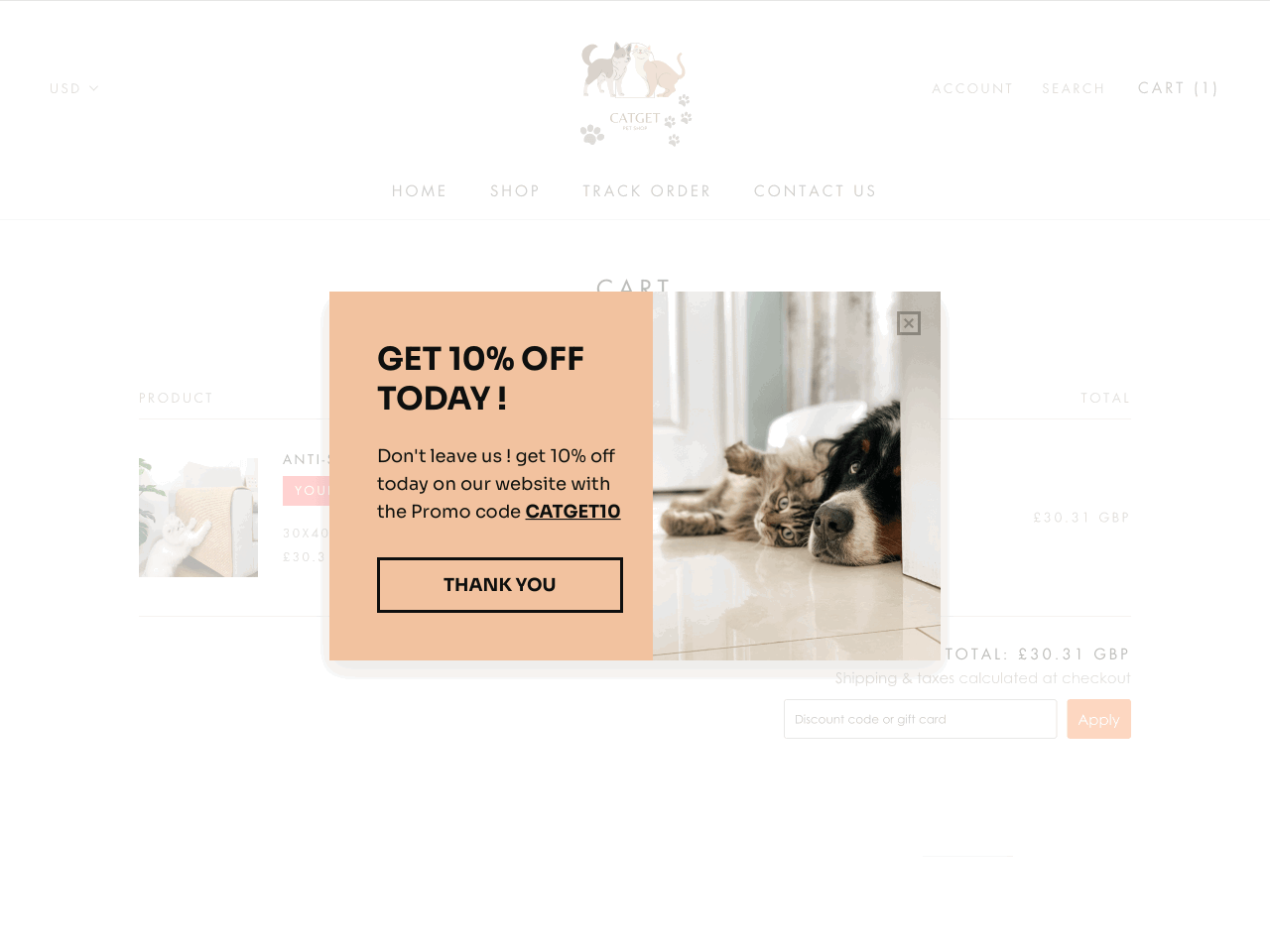
This popup is made in Getsitecontrol
MANC, a luxury accessory brand, features a minimalist brown popup reminding shoppers about items in their cart and inviting them to join the MANCSQUAD community while promising 10% off.
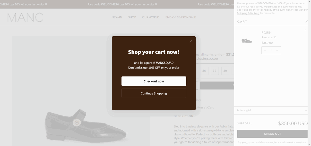
This popup is made in Getsitecontrol
Vintage Threads opts for a minimalist white popup with a simple message: “You’ve left items in the cart. Worry not, they’re still reserved for you.” It reassures shoppers instead of pressuring them to buy.
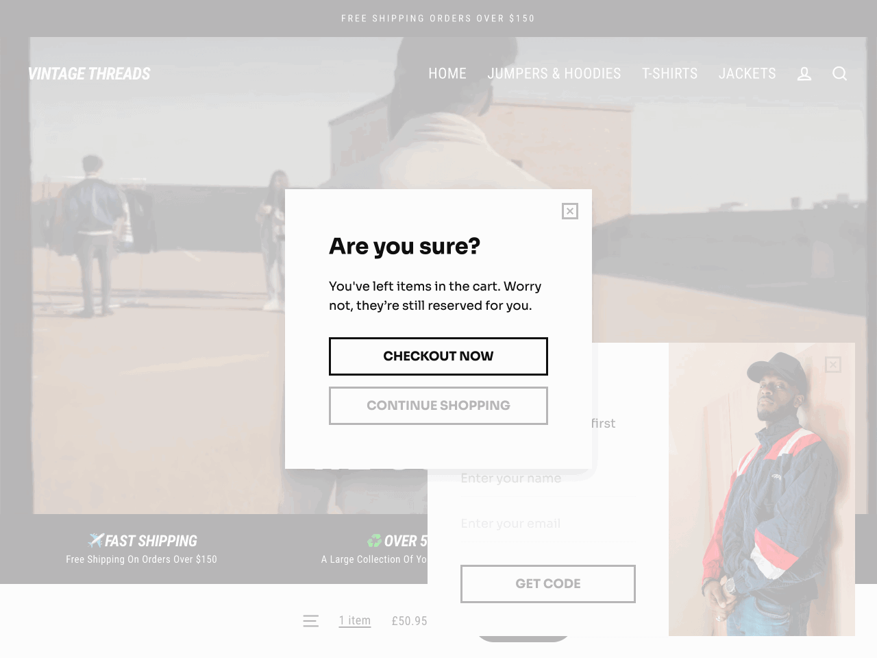
This popup is made in Getsitecontrol
Sometimes, visitors leave without buying because something didn’t feel right: a missing detail, a confusing layout, or a pricing concern. Exit-intent surveys can help uncover those reasons and serve as a part of your customer support system, turning lost opportunities into insights you can act on.
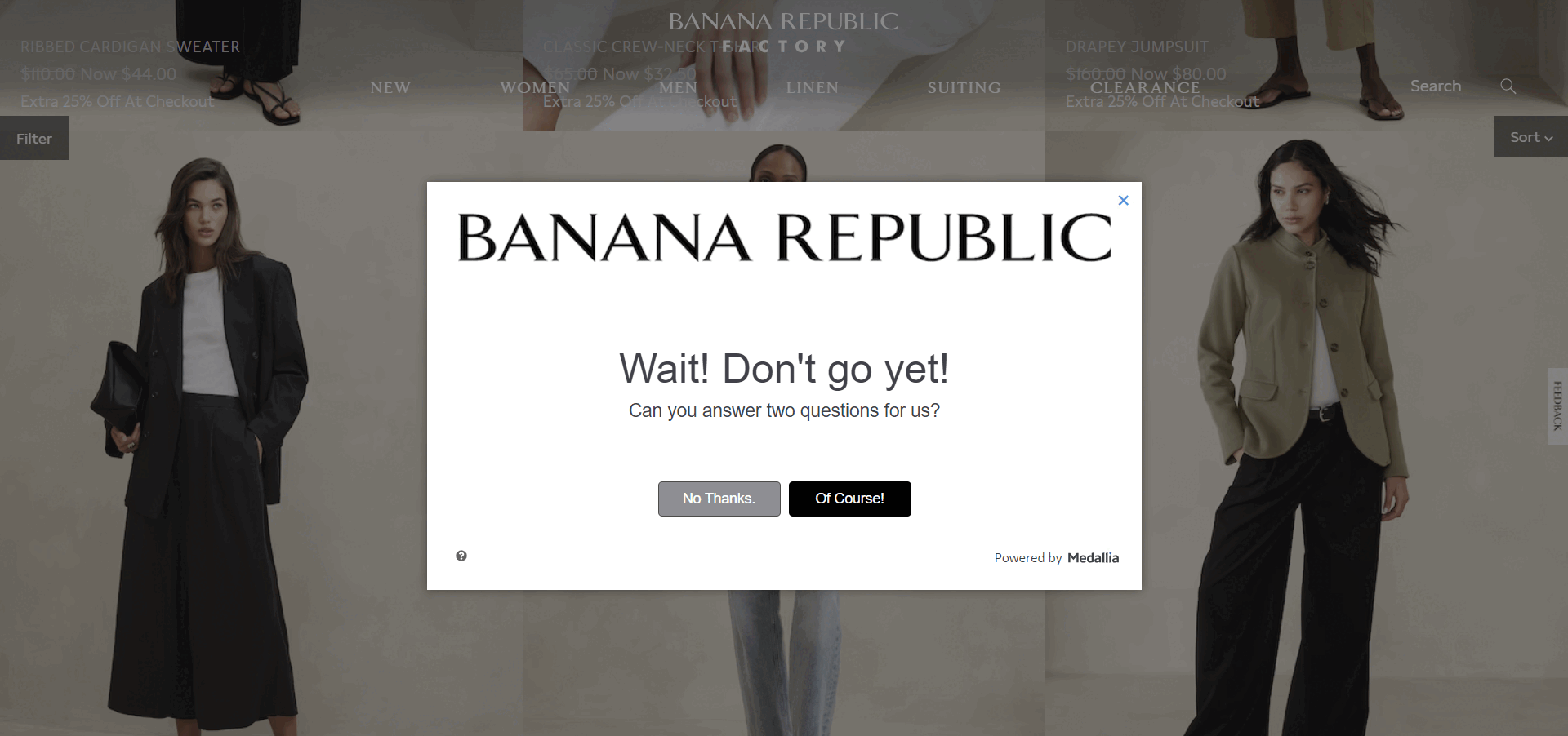
When visitors try to leave without completing a purchase, Banana Republic invites them to answer two short questions. If they agree, a simple survey appears asking how likely they are to recommend the brand and what stopped them from buying.
Ashluxury displays a short exit survey on product pages, asking shoppers why they’re leaving. The options cover common issues like size, cost, and payment preferences — all within a clean, stylish layout.
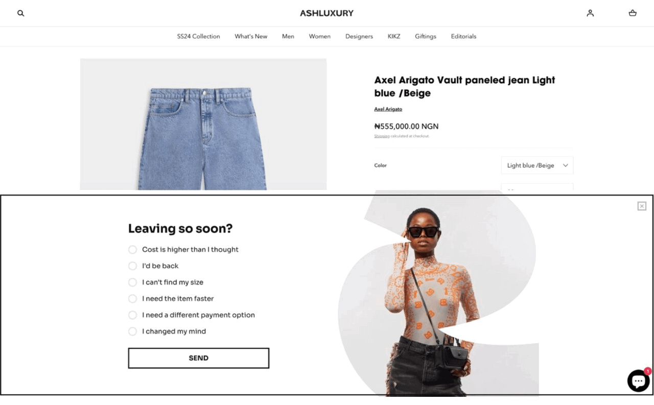
This popup is made in Getsitecontrol
Cap Point uses a clever exit-intent popup that doubles as a customer feedback form and a discount reveal. Visitors can either share why they’re leaving or click to claim a hidden discount, which appears after submission.
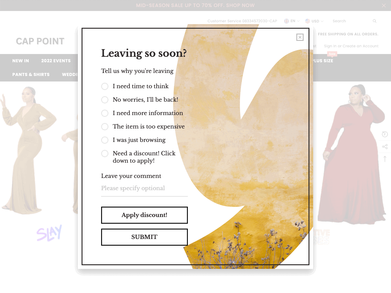
This popup is made in Getsitecontrol
Getsitecontrol is fantastic. It helps us get feedback from our customers (those that buy and also those that choose not to) without being too intrusive.
Online art store shopifyNot every exit popup needs to introduce a new discount. Sometimes, all it takes is a quick popup to remind visitors that a sale is live — in case they missed it while browsing. These reminders help bring shoppers back to explore the offer, and you can easily replicate them on your website with a free popup builder.
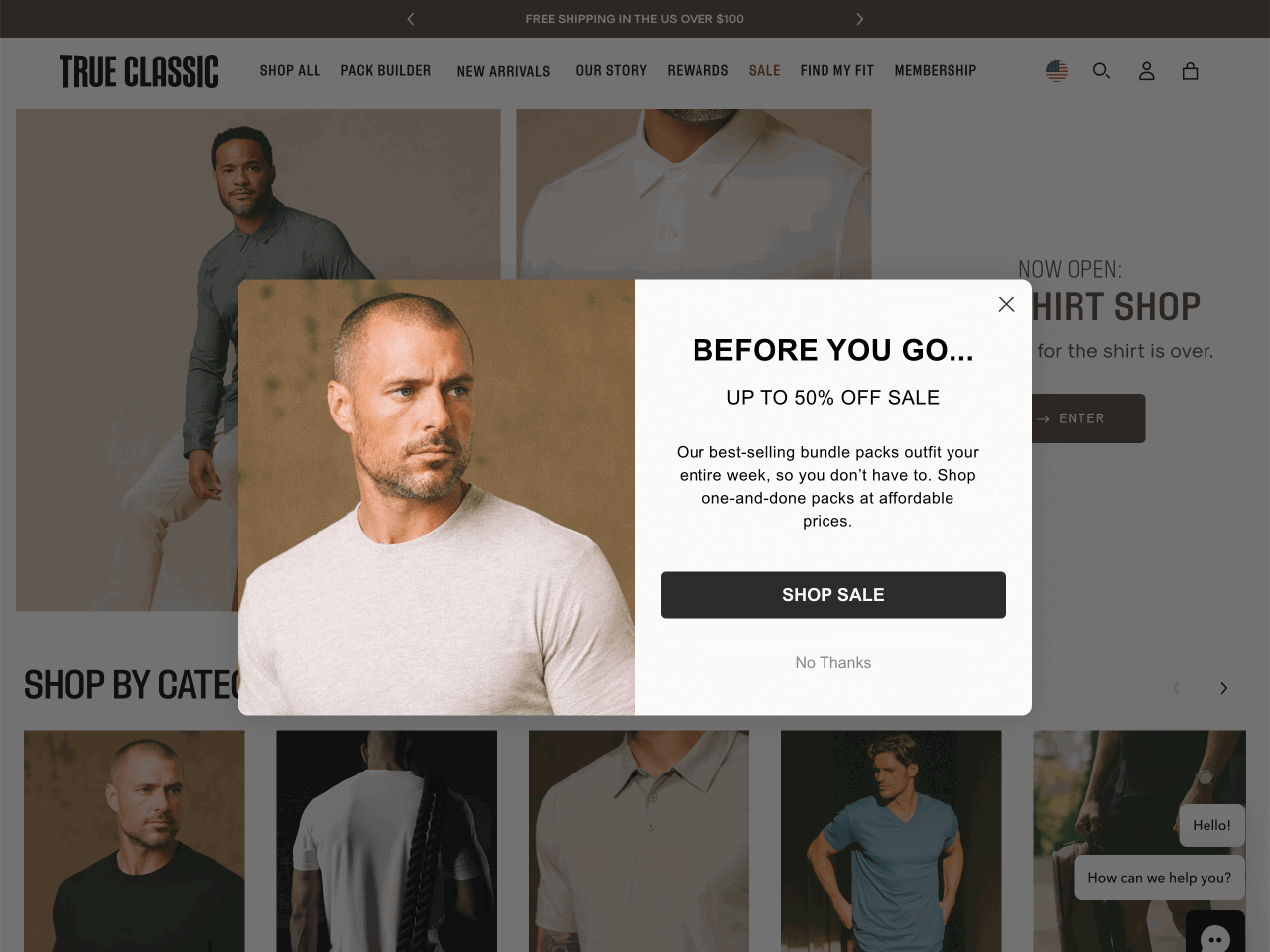
True Classic, a men’s fashion brand, uses a popup featuring a product photo and a clear message: “Up to 50% off sale.” It highlights bundle deals that outfit an entire week — a practical and persuasive angle for last-minute shoppers.
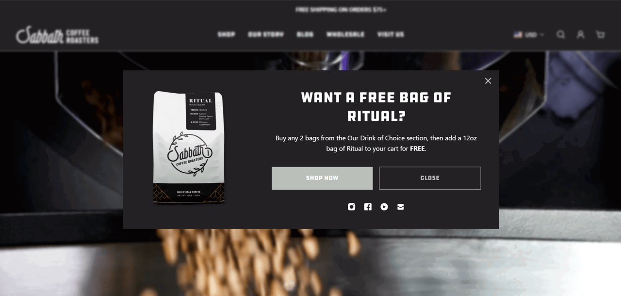
Sabbath Coffee Roasters uses a bold, product-centered popup promoting a “Buy 2, Get 1 Free” deal. The clear instructions explain exactly how to claim the free bag of Ritual coffee.
Yakushi Knives uses a sleek popup with perfectly matched brand colors and a fun twist: “Ok, you win – grab 15% discount on us.” The copy turns a standard discount into a lighthearted reward.
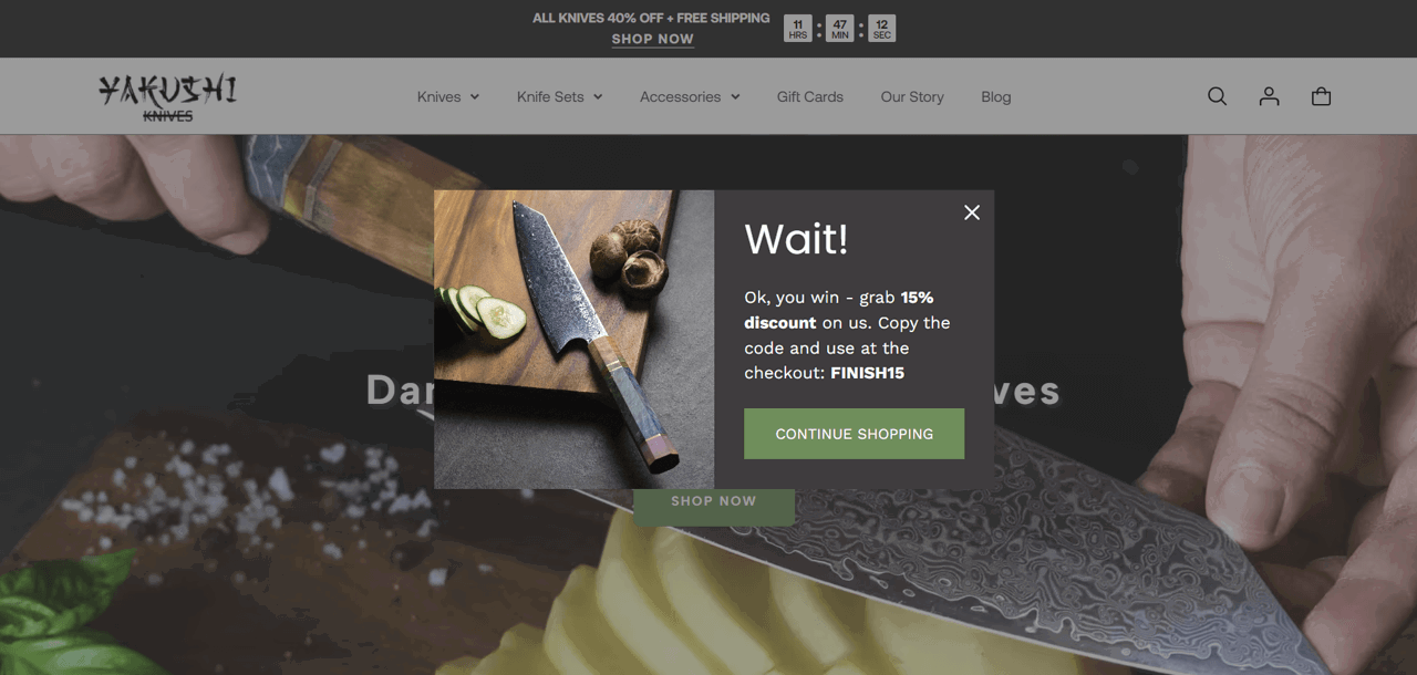
This popup is made in Getsitecontrol
Smart brands use exit popups not just to sell, but to address the doubts that make visitors hesitate. Whether it’s shipping costs, product quality, or trust concerns, a well-timed message can turn uncertainty into confidence.
Dr Steve’s Caffeine Melts uses an exit popup in the shopping cart to explain why their $10 shipping fee is justified. Instead of apologizing, the copy reassures buyers that shipping includes insulated packaging, temperature protection, and even bonus packs.
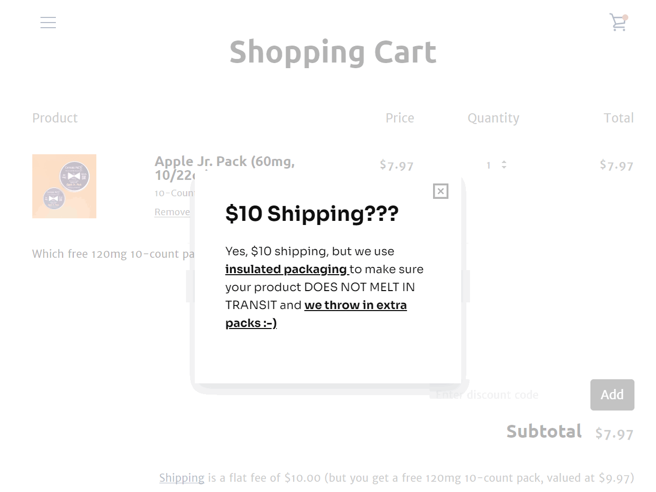
This popup is made in Getsitecontrol
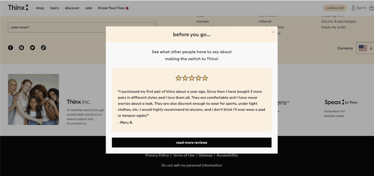
Thinx uses a testimonial-style exit popup to ease doubts about switching to their product. The popup highlights a five-star review and includes a CTA to read more customer feedback — helping skeptical visitors make a confident decision.
Exit-intent popups can save between 10% to 15% of abandonments, according to Conversion Sciences.
Getsitecontrol’s data, based on researching hundreds of ecommerce stores, shows similar results. According to the study, exit popups offering a discount in exchange for an email address can convert up to 7% of those who were about to leave. In the cart, that number reaches as high as 13.5%, when an immediate discount is offered.
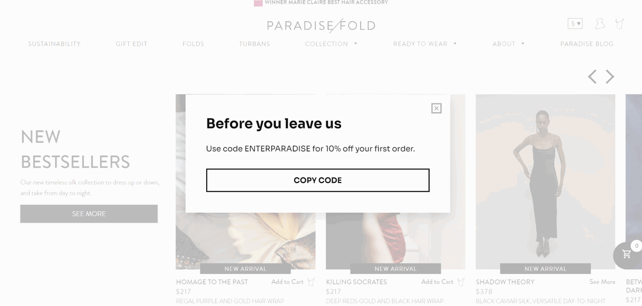
Of course, the numbers vary based on product type, traffic quality, and offer strength. For example, Paradisefold, a fashion and lifestyle brand, achieved an impressive 17.4% click-through rate with an exit popup promoting an instant discount. This shows that the right popup message can deliver exceptional results.
Don’t show the same message to everyone. A first-time visitor browsing your homepage needs a different offer than a returning customer abandoning a full cart.
You can use targeting rules based on:
For example, you may want to show a 10% discount popup to homepage visitors, but bump it to 15% + free shipping for cart abandoners with $100+ orders.
Avoid overly aggressive copy like “Don’t go!” or “Not so fast!” Instead, focus on the visitor’s benefit: “Get free shipping before you leave” or “Save 15% on your order.” Reassuring language outperforms panic-driven urgency.
Fewer form fields mean higher completion rates. For exit popups featuring email capture, collect only the email address — first name is optional. For abandoned cart recovery popups, consider showing the discount code immediately without requiring any information at all.
Match your colors, typography, and tone so the popup feels like part of your site — not an interruption. Use your product photography or brand imagery instead of generic stock photos. The popup should reinforce your brand identity, not distract from it.
You don’t need design or coding skills to create effective exit-intent popups for your website.
Whether you want to get more email subscribers, offer last-minute discounts, or survey abandoning visitors, with Getsitecontrol, you can build and publish your campaign in under an hour. Just choose from dozens of templates, customize the message, and set your trigger conditions.
We use Getsitecontrol to show exit intent popups on our site and just the ease of everything from setup to analytics and reporting is great.
CEO, Real Estate capterraOnce your exit popup is live, monitor its performance through the analytics dashboard and tweak the settings to optimize conversions.
With Getsitecontrol, creating high-converting popups is straightforward and requires zero technical knowledge. Go ahead and give it a try!
An exit-intent popup is a modal window that appears when a visitor is about to close the page or switch tabs. It’s designed to re-engage users who were about to leave.
They can, if they offer no value or if the message comes across as being too aggressive. However, when used to offer a discount, free shipping coupon, or helpful content, exit popups appear as an integral part of user experience.
According to the Getsitecontrol research, based on the analysis of over three hundred ecommerce websites, exit-intent popups can convert up to 13.5% of abandoning visitors into customers when you offer a discount coupon for immediate use, and up to 7% into subscribers when you offer a discount coupon for the next purchase.
Entry popups appear when visitors first land on your site — usually, at once or after a few seconds; while exit popups appear when visitors are about to leave. Exit popups are generally less intrusive because they don't interrupt active browsing — they only appear when someone has already decided to leave.
You can use exit-intent popups to invite those who are leaving your website to join your email list, prevent shopping cart abandonment by offering a last-minute coupon, survey visitors who are heading to exit, remind them about an ongoing promo, or suggest help. Overall, the purpose of using exit-intent popups is typically to prevent website visitors from leaving too soon, highlight your offers, or convert them into subscribers.
Nina De la Cruz is a content strategist at Getsitecontrol. She is passionate about helping small and medium ecommerce brands achieve sustainable growth through email marketing.
You’re reading Getsitecontrol blog where marketing experts share proven tactics to grow your online business. This article is a part of Lead generation section.
Create popups for free
Email forms, promos, coupons, surveys, bounce-stoppers.
Get started, it’s free →Of all the emails you’ll ever send to your subscribers, the first one is crucial. That’s the email where you thank them for subscribing to your newsletter.
So how do you make it memorable?
In search of inspiration, I’ve subscribed to 30 different ecommerce brands’ newsletters and sneak-peeked at their welcome emails.
Below, I’ll share 10 of my favorite email examples, explain why they work well, and provide a couple of templates you can steal.
Popups are a powerful tool to grow your email list, promote offers, and guide visitors toward key actions.
Our data shows that a well-designed email popup can convert 3.77% of your visitors into subscribers on desktop, and 6.57% on mobile, on average.
But not all popups deliver results — there’s a stark difference between those that fall flat and those that convert.
Want to see your email marketing campaigns convert better?
The secret is in sending targeted emails that speak directly to your customers.
Tailoring emails to match customer behavior — like cart reminders, product recommendations, or birthday offers — can make all the difference.
This article explores 13 real-life examples of successful targeted email marketing. We’ll show you what works and walk you through the process of building a simple targeted email campaign yourself.
Let’s get started.
Subscribe to get updates
Get beginner-friendly tips for growing your online business.