
Try Getsitecontrol for free
Following the best popup design practices is easy.

“Can I get this over with?”
That’s pretty much what every time-strapped ecommerce marketer says every time they have to create a new popup. And that’s what you probably do too.
So what do you do?
You speed through the process, creating a relatively good-looking popup so you can move on to the next task on Asana.
But without the right design, your popups will underperform.
I’m talking about leaving people out of your email list because they can’t see the value of signing up. Or sales that potential customers ignored because they can’t see they’re presented with a unique offer.
So, to avoid this costly issue, I put together seven popup design best practices you should follow every time.
In ten minutes from now, you’ll know how to create a high-converting popup without much effort (or time) on your part. Easy, right? Let's get started.
Designing a popup isn’t a typical task for marketers. You know how to grow traffic, promote a deal, or get people to pay for your products. Not design.
The more you simplify the process of designing a popup, the better.
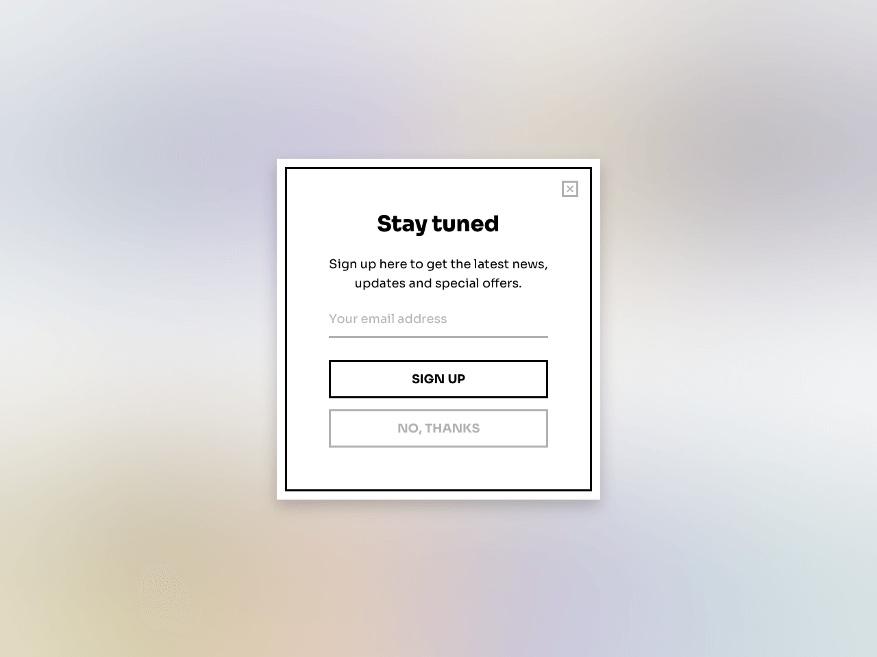
If you can admit that you are not a designer and that you don’t have to have design skills to create a popup, you can use a premade template. Every popup tool (like, ahem, ours) offers templates that users can plug-and-play in one click.
Why complicate things when you can use a template a designer created just for you? Talk about a win-win.
Just go to your popup tool’s template page (they all have one), see what you like to use, and pick it. You'll have to customize it, but we'll talk about that later.

You can also filter the popups by their function (“forms”), message type, and use cases (as seen above), such as:
As a marketer, you understand the importance of branding, the process of using distinctive messages and aesthetics consistently throughout the customer journey to cement a position in their mind.
Likewise, your popups should have the same “vibe” as your store’s design, making it easier to design them and, simultaneously, making them look better. Talk about another win-win, am I right?

In the example above, you can see that Happy Socks presents a slide-in bar on the left side of the screen, using the same typography and colors as the rest of the store. That's what branding looks like.
Take a look at your store’s overall design — or your branding style guide, if you have one. What elements can you take from your store to re-use in your popup?
Consider using at least one identical color from your store's design, the same spacing — i.e., padding and margins — tone, and voice.
The same goes for your fonts — although you can use a different one for your headings.
In other words, think of the popup as another section of your store. The goal is to keep at least some parts of your popup similar to your store but not necessarily identical to it. In the next section, you'll see why.
When somebody visits your store and looks at your design, they will be expecting to see the same aesthetic throughout their visit. This is due to a cognitive and subconscious process known as “template matching.”
When you show them something different, you will break their pattern, which will motivate them to check what that is.
Now, you may think, “but wait, Ivan, didn’t you just say I have to keep my brand intact?”
The reality is that if your popups look exactly like the rest of your store, your visitors may ignore the message in front of them.
Banner blindness is partly to blame for this issue (check this article from the Nielsen Norman group to learn more about it). Whenever possible, use contrasting colors to highlight some parts of your popup while still respecting your brand’s style.
What parts, you may ask? The ones that you want people to see. Most often, that's the background and the CTA.
The safest route would be to use darker, lighter, or grayer colors from the ones you use in your store. These colors are called “analogous” because they sit next to each other on the color wheel and look harmonious when put together.

Analogous colors allow you to respect your brand while catching the visitor’s attention. Krave Beauty uses mostly yellow and lilac colors — the popup's background shows a grayer version of the latter, which stands out subtly.
Another popup design practice is to use high-contrast colors that sit on the opposite side of the color wheel.

Although high-contrast colors (or “complementary,” as designers call them) are guaranteed to grab your visitor's attention, they can also ruin your design. Just look at this “beautiful” combination of colors by G2:

Yikes, am I right? A better way to use complementary colors without causing nausea is to play with their tint and shade. In other words, make your colors brighter or darker.
To find the analogous or complementary version of your store's colors, use this tool. And to see if their contrast ratio is high enough, use this tool. Aim for at least a 4.5:1 ratio, which guarantees a strong contrast.
Another way to catch the visitor’s attention is to contrast the popup from the background to focus them on the thing they have in front — that is, your popup and its message.
The first option you can use is to blur the background from the popup, which imitates how our eyes work. If your popup tool doesn't allow you to do this, add some CSS as shown here. If you’re using Getsitecontrol to create popups, you can use this guide.
Alternatively, you can darken or lighten the background without blurring its contents. This is a better option for higher-intent pages like product pages. It’s a less aggressive, yet equally effective popup design practice.

Humans process images much faster than text. There’s a lot of debate about how fast it is, but one study from MIT says it takes humans as little as 13 milliseconds.
Since most visitors will not read every line of your popup, you want to use an image representing the benefit the visitor will get from taking on your popup’s offer. Because one thing is to get people to pay attention, and it’s another to get them to take action.
The benefit can be as simple as showing your products.

If you want to create a similar popup, grab this template and get your product image ready:
Just click the template and follow the prompts. You’ll be able to adjust the copy and replace the default image with your product photo. For inspiration, check out this roundup featuring popup design practices in ecommerce.
A final alternative is to use a GIF — basically, an animated image. This image format can show the benefit while also catching the attention of the visitor. They are easy to create with the help of tools like Gifox or ShareX.
If the offer you are presenting to your visitor is stock or time-sensitive, add an element to your popup that highlights that fact.
For flash deals and similar offers, you can use a countdown timer. Timers work because people simply dislike FOMO — the fear of missing out.

Another less-effective option is to simply mention when the offer will be finished. People will still act on the urgency even if it's not as clear as with a timer.
Alternatively, you can mention how long the offer will be valid for, like in the template below:
In your copy, highlight the words that mention scarcity either with high-contrast colors, different or larger fonts, or badges. You can use phrases like:
Remember: the more you make your visitors feel like they are missing out on your offer, the better the chances they will act upon it.
Responsiveness has been around the web design world for over a decade now (I still remember when everybody was talking about it). But you can’t take it for granted because it’s that important.
By late 2019, 81% of traffic and 71% of orders on Shopify stores came through mobile devices. Can your store provide a poor experience to this many people? Not really.

Although responsiveness applies to your entire store, your popups must adapt perfectly to your visitor’s device.
As a Getsitecontrol user, you get mobile-friendly popups by default. You can create single-device or multi-device popups as you see fit.
When you’re designing a popup, it’s always a good practice to double-check how it looks on smaller screens. For example, you may find that the copy looks too lengthy or the image doesn’t look the way you expected.
By now, it’s clear that you can’t overlook your popup’s design any longer. The seven tips shared in this article will help you grow your list faster and promote your offers more effectively.
Start by using templates. Companies like Getsitecontrol offer them because they work. Just remember to adapt them to your brand’s style to keep your brand consistent.
Also, remember to use high-contrast colors to magnify specific elements of your popups, like your CTAs or background (or both).
Benefit-driven images and urgency elements like timers will further catch the visitor’s attention and increase popup conversion rates. FOMO is real, so be sure to take advantage of it (but please, do it responsibly).
Finally, make sure your popups show up on every device equally well. Test everything so that your visitors have a great shopping experience.
Ivan Kreimer is a freelance content writer for hire who creates educational content for SaaS businesses like Leadfeeder and Campaign Monitor. In his pastime, he likes to help people become freelance writers. Besides writing for smart people who read sites like Getsitecontrol, Ivan has also written in sites like Entrepreneur, MarketingProfs, TheNextWeb, and many other influential websites.
You're reading Getsitecontrol blog where marketing experts share proven tactics to grow your online business. This article is a part of Customer engagement section.
Download a PDF version of our blog post for easier offline reading and sharing with coworkers.
Download PDFEmail forms, promos, coupons, surveys, bounce-stoppers.
Get started, it’s free →What’s the first thing that ‘pops’ into your mind when you hear or see the term ‘pop-up advertising’?
For many people, this term is enough to get them started on a rant about how annoying pop-ups are.
Years ago, ecommerce websites relied heavily on the use of popups to market their products without taking the user experience into account.
As a result, the Internet was flooded with pop-up adverts that:
There was little to no consideration for providing a positive shopping experience for online buyers.
But if you look at some of the most successful online stores today, you’ll notice that the way popups are used is changing.
If you had to choose one option to communicate with your customers, what would you say?
Most likely, you’d say “email marketing” and “social media,” but what about “SMS marketing”? Yes, we’re talking about the old-school method of text communication we all used back in the day before smartphones were a thing.
In recent years, many ecommerce stores have started using SMS marketing to engage with their customers and increase their sales. Why? Because it works.
If you want to learn what SMS marketing is and how you can implement it in your ecommerce store, here's what you need to know.
Do you want to make email marketing one of your core revenue-generating channels, but you don’t know where to begin? We get it, there are many types of marketing emails you can send, and with so many options available, it’s easy to get overwhelmed.
Fortunately, you came to the right place. In this article, you will learn about the seven types of emails you should be sending to get more sales in your Shopify store.
Are you ready? Let’s begin.
Subscribe to get updates
Get beginner-friendly tips for growing your online business.

