Try free Shopify countdown timer
Add countdown timers to key pages on your store,
Of all urgency tactics used in ecommerce, countdown timers are the most efficient ones. When used thoughtfully, a Shopify countdown timer can help shoppers understand that an offer is time-sensitive. A timer can highlight a flash sale, a seasonal promotion, a limited-time free shipping offer, and encourage faster checkout decisions. Beyond urgency, timers can also build excitement for upcoming events, such as a new store opening or product launch.
But placement matters just as much as the offer itself when using a countdown timer for Shopify. A full-width banner on the homepage creates a very different experience from a small timer embedded next to the Add to cart button. Some Shopify countdown timers work best for storewide campaigns, while others are more effective when tied to a specific product or customer action.
In this guide, we’ll cover the countdown timer types available on a free solution for Shopify, the GSC Countdown Timer app, and we’ll provide suggested placements for each one of them depending on common use cases and purposes. While we’ll use the GSC Countdown Timer app to illustrate different formats and placements, the same principles apply regardless of which countdown timer solution you use. Finally, to bring these concepts to life, we’ll review 13 countdown timers from real Shopify stores and examine what makes each implementation effective.
The GSC’s Small timer is a compact widget that fits inside an existing theme section as a block, without taking over the page. It adds urgency at a key conversion point, where a shopper is already paying attention, without asking them to stop and look at something new.
The most natural placement for a small timer is the product page, placed within the product information area alongside the price, variants, and Add to cart button. When a visitor is already considering buying, a product page countdown timer counting down to the end of a flash sale or a same-day shipping cutoff can be just the nudge they need to commit. It also works well in the cart drawer, where it can reduce cart abandonment by reminding shoppers that the deal they added items for is still ticking.
The Large timer is a full-width banner section, designed to be a statement. It stretches across the page and commands attention, which makes it best suited for moments when the promotion itself is the main event.
Homepages are the obvious placement for this one. A sitewide sale, a product launch, a seasonal campaign; these are all scenarios where you want visitors to know immediately that something is happening. Password pages are another strong use case: if your store isn’t live yet, a large countdown banner counting down to opening day gives visitors a reason to come back. You could also use it on a dedicated campaign landing page or on a collection page to highlight a limited-time offer for a specific product type.
The large timer works best when the design is intentional and cohesive with the store’s design. It should feel like a natural part of the page, not something pasted on top of it.
The Inline timer is designed to blend seamlessly into the page content rather than stand out as a separate promotional element. Its components, such as the countdown itself or the coupon code, are styled like text elements within the layout, making the timer feel lightweight.
Because of this subtle format, inline timers work particularly well in places where shoppers are already focused on product details or checkout actions. On product pages, they can be placed near the Add to cart button or beneath pricing information to reinforce urgency without overwhelming the page. In cart drawers, they emphasize limited-time offers or reserved-cart messaging, reducing cart abandonment at a critical stage.
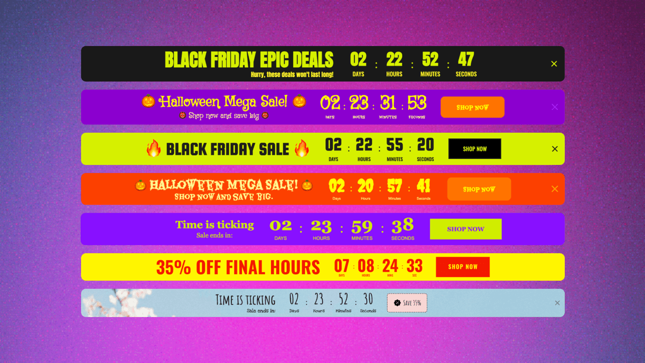
The Bar timer is a pop-up strip that appears at the top or bottom of the page. This makes it particularly good for sitewide promotions that you want to communicate across multiple pages.
One of the bar timer’s main advantages is its targeting flexibility. You can choose to show it across the entire store or limit it to specific pages: the homepage, all product pages or just selected ones, all collection pages or specific ones, the cart page, the password page, or other pages like the blog. This means you can, for example, run a flash sale bar that shows up on collection and product pages but not on the homepage, where you already have a large banner.
The Inline bar is the embeddable counterpart to the pop-up bar. It has the same design, but rather than floating over the page, it is embedded within the page itself, in a fixed position you choose.
A common use case is placing it on the homepage as part of the layout, between a hero section and a product grid, for example, so the promotional message flows naturally with the rest of the content. You can also embed it at the top of a collection page, right before products appear, to add a sense of urgency and/or scarcity to the browsing experience before shoppers even reach the product page.
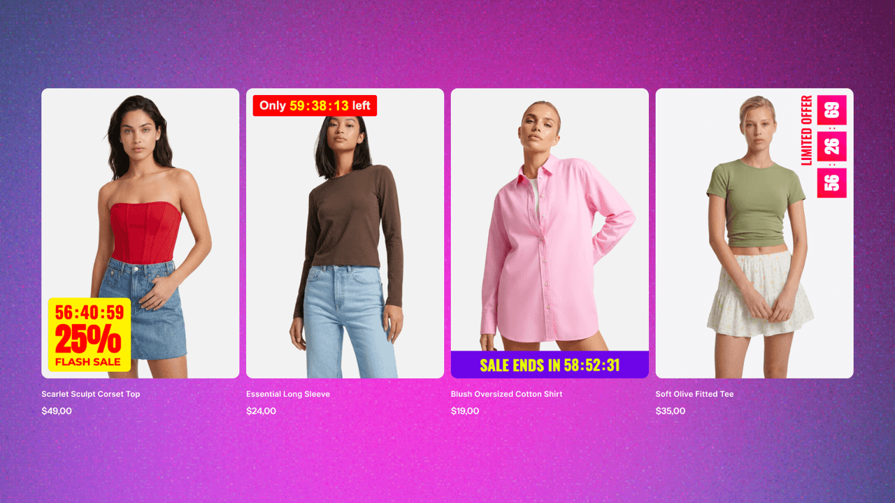
The Product timer is the smallest format in the lineup, and in some ways, the most surgical. It sits directly on top of product cards or product images, visible right on the collection grid or product listing.
This makes it uniquely effective for flash sales across a specific selection of products. A shopper browsing a collection can see at a glance which items are part of a time-limited deal, which naturally draws their eye, reinforces scarcity, and speeds up decision-making. You can also use it on individual product pages, overlaid on the main product image, as an eye-catching way to mention the offer before someone scrolls down to the product info.
Beyond placement, there’s another important decision to make: what the timer is actually counting down to. The GSC Countdown Timer app offers three main modes that cover most use cases and purposes.
Fixed date timers count down to a single deadline shared by all visitors. They’re commonly used for flash sales, seasonal campaigns, product launches, or any promotion with a clear end date.
Evergreen timers reset individually for each visitor. Instead of ending at a specific moment, they start when someone lands on the page, making them useful for personalized offers like welcome discounts, limited-time bonuses, or cart recovery campaigns.
Daily timers reset on a recurring schedule, usually every day or on selected weekdays. They work well for recurring promotions such as same-day shipping cutoffs, daily deals, or limited-time offers that repeat regularly.
Still not sure which countdown timer to use? Here’s a quick reference guide matching common ecommerce goals with the most suitable timer type, countdown mode, and placement.
| Goal | Type & mode | Placement |
|---|---|---|
| Flash sale across the store | Bar timer + Fixed date | Sitewide (top or bottom bar) |
| Seasonal collection promotion | Bar timer + Fixed date | Collection pages |
| Product launch or store opening | Large timer + Fixed date | Homepage or password page |
| Reduce cart abandonment | Inline timer + Evergreen | Cart drawer, cart page, or both |
| Welcome offer for new visitors | Small or Inline timer + Evergreen | Product pages or landing pages |
| Bundle offer on a product page | Small or Inline timer + Evergreen | Above Add to cart |
| Same-day shipping cutoff | Small timer + Daily | Product page |
| Daily deal or recurring promotion | Bar timer + Daily | Homepage or sitewide |
| Pre-order deadline | Product timer + Fixed date | Product cards and/or product media on PDP |
| Highlight selected sale items | Product timer + Fixed date | Product cards in collections |
Now let’s look at how real Shopify stores put these timer types and modes into practice. The examples below showcase different placements, design approaches, and campaign goals, from homepage promotions and product page urgency to password page launches and sitewide announcements.
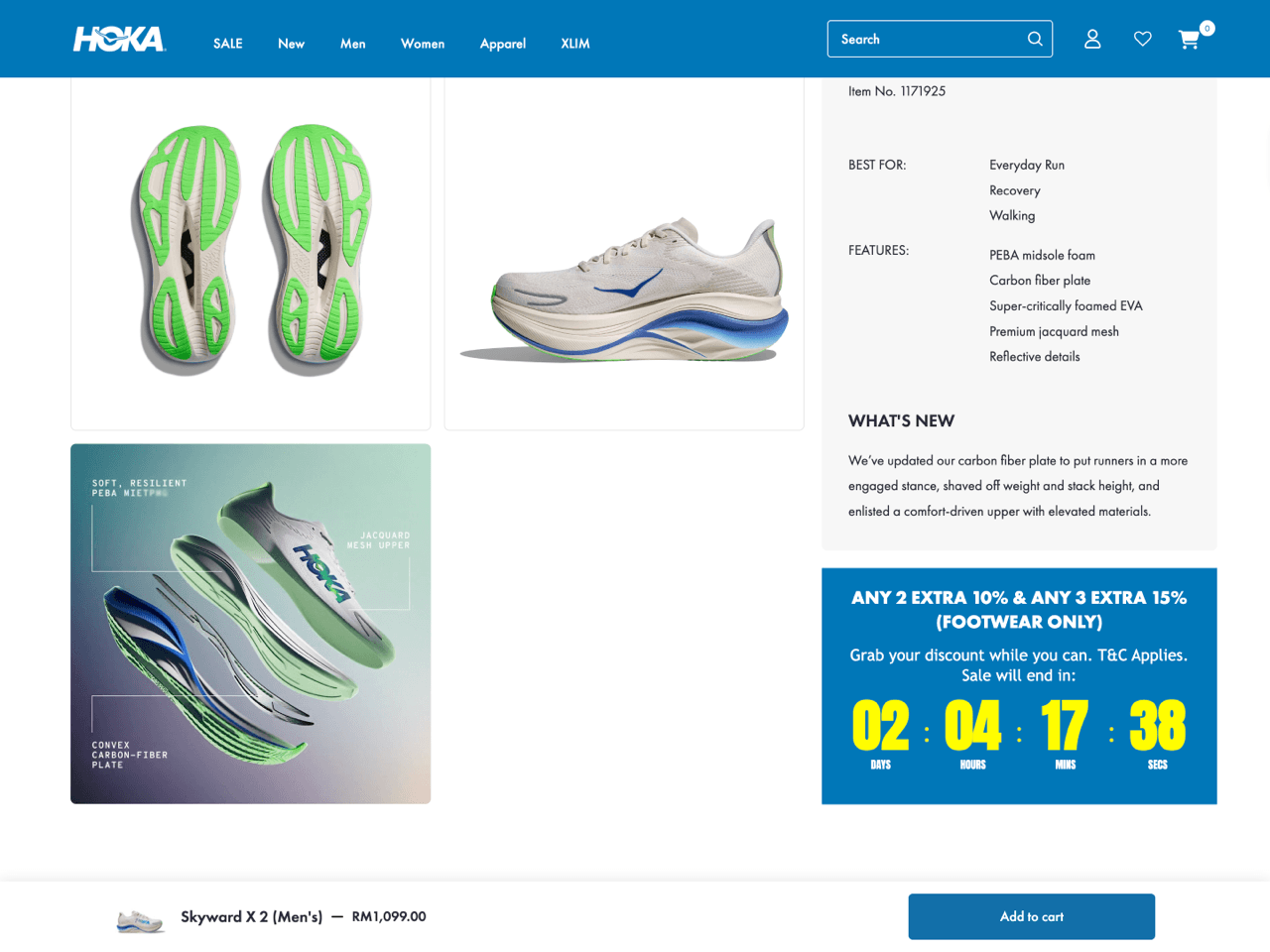
HOKA places a Small countdown timer within the product details section of its product page. Rather than competing for attention near the Add to cart button, the timer appears further down the page, where shoppers are already evaluating product specifications and deciding whether the deal is worth acting on.
The timer promotes a multi-item discount (‘Buy 2, get 10% off’ and ‘Buy 3, get 15% off’) and counts down to the end of the promotion. By combining HOKA’s color palette and bold typography with high-contrast countdown digits, the timer feels integrated into the page while remaining easy to spot.
For stores that prefer a less aggressive approach to urgency, placing a product page countdown timer alongside product information, promotional details, or buying guides can feel more natural than positioning it directly above the Add to cart button.
Lost Way uses a Large countdown timer as the centerpiece of its password page. Rather than placing the timer in a separate section above or below the content, the countdown is integrated directly into the hero area alongside the collection name and email signup form, making it the natural focal point of the page. This approach works particularly well for product launches, waitlists, and store openings because it creates a clear destination for visitors. Instead of simply informing shoppers that something is coming, the page gives them a specific date to anticipate and a way to join the waitlist.
This example also demonstrates how a countdown timer can be incorporated directly into existing page elements rather than treated as a standalone banner. By embedding the countdown within the page design itself, the store creates a more cohesive experience, and the result feels more immersive than a traditional countdown banner.

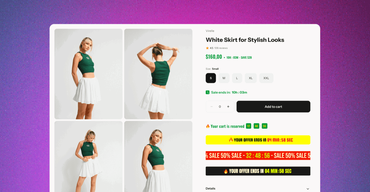
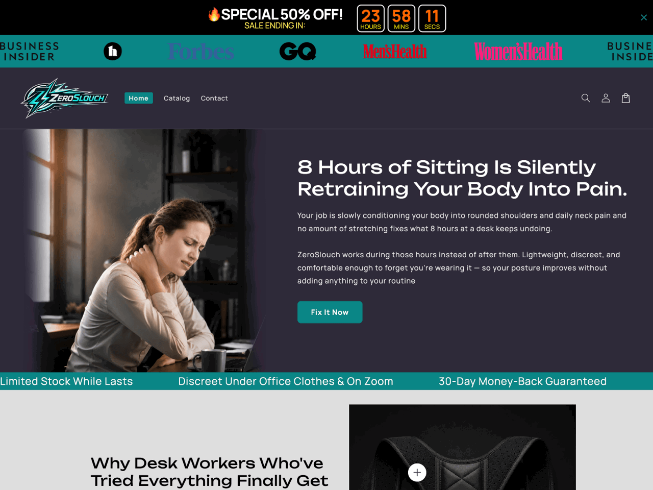
ZeroSlouch uses an Inline countdown timer directly on its product page, immediately above the Add to cart button. The timer promotes a bundle offer with an evergreen countdown. Unlike large banners or announcement bars, this placement keeps the urgency focused on the purchase decision itself, right at the moment a shopper is considering whether to buy.
This is a strong example of using a product page countdown timer to drive conversions without overwhelming the page design. The timer is visually noticeable thanks to the contrasting red countdown, but compact enough to avoid competing with the product images and Buy buttons.
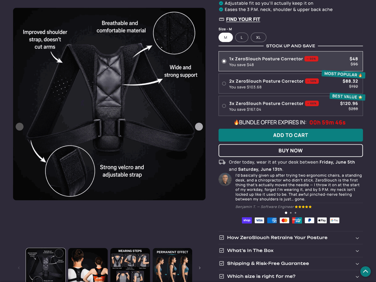
The store pairs this inline countdown timer with a sitewide countdown timer Bar displayed at the top of the page. Together, the two placements create urgency throughout the shopping experience: the announcement bar reinforces the broader promotion sitewide, while the inline timer focuses attention on completing the purchase before the bundle offer expires.
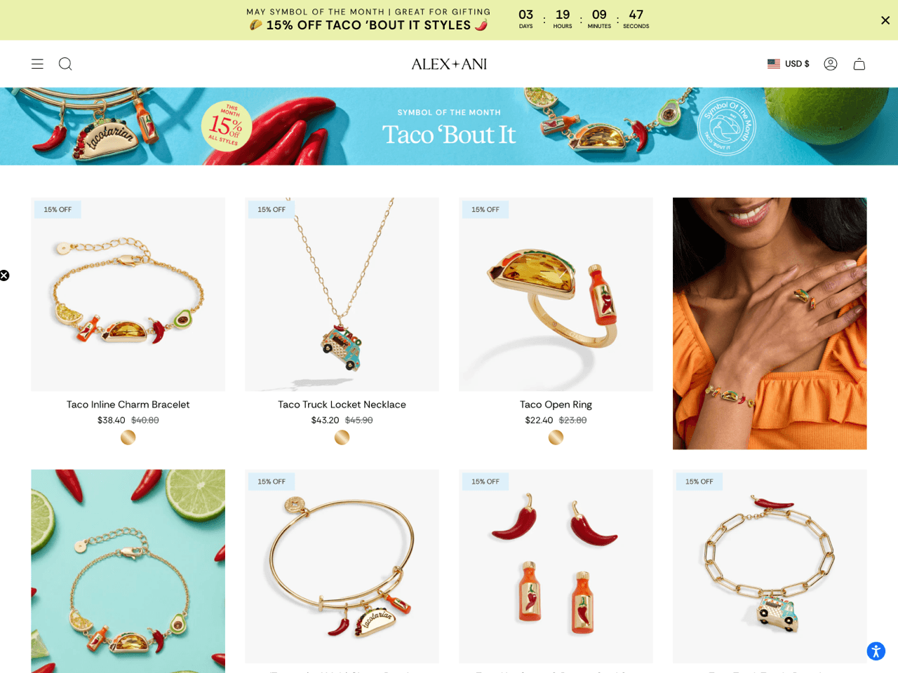
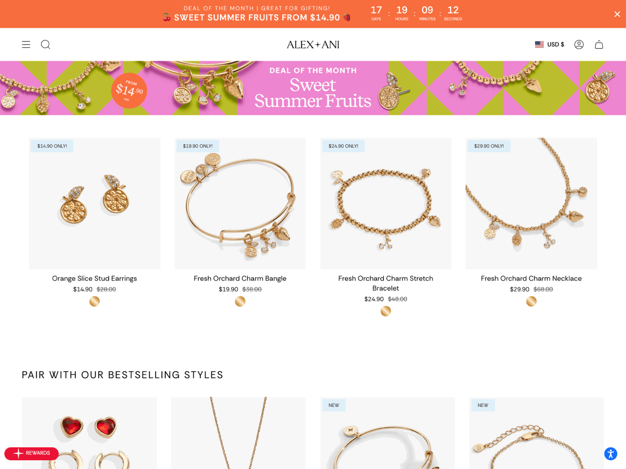
Alex and Ani uses a countdown timer bar across dedicated collection pages to promote its rotating ‘Deal of the Month’ and ‘Symbol of the Month’ campaigns. Positioned at the very top of the page, the countdown timer immediately communicates that the promotion is temporary, before shoppers even begin browsing the products below.
What makes this example particularly effective is the way the countdown timer bar works together with the collection design itself. The color palette, typography, and campaign messaging are visually coordinated with the collection banner and featured products, making the timer feel like a natural part of the shopping experience.
This is also a strong example of using a countdown timer to create urgency across entire collections rather than on a single product. It’s an effective approach for seasonal or themed collections, flash sales, or limited-time category promotions, where the goal is to drive conversions across multiple products at once. The built-in targeting settings make this convenient for recurring campaigns. As the monthly promotion shifts to a new collection, the store can simply retarget the timer bar and update the messaging in a few clicks.
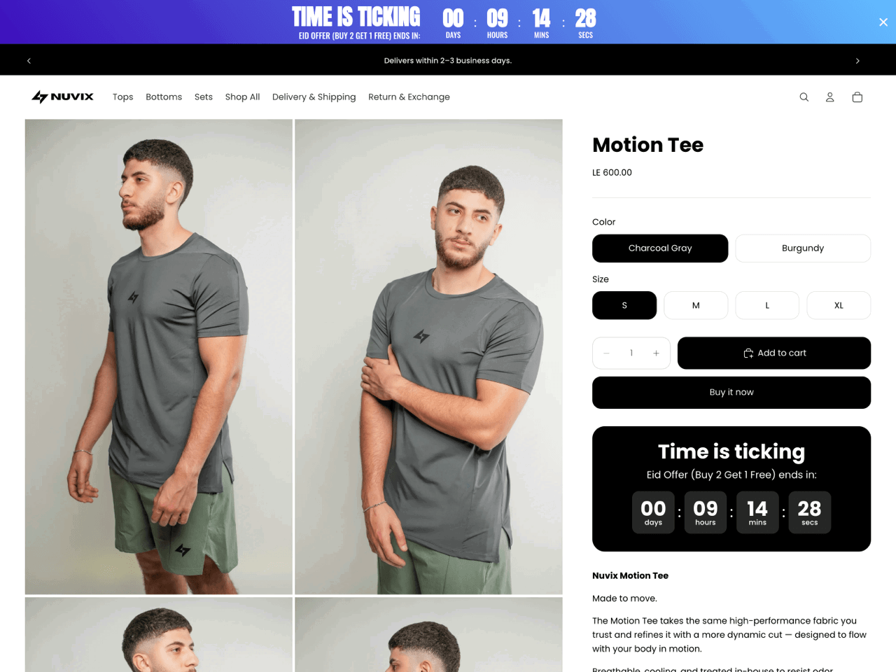
Nuvix displays a site-wide countdown timer Bar at the top of the page. The most distinctive aspect of this implementation is the blue gradient background, which gives the timer bar more visual presence than a solid-color announcement bar.
Appearing consistently across the store, the bar ensures shoppers encounter the same promotional message whether they land on the homepage, a collection page, or a product page. This consistency reinforces urgency and keeps the offer top of mind throughout the browsing journey.
The store also pairs the sitewide countdown timer bar with a Small countdown timer on the product page that reinforces the same message closer to the purchase decision.
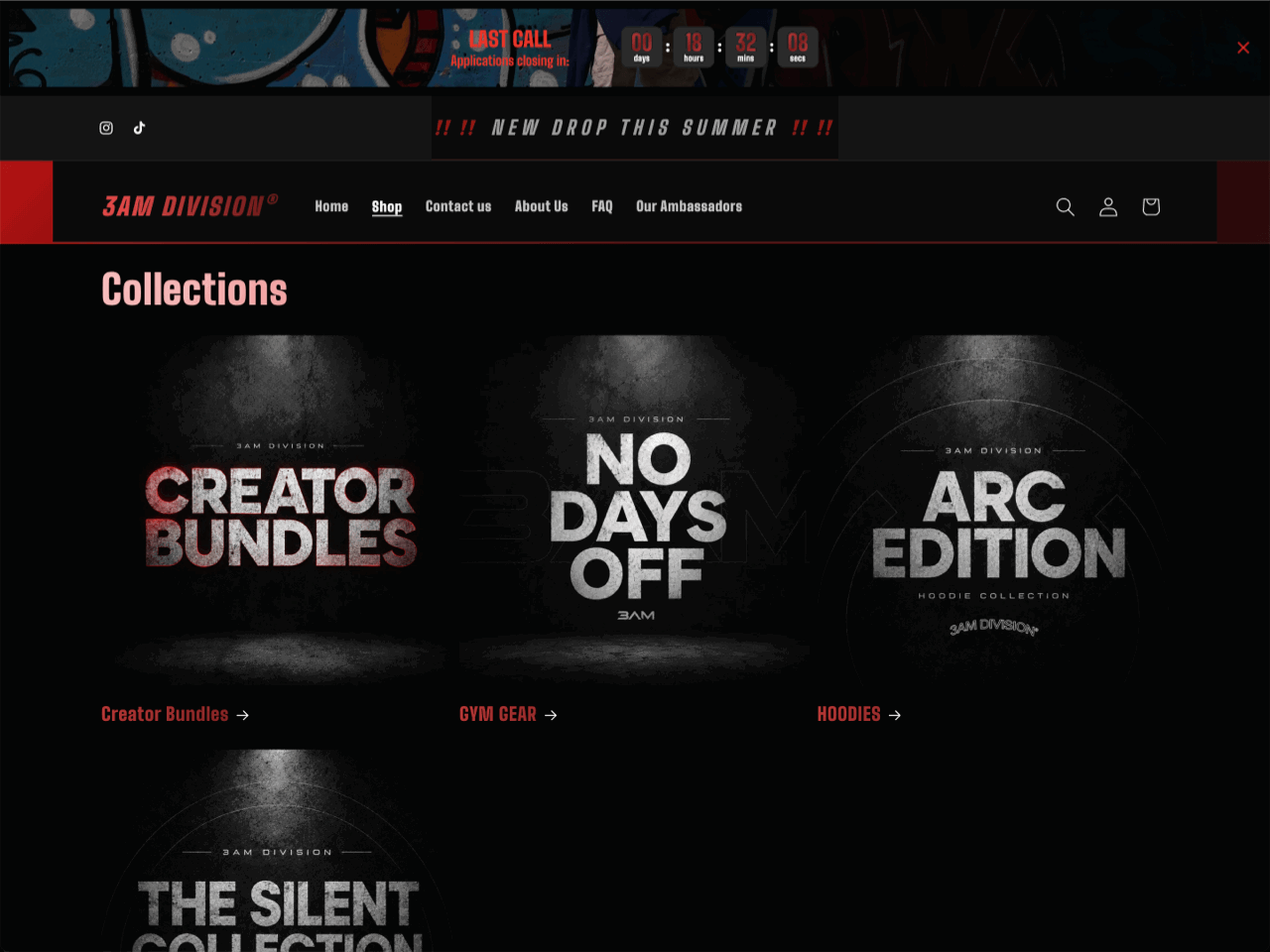
3AM Division uses a daily countdown timer Bar to promote applications on its collections page as well as other pages across the store. Positioned at the very top of the page, the timer remains visible even when visitors scroll down.
What makes this implementation interesting is the level of customization. The timer sits on top of a custom background image that matches the store’s dark, high-contrast aesthetic. The countdown units also feature a custom animation effect that recreates the wave motif used in the brand’s logo.
This example shows how a daily countdown timer can be used for recurring campaign windows, application deadlines, or scheduled product drops. Since the countdown resets automatically, stores can create a sense of urgency around recurring events without having to manually update the timer.
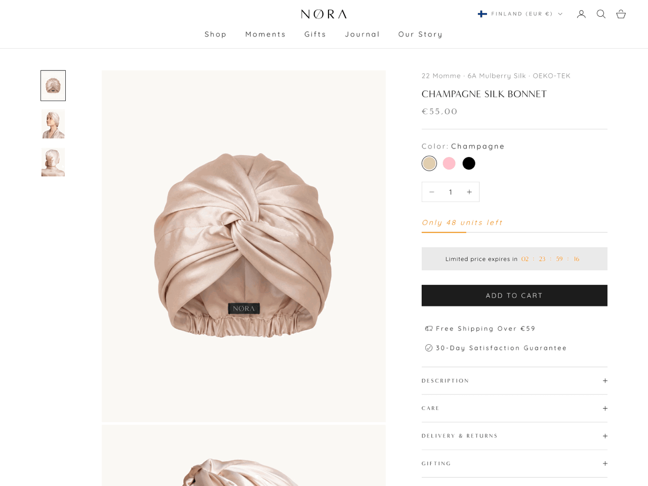
Sleep by NORA uses an Inline bar countdown timer positioned between the stock availability message and the Add to cart button in the product information. What makes this implementation particularly effective is its restraint. Rather than relying on bold colors or oversized numbers, the timer adopts the same neutral palette used throughout the product page. The light background and delicate countdown digits complement the premium aesthetic of the brand.
The timer also works well in combination with the inventory message displayed immediately above it. Together, the two elements communicate both scarcity (‘Only 48 units left’) and urgency (‘Limited price expires in…’), creating a stronger incentive to act without adding visual clutter.
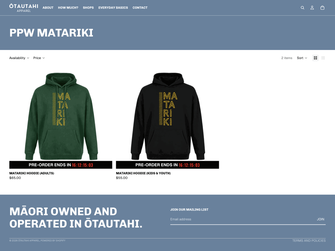
Ōtautahi Apparel uses Product countdown timers on a pre-order collection, displaying the same deadline beneath each product card. This is particularly effective because it makes the pre-order deadline visible directly within the collection grid, reducing friction by allowing shoppers to see how much time remains without opening individual product pages.
The implementation is also visually straightforward. The timer appears as a simple black bar beneath each product image, creating strong contrast against the lighter page background while remaining secondary to the products themselves.
This example shows how product countdown timers can be used for more than discounts and sales. They can also communicate important deadlines such as pre-orders, limited production runs, or made-to-order collections.
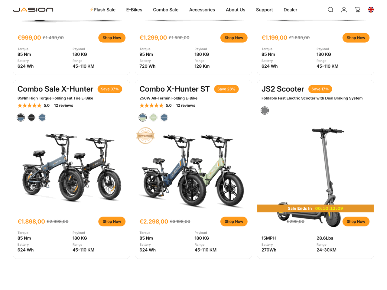
Jasion uses a Product countdown timer on the product card of a single discounted item, making the limited-time offer visible before shoppers even open the product page.
The design integrates naturally with the product card, using the same accent color used in the store’s branding and pricing elements. As a result, the timer feels on-brand while still being prominent, as it’s displayed across the product image.
This example highlights one of the main advantages of product countdown timers: they bring time-sensitive offers into the collection grid. Instead of relying on shoppers to click through and discover the promotion later, the timer surfaces that information at the browsing stage.
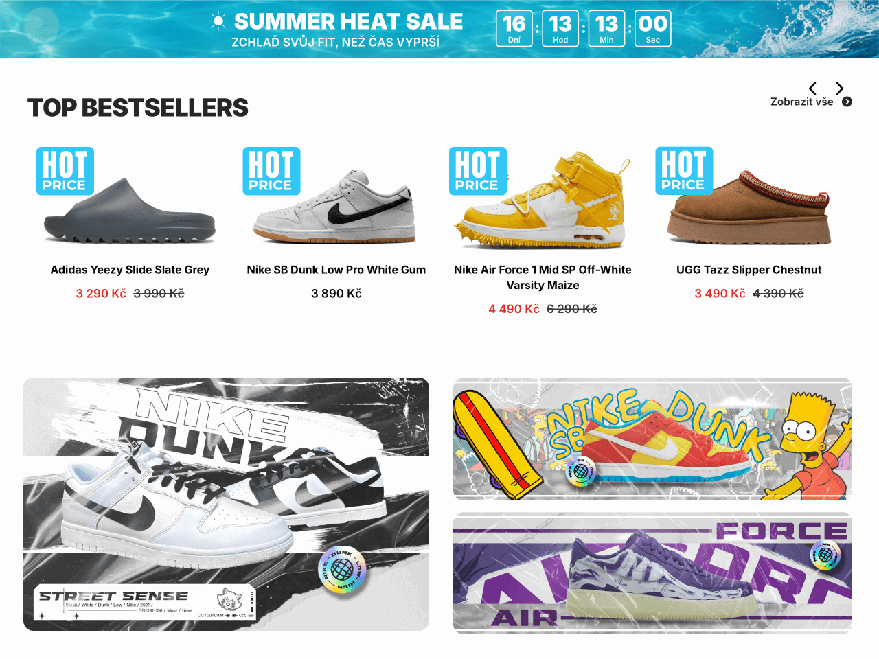
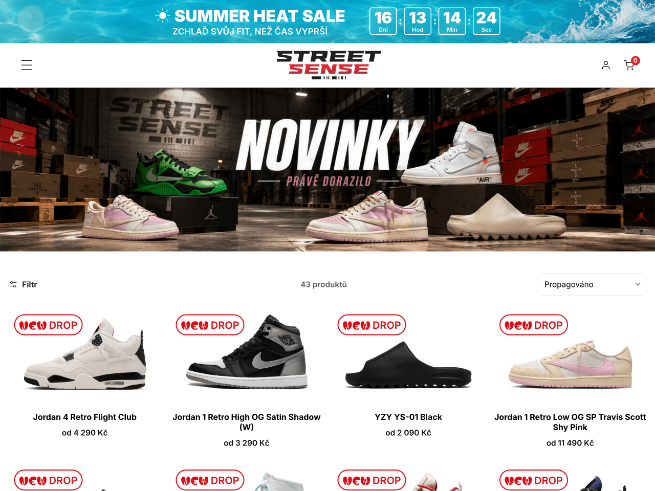
StreetSense uses a countdown timer Bar and product labels created using Product timers. The timer bar spans the top of the page, announcing the Summer Heat Sale with a bright illustrated background, while the product timers are used without a countdown, serving instead as eye-catching labels such as New Drop and Hot Price.
What makes this implementation interesting is the contrast between the two elements. The countdown timer bar uses a vibrant summer-themed background, while the product labels adopt a playful, sticker-like design with bold typography that stands out against the clean product grid. Together, they give the page a fresh, energetic feel without relying solely on countdowns.
This example demonstrates that product timers can be used as visual badges as well as countdowns. Promotional labels such as Hot Price, Limited Edition, or Flash Sale draw attention to featured offers, while informational labels like New Drop or New Arrival help shoppers identify new items. At the same time, a sitewide countdown timer adds an element of urgency across the store without placing a countdown on every product card.
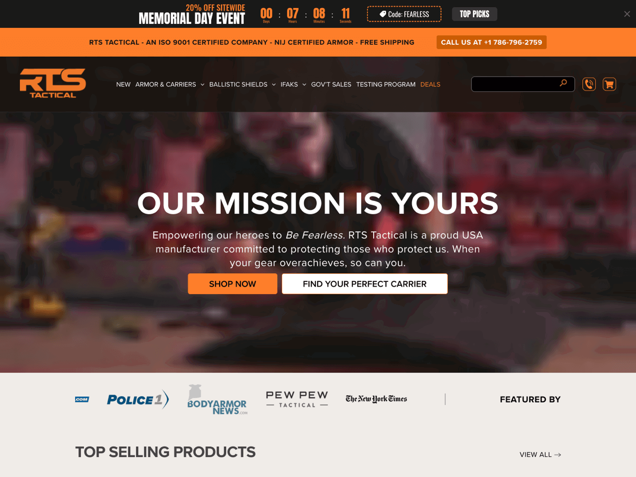
RTS Tactical used a sitewide countdown timer Bar to promote its Memorial Day sale. The timer combines several promotional elements in a single announcement: the event name, a countdown to the offer’s expiration, a discount code, and a shortcut to selected products.
The timer closely aligns with the store’s branding thanks to its black-and-orange color palette and bold typography. Despite containing several pieces of information, the design remains easy to scan thanks to a strong visual hierarchy.
This example demonstrates how a countdown timer bar can serve as a comprehensive campaign tool rather than simply a deadline reminder. By combining discount information, coupon code, and navigation link within the same bar, RTS Tactical turns the timer into the main promotional element of the sale. The same approach works well for other retail events throughout the year, including Black Friday, Cyber Monday, Labor Day, Back-to-School promotions, seasonal sales, and holiday campaigns.
The examples above show that there’s no single ‘best’ Shopify countdown timer. The right implementation depends on your goal, placement, and promotion. However, there are a few common mistakes that can make countdown timers less effective or even undermine trust. Before adding a timer to your store, keep these in mind.
A countdown timer is only as effective as the logic behind it. Fixed date timers work best for genuine deadlines, evergreen timers for visitor-specific offers, and daily timers for recurring promotions. Choosing the wrong mode can make an offer feel confusing or less credible.
A timer has the greatest impact when shoppers encounter it near the moment they need to act. Product page timers typically perform better near pricing, product information, or Add to cart buttons.
A countdown should support a real promotion, event, or deadline. Whether it’s a flash sale, a pre-order window, a shipping cutoff, or a product launch, shoppers should immediately understand what the timer is counting down to and what happens when it reaches zero.
More countdown timers don’t necessarily create more urgency. Multiple timers tied to different promotions can clutter the page and dilute the message. Repeating the same offer in a few strategic locations is often effective, but when several unrelated countdowns compete for attention, shoppers may struggle to understand which promotion matters most.
When used thoughtfully, countdown timers can help you drive engagement, create urgency and scarcity, reduce cart abandonment, and boost conversions in your Shopify store.
The key to success is in proper placement: you want to position them where they grab attention without disrupting the shopping experience. Experiment with colors and designs to ensure your timers stand out and align with your brand’s aesthetic. By doing so, you create a better customer journey and guide customers toward quicker decisions.
Beyond flash sales and holiday promotions, Shopify countdown timers offer endless possibilities. Use them to generate excitement for store openings or product launches, create urgency for limited-edition items or collections, or notify customers of upcoming price increases. They’re also perfect for driving engagement in giveaways and other interactive events. With so many opportunities, now is the perfect time to add a countdown timer to your Shopify store and start seeing results.
Giorgia is a Technical and Marketing Writer at Getsitecontrol. She speaks five languages and enjoys turning complex technical topics into practical, easy-to-follow guides.
You’re reading Getsitecontrol blog where marketing experts share proven tactics to grow your online business. This article is a part of Customer engagement section.
Free countdown timer
Add a stylish timer to your homepage, cart page, product pages, and beyond.
Try shopify appStanding out during Black Friday requires more than just slashing prices. It’s about strategic planning and smart marketing.
However, planning your Black Friday campaign can be overwhelming.
This guide is here to help.
Keep reading to find ten Black Friday marketing ideas for attracting customers and driving sales.
You’re finally getting traffic to your online store.
Congratulations!
But you’ve noticed most of your traffic bounces without making a purchase. Or worse: you’re getting zero sales from all that traffic.
Don’t panic – this happens more than you know, and it can be fixed.
Keep reading to understand why you may be getting traffic but no sales in your store – and how to start fixing this issue ASAP.
Launching your online clothing store is an exciting milestone. But once the first sales start rolling in, how do you maintain momentum, improve conversions, and prevent cart abandonment?
Thankfully, there’s an array of Shopify apps for fashion brands to help you.
For this article, we analyzed over 1,000 clothing stores, using our customer base and the data from Store Leads. We then compiled a list of essential Shopify apps, starting with must-haves like email marketing and reviews, then moving to conversion boosters and scaling tools.
Keep reading to find out what these apps are.
Subscribe to get updates
Get beginner-friendly tips for growing your online business.