
Create a contact form for free
Add a beautiful contact form to your website.

The humble contact form – in one way or another, is the workhorse of nearly every website on the Internet. But while nearly every website has one, not all contact form designs are equal.
To help you create a form that will achieve your business goals, we’ve collected eight contact form examples from real websites. For each example, we’ll describe its strong points in detail, so that you’ll know what to include in your form.
Then, to make this post practical, we’ll suggest templates and steps for creating your own contact form without any technical skills.
Before we get into the real contact form examples, let’s take a quick detour and talk about what makes a great contact form. This detour will set the stage before we discuss what each contact form example brings to the table in the next section.
You most likely want a contact form because you want people to fill it out. So how do you get more people to use it? Here are the best practices.
Contact forms aren’t one-size-fits-all. Some are built to gather quick feedback or handle customer support, while others are designed to qualify leads: collecting details from people who want quotes, demos, or sales consultations.
The purpose of your form should guide which fields you include and how you structure the experience.
For instance, you might use your form to handle:
There are two basic approaches to handling this scenario.
Create a simple, generic form with a dropdown list of query types to let visitors indicate what their message is about. The form fields will remain the same regardless of the query, but it will make it easier for you to sort through incoming messages.
Create a multistep form that will guide visitors to the corresponding form page, pre-designed for the type of query they selected.
The latter approach is a bit more complex because it requires you to use skip logic and branching. However, it also provides you with more flexibility when creating the form and lets you collect information with higher precision.
Regardless of the approach you choose, use your form labels and surrounding text to make the purpose of each contact form absolutely clear to your visitors.
If you have a large volume of queries coming through your social media accounts – or if you don’t have a website yet – consider creating a dedicated online contact form instead of relying on DMs.
You can use online form builders, like Getform, to create such a form and then just link to it from your Bio or About page.
A dedicated online form has two benefits. First, it allows your followers or potential customers to send their query without leaving the platform. Second, it helps you better organize incoming queries, as opposed to sorting through DMs, and send an automated response to those who fill out the form.
If you’re planning to use your contact form for lead generation, there’s a common belief that shorter forms convert better. According to the study by HubSpot, based on over 40,000 landing pages, the peak conversion rate is around three fields. It then steadily drops until eight form fields, before flattening out.
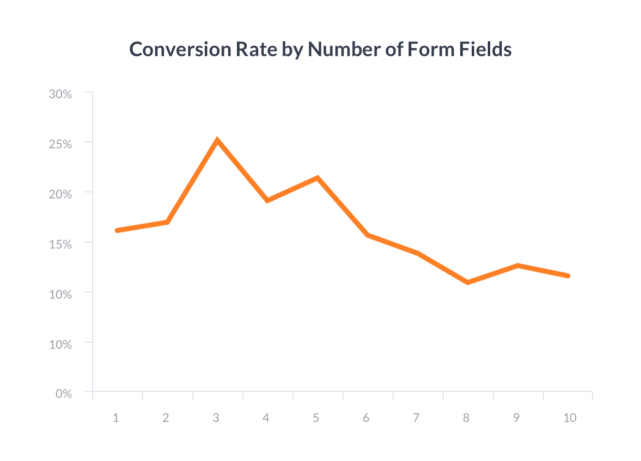
However, the real story is more nuanced.
For example, CXL case study showed that simply removing fields can backfire. One team cut a form from nine to six fields and saw a 14% drop in conversions. Why? Because they removed fields that users actually wanted to fill out. When they reintroduced the fields and clarified them with better microcopy, conversions increased by 19%.
The conclusion? Short forms tend to perform better, especially for casual inquiries or quick feedback. But for lead generation or sales, you might need additional fields to qualify contacts effectively.
If your contact form has more than just the standard “name, email, message” fields, you run the risk of confusing visitors.
For example, if you’re adding a contact form to your agency website, and you have a “budget” field, it might be unclear what that budget is for. Is it for the entire project? Is it for just a specific part?
To avoid such confusion, you can add “microcopy” to your contact form.
Microcopy is short explainer text that accompanies form fields to clarify them. To get an idea, look at the ‘Payments volume’ field in the sales contact form below.

When most people think of a contact form, they picture the same basic embedded form that you see on most websites. But if you want to make it easy for people to get in touch with you, it is worth experimenting with different displaying methods, like a popup or notification bar.
For example, having a floating contact button or a sticky bar that launched a form can be a smart solution.
It makes it easy for users to contact you as soon as they have the intent to do so, without having them look around for your contact page. Insight Homes, in the example below, used that approach on their website.
This contact form is created in Getsitecontrol
Your contact form design does not end with the Submit button!
To offer a better user experience, you want to tell people exactly what will happen next and how long it will take. For example…
Do you respond to all inquiries or only some?
How long will it take you to respond?
Will you respond via email?
If you set clear expectations, your visitors won’t wonder what’s going on and if your form is even working.
💡 To describe the next steps, you can use a submission success message (on the second page of the form) or an automated email confirming form submission.
8 Inspiring contact form examples from real websites
Now that you know the best practices, let’s take a look at some real-world contact form designs to inspire your own.
Stripe’s sales contact form is a great example of how sometimes collecting a little extra information can make your contact forms generate more qualified leads (even if it might lower the baseline conversion rate a little bit).
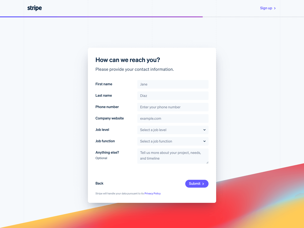
In addition to standard information fields, Stripe adds ‘Job level’ and ‘Job function’ fields, so they can better understand the potential quality of each lead.
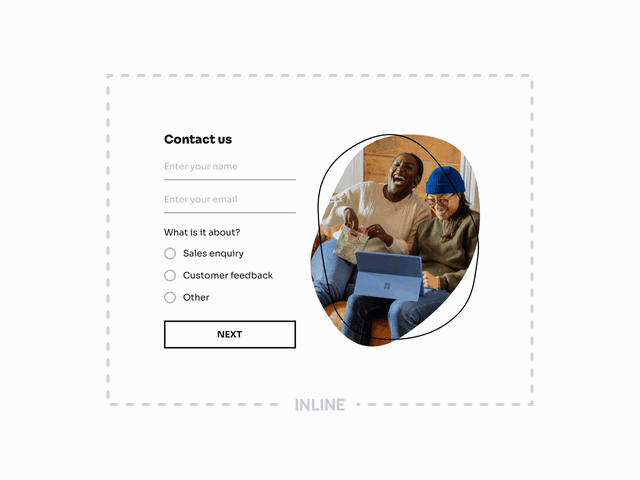
At first glance, Public Goods uses a simple, minimalist contact form design. While it resides on a dedicated Contact page, this form could easily be embedded sitewide as well.
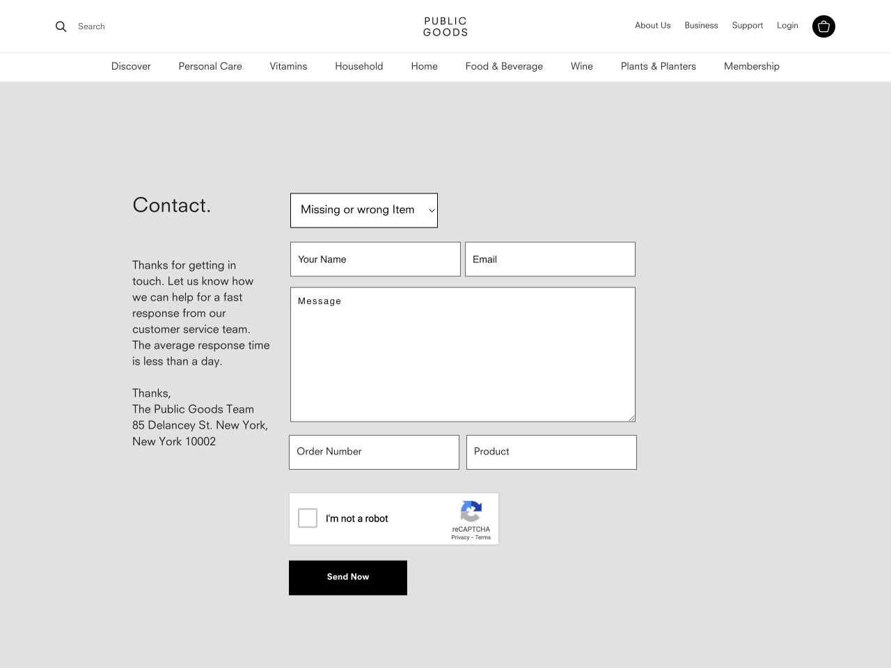
What sets this form apart is the skip logic feature we discussed earlier. If you toggle between the options in the dropdown menu, you’ll notice how the form adapts by displaying additional fields or renaming them based on the selected query.
Furthermore, Public Goods also does a great job of setting expectations about the average response time.
Here at Getsitecontrol, we handle our contact form design a little differently.
Rather than creating a dedicated “Contact us” page that visitors have to navigate to, we simply included a Contact us link in the footer that opens a popup right there and then – no page reloads required.
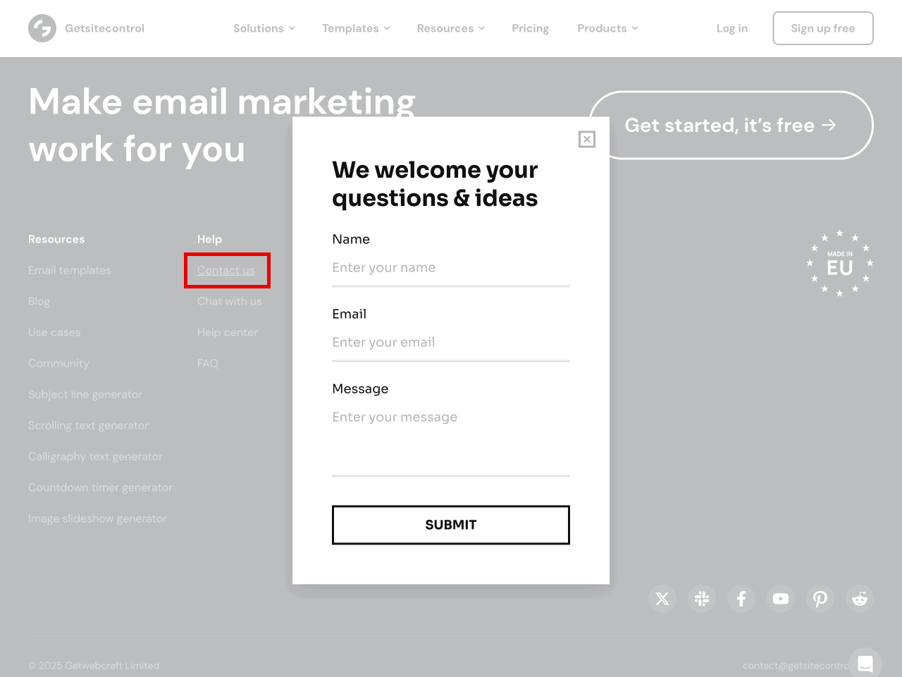
This contact form is created in Getsitecontrol
This approach is convenient for website visitors because they can:
Access our contact form from any page on the site.
Send a message without interrupting whatever else they were doing (like reading this blog post).
Pop-up contact forms are simple and easy to fill out. You can trigger them by clicking on a link or a floating button placed anywhere on a website. Create one for yourself with Getsitecontrol.
The contact form on the Mindful Movement Method website shows that sometimes simplicity and warmth go further than flashy features.
Placed on a dedicated “Contact” page, the form uses a soft color palette and gentle typography that feel totally in line with the brand’s wellness focus.
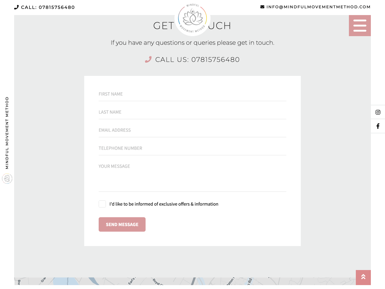
This contact form is created in Getsitecontrol
Functionally, the form is straightforward: name, email, phone, and message — plus a single opt-in checkbox for receiving updates. There’s no unnecessary friction, just a clear invitation to connect.
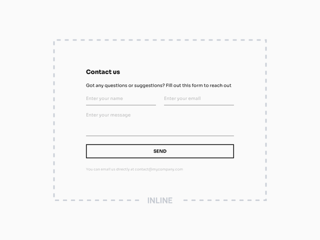
The contact form from Orbits IT is a lesson in clarity and confidence.
Sitting inline on a dedicated landing page, the form is incredibly minimalist: just name, email, and a single “Enquiry” field. But the surrounding context does all the heavy lifting. The copy reassures potential clients with the number of happy customers and the average resolution time.
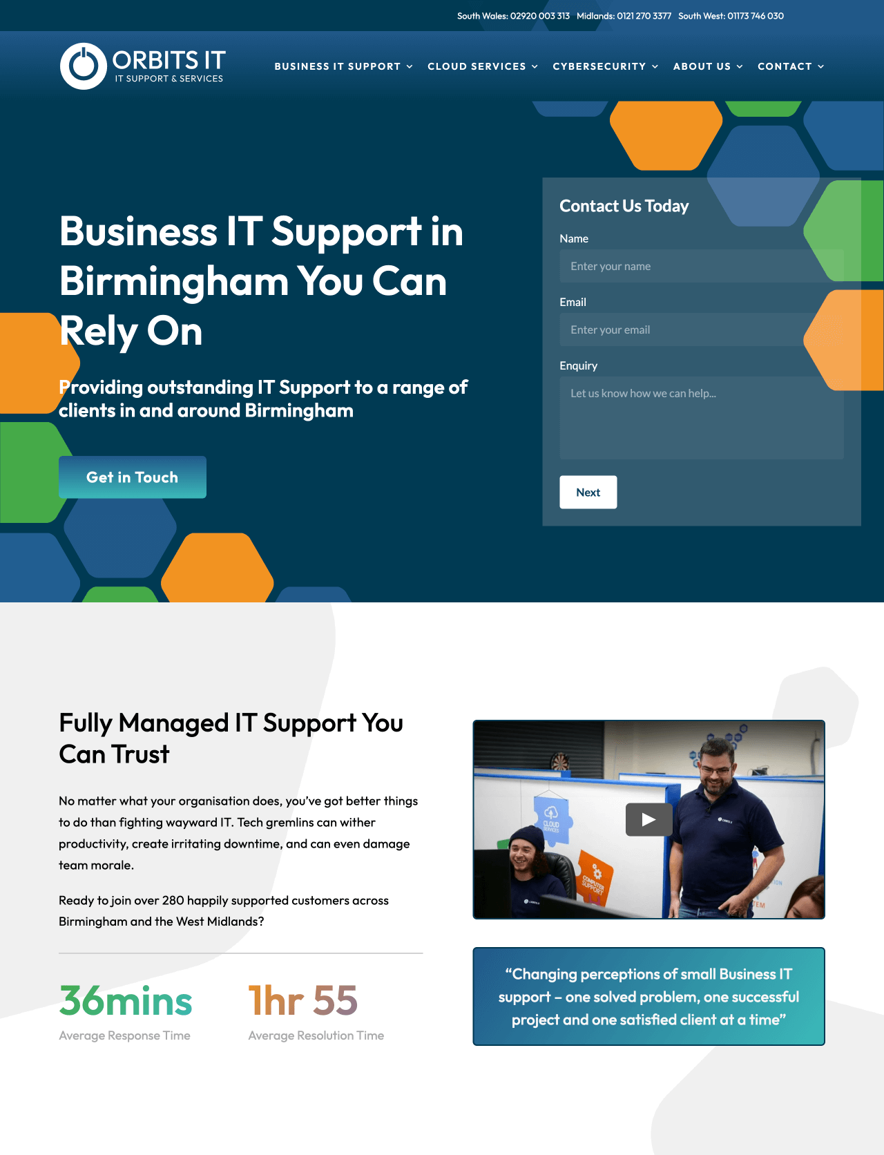
This contact form is created in Getsitecontrol
The overall layout is clean and professional, and the “Next” button hints at a multi-step form that doesn’t overwhelm the user up front.
This contact form works because it’s aligned with its audience: no fluff, no distractions, just an efficient way for businesses to get in touch with a trusted IT provider.
The contact form on Wildcoat’s website is a masterclass in design: in layout, tone, and visual aesthetics.
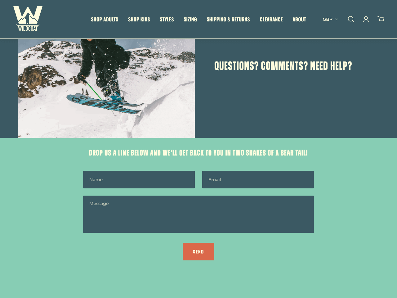
What makes this form stand out is the personality behind the design. Visually, the form blends seamlessly into the brand’s overall look: the typography, spacing, and color choices feel deliberate and on-brand, reinforcing trust through design alone. And the cherry on top? “We’ll get back to you in two shakes of a bear tail!”
Komodo, a digital marketing agency, uses a contact form that’s clean, concise, and intentional — without sacrificing clarity or context. What makes it stand out is everything around the form.
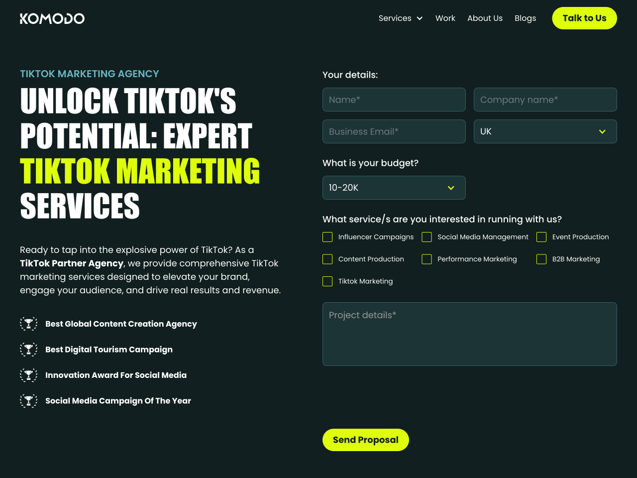
On the left, Komodo explains who they are and what kind of work they do. This helps set expectations and filters out irrelevant inquiries. They also clearly state what this form is for, which is helpful if the form is shared via a direct link. Finally, they include social proof, reinforcing their credibility right at the moment a prospective client is reaching out.
This is a great example of how you can keep your contact form simple while still giving visitors enough context to confidently submit a message.
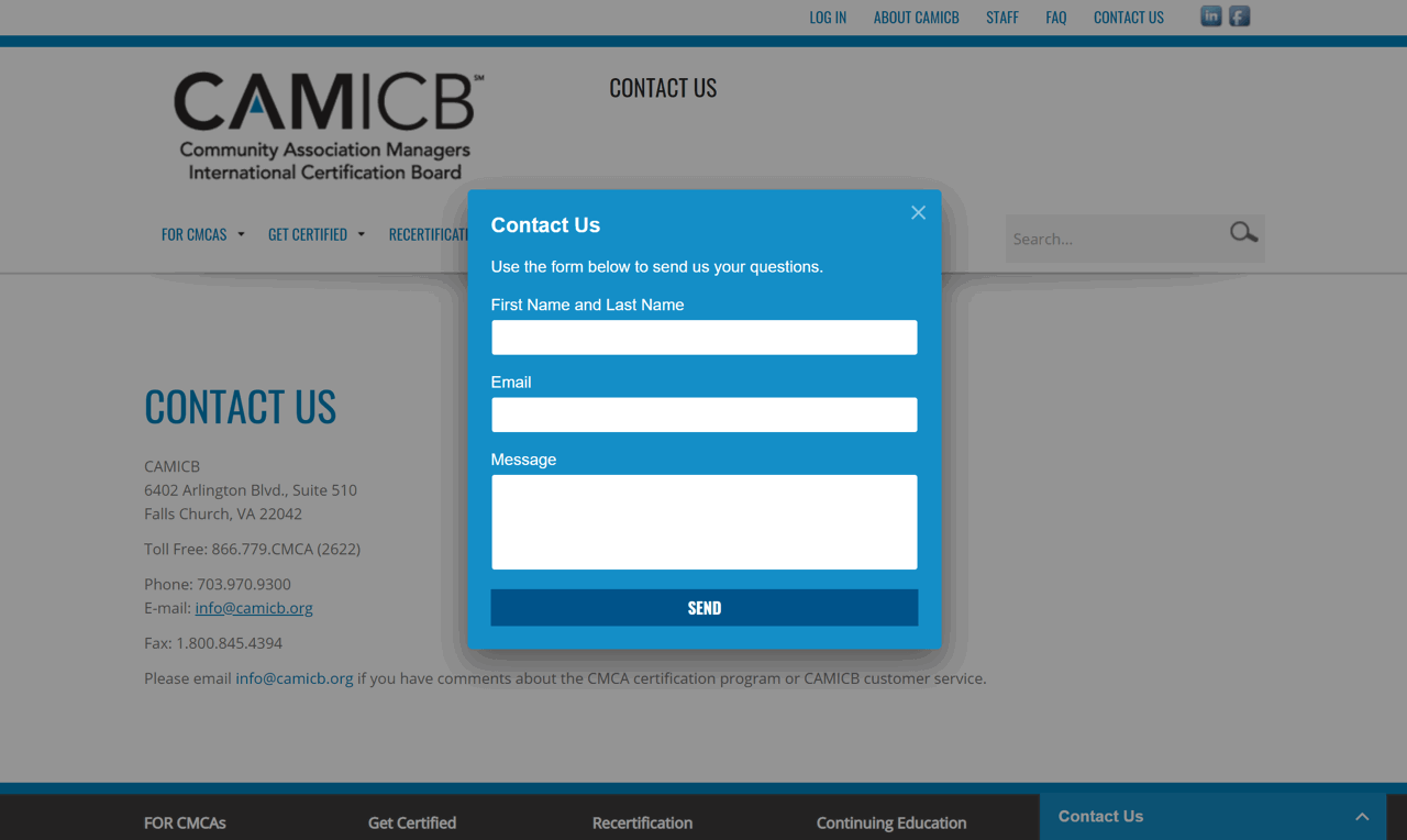
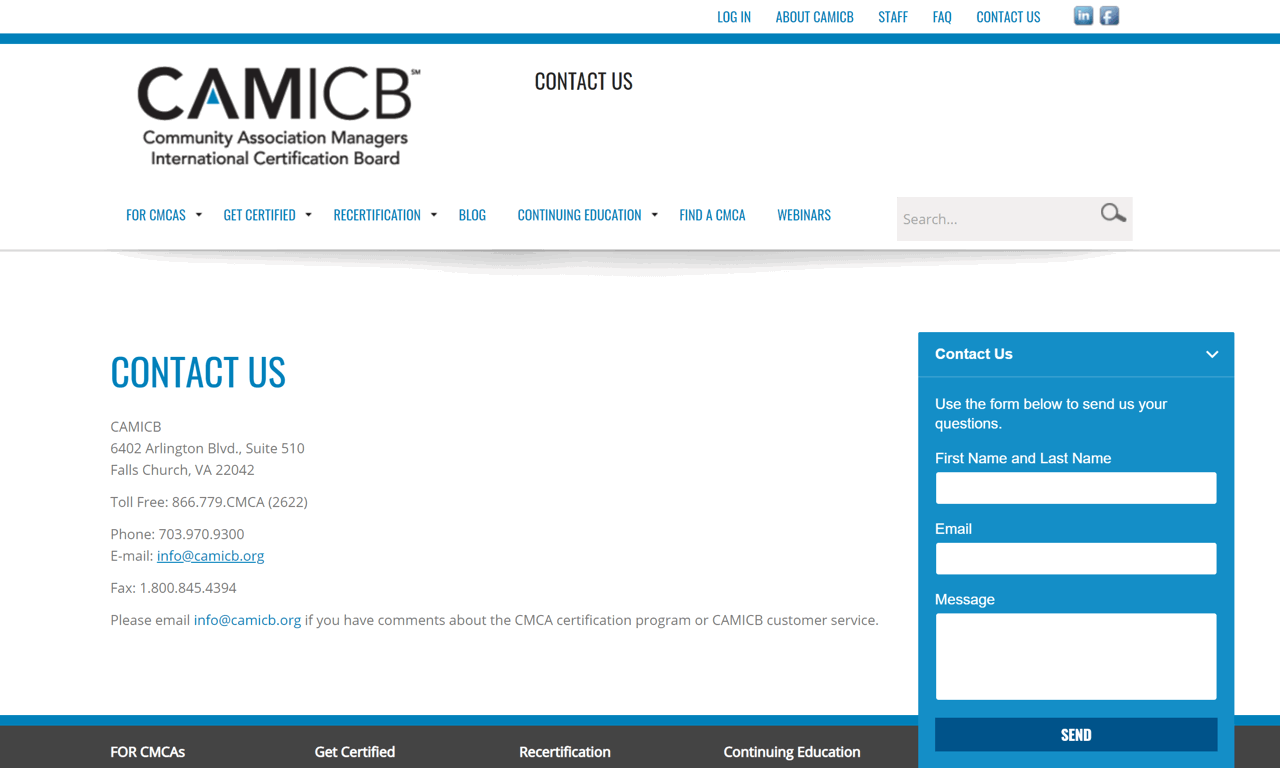
CAMICB, short for Community Association Managers International Certification Board, offers certification for community associations in the USA.
The notable thing about the CAMICB contact form is that it uses a hybrid popup/“Contact Us” page approach. When users land on the Contact Us page, the CAMICB website instantly opens a simple pop-up contact form where visitors can submit their messages.
This contact form is created in Getsitecontrol
With just three fields, CAMICB keeps its form short and to the point. Also, the pop-up approach creates a nice distraction-free interface where the focus is entirely on the form. This makes submitting an inquiry about as frictionless as possible.
And to make things even easier, CAMICB also displays a slide-up contact form that users can access in its footer:
How to create your own contact form with no technical skills
You can create a full-featured contact form without any coding using Getsitecontrol.
Getsitecontrol is a beginner-friendly platform that helps you add professionally designed forms to your website, including contact forms, email newsletter signup forms, survey forms — all fully customizable.
Getsitecontrol enhances website engagement without requiring extensive technical expertise. Whether it’s embedding contact forms, surveys, or pop-ups, their solutions are designed for efficiency and accessibility. Getsitecontrol has been an essential tool for my website. The platform makes the process effortless, offering an intuitive interface that allows for easy installation and customization.
Small Business Owner g2Below, we’ll walk you through the steps of creating a contact form in Getsitecontrol, so you get a better idea of how easy it is.
Once you create an account with Getsitecontrol, start with a pre-designed form template. Options include various formats, and they are fully customizable to align with your goals.
Edit the form title, description, and field labels to match your tone of voice. Add or remove fields based on what information you need; use dropdown menus for query types, checkboxes for services, or microcopy to explain specific fields. You can also use skip logic to create conditional form and customize the success message that appears after submission.
Choose where your form appears. If it’s an inline contact form, you can embed it on specific pages; otherwise, you can display it as a pop-up form that expands when a visitor clicks on a floating button or a link.
Getsitecontrol allows you to receive real-time email notifications when someone submits your form and integrate it with your existing tools through built-in connections or Zapier. This ensures submissions flow directly into your CRM, project management system, or email inbox.
To stop bots and prevent spam submissions, you can enable Google reCAPTCHA protection.
Set up automated emails to confirm form submissions, set expectations about response times, or share helpful resources. This builds trust and keeps visitors informed about next steps.
Once published, your contact form goes live immediately, and you can track its performance using intuitive reports right in the Getsitecontrol dashboard.
Create a Getsitecontrol account today, and get started with the free plan. No credit card required.
What you should include in a contact form depends on what purpose it serves. For example, some brands use contact forms to collect questions and feedback; other brands use contact forms to generate leads. At minimum, include name, email, and message fields. Consider adding a query type dropdown if you receive different types of inquiries. For sales-related contact forms, qualifying fields like budget, company size, or specific needs can help identify serious leads.
Most websites include inline contact forms on a dedicated Contact page accessible from the main navigation. However, consider additional placements for better accessibility: floating buttons on the side of pages for support inquiries or footer forms for easy access from any page.
If you want to prevent spam submissions coming through your contact form, there are several methods available, depending on the form builder of your choice, and the level of your technical skills. For example, if you use Getsitecontrol to create your contact form, you can simply enable Google reCAPTCHA, and it will block bots, prevent fraud and spam.
Getsitecontrol allows you to enable instant email notifications when someone fills out your contact form. From there, you can respond to queries right from your inbox.
Even if you or your team handle responses manually within a set period of time, it’s good practice to set up an instant automated email that confirms form submission, explains next steps, or provides additional helpful resources.
If your business handles different query types (sales, support, partnerships), it’s best to create separate or conditional forms. This allows you to collect purpose-specific information and route submissions to the appropriate team members.
Mobile-friendly contact forms feature large, easy-to-tap fields with adequate spacing, simplified layouts that work on small screens, minimum required fields to reduce typing, and clear, visible submit buttons. Test your form on multiple devices and screen sizes before launching.
Most website form tools, including Getsitecontrol, provide built-in analytics showing submission rates. That means you’ll be able to see how many people have viewed your form, and how many have filled it out.
Colin Newcomer is a freelance writer with a background in SEO and affiliate marketing. He helps clients grow their web visibility by writing primarily about WordPress and digital marketing.
You’re reading Getsitecontrol blog where marketing experts share proven tactics to grow your online business. This article is a part of Customer engagement section.
Create popups for free
Email forms, promos, coupons, surveys, bounce-stoppers.
Get started, it’s free →Collecting feedback from your website visitors is one of the simplest ways to improve UX, conversions, and content performance — but only if you ask the right questions at the right time.
This guide includes 16 proven website survey questions, backed by real examples from brands like IKEA, Banana Republic, and Public Goods. You’ll also learn when to show each question for maximum response rates and actionable insights.
Mention “email popup,” and you might picture those fullscreen forms that appear too early, blocking the content you came to read.
But modern email newsletter popups are nothing like that.
Today’s popups are designed to look on-brand, feel natural within the page, and appear at the right moment — turning visitors into subscribers without being annoying.
Popups are a powerful tool to grow your email list, promote offers, and guide visitors toward key actions.
Our data shows that a well-designed email popup can convert 3.77% of your visitors into subscribers on desktop, and 6.57% on mobile, on average.
But not all popups deliver results — there’s a stark difference between those that fall flat and those that convert.
Subscribe to get updates
Get beginner-friendly tips for growing your online business.