Popups and forms: design, conditional branching, targeting, third-party integrations, A/B testing & more
This guide covers everything you need to know about building and configuring popups and forms in Getsitecontrol. It walks you through the widget editor from start to finish, including the Design, Targeting, Integrations, Contacts, and Anti-Spam tabs, as well as the A/B testing feature, widget statistics, best practices, and common use cases.
- 1. Creating a widget
- 2. Design
- 3. Targeting
- 4. Integrations
- 5. Contacts
- 6. Anti-Spam
- 7. Form submission automations
- 8. Widget statistics
- 9. A/B testing
- 10. Best practices
- 11. Common use cases
Creating a widget
You can create popups and forms from the Widgets section of the dashboard by clicking Create widget. Getsitecontrol includes a gallery of ready-made templates organized into categories such as Announcements, Sign-ups, Age verification, Coupons, Cookies, Feedback, and Contact us, as well as blank templates under Messages and Forms. From the gallery, you can preview a template in more detail or open it directly in the widget editor for customization.
AI-adapted template previews
When previewing a template before opening it in the editor, you can switch between the Original version and an AI-adapted version. The adapted preview automatically personalizes the template using information from your website or store, such as the website language, store name, branding elements, discount codes, or product-related content. It also adjusts the tone of the widget copy to better match your website, for example by using a more friendly, formal, playful, or promotional style. This feature helps you visualize how the widget may look in a more realistic, store-specific context before you begin customizing it manually.
Design
The Design tab is where you build the visual structure and appearance of your widget. It consists of a live preview of your widget, an objects tree where all elements are listed hierarchically, a panel where the settings of the selected element are displayed, and a toolbar with preview tools.
Widget type and position
Each widget template is built using a specific widget type, such as Modal, Slide-in, and Bar. After choosing a template, it is possible to change its widget type. The following options are available.
| Type | Description |
|---|---|
| Modal | A popup that appears in the center of the screen and blocks the page until closed. Best for important announcements, limited-time offers, lead collection, and critical messages that require full attention. This is the most intrusive type. |
| Slide-in | A popup that slides in from the side or top/bottom of the screen without blocking the page. Best for promotions, newsletter sign-ups, product recommendations, and non-urgent reminders. Noticeable but less disruptive than a modal. |
| Sidebar | A popup that occupies the full height of the screen on one side. Best for persistent offers, navigation elements, or ongoing promotions that should remain visible while users scroll. |
| Bar | A popup that slides in from the top or bottom of the screen. Best for announcements, shipping information, or short notices. Highly visible but less intrusive than a modal. |
| Panel | A small collapsed element that expands when clicked and collapses when closed. Best for contact forms and situations where you want to remain available without interrupting the user. Panels appear collapsed by default and do not feature an X button. |
| Fullscreen | A popup that covers the entire screen. Best for age verification and onboarding flows. Provides maximum focus but should be used carefully due to its high intrusiveness. |
| Inline | A widget embedded directly within the page content. Best for forms inside blog posts or content-based promotions. Blends naturally into the page and is the least intrusive type. |
Choosing a widget type
| Goal | Recommended widget type |
|---|---|
| Newsletter signup | Slide-in or Modal |
| Site-wide urgent announcement (with countdown) | Bar |
| Long-form announcement (new arrivals, shipping specifics, updated terms) | Slide-in or Modal |
| Embedded form inside content | Inline |
| Persistent contact/help widget | Panel |
| Mandatory confirmation or verification | Fullscreen or Modal |
| Promotions and discounts | Slide-in or Modal |
| Surveys and feedback | Modal or Teaser-triggered widget |
| Exit-intent message | Modal or Sidebar |
Position
Each widget type has specific position options. Modal widgets always appear centered. Fullscreen widgets cover the entire screen and have no position options. All other widget types offer preset positions as well as manual positioning using X and Y offsets.
Inline widgets installation
Unlike other widget types, Inline widgets are not displayed as popups on the page; instead, they must be embedded into the webpage content using a unique code. The widget will then appear exactly where the code is placed, for example inside a blog post, product page, landing page, or custom section of your website.
Being part of the page layout itself, Inline widgets do not support popup-style positioning or overlays. Instead, they move with the rest of the page content as visitors scroll.
Global widget settings
Font
The Font selector allows you to set the font for the entire widget; you can choose a system font or one of the preloaded Google Fonts. On Pro plans, you can use the CSS editor to import any Google Font or apply your website’s existing custom font.
Size
The Size setting lets you choose from preset sizes ranging from XS to XL. This setting scales the widget as a whole, including text size, buttons, form fields, spacing, paddings, and gaps between elements. This makes it possible to quickly make the entire widget more compact or more prominent without manually adjusting each element. For more precise control, you can still adjust the width, padding, or margins of individual elements within the widget.
Radius
The Radius setting controls the roundness of the widget’s corners. A value of 0 px produces sharp, square corners; higher values produce progressively rounder corners.
Shadow
The Shadow dropdown adds a shadow effect to the widget container, applied across all pages of the widget. You can choose from several preset styles and customize the shadow color using the color picker. In addition to shadow presets, the dropdown includes Outline styles. Unlike shadows, outline presets apply a solid border around the widget container, which can be useful for creating a flatter or more minimal design. The shadow or outline effect can be removed entirely.
Animation
The Animation dropdown controls how the widget appears on the page; for example, whether it fades in, slides in, or appears instantly. Animations can be disabled entirely.
Controls (border and radius)
In the global widget settings, you can set a unified border thickness and corner radius for all interactive controls at once, including buttons, input fields, radio buttons, and checkboxes. If you manually change the border or corner radius of a specific element in its own settings panel, that change will override the global settings. To make the element follow the global settings again, remove its individual border or radius setting.
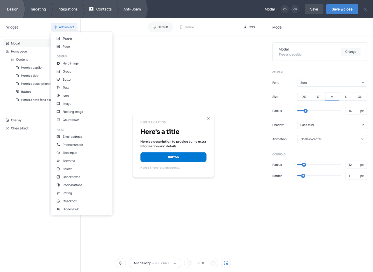
Objects
Objects are the building blocks used to create the structure, content, and functionality of a widget. They are divided into two categories: general objects, which are used to build the widget structure and content (such as text, images, groups, and buttons), and form objects, which are used to collect visitor input (such as email fields, dropdowns, and checkboxes).
From the + Add object menu, you can also add additional pages to create multi-step widgets, as well as a Teaser, a minimized version of the widget that can remain visible before or after the main widget is displayed.
When you select an element in the tree or on the preview, a set of default settings is shown immediately; additional style settings can be revealed by clicking the + icon at the top of the panel. This keeps the interface clean while still offering precise control when needed. Settings are organized into logical sections; for most objects, you will find sections for Layout, Typography, and Appearance. Below is an overview of the available objects and their most relevant settings.
Group
Groups are one of the most powerful tools in the editor. A Group is a container that holds other objects. You can apply settings to a group, and all objects inside it will be arranged and styled according to those settings.
This is especially relevant in the case of the Layout setting, which controls whether the objects within the group are arranged vertically (stacked) or horizontally (side by side). You can also set the alignment of objects within the group and the gap between them.
This nesting system gives you a great deal of layout flexibility. For example, you can create a side-by-side layout with an image on one side and content stacked neatly on the other, or a two-column form with fields arranged evenly across the widget. By combining horizontal and vertical groups in different ways, you can create a wide variety of layouts while keeping spacing and alignment consistent.
Groups can also have click actions assigned to them, which means you can make an entire content block interactive. For example, you can make a group containing an image and a text element open a URL when clicked.
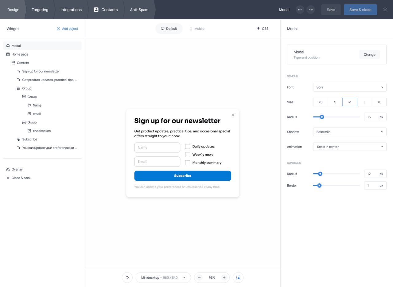
Widget template with multi-group structure and two-column field layout
Group settings include click actions, layout direction (vertical or horizontal), alignment, gap, width, margins, paddings, border radius, background color, and a CSS class name.
The CSS class name setting is mainly useful together with the built-in CSS editor available on paid plans. It allows you to target a specific group with custom CSS instead of affecting the entire widget. For example, you can apply hover effects, transitions and animations, custom shadows or gradients, and other styling options not available in the built-in settings.
Button
Buttons are the primary interactive element of the widget and can be used to submit forms, navigate between pages, open links, launch other widgets, and more. Each button must have at least one assigned action, and multiple actions can be added to the same button. The following button actions are available:
| Button action | Description |
|---|---|
| Submit / Go to page | Submits the form data and sends visitors to the next page of the widget. Can also be used to configure skip logic and branching for multi-step forms (see dedicated section). |
| Open URL | Opens a specified URL when the button is clicked. |
| Copy to clipboard | Copies a predefined piece of text (such as a coupon code) to the visitor’s clipboard. |
| Show widget | Opens another Getsitecontrol widget when clicked. |
| Close widget | Closes the current widget. |
| Add to cart | Adds one or more products to the Shopify cart directly from the widget. |
| Apply discount | Applies a discount code automatically to the Shopify cart. |
You can add an icon to a button by choosing from the available icon library and selecting either an outlined or filled style. The icon color automatically matches the button text color. Colors can be set independently for the button background, text, and border, and separate hover colors can be configured for each. Any of these colors can be made transparent via the color picker. Additional appearance settings include Border width, Border radius, and Border style. Typography settings include Font size, Font weight, and Line height, allowing you to fine-tune the appearance and spacing of the button label.
Button width can be set to Fill (spans the full container width), Fit (sized to the label and icon), or Custom (manually specified). Additional layout settings include Paddings and Margins, content alignment, and Visibility controls for desktop and mobile devices. Buttons can also be styled independently for desktop and mobile using the Default and Mobile tabs, and you can assign a CSS class name for advanced custom styling through the CSS editor (available on Pro plans).
Text
Text objects let you add and style copy inside the widget. You can apply bold, italic, or underline formatting and add hyperlinks. Hyperlinks can use full URLs (e.g. https://example.com), / for the homepage, or relative paths such as /pricing. Each text element can be styled as Heading 1–5, Paragraph, or Paragraph (note).
Text objects also include a built-in AI writing assistant that can improve writing, fix grammar, shorten or expand text, change tone, translate content, or generate alternative copy variations directly inside the editor.
Clicking the + icon in the right-hand panel reveals the full set of text styling options. Layout settings include Visibility (show or hide on desktop/mobile), Width (Fill, Fit, or Custom), Paddings, and Margins. Typography settings include Font size, Font weight, Font case (uppercase, lowercase, or as typed), Line height, Letter spacing, and Alignment. Appearance settings include Border width, Border radius, Colors (background, text, and border), and Opacity.
Icon
Icon objects let you add standalone icons within the content area. Choose from the available icon library and select an outlined or filled style. Style settings include Visibility, Width (Fill, Fit, or Custom), Margins, Color, Opacity, and Rotate.
Hero image
The Hero image is the primary image element of the widget. It is positioned outside the main content block and can be placed at the top, bottom, left, or right of the widget. This makes it well-suited for decorative or prominent visuals that frame the widget’s content.
After uploading an image, you can crop it to show only the desired portion. The Fit settings control how the image fills its allocated space. A Size slider controls how large the image appears, and padding adjusts the space between the image and the edges of its container. The Border radius setting lets you round the image corners or keep them sharp.
You can apply a mask to the Hero image to give it a custom shape or cutout effect. Different mask styles can dramatically change the appearance of the image, making it blend more naturally with the widget design.
The Hero image supports separate configurations for desktop and mobile. Use the Default and Mobile tabs to switch between versions, choosing different images, layouts, or visibility settings for each device type independently.
Image
The Image element is placed inside the main content block (unlike the Hero image) and can be freely positioned, grouped with other objects, and aligned alongside text, buttons, or form fields. This makes it the best choice when you want an image to be integrated within the content layout, for example, next to a heading or above a button.
Floating image
The Floating image is positioned outside the content area with absolute positioning. It can be placed anywhere on the widget, including partially or fully overlapping the widget edges. You can resize it by dragging the corner handles and reposition it by dragging and dropping. Because its position is absolute, it may shift unexpectedly on different screen sizes; therefore, always preview your widget on multiple devices using the toolbar.
| Image type | Best for |
|---|---|
| Hero image | Decorative or prominent visuals positioned outside the main content block, such as side illustrations, promotional product shots, or framing imagery around the widget content. |
| Image | Standard images placed directly inside the content layout, such as product photos, logos, illustrations, or side-by-side image and text sections created with Groups. |
| Floating image | Small decorative or accent visuals layered freely within the widget, often used for stickers, badges, icons, or overlapping design elements. |
Countdown
A countdown timer element that can be added to the content area to display a ticking clock, useful for product launches, registrations, or limited-time promotions.
The countdown supports two modes: Fixed date and Evergreen. Fixed date mode counts down to a specific date and time, while Evergreen mode creates an individual countdown for each visitor based on when they first see the widget.
You can choose the timezone used for the timer and select which time units to display: days, hours, minutes, and seconds. Labels for each unit can be customized, and you can choose how the units are separated (for example, using colons).
The When timer ends setting controls what happens after the countdown reaches zero. Available options are Do nothing, Show message, and Close widget.
Clicking the + icon reveals additional styling options, including visibility, width, paddings, margins, gap, font size, font weight, alignment, border width, border radius, colors, and opacity. Like other objects, the countdown supports separate desktop and mobile settings through the corresponding tabs.
Email address
A dedicated field for collecting email addresses. Getsitecontrol validates emails by checking for the presence of an @ symbol. For stronger validation, you can enable Double opt-in emails via the Anti-Spam tab (see dedicated section below).
Clicking the + icon in the right-hand panel reveals additional styling options for the field. Layout settings include Visibility (show or hide on desktop/mobile), Width (Fill, Fit, or Custom), Paddings, Margins, Layout, and Gap. Typography settings include Font size, Font weight, Line height, and Alignment. Appearance settings include Border width, Border radius, Colors (background, text, and border), and Hover colors.
Phone number
A text field for collecting phone numbers. The field accepts any input, including numbers, spaces, symbols, and text, and does not perform phone number validation or formatting automatically. The Phone number field supports the layout, typography, and appearance settings available for the email field.
Text input
A single-line text field for short answers such as names or titles. The Text input field supports the same styling options as other form fields.
Textarea
A multi-line text field for longer responses. The character limit is approximately 800 characters. Supports the layout, typography, and appearance settings available for other form fields.
Select
A dropdown menu field where respondents can choose a single option from a predefined list. You can set a specific option to be selected by default. Includes the standard field styling controls.
Checkboxes
A multiple-choice field where respondents can select one or more options simultaneously. You can set an option to be checked by default. Shares the same layout and appearance settings as other fields.
Radio buttons
A single-choice field where respondents select one option from a list. You can set a specific option to be selected by default. Supports the same styling options as other form fields.
Rating
A star rating field supporting a 5-star scale. You can adjust the color of the stars and other layout-related settings. On Pro plans, the number of stars can be increased and their appearance customized via the CSS editor.
Checkbox
A single consent checkbox used to obtain agreement from visitors, for example, to accept a privacy policy, terms of service, or marketing communications. It is commonly used in signup and contact forms to document visitor consent and comply with GDPR regulations.
Hidden field
A field that is invisible to visitors but captures data behind the scenes. It appears as a separate column in your response reports. Hidden fields are usually populated using variables selected from the {var} menu in the field settings. Common use cases include capturing an internal user ID passed via the Getsitecontrol API, or recording the UTM parameters of the marketing campaign that led to the form submission.
Pages
Every widget features a single Home page by default. You can add more pages from the objects dropdown. Additional pages are useful for building multi-step forms, success or thank-you screens, and branching flows where different answers lead to different outcomes.
Pages appear in the objects tree and can be reordered by dragging them to a new position. The order of pages in the tree determines the order in which visitors progress through the widget, unless the flow is modified using Skip logic and branching (see dedicated section below).
To allow visitors to navigate between pages, add a button with a Submit/Go to page action. From the second page onward, a back arrow appears automatically, allowing visitors to return to the previous page.
Each page has its own settings, accessible by clicking on the page item in the tree. There you can rename the page and assign a background click action, which defines what happens when a visitor clicks outside the widget content area. Page items in the objects tree also include controls for duplicating or deleting pages.
Teaser
A Teaser is a small floating element that appears on the webpage independently of the main widget. When a visitor clicks the teaser, the main widget opens. The teaser can be designed with its own icon, label, position, animation, and shadow settings, all configured separately from the main widget.
The teaser is useful when you want to make the widget available to visitors without displaying it automatically. It provides a less intrusive way for visitors to open the widget whenever they choose. Teasers cannot contain form fields.
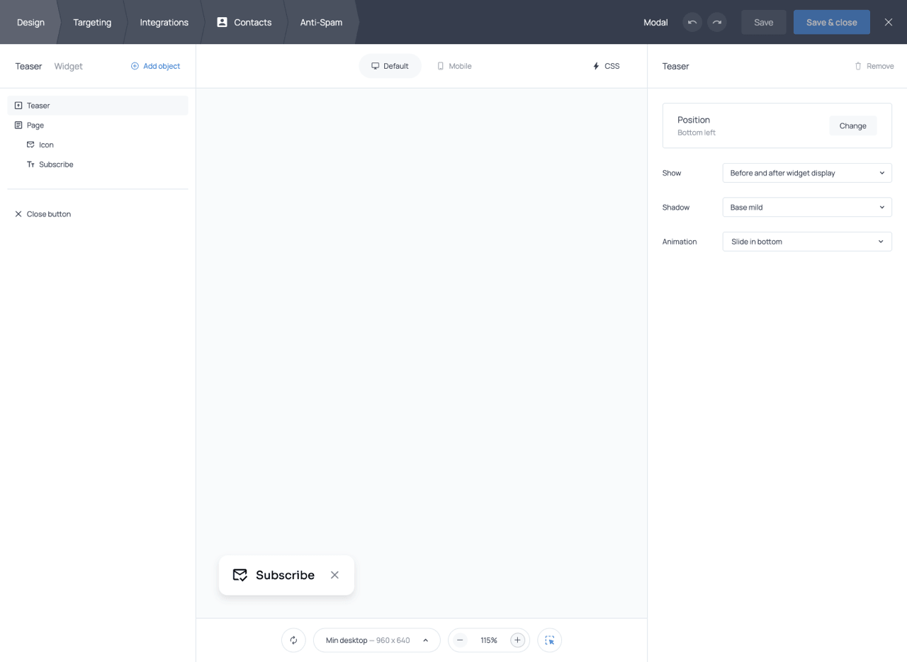
A Teaser and its settings in the widget editor
The objects tree
All objects added to the widget appear in the objects tree, a nested structure that includes pages, groups, text blocks, images, buttons, and form fields. The object tree lets you navigate between pages and objects, open the settings of any selected object, and duplicate or delete objects within the widget.
Objects nested inside a group are children of that group, and groups themselves can be nested inside other groups. This hierarchy gives you precise control over layout and styling. You can also reorder objects by dragging them to a new position in the tree; the order of objects in the tree determines the order in which they appear in the widget.
In addition to the objects you add manually, the objects tree also contains a few built-in items that control widget behavior and structural elements depending on the widget type.
Close & back
The Close & back item controls the appearance and behavior of the close (X) button and the back arrow that appears on pages beyond the first. You can toggle these buttons on or off and customize their size, offset, colors, hover colors, border width, and border radius.
Overlay (Modal widgets only)
For Modal widgets, the editor includes an Overlay item, which represents the dimmed or blurred area behind the modal. You can style the overlay and create a colored, semi-transparent, or darkened background, and configure it to close the widget when clicked by adding a Close widget action to its settings.
Header (Panel widgets only)
For Panel widgets, the editor includes a Header item that controls the appearance of the panel in its collapsed state. You can customize the header text, text size and weight, background color, text color, and text alignment. The caret toggle (the arrow icon indicating that the panel can expand) can be hidden without affecting the panel’s behavior; visitors will still be able to expand the panel by clicking the header itself.
Desktop and mobile styles
Most style settings in the editor support separate configurations for desktop and mobile. The Default tab in the right-hand panel controls the base styles that apply to both device types. The Mobile tab lets you override specific settings for smartphones and tablets only. This system makes it straightforward to adjust button sizes, text sizes, spacing, or layout for smaller screens without affecting the desktop version. The Default and Mobile buttons at the top of the preview window allow you to switch between device previews.
The preview
The center of the editor contains a live, interactive preview of the widget. Here, you can view the widget exactly as it is being built, interact with it, and select individual objects to open their settings.
The preview toolbar provides several utility functions: restarting the widget preview to simulate it appearing again after being closed, previewing the widget at different device sizes, zooming in or out on the preview, and toggling the object selector.
When the object selector (arrow icon) is enabled, hovering over an element in the preview highlights its corresponding entry in the objects tree, while clicking the element selects it and opens its settings in the right-hand panel. When the selector is disabled, the preview behaves like the live widget on your website, so interactive objects such as buttons and fields work normally when clicked.
The CSS editor
On Pro plans, the CSS editor is available via the CSS button at the top of the screen. It allows you to apply custom styles to any element of your widget using standard CSS selectors. Common use cases include importing custom fonts, applying your site’s existing font family, styling the collapsed panel header, applying color gradients, and customizing the design in any way beyond what is covered in the settings panel.
Dynamic text replacement
Dynamic Text Replacement (DTR) allows you to personalize the content of your widgets by inserting variables that are automatically replaced with real visitor or system data when the widget is shown. Variables follow the format {{var}} and can be added to text objects, field labels, placeholder text, default values, button labels, and button URLs. To add a variable, select a text element and click the {var} button, then choose from the available variable categories.
| Dynamic Field | Description |
|---|---|
| Form | Displays data previously submitted by the visitor through the current form, such as their name entered on a previous page. |
| Geo | Displays location data such as the visitor’s city, country, region, state code, or postal code. It is recommended to include a default fallback (e.g., {{$city | your door}}) so the text remains complete even if location data is unavailable. |
| Device | Displays information about the visitor’s browser, operating system, device name, device type, or browser language. |
| Date | Displays the current date, day of the week, day of the month, or current month based on the visitor’s system settings. |
| Developer | Displays custom data passed via the Getsitecontrol API, such as a visitor’s name, subscription status, or a personalized discount value. Default fallback text can be set using the {{name | fallback}} format. |
| UTM | Inserts UTM parameters from the current URL, including UTM Source, Medium, Campaign, Content, and Term. |
| Shop | Displays Shopify-specific data such as the logged-in customer’s name, the currently viewed product or variant, the product vendor, or cart values. |
Variables can also be used in button URLs, allowing you to pass form data or API parameters into the destination URL. JavaScript expressions are supported for more advanced personalization, for example to display different content based on a condition, or to format values before displaying them. Expressions use the format {{= expression }}.
Skip logic and branching
For multi-page widgets, you can use skip logic and branching to control which page a visitor sees next based on their answers. Rather than following a fixed page order, the form adapts to each respondent.
Branching is configured at the button level. The button that advances the form must have a Submit/Go to page action, and within that action’s settings, you can switch from Linear page order to Skip logic and branching.
Each branching rule consists of three elements: the form field being evaluated, the condition (using any of or none of operators), and the target page to navigate to when the condition is met. For example, a survey might ask whether the visitor is an existing customer. If the answer is ‘Yes,’ the form can skip directly to a customer feedback page; if the answer is ‘No,’ it can instead show a lead qualification page.
Multiple rules can be defined for a single button and are evaluated in order from top to bottom. The last rule always acts as a fallback and applies when none of the other conditions match.
A few technical points to keep in mind: branching is evaluated only when a page is submitted, not dynamically as the visitor fills in fields; conditions can only reference fields on the current page; and branching operates between pages, not within a single page.
Before setting up skip logic, it is helpful to rename your pages, field IDs, and response option IDs so that rules are easier to configure and troubleshoot.
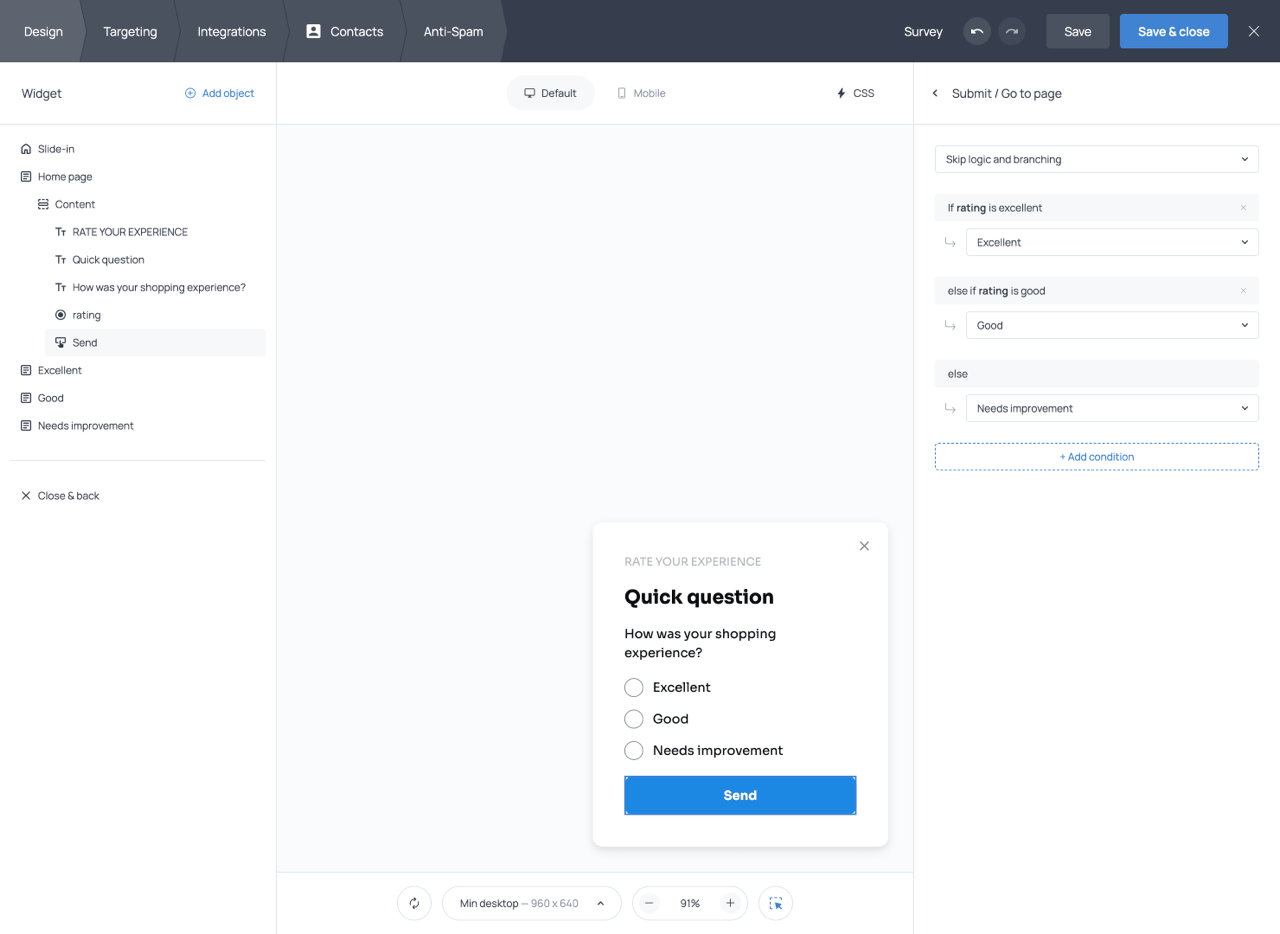
Skip logic & branching button setup
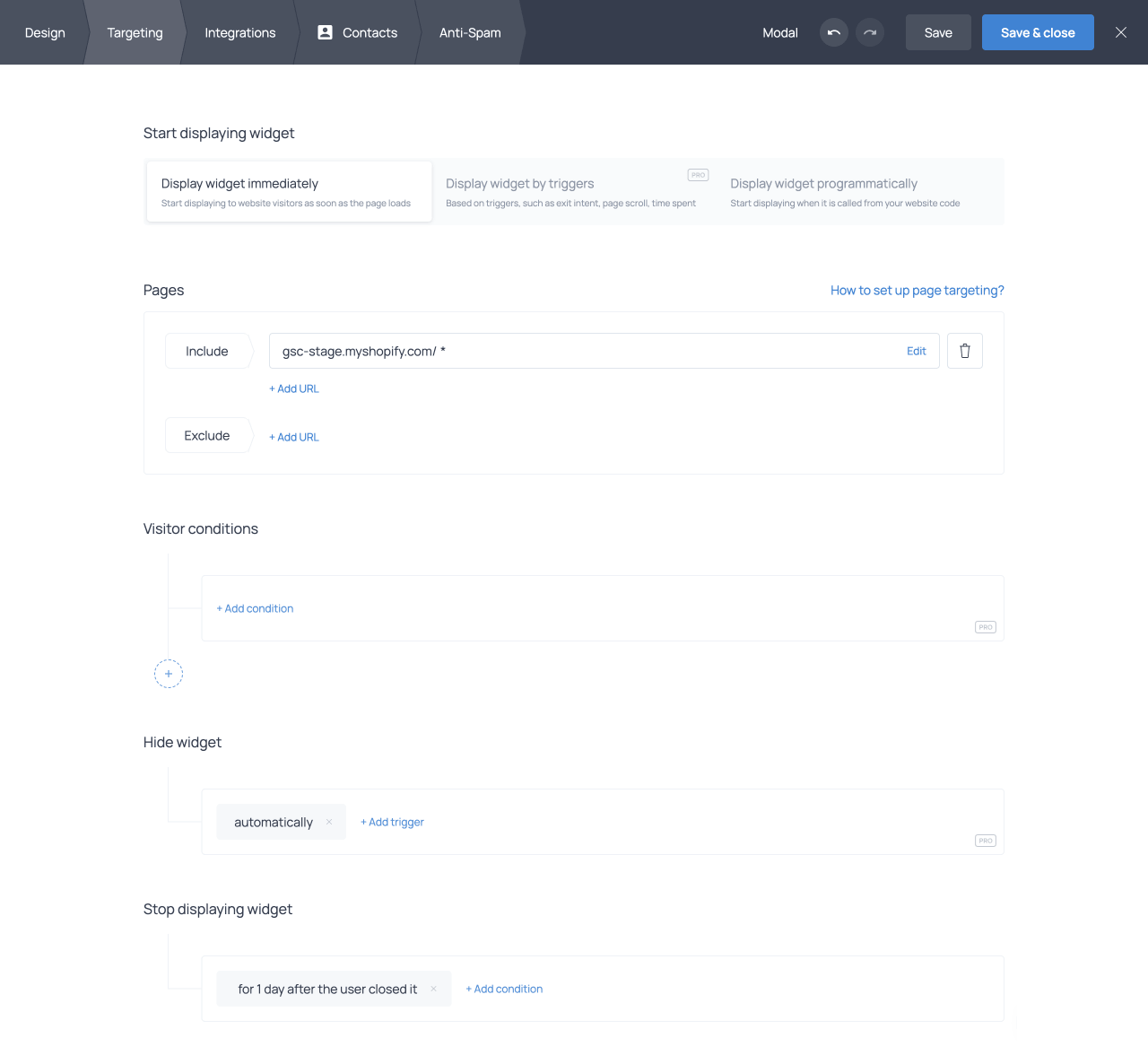
Targeting
The Targeting tab controls where your widget appears, who sees it, and when it is displayed. A widget will only appear when all configured targeting conditions are satisfied simultaneously. Below is a concise overview of the main sections.
Start displaying widget (Pro)
The Start displaying widget section determines when the widget appears after a visitor lands on an eligible page and fulfills the other conditions (if any). You can display the widget immediately, display it by triggers, or display it programmatically.
When displaying the widget by triggers, available triggers include when the user is leaving the website, scrolls to a specified percentage of the page, spends a specified amount of time on the page or site, becomes inactive, and, for Shopify, adds a product to the cart or removes a product from the cart. If multiple triggers are selected, the widget appears as soon as any one is met. These targeting settings are only available on paid plans.
Pages
The Pages section defines which pages of your website the widget appears on. By default, the widget appears on all pages. You can specify exact URLs to include or exclude, use wildcard patterns (e.g. /blog*) to target entire subdirectories, or target by query parameters. Shopify users also have preset options for Cart and Product pages.
Visitor conditions (Pro)
Visitor conditions determine which visitors see the widget based on their characteristics. Available filter groups include Geo (country, region, city), Device (browser, OS, device type, language, screen width), Visit (new visitor status, referrer, page views, sessions, scroll depth, time on page or site), Developer (API parameters, IP address, cookies, custom JavaScript conditions), UTM parameters, and for Shopify cart content, customer attributes, and product data.
Multiple conditions can be combined using AND or OR logic and can be grouped into segments for more complex rules. Visitor conditions are only available on paid plans.
Hide widget (Pro)
Hide widget defines conditions under which the widget disappears automatically, such as after being displayed for a set number of seconds or when the visitor scrolls past a certain depth. These targeting settings are only available on paid plans.
Stop displaying widget
Stop conditions control when the widget stops appearing for a returning visitor; for example, permanently after a visitor submits a form, or for a set number of days after they close it. Available conditions include Upon action, After closure, After hiding, Upon view, and Upon X views.
Schedule (Pro)
Schedule restricts the widget to specific date ranges, times of day, or days of the week. Scheduling conditions can be combined with AND/OR logic and grouped into segments for complex time windows such as different hours on weekdays versus weekends. The scheduling options are only available on paid plans.
Integrations
The Integrations tab is where you connect your widget to external services, set up email notifications, configure webhooks, and enable Google Analytics tracking.
Third-party integrations
You can connect your widget to third-party email marketing and CRM platforms so that new contacts collected by your forms are automatically sent to those services. This can be done through the + Add application option in the Third-party integrations section, where you select the platform you want to connect from the dropdown menu. You can connect a single widget to multiple third-party platforms
The process generally involves logging in to your third-party account, authorizing Getsitecontrol to access it, selecting the list or audience where contacts should be added, and mapping your form fields to the corresponding fields in the external platform. Field mapping ensures that data collected by your form (such as email address, name, or any custom field) is stored correctly in the destination platform.
When mapping fields, you can use the {var} menu to select variables corresponding to your form fields. In addition to form data, you can map system variables such as the visitor’s location, device, or the current date.
Email notifications
You can configure email notifications to receive a message each time someone submits your form. Notifications are added via the + Add notification option in the Integrations tab, where you can specify the recipient email address and customize the subject line.
To send notifications to multiple recipients, list all email addresses in the field separated by commas. You can use variables in the subject line (for example, using the submitted email address as the notification subject) by clicking {var} and selecting the appropriate variable.
Webhooks
Webhooks allow you to send form submission data to any URL in real time. Each time a visitor submits your form, Getsitecontrol will POST the data to the URL you specify. Webhooks are an advanced feature that requires programming knowledge to process data on the receiving end.
You can set up webhooks through the + Add webhook option. There, you define the destination URL and configure field mapping to control which data Getsitecontrol sends and under which key names. Getsitecontrol sends webhook data as an HTTP POST request in application/x-www-form-urlencoded format.
Google Analytics 4 integration
You can enable tracking for widget interactions in Google Analytics 4 directly from the Integrations tab. Simply check the Integrate with Google Analytics checkbox and save the changes to the widget. Once tracking is enabled, Getsitecontrol automatically sends the following events to GA4.
| Event | Description |
|---|---|
| gsc_show | A visitor sees the widget |
| gsc_close | A visitor closes the widget by clicking the close button, clicking an action button that closes the widget, or clicking the widget background (if set to close the widget) |
| gsc_showWidget | A visitor clicks a button that triggers another widget |
| gsc_submit | A visitor clicks a button that submits the data |
| gsc_openUrl | A visitor clicks a button that opens a URL |
| gsc_copyToClipboard | A visitor clicks a button that copies text to the clipboard |
| gsc_addToCart | A visitor clicks a button that adds an item to the cart (Shopify only) |
| gsc_applyDiscount | A visitor clicks a button that applies an automatic discount to the cart (Shopify only) |
Events appear in GA4 under Reports → Engagement → Events within approximately one hour. If GA4 is installed via Google Tag Manager, additional configuration is required to route events from GTM to GA4, including creating a custom event trigger, a GA4 Event tag, data layer variables, and custom dimensions.
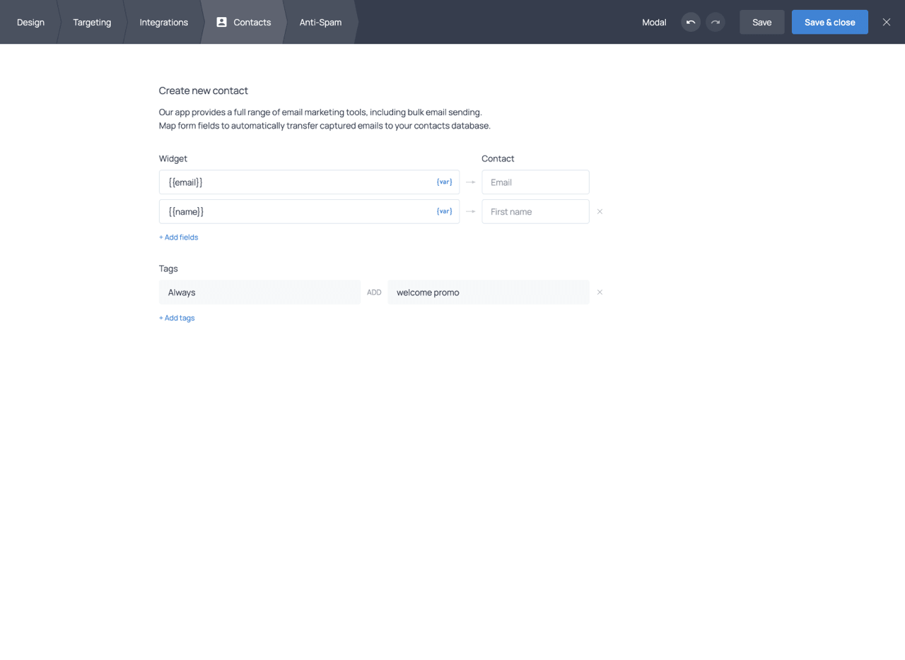
Contacts
The Contacts tab of the widget editor controls how form submissions are stored in your Getsitecontrol contacts database. Here, you configure field mapping (which data goes into which contact field) and define tagging rules applied at the moment of submission.
Field mapping
Field mapping links each form field to a contact field in the Getsitecontrol database. The section is initially empty; by clicking + Add fields, you can add the fields you want to populate. You can map to default contact fields (Email, Phone, First name, Last name, and others) or to any custom fields you have created.
On the source side, you use the {var} menu to select the variable corresponding to the form field or system data you want to capture. On the destination side, you see the contact field where that value will be stored. In addition to form field variables, you can map system-generated values such as the visitor’s location, device type, or the submission date.
You can also use static text values as the source, for example to record the name of a specific form or campaign as a fixed label on every contact created through that widget.
Custom contact fields can be created directly from this interface if you need to store data types not covered by the default fields. Any custom field becomes immediately available for mapping, filtering, and segmentation across the platform.
Assigning tags at submission
The Tags section of the Contacts tab lets you define rules that automatically assign tags to contacts when they submit the form. Each rule uses either the Always condition, which applies the tag to every submission, or the If condition, which applies the tag only when a specific field contains a matching value. Conditional tagging works with fields that have predefined choices, such as dropdowns, radio buttons, checkboxes, and rating fields. This makes it possible to segment contacts immediately as they enter your database. For example, if your form includes a question about the visitor’s area of interest, you can assign different tags depending on which option they select, all without requiring any additional automation setup.
Anti-Spam
The Anti-Spam tab provides two tools to protect your forms from bots and fake submissions: Google reCAPTCHA and Double opt-in emails. You can use either or both, depending on how much protection your forms require.
Google reCAPTCHA
Getsitecontrol uses reCAPTCHA v3, which works in the background by analyzing visitor behavior. It does not present any challenge to real users. When suspicious activity is detected, the submission is blocked before it reaches your contact database.
Google ReCAPTCHA is available for widgets that include an email field and can be enabled with a single toggle; no Google account or API key configuration is needed. Blocking bots at the point of submission prevents fake contacts from entering your database, reduces unnecessary confirmation emails, and protects your sender reputation.
Double opt-in emails
Double opt-in emails add a confirmation step to the subscription process. After a visitor submits their email, they receive a confirmation email with a verification link. Only visitors who click that link are added to your contacts database as confirmed subscribers. Submissions that are never confirmed are automatically excluded.
This means that mistyped, fake, or bot-generated email addresses never reach your contact list. The result is a smaller but higher-quality list of verified subscribers, which typically leads to better open and click rates, lower bounce rates, and a stronger sender reputation.
Double opt-in emails are fully customizable: you can edit the subject line, message content, sender name, and sender domain. You can send confirmation emails from a shared Getsitecontrol domain or from your own custom sender domain. After confirmation, you can redirect subscribers to your own landing page or show a built-in success screen.
A single double opt-in email can be linked to multiple widgets, and you can create multiple confirmation emails for different languages or use cases.
Form submission automations
After a visitor submits a form, you can automatically follow up with an email or an entire email sequence using Getsitecontrol Automations. This is configured using the Form submission trigger, which launches an automation whenever someone submits a connected widget containing an email field.
Automations can be connected to a single widget or multiple widgets and can include actions such as sending emails, assigning tags, waiting before the next step, or launching reusable workflows. This allows form submissions to trigger onboarding flows, welcome sequences, lead-nurturing campaigns, discount reminders, and other automated follow-ups.
Filters can be applied to the automation or its individual actions to target different audiences based on form data, tags, contact fields, purchase behavior, or engagement. For example, you can send different follow-up emails depending on which option a visitor selected in a form.
Widget statistics
Getsitecontrol provides built-in statistics for every widget, allowing you to monitor views, interactions, conversion rates, and audience data directly from the dashboard.
Widget card statistics
Each widget card in the Widgets section displays a compact statistics summary. The metrics shown include the number of views, the total number of actions, and the combined CTR (Click-Through Rate) across all widget actions.
Statistics panel
Clicking the View statistics button on a widget card opens a detailed statistics panel. In addition to the overall metrics, the panel displays separate performance data for each action configured in the widget. For example, if a widget contains both a Submit action and an Open URL action, each action will have its own action count and CTR. The panel also includes small trend charts and audience breakdowns by country, device, page, and traffic source.
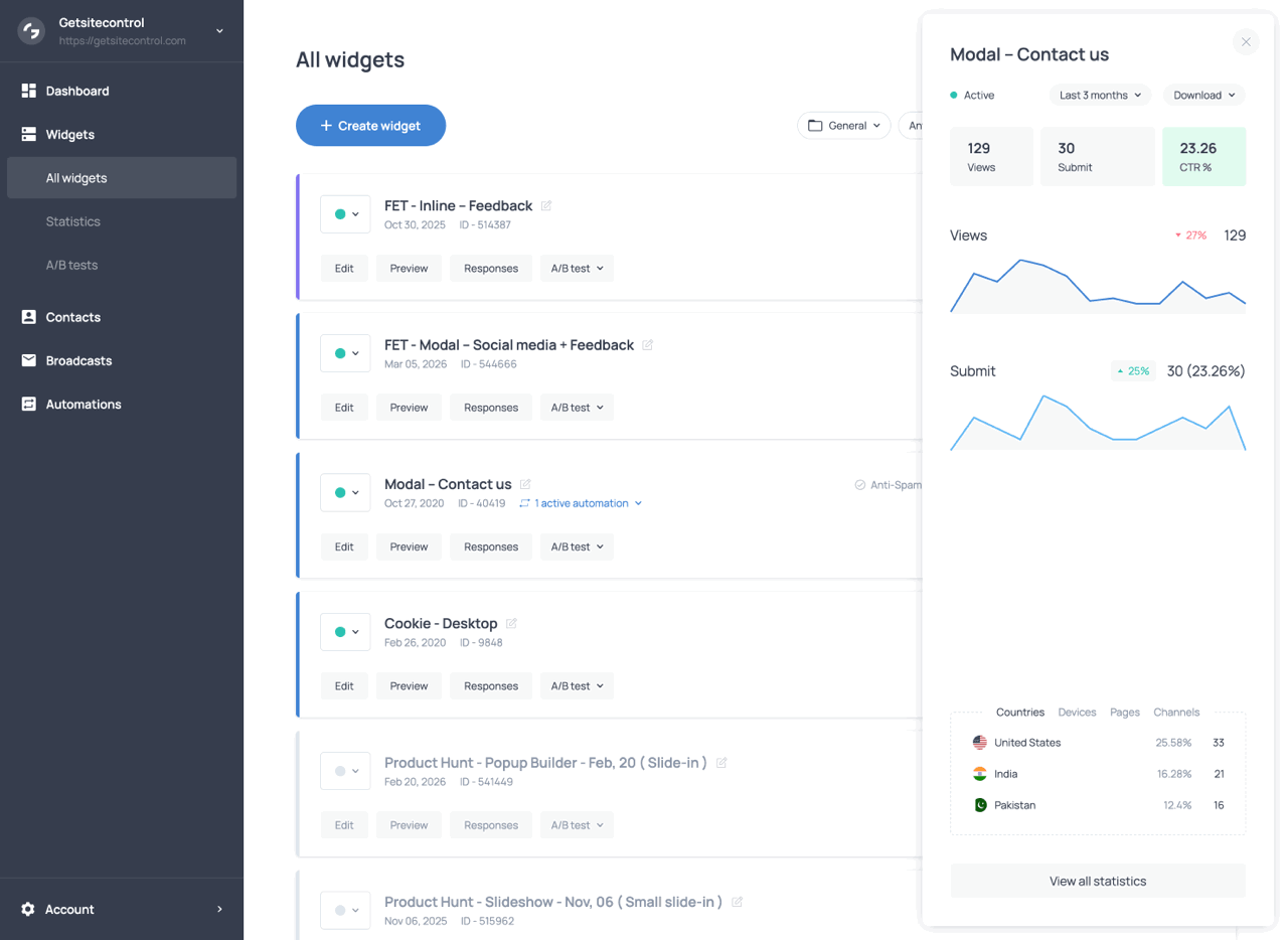
The statistics panel featuring action statistics, trend charts, and audience breakdown
Full statistics page
The full Statistics page provides a more detailed analytics view for the selected widget or widgets. At the top of the page, you can filter the data by widget, channel, country, device, and date range. The page includes dedicated charts for views and actions over time, helping you identify trends and compare engagement levels across different periods.
Additional sections display audience and technical breakdowns such as visitor countries, devices, screen resolutions, browsers, and traffic sources or mediums. The lower part of the page contains detailed tables showing widget and page-level performance, including views, actions, and CTR for individual pages where the widget appeared. Performance statistics can be downloaded in CSV format.
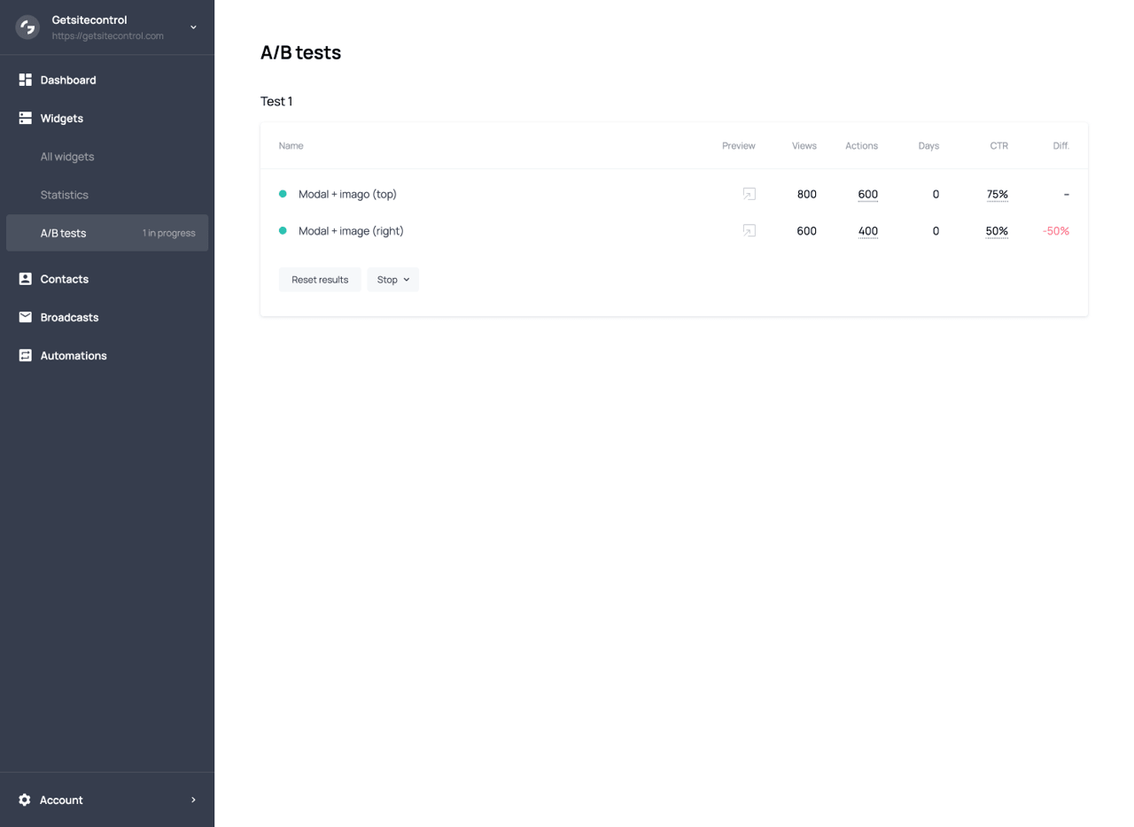
A/B testing
A/B testing lets you compare different versions of a widget to find out which one performs better with your audience. In Getsitecontrol, you can run up to five A/B tests simultaneously.
How it works
To run a test, create the widget variants you want to compare and add them to the same A/B test. Getsitecontrol splits traffic evenly among variants: each visitor is randomly assigned one variant and continues to see it throughout the test. The test runs until you decide to stop it, and performance data is collected continuously in the A/B tests tab of the dashboard.
All variants in a test must have identical targeting settings. Variant assignment happens before targeting conditions are evaluated, so if targeting differs between variants, traffic distribution will be uneven, and results will be unreliable.
Metrics
The A/B testing dashboard provides a set of performance metrics for each variant included in the test. These metrics help you evaluate how visitors interact with each version of the widget and compare their effectiveness over time.
| Metric | Description |
|---|---|
| Actions | Interactions with the widget, such as form submissions or link clicks. If a widget contains multiple actions, the metric shows both the combined total and a breakdown by action type. |
| Days | How long the test has been running. Useful for evaluating whether enough data has been collected to interpret the results reliably. |
| CTR | The Click-Through Rate, calculated by dividing the number of actions by the number of views. It represents the percentage of views that resulted in an interaction. |
| Diff. | The performance difference between variants, expressed as a percentage to show how much better or worse one variant performs compared to another. |
CTR is the primary metric for comparing variants. When a widget contains multiple button actions, the overall CTR combines interactions from all of them, but the report also includes a separate CTR breakdown for each action. In these cases, the comparison should focus on the CTR of the action most relevant to your goal.
Best practices
Start from a template
Unless you have a very specific design in mind, starting from one of the available templates is faster than building from scratch. Templates are already structured with sensible layouts, placeholder content, and appropriate widget types for common use cases. You can customize every aspect of a template after opening it in the editor.
Match the widget type to the goal
The widget type has the biggest impact on how visitors perceive and interact with your popup. Intrusive types like Modal and Fullscreen work well for high-priority messages but can frustrate visitors if overused. Less intrusive types like Slide-in, Bar, and Panel tend to generate less resistance. Choose based on how much attention the message genuinely requires, not just on which type converts best in general.
Design for mobile from the start
A widget that looks good on desktop can appear cramped, oversized, or misaligned on a smaller screen. Use the Mobile tab to review and adjust font sizes, button widths, spacing, and image visibility early in the design process rather than as an afterthought. The preview toolbar lets you switch between screen sizes at any time.
Keep the content focused
Each widget should communicate one clear message and ask for one action. Adding too many fields, buttons, or competing calls to action reduces the chance that visitors will complete any of them. For more complex flows, use multiple pages rather than cramming everything on a single page.
Use groups to control layout
Rather than relying solely on padding and margins to arrange objects, use groups to define the structure of your widget. Setting a group’s layout direction to horizontal or vertical and nesting groups within groups gives you precise control over how objects are arranged and how they respond to different screen sizes.
Set stop conditions before publishing
By default, a widget stops appearing for one day after a visitor closes it. Review the stop conditions in the Targeting tab before activating a widget to make sure the behavior matches your intent. For informational popups such as cookie notices, consider using the Upon view condition so the widget does not reappear after a visitor has already seen it.
Test button actions before going live
Every button in your widget should have an assigned action, and every action should be tested before the widget is activated. For accurate testing, preview the widget on your live website rather than only in the editor. A practical way to do this without showing the widget to all visitors is to add an IP address condition to the Visitor conditions section in the Targeting tab so that only you can see it. Verify that form submissions work correctly, URLs open as expected, and multi-page navigation flows from one page to the next.
Show the widget at the right moment
Showing a widget immediately on page load is rarely the most effective approach. A short time-on-page delay or a scroll-percentage trigger gives visitors time to engage with your content before the widget appears, which typically leads to higher engagement and fewer immediate dismissals. Exit-intent triggers are well suited for last-chance offers without interrupting the browsing experience.
Personalize when you have the data
Dynamic Text Replacement can significantly improve how relevant a widget feels to a visitor. Even a simple personalization can increase engagement, such as displaying the visitor’s city in a shipping message or their name on a thank-you page. If you collect data across multiple form pages, use Form variables to carry responses forward and acknowledge them in later steps.
A/B test one change at a time
If you want to improve a widget’s performance, change one element at a time and run an A/B test to measure the impact. Testing multiple changes simultaneously makes it impossible to know which one made the difference. Focus on elements that are likely to have the most impact first, such as the headline, the call-to-action text, or the offer itself.
Common use cases
Email opt-in forms
Email opt-in forms collect subscriber email addresses, typically in exchange for a lead magnet, discount, or newsletter. A Modal or Slide-in with a time-on-page or scroll-percentage trigger works well, giving visitors time to engage with your content before the form appears. The form typically contains an email address field, an optional first name field, and a consent checkbox. Enable double opt-in in the Anti-Spam tab to ensure only verified addresses are added to your list, and connect the widget to your email marketing platform in the Integrations tab so new contacts are added automatically.
Announcement popups
Announcement popups are used to communicate important information to visitors quickly and visibly. A Bar widget is well-suited for short, persistent announcements such as shipping updates, policy changes, or service notices. A Modal is appropriate when the announcement requires the visitor’s full attention before they continue. Keep the message concise, use a single action button if needed (such as ‘Learn more’ or ‘Got it’), and configure stop conditions so the widget does not reappear after the visitor has acknowledged it.
Welcome popups
Welcome popups are designed to introduce visitors to your website, brand, or current offer shortly after they arrive. Slide-ins and Modals both work well for this use case depending on how much attention the message requires. A typical welcome popup combines a short introduction with a clear call to action, such as subscribing to a newsletter, exploring a featured collection, or claiming a first-order discount. Time-on-page triggers are commonly used to avoid interrupting visitors immediately after page load. For ecommerce websites, welcome popups are often shown only to first-time visitors, while stop conditions prevent the same message from appearing again after dismissal or interaction.
Discount popups
Discount popups are designed to present offers, discounts, or incentives. Slide-in widgets work well because they are visible without blocking the page. A hero image of the promoted product alongside a concise offer and a clear CTA button is a common and effective layout. Countdown timers are often used to add urgency to limited-time offers. Exit-intent triggers are a popular choice: displaying the offer when a visitor shows signs of leaving gives you one last opportunity to convert. You can use Dynamic Text Replacement to personalize the offer, for example by displaying the visitor’s city in a free shipping message, or the remaining amount to qualify for a threshold discount on Shopify.
Surveys
Surveys collect structured feedback or information from visitors. Multi-page widgets are ideal for surveys, allowing you to spread questions across pages and adapt the flow based on previous answers using branching logic. Use Radio buttons or Checkboxes for closed-ended questions, Textarea for open-ended responses, and Rating fields for satisfaction or experience scoring. To create more advanced survey flows, leverage the Skip logic and branching feature; it allows you to show respondents different follow-up questions depending on their answers. Teaser-triggered widgets are often a good choice because they let visitors open the survey voluntarily rather than interrupting the browsing experience. Use the Contacts tab mapping to store responses alongside contact profiles, and use tagging rules to categorize respondents automatically.
Age verification popups
Age verification popups are used to restrict access to age-sensitive content or products. Fullscreen widgets are commonly used for this purpose because they block access to the rest of the page until the visitor confirms their age. Modals with a darkened or blurred background and no close button are also a common choice, as they keep the visitor focused on the verification step. A typical setup includes a short explanatory message and two buttons, such as ‘I am over 18’ and ‘Exit.’ The confirmation button usually closes the widget and grants access to the website, while the secondary action can redirect visitors elsewhere or close the page. To avoid repeatedly interrupting verified visitors, configure stop conditions so the popup no longer appears after confirmation.
Exit-intent popups
Exit-intent popups appear when a visitor shows signs of leaving the website, giving you one last opportunity to keep them engaged. They work especially well for last-minute offers, newsletter sign-ups, discount reminders, cart recovery messages, and lead capture forms. A Modal is a common choice for this use case because it draws attention at a critical moment, while a clear headline, concise message, and single CTA help visitors understand the offer quickly.
For ecommerce stores, exit-intent popups can be combined with discounts, free shipping messages, countdown timers, or Shopify-specific targeting to make the offer more relevant. To avoid showing the same message repeatedly, configure stop conditions so the popup stops appearing after the visitor submits the form, clicks the CTA, or closes the widget.